Soft Lavender Color —The Pale Lavender That Belongs to Soft Summer, and Why
Soft Lavender Color —The Pale Lavender belonging to soft summer
There is a specific pale lavender colour that stops people cold in a drapting session. It’s not vivid. It’s not even clearly purple. And yet something in the room changes when it goes up.
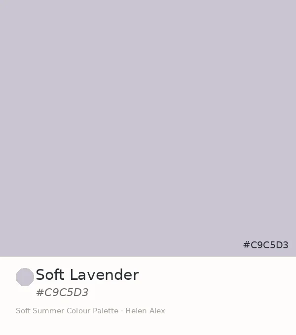
That colour is Soft Lavender — hex #C9C5D3 — and this is its full introduction as an official member of the Soft Summer colour palette.
Soft Lavender • Soft Summer Colour Palette • Helen Alex
Quick answer, if you’re short on time
Soft Lavender (#C9C5D3) is a pale lavender colour at very low chroma (Munsell 5PB 8/2) — the greyed, dusty version of lavender that exists when the violet has been almost entirely consumed by grey. It is an official Soft Summer neutral: the first hue in the palette to cross from blue into violet, and the one that makes the full cool-neutral family feel complete.
Take a ride through our soft summer gallery !
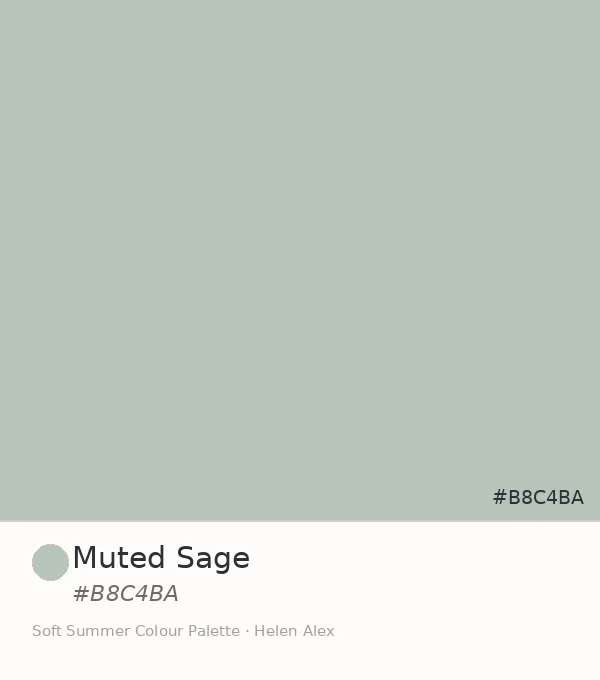
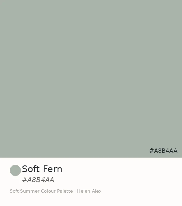
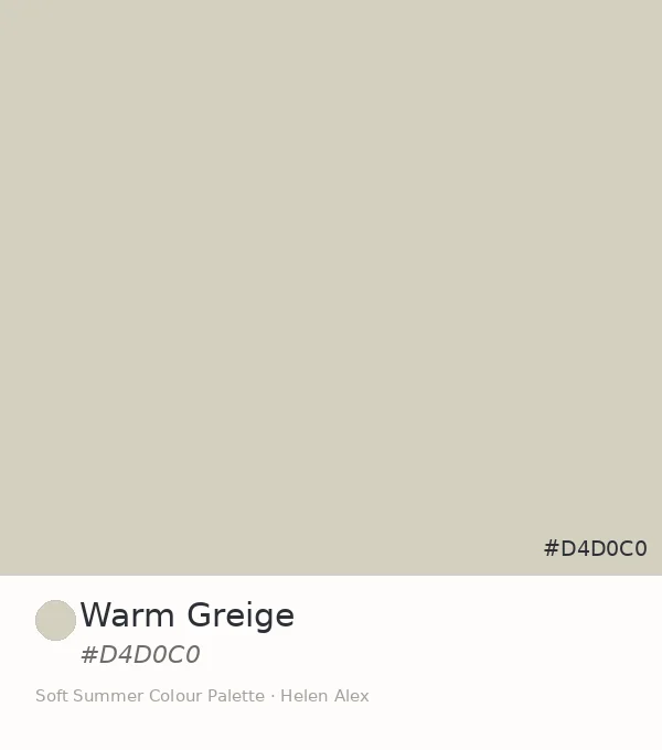
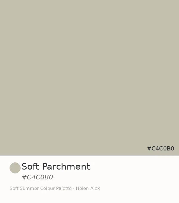
The Analyst Perspective — Munsell Profile of Soft Lavender Color
Strip the name and look at the numbers alone. #C9C5D3 converts to Munsell value 8, chroma 2, in the blue-purple hue family at approximately 5PB — medium-high value, the lowest readable chroma before a colour becomes visually indistinguishable from grey.
That chroma reading of 2 is the defining fact. Most “lavender” colours sit at chroma 4 to 8 — vivid enough to read as a clear colour accent. At chroma 2, Soft Lavender has released most of its violet character into the grey it carries, leaving behind only a residue of hue.
Soft Lavender doesn’t argue for attention the way vivid lavender would. At chroma 2, it simply refuses to be fully grey — and that quiet refusal is what earns it a place in the palette.
#C9C5D3
Munsell ≈ 5PB 8/2
Reads as plain pale grey until it sits beside stark white — then the violet shows itself, just enough to confirm this is not neutral at all, only disguised as one.
This Munsell position separates Soft Lavender from its closest relatives. True Summer’s lavender equivalents sit at chroma 3–4: cleaner, more clearly violet. Light Summer’s greyed lavenders sit at value 9 or above: airier, almost translucent. Soft Lavender at value 8 and chroma 2 is grounded in a way neither of them are.
Soft Lavender ✦
Value 8 · Chroma 2 · 5PB — violet-blue, greyed
True Summer equiv.
Value 8 · Chroma 4 — cleaner, more clearly violet
Light Summer equiv.
Value 9 · Chroma 2 — same mute, far lighter
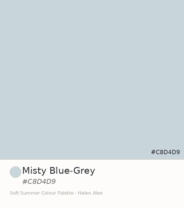
Misty Blue-Grey
Value 8 · Chroma 2 · 5B — same height, blue family
The Nature Perspective — Where Soft Lavender Already Exists
Where Soft Autumn occupies this same low-chroma, medium-high value territory with warm sueded rose and aged ivory (see the Soft Summer vs Soft Autumn guide), Soft Summer reaches the same quietness by its cooler route — and pale lavender colour is what the journey produces.
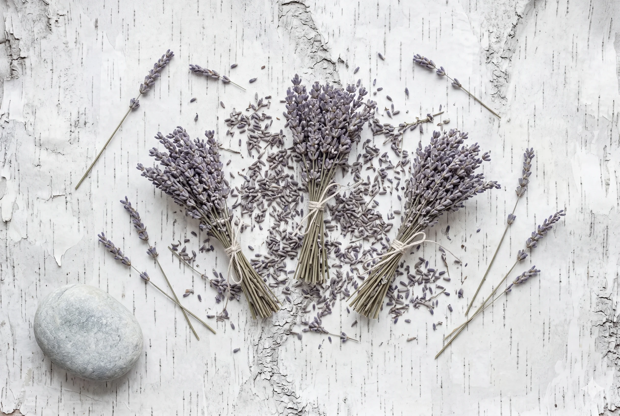
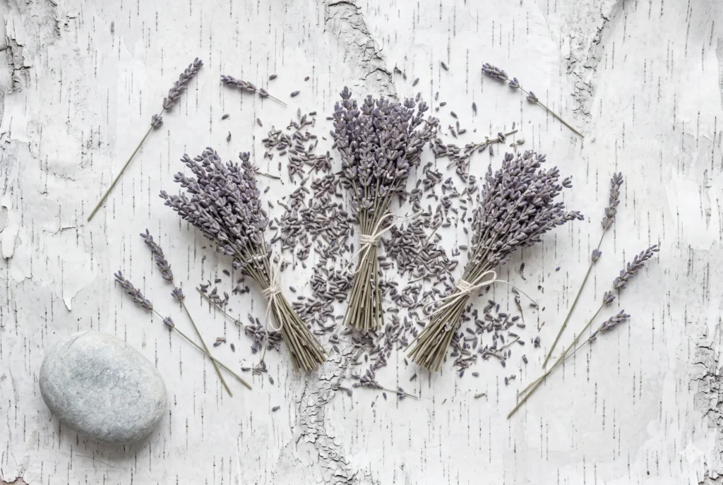
Think of dried lavender left in a ceramic jar by a north-facing window for six months — not the vivid purple of a freshly cut stem, but what remains when the colour has finished exhausting itself. That greyed, dusty aftermath of violet is Soft Lavender exactly. The hue is still there. It’s just stopped insisting.
The lavender flower itself encodes this perfectly. Fresh lavender is a vivid cool purple — well outside Soft Summer’s range. But dried lavender, faded, with grey having entered and violet having retreated to a whisper, becomes something that belongs precisely here.
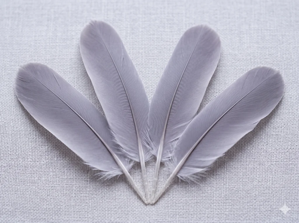
Dove feathers do this too. The grey of herring gull plumage sits inside the blue-grey family. Dove feathers carry their grey a different way — warmer in some lights, but in flat north-facing daylight, the barely-there violet in their surface colour is exactly the register of #C9C5D3.
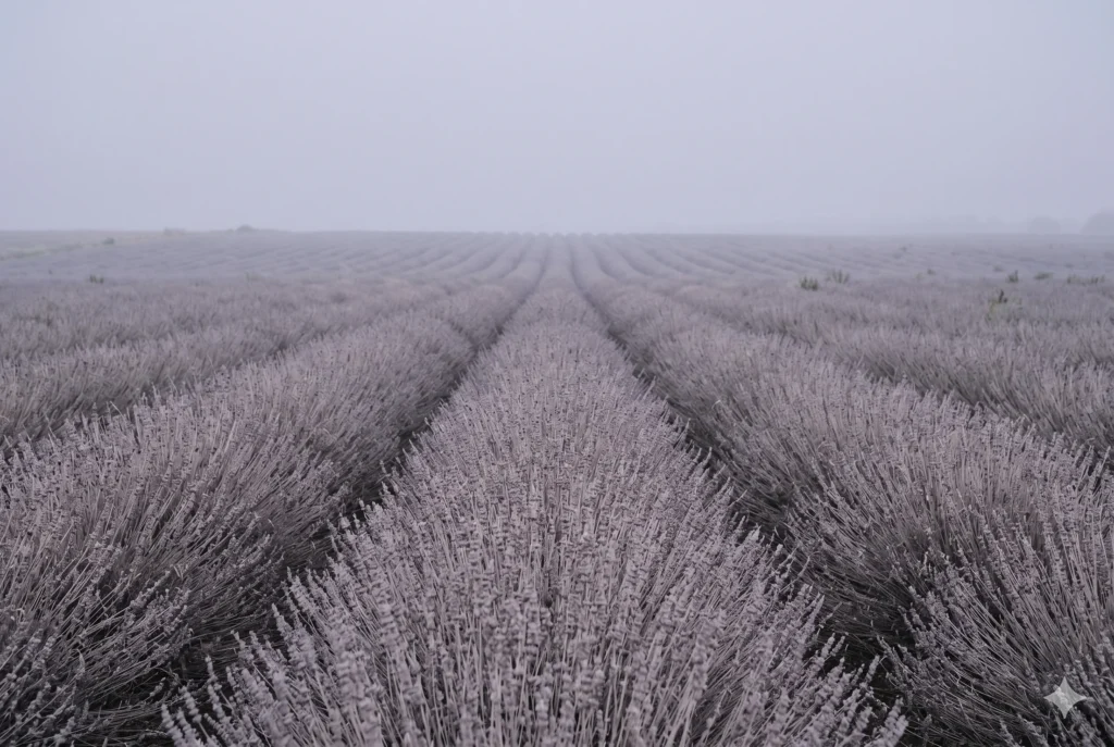
August morning haze over open countryside holds this tone for exactly the thirty minutes before the sun burns through it — the atmosphere at that specific hour when the sky is pale grey-violet and the world hasn’t decided yet whether it will be warm or cool. Soft Lavender is that undecided moment, caught.
The Wardrobe Perspective — A Muted Lavender That Functions as Neutral
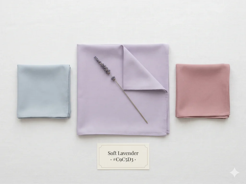
Most lavender colour advice positions it as an accent — something bright that sits against neutrals. At chroma 2, Soft Lavender operates differently. Its grey content is high enough that it is itself the neutral, with the lavender character available only on close inspection.
In a Soft Summer capsule wardrobe, this matters. Pure black sits at a contrast level higher than this season’s naturally blended colouring. Optic white does the same from the opposite direction. Soft Lavender anchors the way a soft grey would — present, quiet — while adding the faintest trace of hue that pure grey cannot offer.
Where greyed lavender as a lavender gray colour reads as cold in a True Winter or clinical in a Light Summer context, it reads as soft, inhabited, and right for Soft Summer — because the pale lavender it carries is the same cool-muted temperature as every other tone in the palette.
🩶 Practitioner Note — Melanin Calibration
In my drapting sessions, the cool-neutral direction of Soft Lavender holds consistently across Soft Summer’s full Fitzpatrick range, from II through V. At deeper skin depths the very low chroma can make the lavender character read as a near-neutral grey — which is actually useful. The temperature and the absence of warm cast remain constant at every depth. The colour doesn’t need recalibration by depth, only attention to how much contrast it creates relative to the face.
What Colors Go with Soft Lavender in the Soft Summer Palette
The governing rule is chroma, not hue. Any colour in the Soft Summer palette at chroma 2 or below reads as a natural companion to Soft Lavender — because they all share the same muted, grey-cast quality that prevents any one shade from dominating.
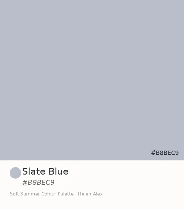
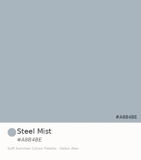
Within the cool-neutral family, the three blue-grey siblings sit beside it without any friction: Misty Blue-Grey, Slate Blue, and Steel Mist all share the same chroma ceiling and simply occupy different hue positions on the same cool axis.
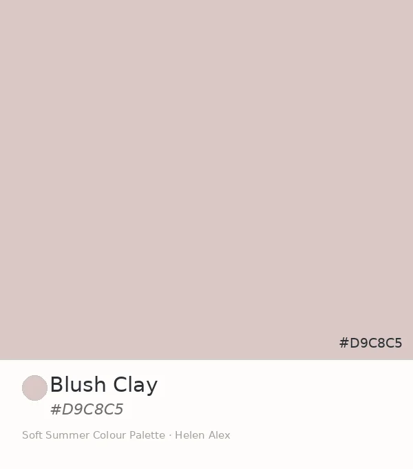
Across the palette, Soft Lavender bridges the two wings — it sits at the hue midpoint between the blue-grey neutrals and the muted rose tones, and pairs with both without any visual jump.
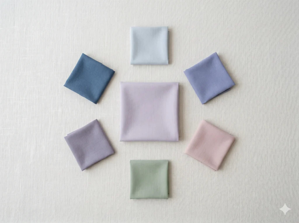
The Complete Soft Summer Cool-Neutral Family
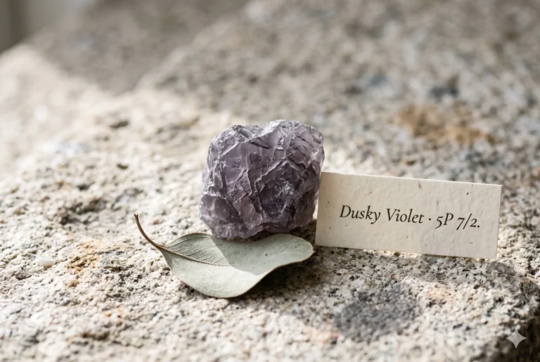
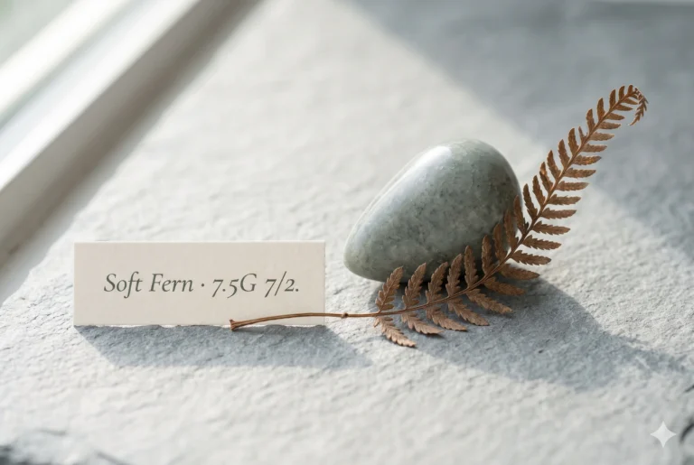
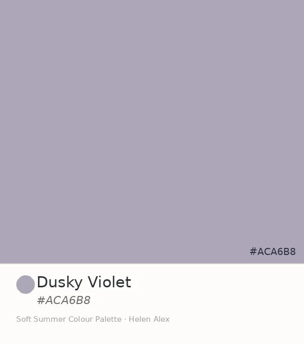
With Soft Lavender confirmed, the cool-neutral family within the Soft Summer palette has four established members. The arc spans from cyan-blue through true blue through blue-violet and into greyed violet — each at the same low chroma, each in a different hue position.
Placed together, something becomes clear: Soft Lavender is not the odd one out. It’s the hinge — the colour that reveals how the blue family and the rose family in this palette were always pointing toward each other, and always needed a violet in between.
16-Season Wheel — Soft Summer’s Four Cool Neutrals, Marked
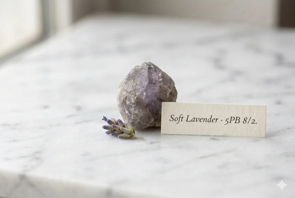
Three readings, one answer. The Munsell profile confirms greyed violet-blue at very low chroma — the palette’s first hue to leave the blue family entirely. The dried lavender sprig and the August morning haze confirm it already exists this way outdoors, needing nothing added. The wardrobe role confirms it bridges Soft Summer’s two coolest wings in a way no single blue-grey can manage alone.
Soft Lavender IS a neutral-accent swatch WITHIN the Soft Summer palette IN the 16-season framework — earned by colour theory, confirmed in nature, and irreplaceable in the wardrobe because nothing else sits where it sits.
Frequently asked questions .
A Few Things People Ask Me
What is soft lavender color?
Soft lavender color is a pale, heavily greyed lavender-violet at hex #C9C5D3. In the Sci/ART 16-season framework it is a confirmed Soft Summer neutral-accent — Munsell value 8, chroma 2, blue-purple hue family — the greyed version of lavender that exists when violet has been almost entirely consumed by grey.
What colors go with soft lavender in a Soft Summer wardrobe?
Soft Lavender pairs with the entire low-chroma neutral family in the Soft Summer palette: Misty Blue-Grey, Slate Blue, Steel Mist, dusty rose, and muted sage. The governing rule is shared chroma level — any Soft Summer tone at chroma 2 or below sits naturally beside it, regardless of hue.
Is pale lavender color the same as soft lavender?
Pale lavender is a broad term covering any diluted lavender shade, which can range from warm to cool and from slightly pink to clearly violet. Soft Lavender (#C9C5D3) is a specific, measured version — greyed to chroma 2 at value 8 — and belongs specifically to the Soft Summer palette in the 16-season system.
What does lavender color mean for Soft Summer?
For a Soft Summer, lavender at chroma 2 is not a colour accent but a neutral — its grey content is high enough that it grounds an outfit the way soft grey does, while the barely-there violet adds more warmth and depth than a pure blue-grey can offer. It is the palette’s hinge tone between cool blue and cool rose.
Is greyed lavender better for Soft Summer or Light Summer?
Greyed lavender at Munsell value 8 and chroma 2 sits in Soft Summer territory. Light Summer’s lavender equivalents sit at value 9 or above — airier, translucent. Soft Lavender (#C9C5D3) has more visual weight — still light, but grounded — which aligns with Soft Summer’s slightly deeper, more present colouring.
Yours in colour, Helen
I’ve had more clients moved at the lavender drape than any other — it’s the moment the palette stops feeling like a list of restrictions and starts feeling like a description of them. Give it fifteen minutes on your shoulder before you form an opinion.
For the full Soft Summer neutral and accent breakdown, see the Soft Summer Color Palette guide. To trace the complete cool-neutral family arc, read Misty Blue-Grey, Slate Blue, Dusky Violet and Steel Mist.