Am I a Soft Summer?
7 Clinical Tests to Know for Certain
You asked — Am I a Soft Summer? Here is the Answer
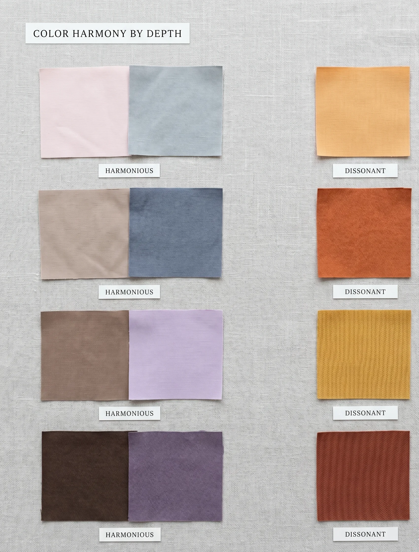
You are likely a Soft Summer if your natural colouring is cool-toned, visibly muted, and low-to-medium in contrast. The three core markers are: a cool (blue-based) undertone to the skin, a characteristic “dusted” or slightly smoky quality to your features, and hair, eyes, and skin that tend to blend into each other rather than contrast sharply. The soft summer colour analysis places you at the precise intersection of cool thermal undertone and low chroma saturation within the 16-season framework.
Who This Guide Is Not For
If you have already confirmed your colour season through a professional 16-season drapting session, this guide is a reference rather than a diagnostic tool. This is a self-analysis framework based on the same 7 physical markers I assess in clinical sessions — accurate for most, but not a substitute for in-person testing under controlled daylight conditions. If your colouring is genuinely ambiguous between Soft Summer and Soft Autumn, a professional analysis is the most reliable path forward.
What You’ll Find in This Guide
“Am I a Soft Summer?” Nature’s point of view
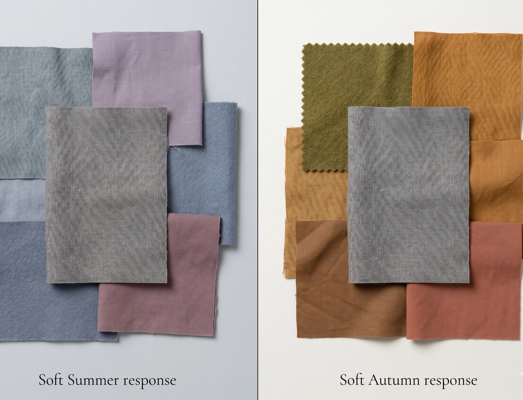
Before we get to the clinical tests, consider this: some of the most reliable colour-reading tools we have are not swatches or laboratory instruments. They are the natural world around us. Colour has patterns. And the Soft Summer pattern is one of the most distinctive — and most beautiful — in all of seasonal colour analysis.
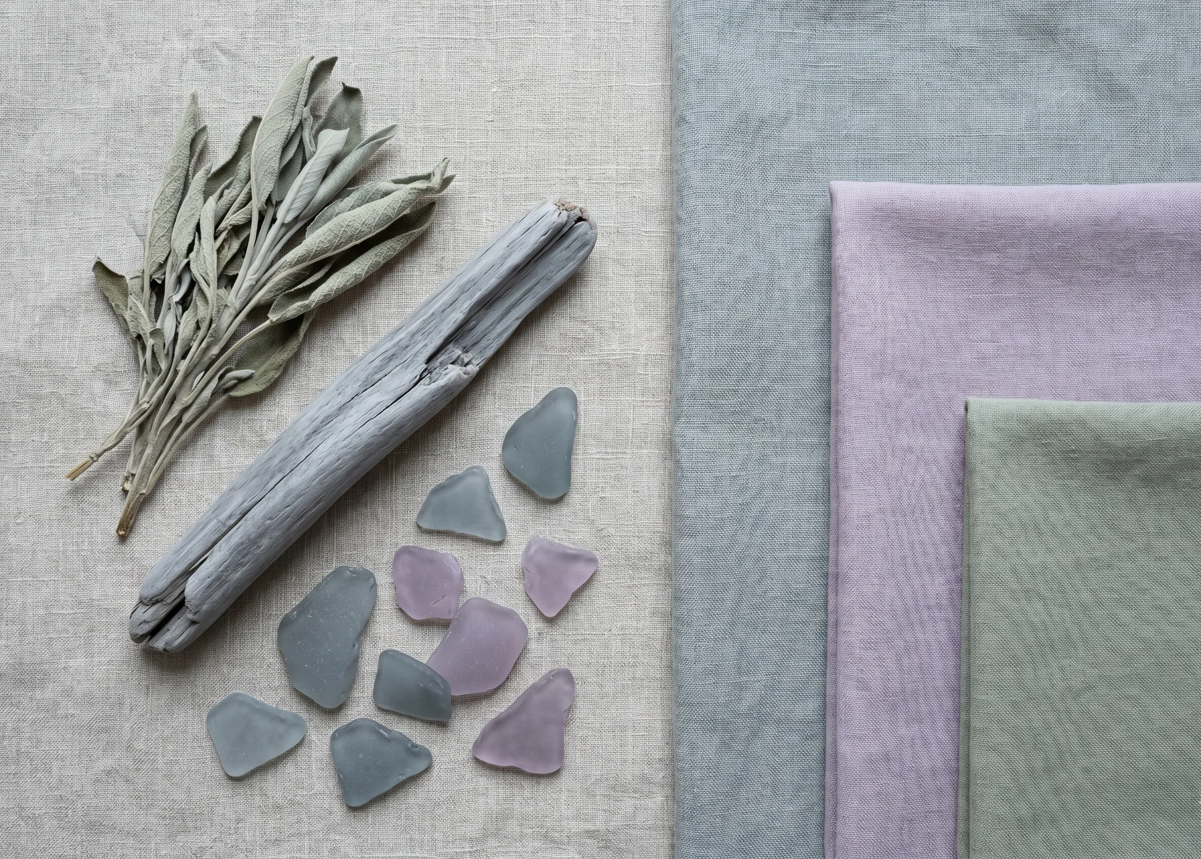
The Soft Summer in Nature
Picture a dove — the common grey dove, not a white one. Its feathers carry that characteristic blue-grey with a muted pinkish warmth at the breast — never vivid, never pure cool or pure warm, but somewhere in the precise overlap that makes it quietly arresting. That blend of cool and soft, that refusal to be either sharp or washed-out, is the Soft Summer colouring fingerprint.
Or consider a morning in late August just before the heat arrives. The sky is not fully overcast — it’s that particular haze where blue-grey cloud is diffused by thin light. The shadows have a lavender quality. The grass holds the dusty green of summer’s last weeks. This is not the crisp clarity of a True Summer sky or the golden warmth of early Autumn. It is something in between — cool-dominant, muted, and luminously soft.
If these descriptions feel visually familiar — if the muted dove, the hazy August morning, the dusty lavender shadow feels like your aesthetic language — you are already reading the right signal.
Now let us confirm that reading with clinical precision.
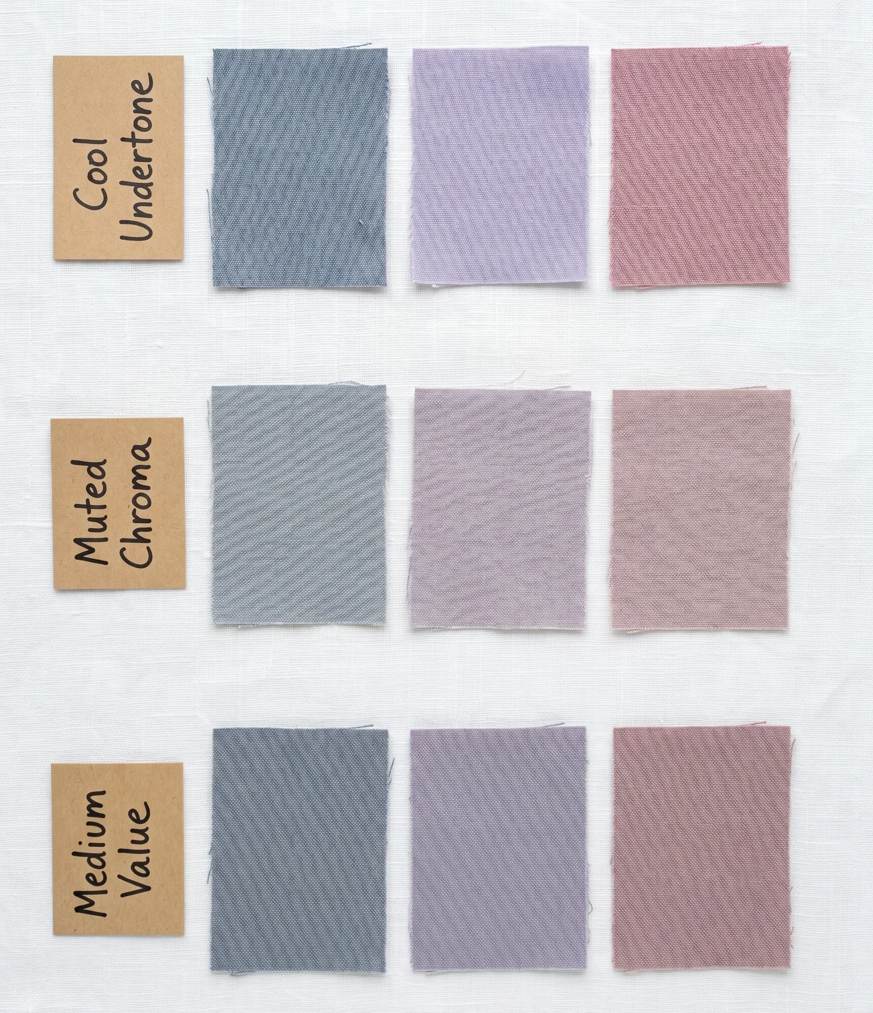
The 3 Core Markers of Soft Summer Colouring
In my studio practice, I identify colour season through three primary dimensions. Soft Summer has a specific “address” on all three. Before you take the 7-test quiz below, understand what you are looking for:
Dimension 1 — Hue (Undertone)
Cool. Your skin has a blue or pink-cool base — never golden or yellow-warm.
Dimension 2 — Chroma (Saturation)
Muted / Low. Your colouring has a dusted, slightly greyed quality — not vivid, not washed out.
Dimension 3 — Value (Contrast)
Medium. Your hair, skin, and eyes are closer in depth to each other than they are different.
For Soft Summer, the primary characteristic is mutedness — and the secondary characteristic is coolness. This is the critical hierarchy. Many people get this backwards. If you are primarily cool and secondarily muted, that is more consistent with True Summer. Soft Summer is soft first, cool second. This one distinction changes everything about which palette fits.
Read my complete guide on Soft Summer Jewelry to understand Your color more deeply !
Practitioner’s Note — The Ordering Matters
“In clinical drapting, when I place a distinctly cool fabric on a True Summer client, it reads as completely natural. When I do the same with a Soft Summer client, the very cool tones can occasionally read as slightly stark — the skin needs that whisper of grey-warmth in the cool to feel balanced. That nuance — coolness that is softened — is the Soft Summer’s signature. It is not a less-cool True Summer. It is an entirely distinct season.“
7 Clinical Self-Tests — With Scoring
Each test below mirrors what I assess in a professional drapting session. For each test, answer honestly and record whether your result points toward Soft Summer (score 1) or away from it (score 0). Your total out of 7 guides the interpretation. Perform all tests in natural daylight, without makeup, ideally on a neutral grey or white background.
1
The Vein Test — The Thermal Undertone Indicator
Takes 30 seconds · Natural light require
Look at the inside of your wrist in natural light. The colour of your veins is your most direct window into thermal undertone — the foundation dimension of any colour season.
What to look for: Examine the visible veins along your inner wrist and the inside of your elbow. Note their primary colour without overthinking it — your first impression is usually the correct one.
✓ Points to Soft Summer
Veins read as blue, blue-purple, or blue-grey. There is little or no green visible. This confirms a cool thermal undertone — the foundational requirement for the Summer season family.
↗ Points Away
Veins read as green or yellow-green. Green veins indicate warm undertone — more consistent with Autumn or Spring season families. If your veins are blue-green, you may sit at a neutral-cool position — continue testing.
2
The Silver vs Gold Test — Metal Resonance
Takes 2 minutes · Natural light · Two different metals needed
Hold a piece of clearly silver jewellery (or a silver-coloured fabric) against your face. Then replace it with a piece of clearly warm yellow gold. Do this in natural daylight, not artificial light, which distorts colour temperature significantly. The effect you are looking for is not which metal you prefer aesthetically — it is which one makes your skin look more alive, clearer, and healthier.
What You’re Actually Seeing
Think of the difference between dew-covered grey river stones (cool) and sun-warmed terracotta clay (warm). Neither is “better.” But one of them will echo the temperature of your own skin. When a metal echoes your skin temperature, the skin reads as luminous. When it conflicts, the skin reads as slightly dull or off-colour — hard to name, but immediately visible.
✓ Points to Soft Summer
Silver makes the skin look cleaner, pinker, and more even. The face seems brighter. Gold introduces a slightly yellow or sallow quality to the skin — a change that registers clearly even if subtle.
↗ Points Away
Gold creates a warm, healthy glow while silver looks slightly cold. If gold is clearly the winner, you likely sit in the warm season families (Autumn or Spring). If both work equally well, your undertone may be neutral — continue testing.
3
The Grey Eye Test — The Mutedness Indicator
Takes 1 minute · Natural light · A grey garment or fabric needed
This is one of the most precise distinguishing tests between Soft Summer and Soft Autumn — two seasons that share mutedness but sit on opposite sides of the thermal axis. Hold a plain medium-grey fabric (neutral grey, not blue-grey or warm grey) directly beneath your face in natural daylight. Then look at your eyes in a mirror. What colour do your eyes appear?
The reason this works: Soft Summer has a naturally high concentration of grey pigmentation in the eyes, skin, and hair. When grey is introduced near the face, it resonates with that existing grey — and the eyes appear to reflect it back. Soft Autumn eyes, by contrast, carry walnut, gold, and hazel pigments that resist grey resonance — they remain green, hazel, or olive when grey is placed near them.
✓ Points to Soft Summer
Your eyes appear to take on a greyish quality — even if they are green, blue, or soft brown, they develop a noticeable grey cast. This greyness is the signature of Soft Summer’s high grey-pigment content.
↗ Points Away
Your eyes remain clearly green, hazel, olive, or warm brown against the grey — they do not grey out. This suggests the warm walnut and gold pigments of Soft Autumn, or the clearer blue of True Summer.
4
The Contrast Mirror Test — Value Range
Takes 3 minutes · A mirror in natural light
Stand in front of a mirror in natural daylight without makeup and with your hair worn as naturally as possible. Look at the overall picture of your face — specifically the relationship in depth between your skin, the colour of your hair, and your eyes. You are measuring contrast, not colour. How different are these three elements from each other on a simple light-to-dark scale?
Imagine the same face rendered in black and white. Would the hair be dramatically darker than the skin, with striking contrast between them? Or would everything sit within a similar, blended mid-range — distinguishable but not dramatically different?
✓ Points to Soft Summer
Your features blend together in a mid-range depth. Hair, skin, and eyes are different, but the difference feels harmonious rather than striking. In a black-and-white image, the hair would be somewhat darker than the skin, but nothing would be dramatically light or dramatically dark. Low-to-medium contrast overall.
↗ Points Away
Very high contrast — striking difference between dark hair and light skin — suggests the Winter family. Very low contrast where everything blends to near-invisibility suggests Light Summer. Very deep, rich depth with muted warmth suggests Dark Autumn.
5
The Colour Reaction Test — Live Drapting at Home
Takes 10 minutes · Natural light · Requires fabric in contrasting colours
This is the most definitive home test — and the closest replication of what I do in the studio. Gather the following fabric pieces if you can, or use clothing you already own. Hold each one directly beneath your chin in natural light and observe your skin in a mirror. You are looking for the skin’s response — not which colour you prefer, but which one makes your face look the most even, lifted, and healthy.
The test pairs:
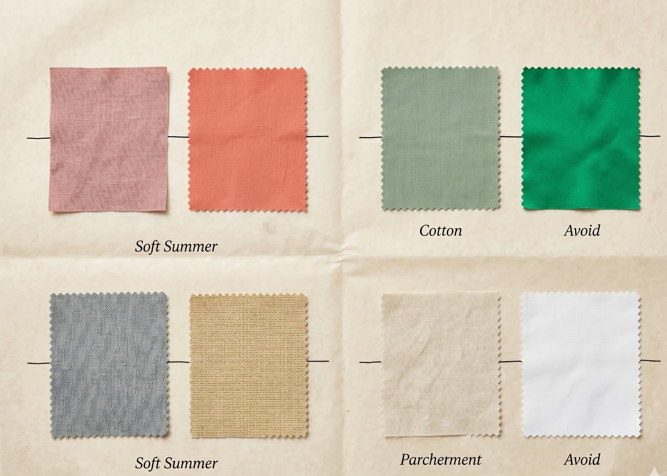
Muted dusty rose vs warm coral:
If dusty rose (#D9C8C5) clarifies your complexion and coral introduces any orange-yellow quality, you lean Summer. If coral gives you a warm healthy glow, you lean warm-season.
Cool grey-blue vs warm golden beige:
The fabric that makes your under-eye shadow lift and disappear is pointing to your correct thermal undertone. For Soft Summer, this is always the cool grey-blue.
Muted sage green vs vivid emerald:
Soft Summer tolerates the muted sage naturally. Vivid emerald typically creates a “competing” effect — the colour takes over from the face. If vivid emerald makes you look radiant, you are likely in the Bright or True season families.
Bright white vs soft parchment:
This tests contrast tolerance. If bright white creates any washed-out or drawn quality at the face and soft parchment looks cleaner, you sit below the high-contrast threshold — consistent with Soft Summer.
✓ Points to Soft Summer
The muted, cool-toned fabric in each pair makes your face look more rested, even, and three-dimensional. The warm, vivid, or very cool options feel slightly “off” — either too loud, too yellow, or too stark.
↗ Points Away
If the vivid colours energise your complexion and the muted options make you look flat — you may be in a clearer or brighter season. If warm tones consistently outperform cool — you lean warm-season.
6
The Sun Reaction Test — Pigmentation Pattern
Memory-based · No materials needed
This test draws on your biological pigmentation response to UV — something that is coded by the same genetics that determine your colour season. Think about how your skin responds to prolonged sun exposure (over a full summer season, not a single day).
✓ Points to Soft Summer
Your skin tans to a cool, pinkish-brown or fawn rather than a golden bronze. You may also have a tendency to freckle lightly in summer, with freckles that read as cool grey-brown or pinkish rather than warm ginger. The tanned skin retains its cool quality — it does not golden.
↗ Points Away
A golden, warm bronze tan that turns distinctly warm or golden points toward the warm season families (Autumn or Spring). A tan that reads red-bronze before going golden may indicate a Bright Summer or True Summer. Deep skin tones with cool blue-black undertones can also be Soft Summer — the sun reaction test works differently at deeper Fitzpatrick levels (see Melanin section below).
7
The Sister Season Test — The Decisive Boundary Check
Requires a Soft Autumn and True Summer colour reference
The final test identifies where you sit in relation to Soft Summer’s two neighbouring seasons: True Summer (more cool, slightly higher chroma) and Soft Autumn (same mutedness, but warm instead of cool). This test often provides the clearest result of all seven, because the wrong sister season is almost always an obvious no.
Gather — or look up — the following colour comparisons and hold each group near your face in natural light:
Dusty muted mauve (Soft Summer) vs warm dusty camel or latte (Soft Autumn):
One of these should feel immediately “wrong.” If camel or latte introduces warmth your skin resists, you lean Soft Summer.
Cool rose-pink (True Summer) vs dusty rose (Soft Summer):
The rose-pink of True Summer has slightly more chroma and clarity. If it feels just slightly too vivid or cool and the softer dusty rose fits more naturally, Soft Summer is the right address.
The Soft Autumn Boundary — Critical Distinction
Soft Summer and Soft Autumn are the two most commonly confused seasons in colour analysis. The difference is thermal undertone alone. If warm, earthy, honey-toned colours make you look healthy and glowing, you are Soft Autumn — not Soft Summer. For the complete Soft Autumn analysis, see our dedicated Soft Autumn Colour Season Guide. Do not try to resolve this boundary through this article alone — the distinction is subtle and professional analysis is the most reliable confirmation.
✓ Points to Soft Summer
Soft Autumn warm tones feel slightly “off” — they may not be dramatically wrong, but there is a noticeable softening or slight sallowness. Soft Summer muted-cool tones feel more naturally aligned with your complexion.
↗ Points Away
If the Soft Autumn warm tones read as equally or more flattering, you may be Soft Autumn. If True Summer’s slightly clearer, cooler palette looks better than the muted Soft Summer version, True Summer may be your home season.
Read Your Score — Are You Soft Summer?
Know that you are very clear about the soft summer color palette ,check your soft summer self analysis score below .
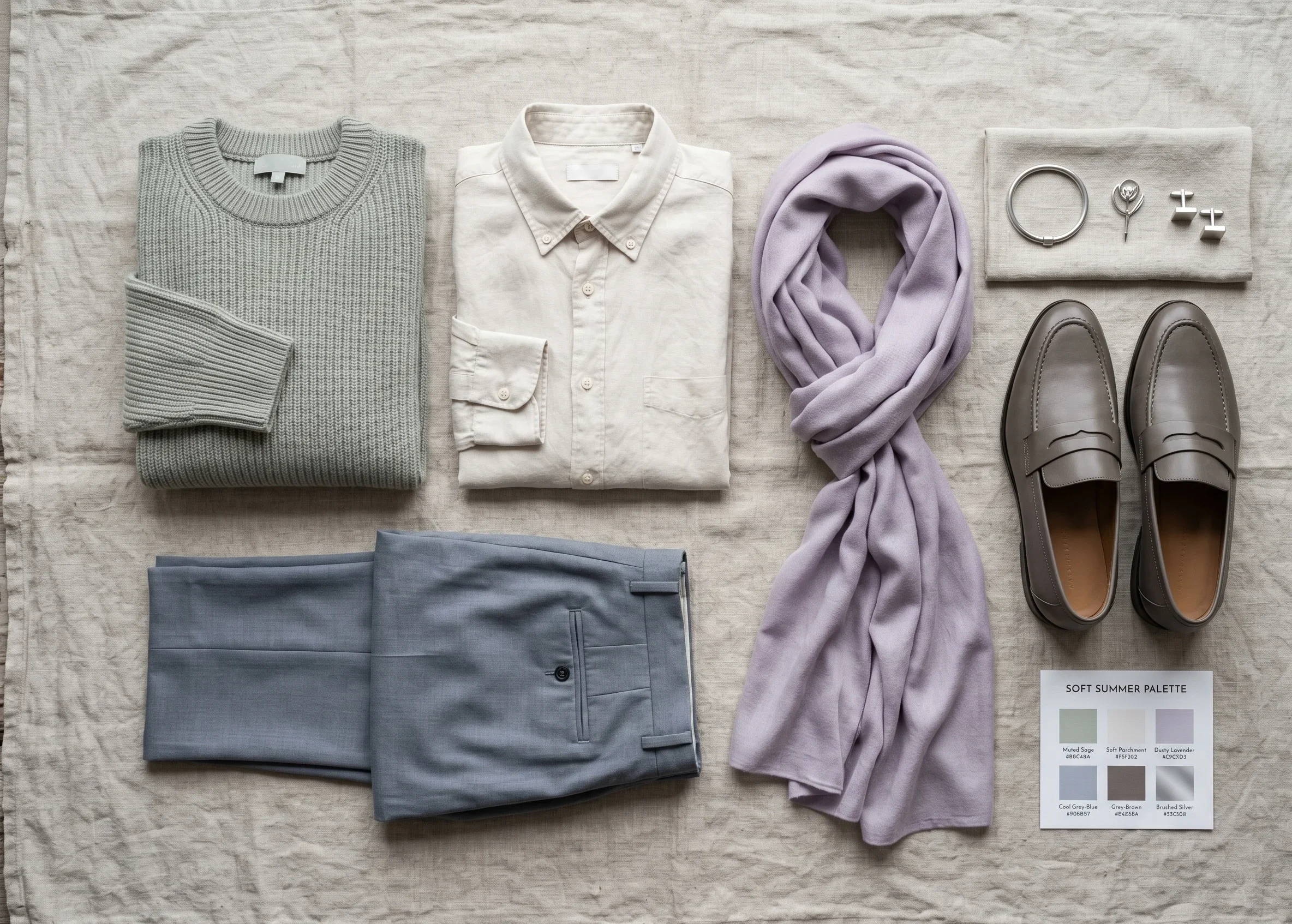
Your Soft Summer Self-Analysis Score
6 – 7
All major markers align with Soft Summer colouring. Your season is very likely Soft Summer. The soft summer colour palette will perform consistently well across clothing, makeup, and hair colour choices. Proceed with confidence — and download your palette card to begin building.
Strongly Soft Summer
4 – 5
Most markers point to Soft Summer, but 2-3 show ambiguity. You are likely in the Summer family, but may sit at a boundary between Soft Summer and True Summer or Soft Summer and Soft Autumn. The Soft Summer palette will still perform well for you, with possible borrowing from one sister palette. Professional confirmation is valuable here.
Likely Soft Summer
2 – 3
Your results suggest the Summer family but not a strong Soft Summer signature. You may be True Summer, Light Summer, or sitting at the Soft Autumn boundary. Explore the True Summer and Soft Autumn profiles — one of them will likely feel more accurate. A professional analysis is strongly recommended.
Season Uncertain
0 – 1
Your colouring does not align with Soft Summer characteristics. Your season is more likely warm (Soft Autumn, Warm Autumn, Spring family) or high-contrast cool (Winter family). Do not attempt to wear the Soft Summer palette — it will work against your natural colouring rather than with it.
Not Soft Summer
Deep Dive: Soft Summer Eyes, Hair, Skin & Contrast
For those who scored 4–7 above, this section provides the fine-grain physical characteristics of Soft Summer colouring. These are the markers I document in every professional drapting session. They do not need to all apply to you — they describe the common pattern of this season’s colouring, not a checklist of requirements.
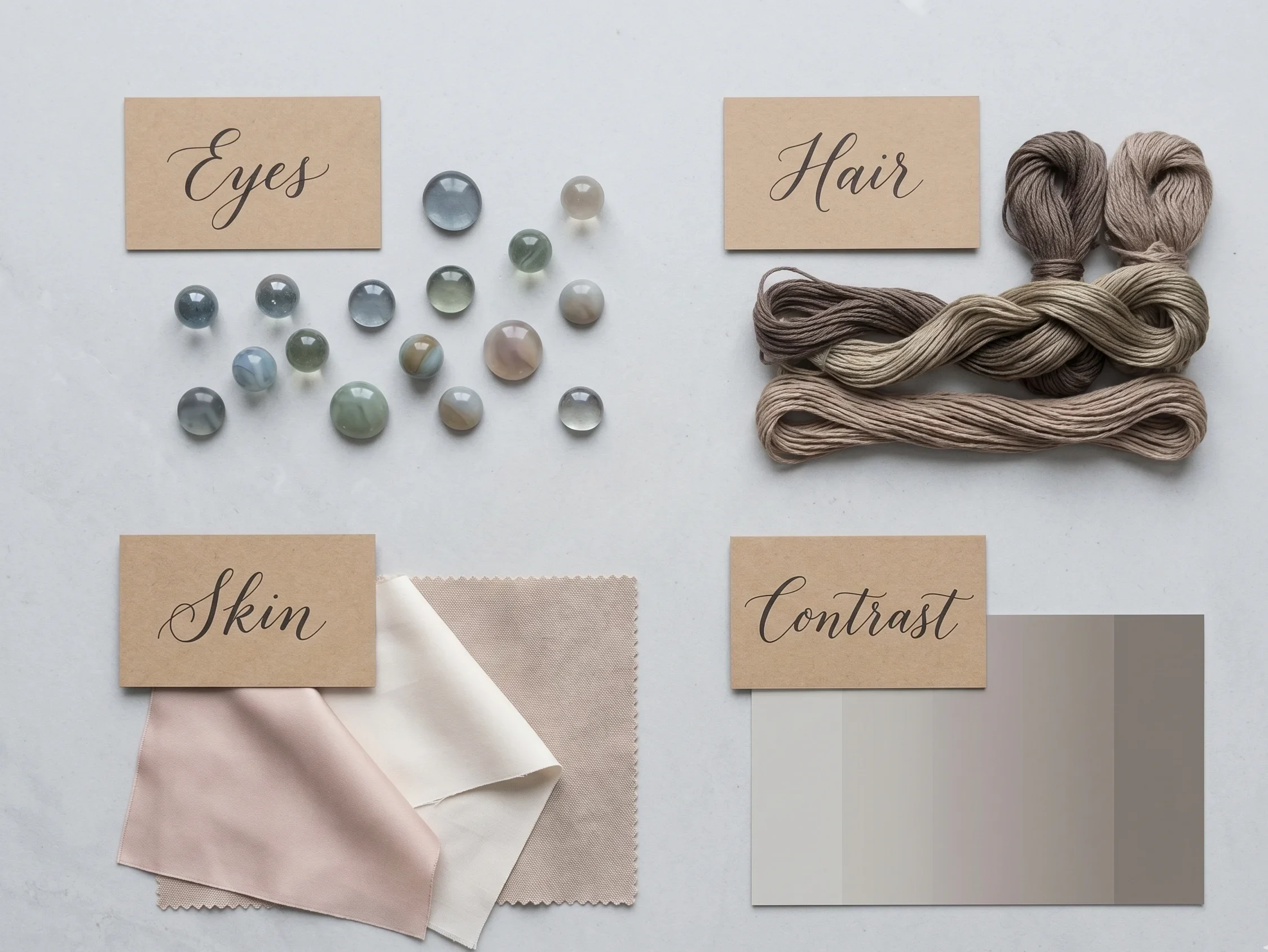
The Eyes
Soft Summer eyes carry a characteristic greyed or “frosted” quality regardless of their base colour. Grey-blue, grey-green, grey-hazel, and muted cool brown are all common. The defining trait is not colour — it is the visible grey overlay that diffuses the iris. You may have noticed that your eyes change colour depending on what you wear, shifting between grey, blue, and green — this chromatic flexibility is the grey-pigment base expressing itself through surrounding colour.
You may also notice a subtle “crackled glass” or radial spoke pattern on the iris — a fine line texture common in Summer eyes. Soft Summer eyes are always softer and less vivid than True Summer or Bright Winter eyes. They have a muted luminosity — like sea glass rather than a clear gemstone.
The Hair
Soft Summer hair carries a consistently ashy, grey-cool quality — the biological equivalent of those August morning haze colours described above. Natural hair colours in this season range from medium ash blonde to light, medium, and occasionally dark ash brown. The defining characteristic is the absence of warm pigment: no golden sheen, no red undertone, no rich chocolate warmth.
In sunlight, Soft Summer hair may develop ash blonde highlights — never golden or honey highlights. When grey hairs appear, they integrate seamlessly and often improve the palette harmony rather than disrupting it, because grey is a natural Soft Summer colour. The overall effect is one of muted, blended colour — hair that sits in the same visual depth family as the skin rather than contrasting strongly against it
The Skin
Soft Summer skin has a characteristic neutral-cool quality with a subtle pinkish or ashy surface tone. It is not dramatically pale, not deeply golden — it sits in the muted middle. The surface of the skin often has visible pink or lavender undertones at the lips, eyelids, and cheeks, even in deeper complexions. This is the cool thermal undertone expressing itself at the surface.
Soft Summer skin does not typically bronze warmly in summer. It tends toward a cool pinkish-fawn tan or remains relatively consistent in depth year-round. Freckles, when present, tend to read as cool grey-brown rather than warm ginger. The skin may also show visible lavender or blue-pink in the shadows under the eyes — a characteristic that disappears when correct cool palette colours are worn near the face.
The Contrast Level
Soft Summer’s most immediately visible characteristic is its low-to-medium contrast. Look at a photograph of yourself in natural light, without makeup. The hair, skin, and eyes should all sit within a relatively close depth range — different enough to be distinguishable, but not so different as to create the sharp contrast effect of a Winter or Dark Autumn.
Think of the difference between a pencil sketch done entirely in 2B medium grey tones (Soft Summer) versus one done in the full range from pure white to ink black (Winter). The Soft Summer face is drawn with a softer pencil in a narrower value range — every feature present and clearly defined, but without dramatic light-dark divisions. This is why high-contrast colour combinations in clothing feel “loud” or “too much” — they exceed the contrast ceiling of the natural colouring.
Soft Summer vs True Summer vs Soft Autumn — The Three-Way Comparison
These three seasons are responsible for the majority of mistyping in colour analysis. Study this table alongside the test results above.
|
Marker |
Soft Summer |
True Summer |
Soft Autumn |
|---|---|---|---|
|
Primary characteristic |
Soft (muted) first |
Cool first |
Soft (muted) first |
|
Secondary characteristic |
Cool second |
Soft second |
Warm second |
|
Thermal undertone |
Cool (blue-dominant, slightly softened) |
Purely cool (blue-dominant) |
Warm (yellow/golden-dominant) |
|
Chroma (saturation) |
Low — heavily muted and greyed |
Low-medium — softened but slightly clearer |
Low — heavily muted and dulled |
|
Value (depth) |
Medium — darkest of Summer family |
Medium-light |
Medium — similar to Soft Summer |
|
Eye quality |
Greyed — eyes grey out with neutral grey |
Clearer — blue, grey-blue, soft green with clarity |
Warm — eyes stay hazel, olive, warm brown with grey |
|
Best metal |
Silver, white gold, muted rose gold (pink bias) |
Silver and cool white gold |
Brushed gold, antique gold, rose gold (warm bias) |
|
Worst colours |
Black, vivid brights, warm earthy oranges and browns |
Warm earthy tones, very muted/greyed colours |
Bright clear colours, pure cool greys and blues |
|
Black near face |
No — too harsh, creates ageing shadow |
No — exceeds contrast ceiling |
No — too stark for muted season |
|
Palette feel |
Hazy August morning — muted, cool, softly luminous |
Crisp overcast sea mist — cool, clear, gentle |
Dried autumn field — muted, warm, dusty and rich |
|
Sister season (shares primary characteristic) |
Soft Autumn (shared mutedness) |
True Winter (shared coolness) |
Soft Summer (shared mutedness) |
What If You’re NOT Soft Summer?
One of the biggest gaps in colour analysis content is a clear answer to this question. Most guides tell you everything about the season they are describing and nothing about what to do if it doesn’t fit. This guide addresses that directly.
If warm colours clearly outperform cool ones
You likely sit in theAutumn or Spring season families. If your colouring is also muted and medium-depth, explore
Soft Autumn
first.
If you are muted but with golden warmth,
True Autumn or Warm Autumn
may be the correct address.
If cool works but you need more vibrancy and clarity
You are likely
True Summer or Light Summer
. True Summer shares Soft Summer’s cool undertone but tolerates slightly higher chroma — their palette colours retain more blue clarity and less grey diffusion.
See our True Summer Colour Guide for the full comparison.
If very deep, high-contrast colouring and cool undertone
You may be in the
Winter season family— specifically Dark Winter or True Winter.
Both have cool undertone but require much higher value contrast and chroma than Soft Summer can offer.
If light, cool, and delicate — lower depth than Soft Summer
Explore
Light Summer.
Light Summer shares the cool undertone of the Summer family but sits at a lighter value point —
the palette leans toward lighter, more pastel-adjacent tones that would be too light for Soft Summer’s medium depth range
Practitioner’s Note — On Getting It Wrong
“In my studio work, I frequently see clients who have been wearing an incorrect palette for years — often because a self-test or online quiz landed them in the wrong sub-season. The most important thing to understand is that wearing the wrong palette does not harm you — it simply creates a visual disconnection between your colouring and your clothing. The investment in correct analysis is getting your colour back on your side. A Soft Autumn client who has been wearing Soft Summer palette colours will find that the muted cool tones feel ‘safe’ but somehow flat — and the moment they try a warm muted taupe or a dusty camel, the face comes alive. That moment is the confirmation.”
Read our popular guide on soft summer vs. Cool summer for more clarity .
Soft Summer Across All Skin Depths — Inclusive Analysis
The majority of Soft Summer palette content online is calibrated to one specific physical type: cool-fair, light-eyed, ash-blonde or light-brown-haired. This creates a significant barrier for BIPOC clients whose Soft Summer colouring may present very differently at deeper Fitzpatrick levels — and leads to high rates of mistyping.
Soft Summer is defined by undertone and chroma — not skin depth.
The season occurs across the full range of skin tones. Here is how the self-tests and characteristics present at different depths:
|
Depth Range |
How Soft Summer Presents |
Most Reliable Test |
|---|---|---|
|
Cool-Fair (Fitzpatrick I–II) |
Visible pinkish-lavender undertone in cheeks and temples. Veins clearly blue-purple. Eyes have visible grey cast. Freckles cool grey-brown. Hair reads ashy even in sunlight. |
Vein test + grey eye test most reliable |
|
Cool-Light to Medium (Fitzpatrick II–III) |
Cool-olive or pinkish-medium skin. The “not warm olive” quality — the olive has a grey or blue-grey bias rather than a gold-green one. Tans cool pinkish-brown. |
Silver vs gold test most reliable + warm colour reaction |
|
Cool-Medium to Deep (Fitzpatrick IV–V) |
Rich skin with cool blue undertone — sometimes described as having an “ashy” or “plum” quality in shadow areas (jawline, neck, temples). Silver reads naturally; warm gold introduces a slight orange cast. |
Metal test + Soft Autumn warm colour reaction (should feel wrong) |
|
Cool-Deep (Fitzpatrick V–VI) |
Deep complexion with distinctly blue-cool undertone. Shadow areas at the jawline and hairline carry a cool blue-purple quality. The skin has visible “blue” in the black of the hair and the undertone of the face. |
Sister season test — Soft Autumn warm tones will create noticeable orange cast; cool muted tones will not |
Note on Vein Tests for Darker Skin Depths
The vein test is less reliable as a standalone test at deeper Fitzpatrick levels because vein visibility through darker skin varies significantly. At deeper depths, the silver vs gold metal test and the colour reaction test are the most consistent and reliable diagnostic tools — they work independently of skin depth because they test the skin’s response to external colour, not its own visible undertone markers.
If you get to pass this test ,this soft summer wardrobe guide is for you !
What Happens If You Are Soft Summer?
Confirming your season is the beginning, not the destination. The value of knowing you are Soft Summer lies in what the palette does for every practical decision you make: what you buy, what you wear to work, how you approach your haircolour appointment, which foundations and lipsticks actually perform for you. Get to know Soft Summer celebrities .
The Myth You Will Encounter — Debunked
As you begin building your Soft Summer wardrobe, you will likely encounter one persistent piece of advice: “As a Soft Summer, you can wear any pastel.” This is one of the most common and most consequential misunderstandings in the colour analysis space.
Pastels and muted colours are not the same thing. A pastel is a high-chroma colour with white added — it retains chromatic intensity at a lighter value. A muted colour has grey or brown added — it reduces chromatic intensity regardless of value. These are different operations producing different results at the face.
Mint green, lemon yellow, and bright lilac are pastels — light, but chromatically intense. When held against Soft Summer colouring, their chromatic energy competes with the skin’s low-saturation biology. Research published in the Journal of Color Research and Application (2024) confirms that high-saturation light colours produce measurable perceived skin desaturation in cool-muted complexion types. The correct Soft Summer palette uses greyed-down versions of these colours — soft dusty rose instead of bubblegum pink, grey-lavender instead of lilac, muted sage instead of mint. The difference on the shelf is subtle. The difference at the face is immediate and clear.
If you are a Soft Summer ,read our popular guide on Soft summer makeup .
Your Implementation Task
Three Things to Do in the Next 48 Hours
Knowing your season intellectually and living it practically are two different stages. Here is a specific, actionable sequence:
- Conduct the 7-test sequence in natural daylight. Do not rush it, and do not do it under artificial light. The accuracy of colour-based tests depends entirely on lighting conditions. A north-facing window in daylight is the ideal environment.
- Pull out 3 items from your current wardrobe: one you always receive compliments in, one you rarely wear despite liking it, and one that is black or bright white. Hold each near your face in natural light with fresh eyes. Notice what the skin does — not what you feel about the garment. This exercise is usually revelatory.
- Download the Soft Summer Palette Card. 36 colours with hex codes, Munsell references, and wear notes — formatted as a permanent shopping and styling reference. The palette card removes guesswork at the point of purchase, which is where Soft Summer colouring is most often undermined by “it looks nice on the hanger” reasoning.
If after completing all 7 tests your results are still genuinely ambiguous between Soft Summer and Soft Autumn, a professional virtual or in-person colour analysis session is the most reliable next step. Boundary cases — particularly the Soft Summer / Soft Autumn distinction — are the cases where the drapting environment and calibrated lighting make a decisive difference that self-testing alone cannot fully resolve. If you wish to know more about What is seasonal color analysis don’t miss our mentioned guide !