The Summer Color Palette: 16-Season Guide to Light, True & Soft
Summer Color Palette —
Every Sub-Season, Explained
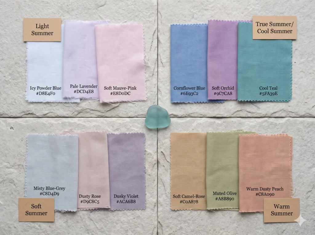
Direct Answer — The Summer Color PaletteThe Summer color palette is cool-toned, low-to-medium in saturation, and light-to-medium in depth. All Summer colours share one quality: a cool, blue-pink undertone with no golden warmth. The Summer family has four sub-seasons — Light Summer, True Summer (also called Cool Summer), Soft Summer, and Warm Summer. Each sub-season shares the cool base but differs in exactly how light, how vivid, or how muted its palette becomes.
What Is the Summer Color Season?
The Summer color palette is a cool-toned, low-to-medium saturation colour family within the 16-season analysis framework. It consists of four sub-seasons—Light, True, Soft, and Warm Summer—all of which share a blue-pink undertone and flatter muted, blended natural colouring.
In the 16-season colour analysis framework, Summer is one of four broad seasonal families — alongside Spring, Autumn, and Winter. Every individual season within Summer shares a cool undertone: the skin, hair, and eyes have a blue-pink biological base rather than a golden or warm one.
The Summer season earned its name because its colours evoke the overcast side of warm weather — the sky on a grey August coast, the sea glass below the tide line, the cool mist that drifts in from the water even when it’s technically hot outside.
The Nature Analogy — What Summer Colouring Looks Like Picture an overcast August coastline. The sea is steel-blue, the sky is grey-lavender, the pebbles are cool grey-brown, the sea glass is the colour of neither sky nor sea but somewhere in between. Nothing in this scene is warm. Nothing is vivid.
The entire Summer palette family lives inside that scene. Light Summer is the pale morning light. True Summer is the defined steel-blue water. Soft Summer is the fog that rolls in at midday and softens everything. They are all the same cool world — just at different times of day and different levels of clarity.
Summer colouring — the underlying summer colour analysis that determines which palette you belong to — is defined by a blue-pink undertone, a naturally muted or medium quality to the features, and a characteristic absence of warmth or golden brightness in the hair, skin, and eyes.
The Three Qualities All Summer Palettes Share
1. Cool Undertone
Every Summer colour has a blue, pink, or grey base — no golden or orange warmth. This is the one quality shared by all four Summer sub-seasons. Warm colours — camel, mustard, terracotta — conflict with every Summer’s biology, not just Soft Summer’s.
2. Low-to-Medium Saturation
Summer colours are never vivid. Even True Summer’s clearest colours sit at medium chroma, not the high-chrome vibrancy of Winter or Bright Spring. The Summer family knows that restraint is not the same as absence — a muted blue can be just as beautiful as a vivid one.
3. Light-to-Medium Depth
Summer palettes don’t reach the darkest depths. The deepest colours in any Summer palette are the equivalent of a dark navy or deep plum — never the near-black of Deep Autumn or Winter. Every Summer has a light anchor and a relatively gentle dark anchor.
These three qualities describe the summer color palette’s shared territory. Once you understand them, the individual sub-seasons become variations on the same three-note chord — each shifting one variable while the others stay consistent.
The Summer Colour Analysis Framework — Entity Map
The Summer Season IS a colour family OF the 16-season Sci/ART colour analysis framework. It contains four sub-seasons: Light Summer, True Summer (= Cool Summer), Soft Summer, and Warm Summer. All share a cool undertone. They differ in saturation, lightness, and contrast level. The Summer family is adjacent to the Winter family (shares cool undertone, differs in contrast/saturation) and the Spring family (shares lightness in some sub-seasons, differs in undertone temperature).
The Four Summer Sub-Seasons at a Glance
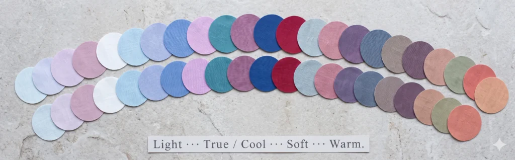
Light Summer
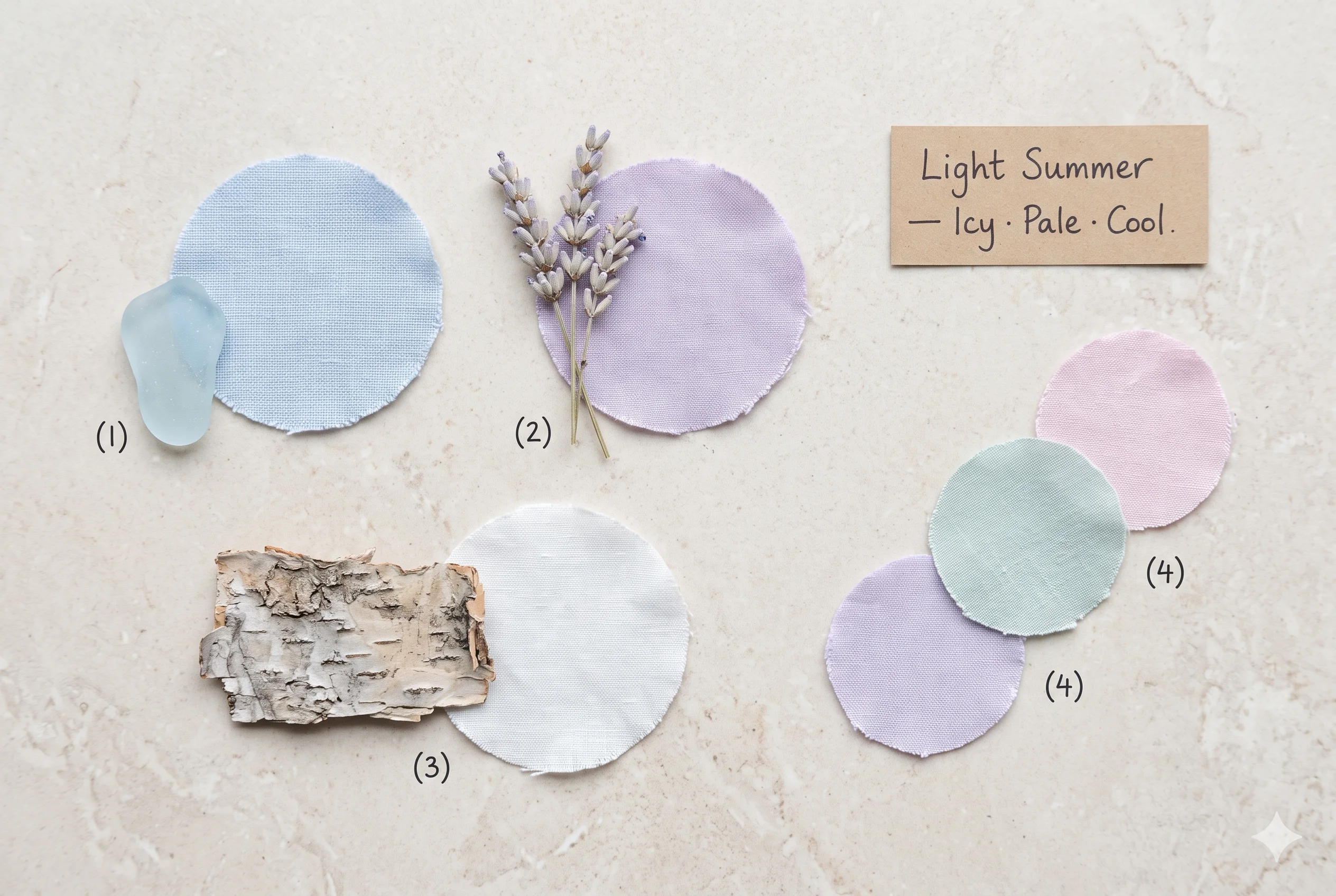
The most spring-adjacent Summer. Icy pastels, very high LRV, and a delicate airy quality — pale lavender, powder blue, soft mauve-pink. Neither fully Summer nor fully Spring, it bridges both.
Full Light Summer GuideTrue Summer
The purest Summer expression — also called Cool Summer. Cornflower blue, cool teal, orchid, and raspberry at medium saturation and medium contrast. Every colour is clearly nameable.
Full True Summer GuideSoft Summer
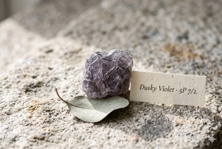
The most muted Summer — colours are greyed-down, blended, and beautifully ambiguous. Misty blue-grey, dusty rose, dusky violet. Shares its mutedness with Soft Autumn, its coolness with True Summer.
Full Soft Summer Color Palette GuideWarm Summer
The most contested Summer sub-season — some frameworks include it, others don’t. Sits at the warm-neutral boundary where Summer meets Autumn. Covered in full detail below.
Warm Summer — Read More BelowLight Summer — The Palest, Most Ethereal Sub-Season
Light Summer
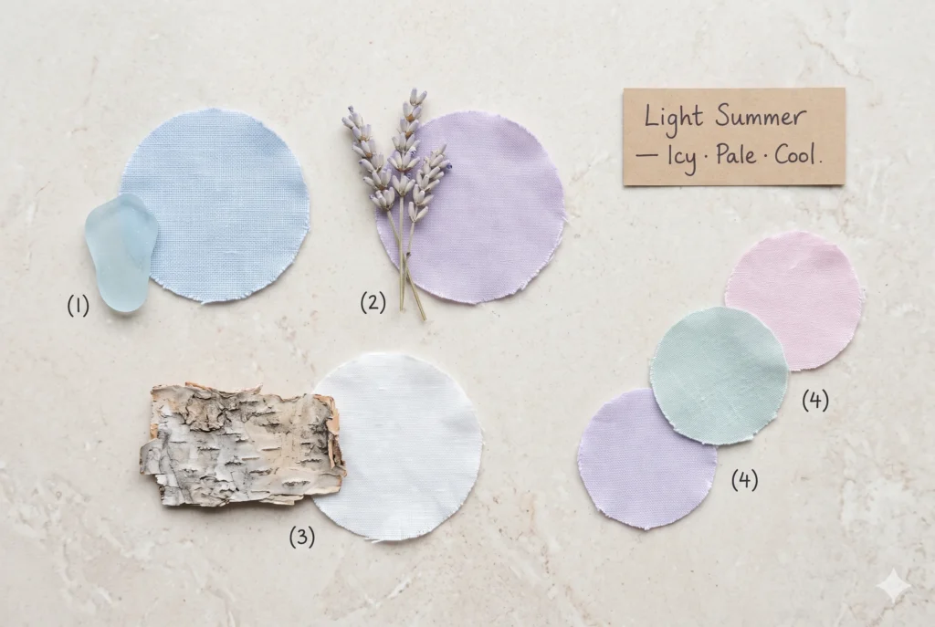
Light Summer is where the Summer family approaches Spring without fully crossing over. Colours are very high in LRV — close to white — and carry the same cool undertone as the rest of the Summer family.
If True Summer is the steel-blue sea at midday, Light Summer is the same water in late February when the light barely reaches it — everything is pale, diffused, and luminous without being vivid.
LIGHT SUMMER PALETTE — SIGNATURE COLOURS
WHO IS LIGHT SUMMER — THE QUICK IDENTIFIERS
- Hair: Very light ash blonde to medium cool blonde — the lightest natural hair of any Summer sub-season.
- Skin: Very fair, cool-toned, with a pale translucent quality and visible blue-pink undertone.
- Eyes: Pale blue, grey-blue, or very light grey-green with a delicate, diffused quality.
- Key tell: Pale cool pastels make the face look luminous; anything dark or vivid overwhelms immediately.
True Summer — The Purest Cool Expression
True Summer
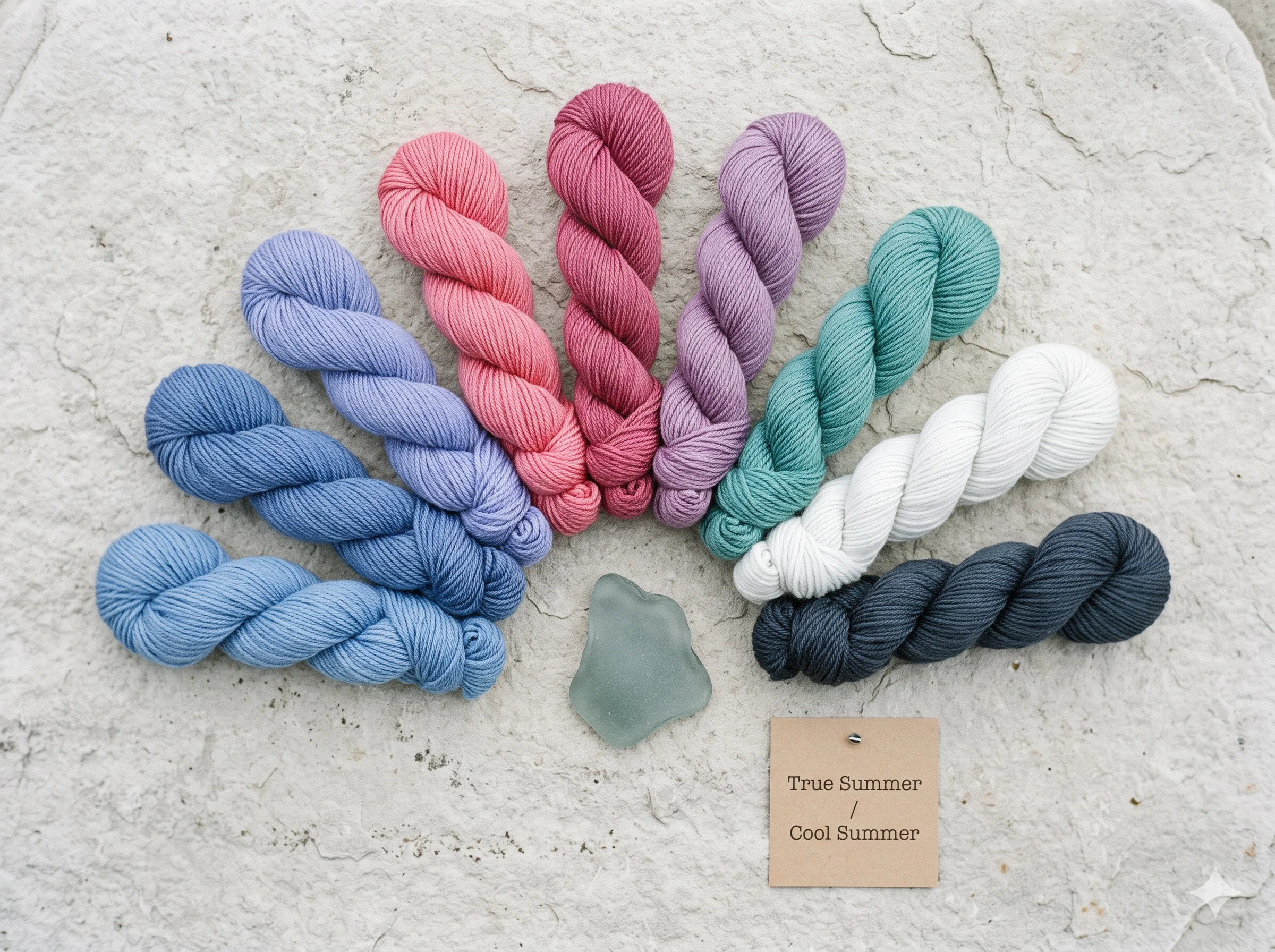
True Summer is the coolest, clearest expression of the Summer family — sometimes called Cool Summer, especially in the 12-season framework. These two names describe the same palette: cool undertone, medium saturation, medium contrast.
Where Light Summer’s colours are almost too pale to name, True Summer’s colours are exactly the right depth to be clearly themselves — that steel-blue actually reads as blue, that teal actually reads as teal.
TRUE SUMMER PALETTE — SIGNATURE COLOURS
“Cornflower Blue looks ‘just blue’ on a hanger — ordinary, even. Place it near a cool-toned face in natural light and the skin clarifies, the eyes sharpen, the whole face reads as more itself. That’s what the correct colour does: it doesn’t distract, it amplifies.”
TRUE SUMMER VS SOFT SUMMER — THE ONE-LINE DISTINCTION
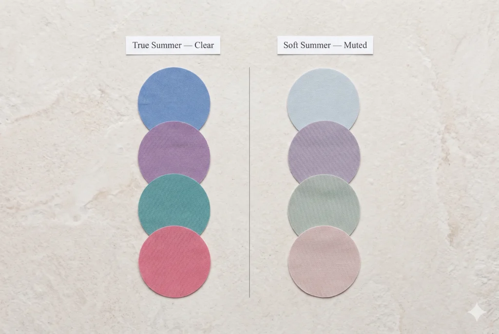
True Summer colours are clear enough to name immediately at a glance. Soft Summer colours make you hesitate — “Is that grey-blue or dusty lavender?” That naming hesitation is not vagueness; it is the Soft Summer chroma level doing exactly what it should. For the full comparison, see the dedicated True Summer vs Soft Summer guide.
Soft Summer
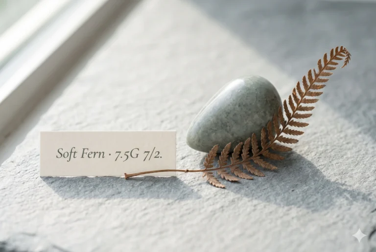
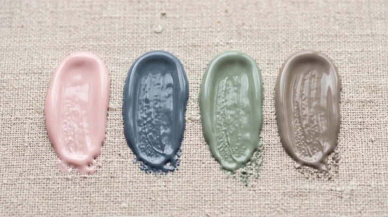
Soft Summer is True Summer’s palette after it has been photographed through a fine morning mist. The hues are the same family — cool blues, mauves, rose, sage — but every colour has had its saturation gently, insistently lowered. The result is one of the most sophisticated and quietly beautiful palettes in the entire 16-season framework.
The Soft Summer color palette shares its cool undertone with True Summer and Light Summer — but it borrows its mutedness from Soft Autumn, which is why these two seasons (sitting on opposite sides of the warm-cool divide) read so harmoniously when placed side by side.
SOFT SUMMER PALETTE — SIGNATURE COLOURS
WHAT MAKES SOFT SUMMER UNIQUE IN THE FAMILY
The saturation difference between Soft Summer and True Summer is the entire story. If you’d name a colour immediately looking at it — “that’s clearly blue” — it is probably True Summer. If you’d pause and say “grey-blue? or dusty lavender?” — that ambiguity is Soft Summer’s chroma at work, and it is one of the season’s most distinctive qualities.
Soft Summer is also the most widely identified Summer sub-season in colour analysis practice, occurring across all ethnic backgrounds and skin depths. The season’s warm-cool boundary is described in full detail in the Soft Summer vs Soft Autumn comparison.
Warm Summer — The Debated Sub-Season
Warm Summer
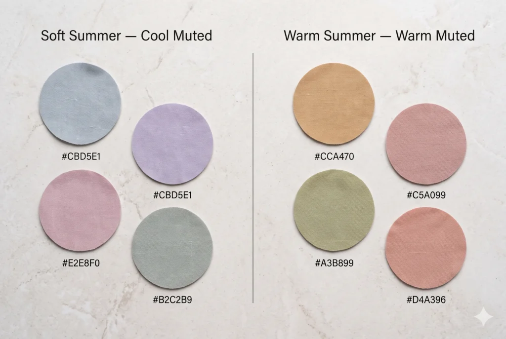
Warm Summer is the most contested sub-season in the entire 16-season framework. Some practitioners include it; others argue that a “warm Summer” is a contradiction — that warmth in the undertone direction disqualifies the colouring from the Summer family entirely and places it in Soft Autumn instead.
WARM SUMMER PALETTE — SIGNATURE COLOURS
Including it: A genuinely neutral-warm colouring that has enough cool influence to remain in the Summer family boundary — not as cool as True Summer but not as warm as Soft Autumn. The palette is warm-biased muted colours: soft camel-rose, warm sage, dusty warm peach.
Excluding it: The Summer family is defined by its cool undertone. A colouring that tests as warm-biased, however muted, belongs in the Autumn family — specifically on the Soft Autumn boundary.
In clinical practice, what most Warm Summer searchers are looking for is either Soft Autumn or the cooler end of True Summer. The dedicated comparison guide for Soft Summer vs Soft Autumn covers this boundary in clinical detail.
If you have been told you are Warm Summer color palette and find the palette feels slightly “off” in either direction, the Soft Autumn color palette may be the closer match. Warmth doesn’t belong in the Summer family by definition — but if your Summer draping confirmed it, your analyst saw something at the boundary worth considering.
Which Summer Are You? — The Self-Identification Framework
Confirmed you have a cool undertone, but unsure which Summer sub-season fits? These four questions narrow it down more reliably than any feature description alone.
| Question | Light Summer | True Summer | Soft Summer |
|---|---|---|---|
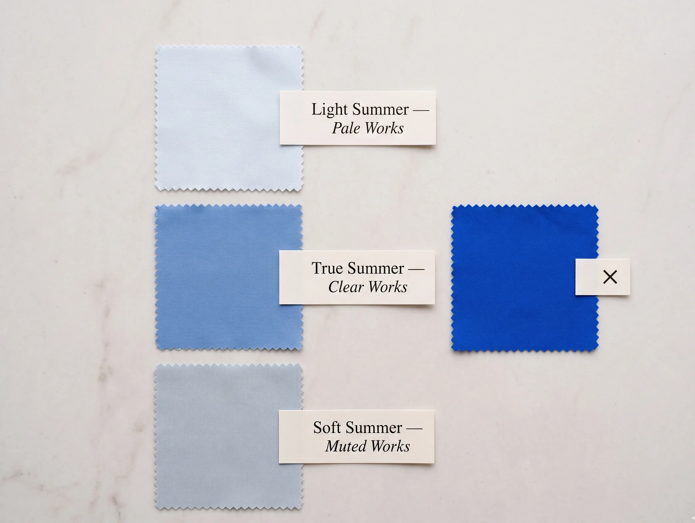
| Hold a vivid cool blue near your face. What happens? | Overwhelms immediately — face looks pale against it | Looks natural and flattering — matches feature clarity | Slightly overpowering — a muted version works better |
| How would someone describe your hair colour? | “Very light blonde” or “ash blonde” — clear single word | “Medium brown” or “medium blonde” — defined, clear | “Mousy brown” or “ash… sort of?” — naming hesitation |
| What’s your natural contrast level? | Very low — hair and skin barely differ in depth | Medium — noticeably darker hair against lighter skin | Low — features blend, similar depth range throughout |
| Do pastels or clear colours serve you better? | Pale pastels — near-transparent quality suits best | Clear medium colours — cornflower blue, watermelon pink | Muted, greyed versions of both — nothing too vivid or pale |
Run the vivid cool blue drape test in natural daylight before making a final call. The response to saturation tells you more about your sub-season than any physical feature description can.For complete awareness of 36 colors of soft summer color palette visit our homepage .
Summer vs the Other Seasonal Families
Understanding where the Summer season sits relative to Winter, Spring, and Autumn clarifies the entire framework. Summer and Winter share a cool undertone — the key difference is contrast and saturation, not temperature.
| Season Family | Undertone | Saturation | Contrast | One-Sentence Character |
|---|---|---|---|---|
|
Summer
|
Cool (blue-pink base) | Low to medium | Low to medium | Overcast August coast — cool blended never harsh |
|
Winter
|
Cool (blue base, icy) | High (vivid) | High (stark) | Clear January midnight — cool vivid high contrast |
|
Spring
|
Warm (golden-peach base) | Medium to high | Light to medium | April meadow — warm, light, clear and fresh |
|
Autumn
|
Warm (gold-brown base) | Medium to high | Medium | October woodland — warm, rich, muted or defined |
Summer and Spring both have light sub-seasons (Light Summer and Light Spring) that people frequently confuse. The single test that separates them every time: a pale cool blue versus a warm pale peach. Cool pastels flatter Summer; warm pastels flatter Spring. Temperature doesn’t change at low saturation — it just gets easier to overlook.
Summer Colouring at Every Skin Depth
All four Summer sub-seasons occur across the full range of Fitzpatrick skin depths. The cool undertone is the defining quality — not the depth of skin. A deep-skinned Summer has the same cool, blue-pink undertone biology as a fair-skinned Summer, simply expressed through a richer melanin depth.
| Depth Range | How the Cool Undertone Shows | Most Likely Sub-Season at This Depth |
|---|---|---|
|
Very Fair
(FI–II)
|
Visible pink-lavender undertone at temples and lips. Veins clearly blue-purple at the wrist. | Light Summer or True Summer — the very fair range is rare for Soft Summer but not impossible. |
|
Light
(FII–III)
|
Cool-neutral surface with a pink or ashy quality. Veins blue-grey. | Most commonly True Summer or Soft Summer at this depth range. |
|
Light-Medium
(FIII–IV)
|
Cool undertone with a visible pink-cool or ashy quality in the shadow areas. No golden warmth. | True Summer or Soft Summer — Soft Summer is particularly common at this depth. |
|
Medium to Deep
(FIV–VI)
|
Blue-cool or ashy quality in the undertone. Deep skin with a plum or blue-grey quality in the shadows rather than golden-warm. | True Summer or Soft Summer — the cool undertone reads clearly when tested against warm fabrics vs cool fabrics in draping. |
Practitioner’s Note — Summer at Deeper Skin Depths
“Clinically, what I observe at deeper Fitzpatrick depths is that the Summer colouring is sometimes overlooked in favour of an Autumn diagnosis, because the warmth assumption about deeper skin is pervasive. The draping test clears it immediately: warm earthy fabrics produce a slight sallow or orange-cast quality; cool blues and lavenders produce a ‘lit from within’ clarity. The skin doesn’t lie. The undertone either resonates or it doesn’t, at every depth level.”
Summer Color Palette — FAQs
What are summer colors?
In colour analysis, summer colors are cool-toned, low-to-medium in saturation, and light-to-medium in value. They include blues, mauves, lavenders, soft pinks, cool teals, and greyed-down neutrals. No warm golden or earthy tones belong in any Summer palette. The Summer family has four sub-seasons: Light Summer, True Summer (also called Cool Summer), Soft Summer, and Warm Summer.
What is the summer color palette in color analysis?
The summer color palette in colour analysis refers to a family of four sub-seasons (Light, True, Soft, Warm Summer) that all share a cool blue-pink undertone. The palette is muted to medium in saturation and never includes warm golden or earthy tones. Summer is one of four seasonal families in the 16-season Sci/ART colour analysis framework.
Is cool summer the same as true summer?
Yes, in most colour analysis contexts. Cool Summer and True Summer refer to the same palette — cool undertone, medium saturation, medium contrast. The difference is naming convention: Cool Summer is the 12-season term; True Summer is the 16-season Sci/ART term. Both describe the same clear, cool, medium-saturation Summer sub-season.Also check our guide for shopping best nail colors for soft summer .
How do I know which Summer I am?
Confirm your cool undertone first (blue-pink veins, cool features overall). Then: if you have very light colouring and pastels work best — Light Summer. If medium colouring and clear cool colours work — True Summer. If features are blended, muted, and vivid colours overwhelm — Soft Summer. The drape test with a vivid cool blue versus a muted slate blue is the most reliable single test between True and Soft Summer.
What is the difference between summer and winter in colour analysis?
Both Summer and Winter are cool-toned, but they differ in contrast and saturation. Winter has high contrast and high saturation — vivid, icy cool colours against high-contrast features. Summer has low-to-medium contrast and low-to-medium saturation — the same cool direction but softer, more blended. Winter is an icy midnight; Summer is an overcast August coastline.
What summer colors suit pale skin?
For pale skin with a cool undertone (Summer family), the most flattering summer colors are cool-toned pastels and medium cool tones: powder blue, soft lavender, dusty rose, slate blue, and muted sage. Avoid warm pastels — cream, peach, warm yellow — which conflict with the cool undertone. The specific sub-season (Light, True, or Soft Summer) determines the correct saturation level within this cool-toned range.
Choose Your Path From Here
Find Your Summer Sub-Season
This guide is the hub — every Summer story starts here and continues in one of the dedicated sub-season guides. The fastest route forward:
If you already know your sub-season: Go directly to its dedicated guide — Light Summer, True Summer, or the full Soft Summer color palette guide. Each one covers the complete palette, melanin calibration, hair colors, makeup, and wardrobe in standalone depth.
If you’re between True and Soft Summer: The single most useful next step is the True Summer vs Soft Summer comparison — specifically the vivid cool blue drape test described there. Run it before making any other decision.
If you’re between Soft Summer and Soft Autumn: The Soft Summer vs Soft Autumn guide covers the single deciding factor (undertone temperature) with diagnostic tests and side-by-side palette comparisons.
If you’re confirming your cool undertone first: The Am I a Soft Summer? 7 Clinical Tests guide walks through the undertone confirmation tests that apply to the entire Summer family — not just Soft Summer.
The Summer family is one of the most nuanced in the framework, and the boundary calls between sub-seasons are genuinely close. Take the drape test seriously — it tells you something that no feature description or online quiz can replicate. Trust what the fabric does to the face, and you’ll find your season.