Light Summer vs Soft Summer: Value & Chroma Split
Quick Answer —
Light Summer vs Soft Summer: both are cool-undertoned Summer seasons, but they differ in their defining dimension. Light Summer is defined by extreme lightness — very pale features with minimal depth variation. Soft Summer is defined by extreme mutedness — greyed, dusty colouring at a medium value. Light Summer needs icy pastels. Soft Summer needs dusty, greyed mid-tones. The core question is: do your features read as extraordinarily pale, or as greyed and blended?
Why Light Summer and Soft Summer Get Confused
Light Summer and Soft Summer are the two most frequently mixed-up seasons in the Summer colour family — and for good reason. Both are cool-undertoned. Both are muted. Both look terrible in anything saturated or warm.
The confusion deepens because many online resources treat them as near-identical — soft, cool, delicate. The palette images can look remarkably similar at a glance, especially in flat digital colour swatches that strip out the subtle depth differences.
In my drapting sessions, distinguishing the two is one of the most common tasks I work through with clients. The good news: once you understand what specifically defines each season, the difference is clear and the decision becomes logical rather than guesswork.
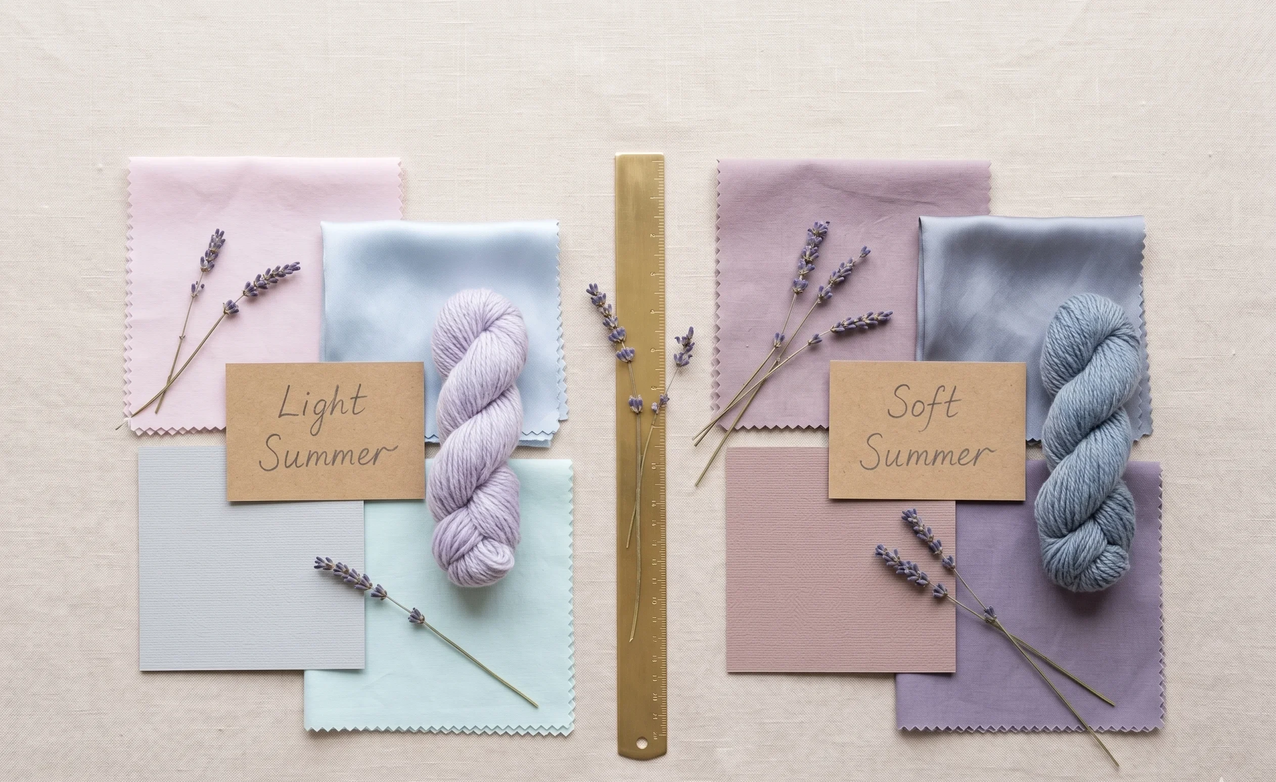
Season 1
Light Summer
Cool + Very Light + Low-Medium Chroma
Defined by paleness
vs
Season 2
Soft Summer
Cool + Medium + Very Low Chroma
Defined by greyness
Both seasons are IS a sub-season OF the Summer family IN the 16-season framework. Both share cool undertones and need to avoid warm or highly saturated colours. The difference lives in which colour dimension is their most extreme characteristic.
The Core Difference: Value vs Chroma
This is the one distinction that unlocks everything else. Light Summer’s defining axis is value — the lightness dimension. Soft Summer’s defining axis is chroma — the saturation dimension.
Think of value as a greyscale photograph. How light or dark do your features read when all colour is removed? Light Summer reads very light — close to white on the greyscale. Soft Summer reads medium, with more visible depth even in greyscale.
Chroma is about how much grey pigment is mixed into your colouring. Soft Summer has the highest grey content in the entire Summer family — everything reads dusty, blended, and muted. Light Summer has low chroma too, but it is secondary to the dominant lightness.
Nature Analogy — Light Summer
Think of a morning mist rising over a still loch in early spring. Everything in the frame is present but weightless — pale sky, pale water, pale shore. The colours are cool and real, but they seem backlit, almost translucent.
That weightless, backlit quality is the signature of Light Summer colouring. Lightness is the dominant impression before anything else.
Nature Analogy — Soft Summer
Pick up a piece of weathered driftwood from an overcast coast. It has depth and substance — clearly present, clearly coloured — but everything is greyed over, as if a cool haze has been worked into the grain.
That greyed-over quality with actual substance behind it is Soft Summer colouring. There is more body here than Light Summer, but that body is filtered entirely through grey.
The Decisive Single Question
In my drapting sessions, I frame it this way: “Is the first thing you notice about this person’s colouring that everything is extraordinarily pale? Or that everything is greyed and blended?”
Extraordinary paleness → Light Summer. Greyed, blended quality at medium depth → Soft Summer. Both are cool and muted, but the dominant impression is different.
Feature-by-Feature Comparison
Natural features — hair, eyes, and skin — are the data points we use to place any season. Here is how each season typically presents across all three, with the critical differences highlighted.
|
Feature |
Light Summer |
Soft Summer |
|
Primary axis |
Value (very light) |
Chroma (very muted) |
|
Hue |
Cool-neutral |
Cool |
|
Value |
Very light |
Medium |
|
Chroma |
Low-medium |
Very low (maximum grey) |
|
Hair (natural) |
Very light ash blonde to light ash brown; uniformly pale |
Ash blonde to medium ash brown; greyed, ashy quality throughout |
|
Eye colour |
Pale blue, very light grey, icy grey-blue; little depth |
Grey-blue, blue-grey, cool hazel, soft grey-green; more depth but greyed |
|
Skin |
Very fair to fair; overall impression is pale |
Fair to light-medium; cool-grey or grey-rose overlay |
|
Overall contrast |
Very low — features are uniformly light |
Low-medium — features blend but have more visible depth |
|
Metal preference |
Silver strongly |
Silver strongly |
|
Best fabric texture |
Delicate, fine-weave, soft drape |
Matte, diffused surface, soft drape |
Natural, undyed hair and makeup-free skin in north-facing natural daylight are the only reliable reference points for these readings.
The Eye Colour Distinction
Eyes are one of the clearest differentiators between the two seasons. Light Summer eyes have very little depth — they are typically icy pale, almost translucent in the iris. The overall impression is cool and very light.
Soft Summer eyes have more visible structure and depth. Grey-blue, blue-grey, and cool hazel eyes are common — cooler than Soft Autumn but greyed and blended rather than icy and pale. The grey mixes into the iris rather than sitting on top of a pale base.
During live client work, I look at the whites of the eyes and the iris together. Light Summer shows very pale irises with cool, clean whites. Soft Summer irises have more colour but that colour is desaturated — as if the pigment has been mixed with ash.
Palette Side-by-Side: Where the Colours Diverge
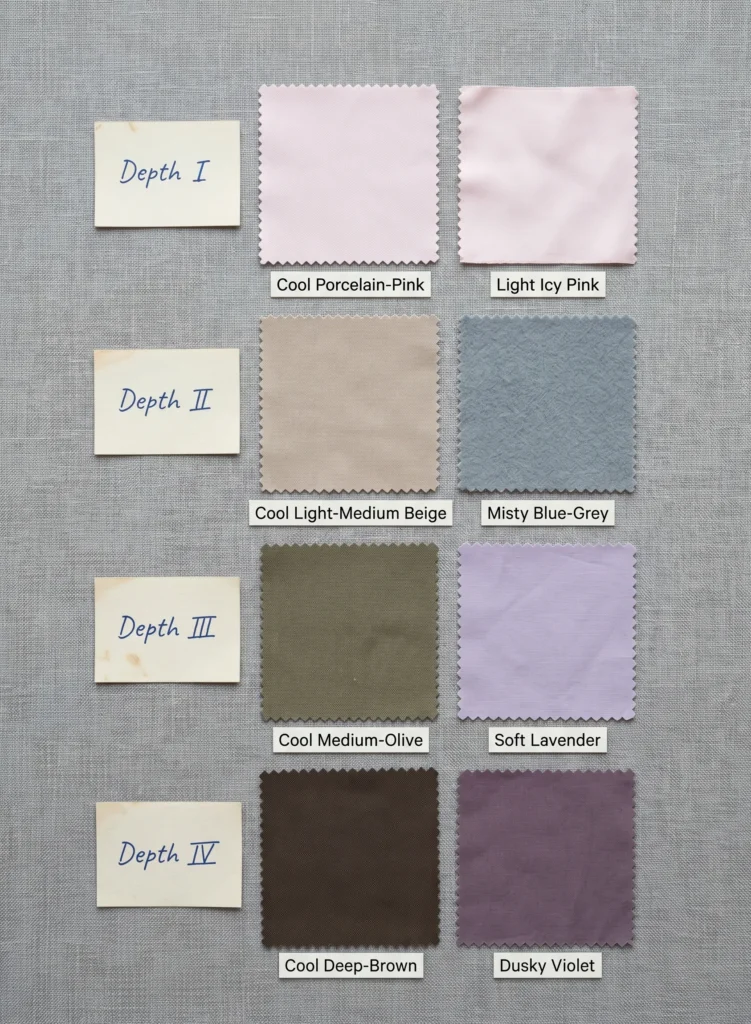
Both palettes are cool and muted. The difference shows most clearly when you compare their neutral ranges and their depth levels. Light Summer’s palette stays in the light-to-very-light range throughout. Soft Summer’s palette dips into the medium range with its deeper dusty tones.
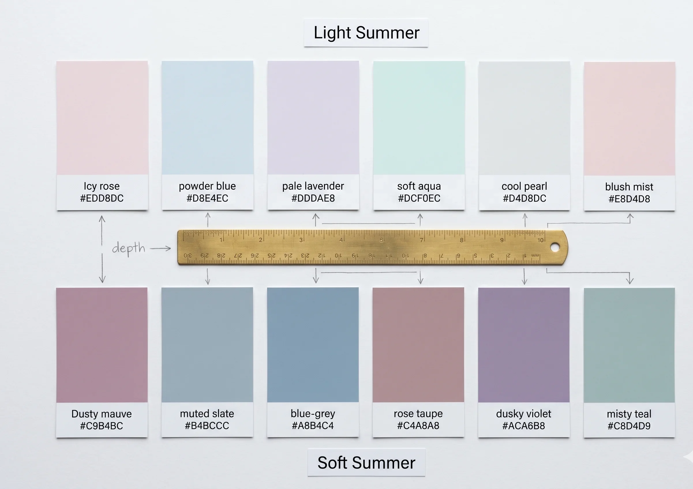
The key distinction visible here: Light Summer’s colours are tints — pale, high-value, barely-there washes of cool hue. Soft Summer’s colours are tones — grey has been actively mixed into the pigment, lowering the chroma while sitting at a medium rather than very light value.
For the complete Soft Summer colour palette with all hex codes and seasonal neutrals, the dedicated Soft Summer colour palette guide covers the full range.
The Draping Test — Where Light Summer and Soft Summer Diverge
In a Sci/ART draping session, we place fabric swatches against bare skin in natural light and read the skin’s response. Light Summer and Soft Summer produce distinctly different reactions when we test across the depth range.
Light Summer — What Goes Wrong
Too much depth creates shadow, heaviness, and an impression of age or illness. Even Soft Summer’s medium-depth dusty tones can feel slightly heavy on a very fair Light Summer.
Anything saturated — even cool, muted colours at higher chroma — pulls focus immediately away from the face and onto the colour.
Warm colours of any depth create an unflattering yellowish cast against their cool undertone.
Soft Summer — What Goes Wrong
Very icy or pale colours — Light Summer’s icy pastels — often lack sufficient body to register on a Soft Summer. The face disappears rather than being enhanced. The colours feel too insubstantial.
Anything saturated — even cool, clear bright tones — immediately competes with and overpowers the grey-soft colouring.
Warm colours create the same yellow cast problem as with Light Summer.
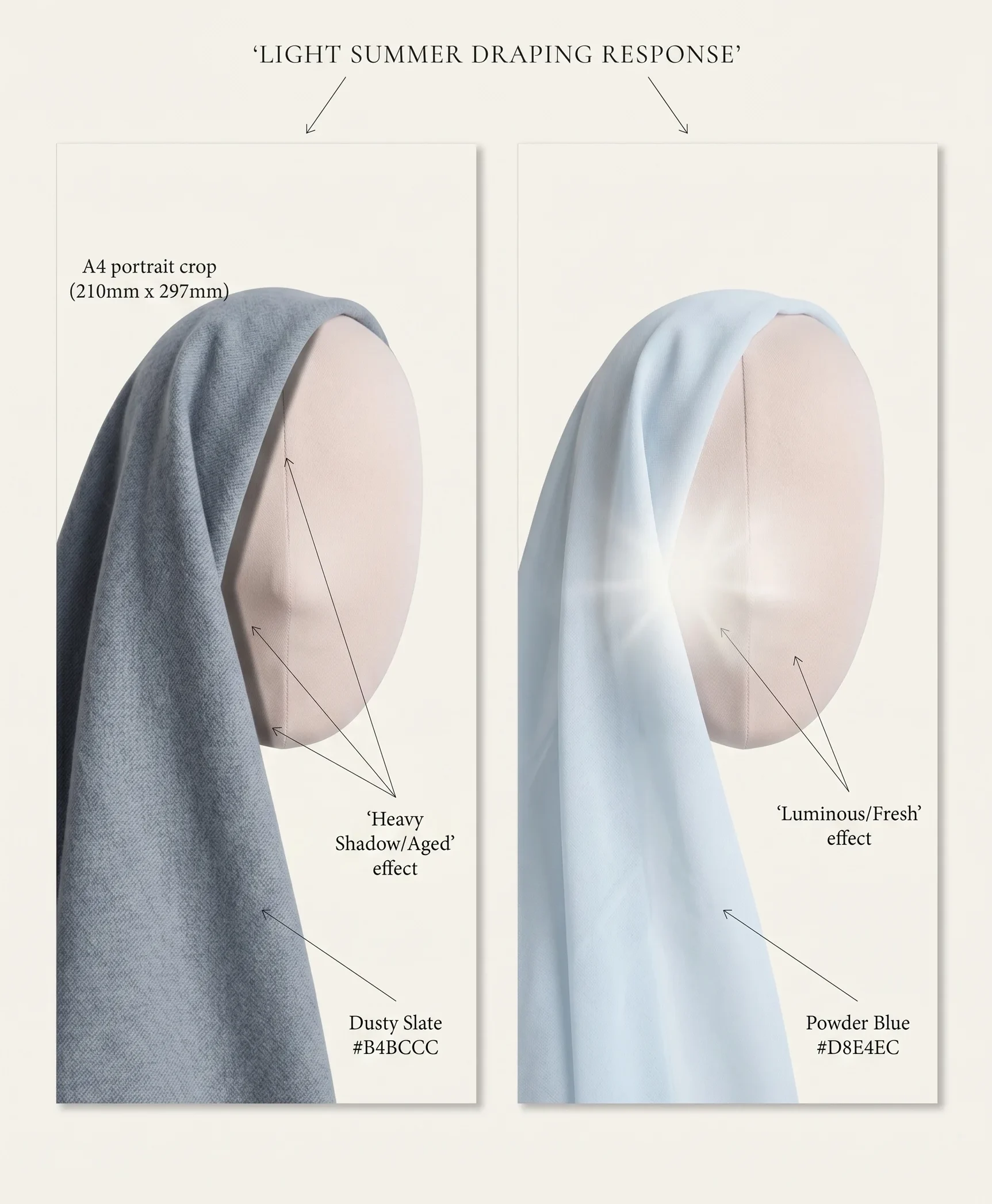
The Specific Test That Separates Them
In my drapting sessions, the clearest separation test is to hold a medium-depth dusty cool colour — something like #B4BCCC (Soft Summer’s muted slate) — close to the face and watch what happens.
On a Light Summer, this colour adds visible weight. It can make the face look slightly heavier or more shadowed. The delicacy of their features is dimmed rather than enhanced.
On a Soft Summer, that same colour clears the skin, opens the eyes, and creates exactly the right depth echo between the colour and the features. The face fills in rather than disappearing or being shadowed.
Clinically, What I Observe
The tell-tale moment in draping this comparison is when I hold the Soft Summer dusty slate near a true Light Summer and watch the skin take on a faint heaviness — not dramatically wrong, but subtly aged. Switch to a properly icy pale powder blue (#D8E4EC) and the same face opens up completely.
Reverse the draping on a Soft Summer, and the icy pale looks fine but somehow empty — not enhancing. The dusty slate adds a richness that the pale simply does not provide at their depth level.
The Deciding Questions — Light Summer or Soft Summer?
These are not quiz questions — the full Soft Summer self-assessment covers the diagnostic process in detail. These are the specific points of difference that separate these two seasons once you have confirmed you are in the Summer cool family.
|
Ask Yourself |
Points to Light Summer |
Points to Soft Summer |
|
What is the first impression of my overall colouring? |
Extraordinarily pale, delicate, weightless — everything reads very light |
Greyed, blended, dusty — features have depth but it is all muted |
|
What do icy, very pale cool colours do on me? |
They enhance — face opens up, looks fresh and luminous |
They look fine but slightly empty — not enhancing, just fine |
|
What do dusty mid-tones do on me? |
Can feel slightly heavy, add shadow or age |
They come alive — the face fills in, looks balanced |
|
How do greyscale photos of my features read? |
Very pale — most of the image is in the light end of the greyscale |
More depth visible — medium grey range, more tonal variation |
|
What does pure white near my face do? |
Works well or well in off-white — complements the lightness |
Can be slightly stark — greyed white or soft white works better |
|
Where does my hair sit naturally? |
Very light — pale ash blonde, minimal depth throughout |
More depth — ash blonde to medium ash brown, greyed quality |
Both Seasons Across Skin Tones
A common assumption is that both Light Summer and Soft Summer only appear in very fair skin. This is not accurate, and it is a misreading that causes many clients with medium skin tones to be misclassified.
Both seasons are defined by undertone and the primary colour axis — lightness for Light Summer, greyness for Soft Summer — not by surface skin depth. The defining qualities can appear across a wider Fitzpatrick range than is typically represented in most colour analysis content.
Light Summer Across Fitzpatrick Depths
Light Summer is most commonly found at Fitzpatrick I–III, where the overall paleness of the colouring is readily visible. It is less common at Fitzpatrick IV and above, because the lightness dimension requires uniformity across all features — skin, hair, and eyes all reading pale.
That said, Light Summer at Fitzpatrick III–IV is possible when all features are relatively light despite the skin being slightly deeper — light grey or pale blue eyes, light ash hair, and skin that reads cool and light even if not extremely fair. The key is that lightness is still the dominant quality of the overall colouring.
Soft Summer Across Fitzpatrick Depths
Soft Summer appears across a somewhat wider range — Fitzpatrick I through IV. The defining grey content can manifest across a range of skin depths. What I look for in clients with Fitzpatrick III–IV colouring is the characteristic grey overlay in the skin — a cool, ashy quality that gives the impression of a soft filter over the colouring.
Clinically, what I observe in these sessions is that the muted, greyed quality of Soft Summer is the most universal characteristic across ethnicities. A client with medium-warm surface skin can still have cool undertones and a greyed chroma level that places them firmly in Soft Summer territory — the surface depth alone does not determine the placement.
Studio Note on Self-Assessment at Deeper Skin Tones
For clients with Fitzpatrick III–IV colouring who are testing between Light Summer and Soft Summer, the greyscale photo test is particularly useful. It removes the overtone and reveals the depth pattern clearly. Most Soft Summers at this depth read medium grey overall — not the very-pale end that Light Summer occupies.
Related Comparison · Bonus Section
Light Spring vs Soft Summer — Why They Look Similar
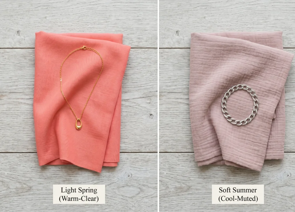
Light Spring and Soft Summer are an unusual comparison because they come from completely opposite families — one warm, one cool — yet both appear light and delicate in overall colouring. This is why the pair appears as a search query: “light spring vs soft summer” is the confusion of people who know their features are soft but are uncertain about their undertone temperature.
The separation is straightforward once you test undertone temperature. Light Spring has clear warm undertones — yellow-based, golden. Silver looks slightly off against their skin. Gold enhances. Soft Summer has clear cool undertones — blue-based. Gold looks slightly greenish or sallow. Silver sits clean and clear.
In draping, the test is sharp: hold a warm coral and a cool dusty pink to the face side by side. On Light Spring, the coral brings colour into the cheeks. On Soft Summer, it creates a yellowish cast immediately. The warm-versus-cool question is the dividing line here, not the lightness or delicacy of the features.
For soft colouring confusion that extends to the Soft Autumn family as well, the dedicated Soft Summer vs Soft Autumn comparison covers the warm-cool boundary in that pairing.Also get to know about True summer color palette.
Frequently Asked Questions
What is the difference between light summer and soft summer?
Light Summer’s defining characteristic is VALUE — extreme lightness across all features. Everything reads very pale with little depth variation. Soft Summer’s defining characteristic is CHROMA — maximum greyness throughout the colouring, sitting at a medium value rather than a very light one.
Both are cool and muted, but Light Summer needs icy, pale tints while Soft Summer needs dusty, greyed mid-tones with more colour body. The first impression of Light Summer is extraordinary paleness. The first impression of Soft Summer is a greyed, blended quality.
Is light summer the same as soft summer?
No. Light Summer and Soft Summer are two distinct seasons within the Summer colour family. Light Summer IS defined by very light value — paleness is the primary quality. Soft Summer IS defined by very low chroma — greyness is the primary quality.
They share cool undertones and both need silver over gold, but they require different palette depths. Light Summer needs icy pastels. Soft Summer needs dusty, greyed mid-tones. The same colour range will not serve both seasons equally.
How do I know if I am light summer or soft summer?
Take a greyscale photograph of your face. If your features all read very pale — close to the light end of the greyscale with little variation — this points to Light Summer. If your features have more visible depth in greyscale, sitting in the medium grey range, this points to Soft Summer.
Then test with colours: icy pastels (very pale, cool, almost no colour body) versus dusty mid-tones (greyed cool colours with more substance). Whichever group makes your skin look more even and alive points to your season. For the full placement process, the Am I Soft Summer guide covers the diagnostic in detail.
Can light summer wear soft summer colors?
Some overlap exists in the lighter, less greyed range of the Soft Summer palette. Colours like a pale misty blue (#C8D4D9) or a soft rose (#D9C8C5) may work on both seasons. But Soft Summer’s deeper dusty mid-tones — the slate blues, rose taupes, and dusky violets — tend to add unwanted heaviness or shadow on a Light Summer.
Light Summers generally do better in colours that are icier and paler than even the lighter Soft Summer tones. When in doubt, test in natural daylight — the skin’s response will be visible within seconds.
What does a light summer look like compared to soft summer?
Light Summer has uniformly very pale features — typically very light ash or golden-ash hair, pale blue or light grey eyes, and fair skin. The overall impression is weightless, delicate, and luminous. Features blend because they are all uniformly light.
Soft Summer has features with more visible depth, but all of that depth is greyed and blended. Ash hair in a medium tone, grey-blue or cool hazel eyes, and skin with a characteristic cool grey-rose quality. The impression is a soft, muted depth rather than paleness.
What is the difference between light summer and soft summer skin tone?
Light Summer skin is typically very fair to fair — the skin’s paleness contributes to the overall lightness profile of the season. Soft Summer skin ranges from fair to light-medium and often carries a visible grey-pink or grey-beige quality — not yellow or golden, but not purely pink either.
Skin tone alone does not confirm either season — undertone and the overall chroma level across all features together determine the placement. Both seasons have cool undertones. Neither works with gold jewellery as a primary metal.
Light summer vs soft summer vs true summer — what is the difference?
True Summer is the archetypal cool-muted Summer: medium value, medium-low chroma, clearly cool undertone. It is the centre point of the Summer family — not dramatically light or dramatically greyed, but balanced across both dimensions.
Light Summer pushes toward the light end of the value axis and needs icier, paler colours. Soft Summer pushes toward maximum grey content on the chroma axis and needs dustier, more substance-rich tones. All three share cool undertones and silver over gold preference, but each season needs a different depth and grey-content calibration in its colours.
Implementation Task Block
Next Steps — Confirm Your Season
- Take a greyscale photo of your face in natural light. No makeup. Remove it from your phone camera’s colour mode or convert it in any photo app. Look at where your features sit on the greyscale: all very light points to Light Summer, medium depth with blended tones points to Soft Summer.
- Test the decisive colour pair. Find one fabric or piece of clothing in an icy pale cool tone (powder blue, pale lavender, or icy pink — very light, close to white in value) and one in a dusty mid-tone (muted slate blue, rose taupe — more colour body, visibly greyed). Hold each near your bare face in daylight and observe which creates more life in the skin.
- Confirm your Summer family first. Before deciding which Summer sub-season you are, confirm you are in the Summer family: silver looks cleaner than gold, cool pinks enhance more than warm peaches, and saturated or warm colours feel overwhelming. If this is uncertain, start with the undertone confirmation.
- Read the dedicated Soft Summer guides. Once your season is confirmed, the complete Soft Summer colour palette guide covers all palette colours with hex codes, neutrals, accents, and seasonal application. For characteristics and self-assessment, the Am I Soft Summer guide walks through the full diagnostic.
- Book an in-person draping session if you remain uncertain. Light Summer and Soft Summer are close enough that self-assessment between the two is genuinely difficult — especially at Fitzpatrick III+ where the depth range of each season overlaps more. A Sci/ART certified analyst will resolve the placement in a single live session with standardised fabric drapes.