The Soft Summer
Colour Palette.36 colors
Defined.
Quick Answer — The Soft Summer Color Palette
The Soft Summer color palette is cool-toned, muted, and medium-low in contrast. Every colour has a blue-pink base (never warm or golden), low saturation (greyed-down rather than vivid), and a medium-light value. Signature colours include misty blue-grey, dusty rose, soft lavender, muted sage, dusky violet, and a range of cool neutrals from soft parchment to dark charcoal. Soft Summer IS a sub-season OF the Summer family IN the 16-season colour analysis framework.
Soft Summer is a cool, muted, and medium-depth colour season. These are the 36 colours that work with your biology — not against it. Analysed through the 16-season framework by Helen Alex, Senior Certified Colour Analyst.
What Is the Soft Summer Color Palette?
Soft Summer color palette belongs to Soft Summe, that is one of the four sub-seasons in the Summer family of the 16-season colour analysis framework. It sits at the most muted, most blended corner of the Summer family — sharing its cool undertone with True Summer and Light Summer, borrowing its greyed-down quality from its neighbour Soft Autumn.
Every colour in the Soft Summer color palette is defined by three coordinates. Understanding these three removes all ambiguity about which colours belong here and which don’t.
Cool Undertone
Blue-pink biological base — no gold, no warmth. This is the quality shared with all four Summer sub-seasons. Veins at the wrist appear blue-purple, never green. Every warm colour conflicts.
Low Saturation
Chroma is heavily reduced — every colour is greyed-down and blended, impossible to name precisely at a glance. This mutedness is Soft Summer’s defining quality and what separates it from True Summer at the same cool temperature.
Medium-Low Contrast
Hair, skin, and eyes exist in a gently blended range — distinguishable but not dramatically different. A 2024 study in the Journal of Color Research found muted cool palettes produced the most even perceived skin luminance for low-contrast, cool-undertone colouring.
36 Colours of Soft Summer color palette . Precisely Calibrated.
Where Soft summer color palette can be found in nature ?
The Nature Analogy
Picture an August morning on a grey northern coast. The sea isn’t bright blue — it’s a blended, atmospheric grey-blue. The sky isn’t dramatically dark — it’s overcast, pale, and luminous without being vivid. The pebbles below are every shade of cool grey, the sea glass is worn to an ambiguous blue-green, the driftwood is a bleached grey-brown with a cool cast.
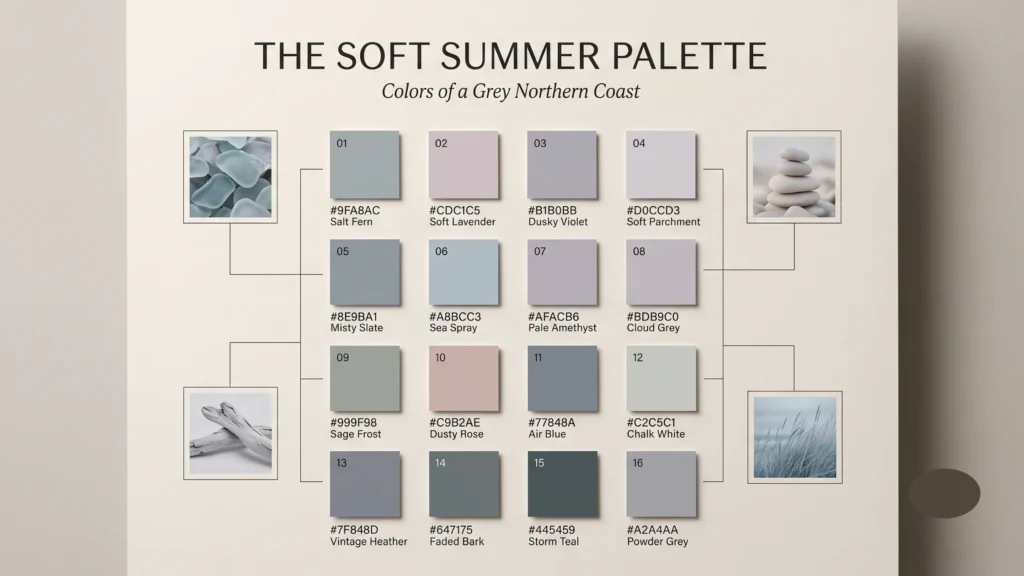
While the complete Soft Summer library spans 36 comprehensive tones, these 16 Core Anchors define the absolute boundaries of the season’s temperature and saturation limits.
Grid layout titled The Soft Summer Palette Colors of a Grey Northern Coast showcasing 16 color swatches numbered 01 to 16 with hex codes including Salt Fern, Misty Slate, Sage Frost, Vintage Heather, Soft Lavender, Sea Spray, Dusty Rose, Faded Bark, Dusky Violet, Pale Amethyst, Air Blue, Storm Teal, Soft Parchment, Cloud Grey, Chalk White, and Powder Grey flanked by 4 aesthetic nature imagery callouts.
Nothing in this scene is warm. Nothing is vivid. Every element sits in that quiet, blended range where colours lose their hard edges. That is the Soft Summer color palette — and it is one of the most sophisticated in the entire 16-season framework.
-
Soft White
#E8E5E1 -
Rose Pearl
#E2D7D1 -
Warm Greige
#D4D0C0 -
Soft Parchment
#C4C0B0 -
Mushroom
#C4BDB7 -
Rose Taupe
#B2A4A1 -
Pewter
#9EA3A6 -
Charcoal Grey
#555B61 -
Soft Navy
#4A5463 -
Icy Aqua
#CDE0DD -
Misty Blue
#C8D4D9 -
Slate Blue
#B5BEC9 -
Steel Mist
#A5B4BE -
Ocean Grey
#7C8B99 -
Soft Mint
#C2D6CA -
Muted Sage
#CBD4C5 -
Salt Fern
#A5B4AA -
Deep Pine
#5C6B64 -
Icy Pink
#EEDAE3 -
Blush Clay
#D9CDC5 -
Antique Rose
#D4AEB3 -
Dusty Mauve
#C2A3A9 -
Soft Plum
#8F6A76 -
Salt Lavender
#C9C5D3 -
Dusky Violet
#ACA6B3 -
Heather Grey
#938A99 -
Aubergine
#5B4B5A -
Faded Lemon
#E5DAB5 -
Soft Melon
#E8BBAA -
Muted Coral
#D99589 -
Brick Dust
#A86C65 -
Washed Denim
#8FA3BA -
Lapis Blue
#667B96 -
Sea Glass
#9FB8AD -
Juniper
#6B827A -
Cocoa
#735C53
Each colour is selected at a specific chroma and LRV (light reflectance value) that harmonises with the Soft Summer’s cool-neutral biology. Here I mention the most prominent of them , Hover any swatch for hex reference or to read the details of each color.
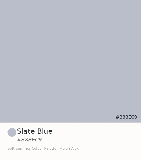
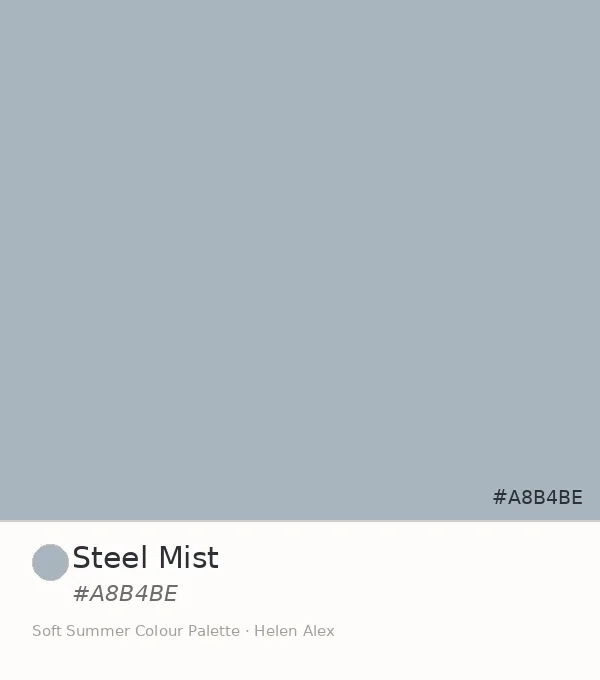
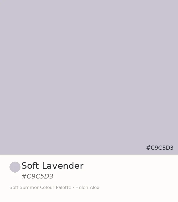
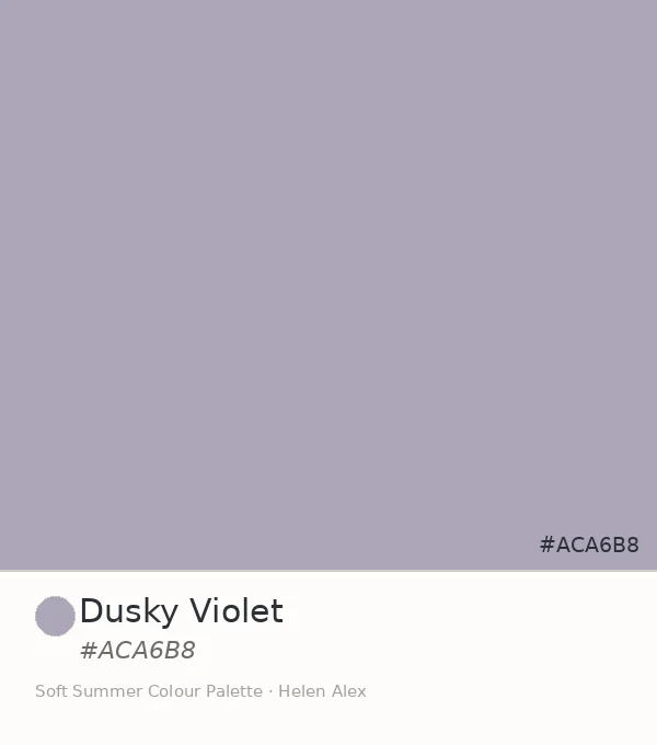
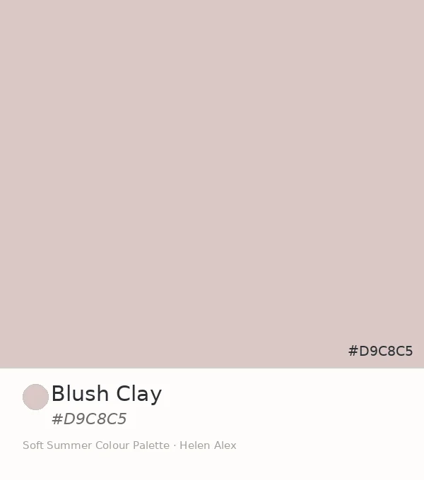
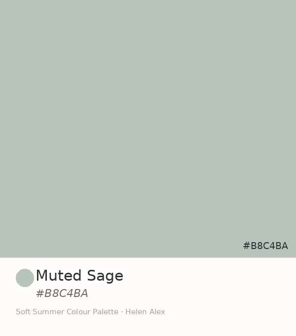
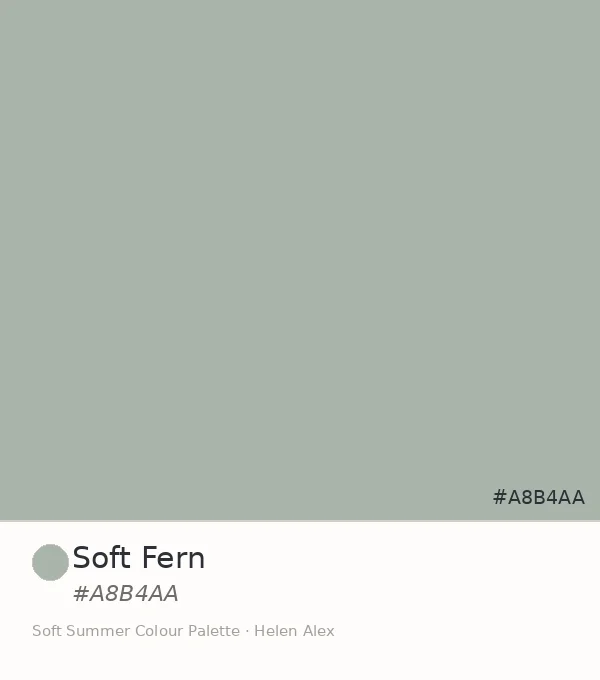
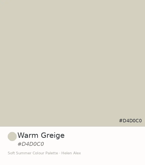
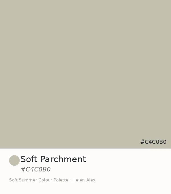
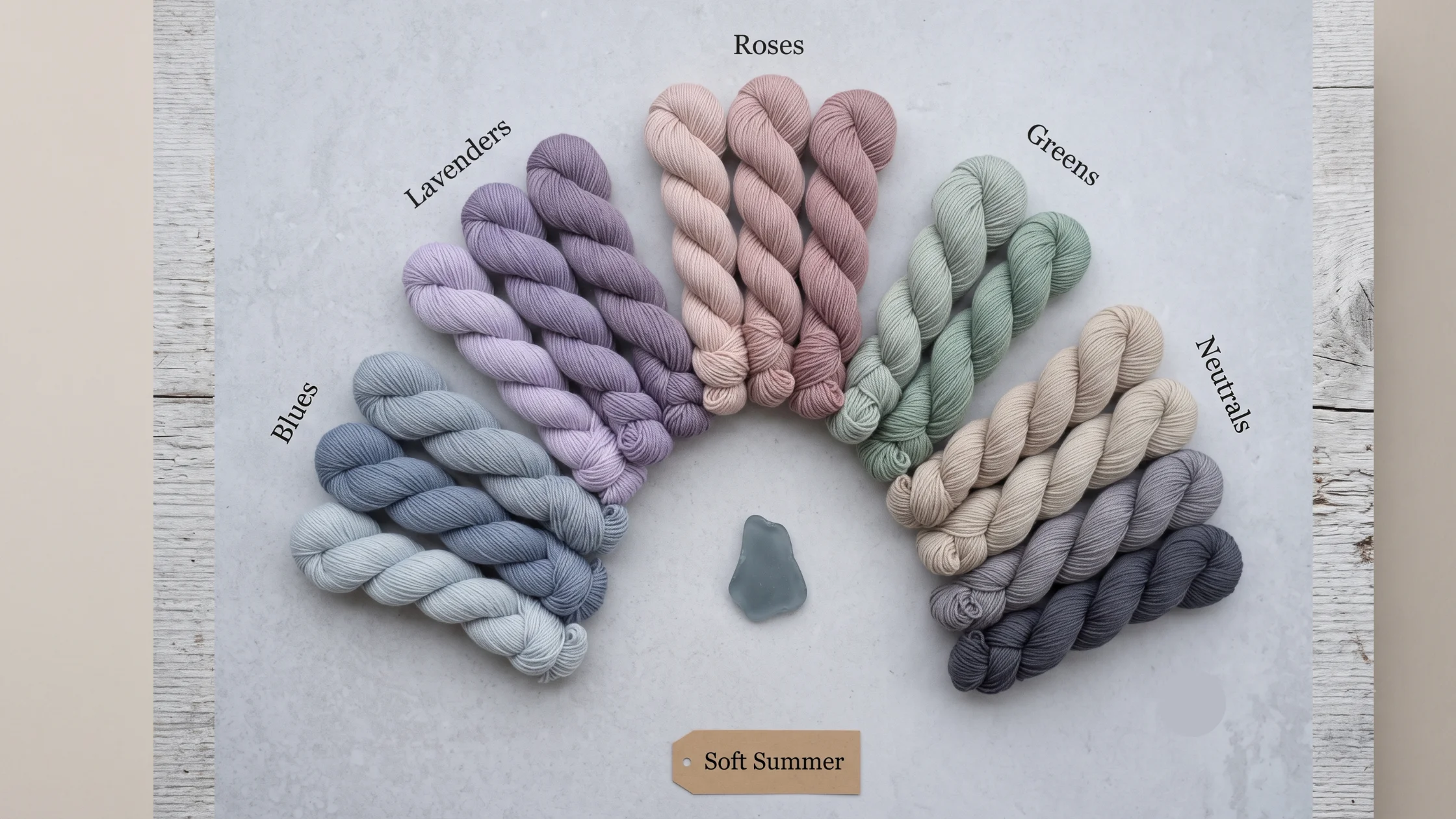
The Complete Soft Summer Color Palette — 36 Colours Introduced
Every colour below passes all three Soft Summer tests: cool undertone, low saturation, and a value within the season’s medium-light range. The 36 colors we saw individually are here organised into six colour families plus a neutral range.
Blues & Blue-Greys — The Anchor Family
The same grey that softens a summer sky — these blues are never bright or vivid, but unmistakably cool and blue when isolated. Think of sea glass that has spent three seasons underwater.
-
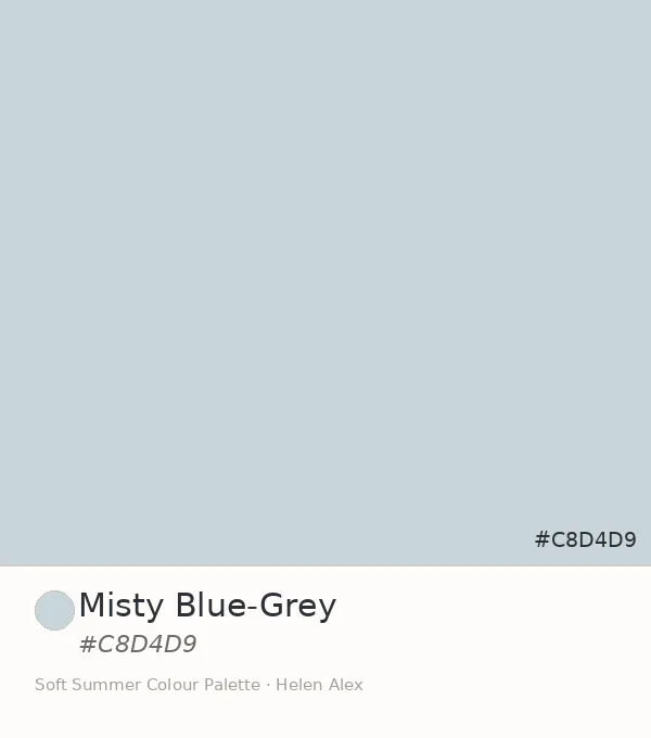
Misty Blue-Grey
-
Slate Blue
-
Steel Mist
-
Soft Denim
-
Deep Slate
Studio Read — The Palette’s Most Misread Colour
“Misty Blue–Grey looks nearly grey on a hanger — people pass it over constantly. Under natural daylight against a cool–undertone face, it transforms the skin’s luminosity more than almost any other colour in the palette. The blue is there; it’s just whispering rather than shouting. That whisper is what Soft Summer colouring needs.”
Lavenders & Purples
Dried lavender from last summer — not the vivid purple of a fresh plant, but the silvery, greyed, ambiguous purple that remains once the colour has settled into something quieter.
-
Soft Lavender
-
Dusky Violet
-
Smoky Mauve
-
Deep Amethyst
Roses & Pinks
A dried rose petal, not a fresh one — the vivid pink has long since left, replaced by a cool-dusty blush that reads as more sophisticated the longer you look at it.
-
Blush Clay
-
Dusty Rose
-
Soft Mauve-Rose
-
Muted Raspberry
Sage & Soft Teals
Eucalyptus at dusk — the leaves have taken on that cool, silver-green quality where the warmth of the day has left and only the cool blue-green remains.
Muted Sage
Soft Fern
Deep Sage
Muted Teal
Cool Neutrals — Light to Deep
Herring gull plumage — that precise in-between quality of grey that is neither white nor dark but carries a faint cool-blue quality in certain lights. These neutrals are the wardrobe’s engine room.
Soft White
Soft Parchment
Warm Grelge
Pale Grey-Blue
Mid Cool Grey
Soft Charcoal
Practitioner’s Observation — The “Black” Question
“In my drapting sessions, more clients arrive wearing black than any other colour — and for Soft Summer, no single swap produces a more dramatic improvement than replacing a black top near the face with soft charcoal (#4A5060) or dark slate. The face immediately stops competing with the garment. The luminosity that was hidden behind high-contrast darkness comes forward. I’ve watched clients recognise themselves for the first time.”
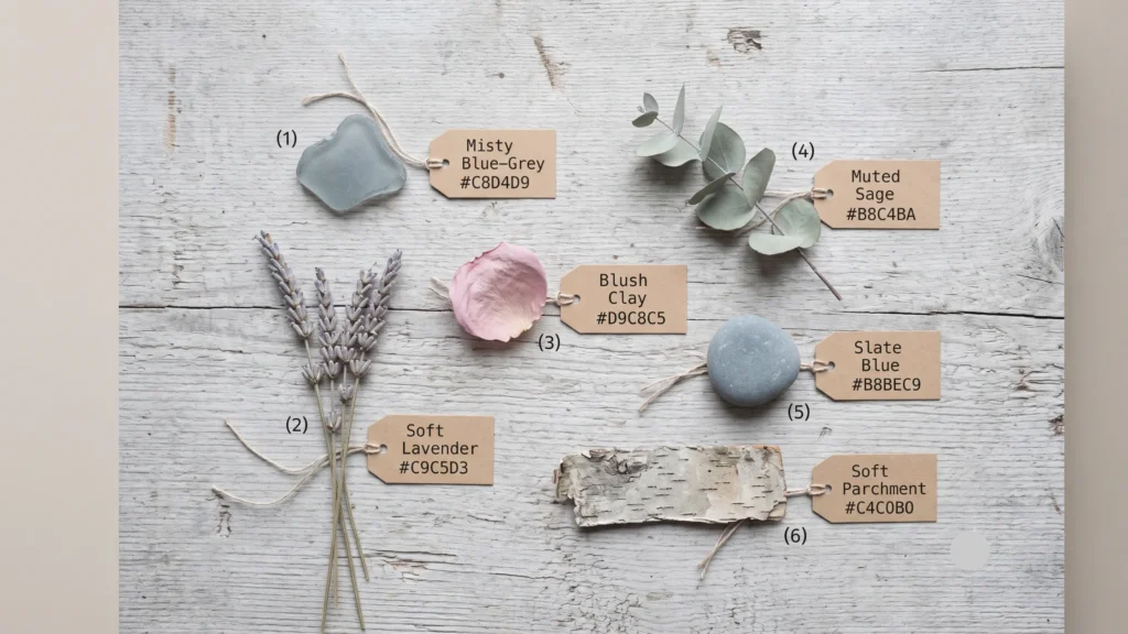
Finding Soft Summer Palette Colours in the Natural World
The Soft Summer palette is not abstract. Every shade exists in the world around us — in specific weather, specific hours of day, specific textures. Training your eye to see these naturally makes identifying the palette instinctive.
Where to Find the Soft Summer Palette in Real Life
The August morning mist rolling in from the sea, turning every colour slightly grey. The inside of a mussel shell — that iridescent, ambiguous blue-purple that sits between blue and lavender without committing to either. Dried lavender stalks after a week indoors. The grey-green of eucalyptus leaves in a vase, cooling as they dry. River stones from a rocky stream, each one a different shade of cool grey-green-blue.
All these share three things: a cool quality, a blended ambiguity where the colour resists precise naming, and a medium-light luminosity. They are never vivid. Never warm. Never dark. They are the overcast spectrum — and it is one of the most complex and interesting colour families in the world.
Am I Soft Summer? — The Quick Self-Check
These four observations narrow the field before a full drapting test. Read each one and check how closely it describes your natural colouring — your current hair colour, not dyed or highlighted.
Undertone Assessment
- Wrist Veins Blue-purple appearance, lacking green.
- Skin Quality Cool, pink-neutral base; never sallow or golden.
- Sun Reaction The base undertone remains cool even after tanning.
Hair & Eye Quality
- Color Ambiguity Natural colors resist precise naming (e.g., “mousy,” “ash but not quite”).
- Eye Characteristics Gray-blue eyes that appear to shift or change color.
- Core Indicator Hard-to-define coloring is a primary Soft Summer trait.
The Vivid Color Test
- Trigger Colors Electric blue, hot pink, vivid green.
- The Effect The garment becomes more visually prominent than your face.
- The Result You appear “washed out” rather than illuminated.
The Muted Color Test
- Trigger Colors Slate blue, dusty rose, cool-toned neutrals.
- The Effect Skin appears cleaner and eyes look sharper.
- The Result A seamless, harmonious transition between your face and clothing.
For the Full Clinical AssessmentThese four markers give a strong directional signal. The full diagnostic — 7 clinical tests including undertone drapting, value range testing, and the cool/warm discrimination test — lives in the dedicated guide.
Take the 7 Clinical Tests → Am I a Soft Summer?
The Summer Season — Where Soft Summer Sits
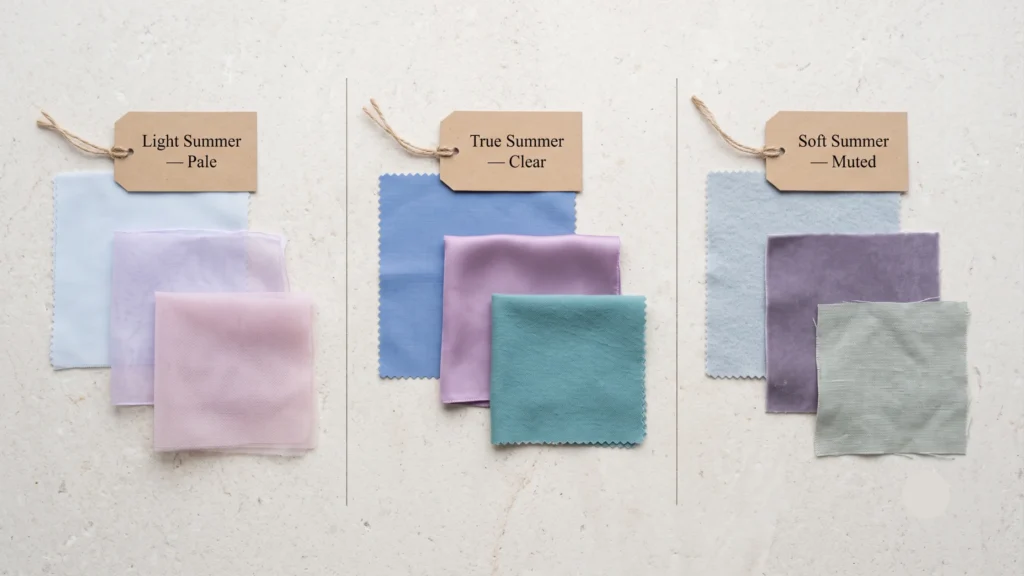
Soft Summer is one of four sub-seasons in the Summer family. All four share the same cool undertone. They differ in how light, how saturated, or how blended the palette becomes.
| Sub-Season | Undertone | Saturation | Key Character |
|---|---|---|---|
|
Light Summer
|
Cool | Low, light (white-modified) | Icy pastels, very high LRV — pale lavender, powder blue |
|
True Summer
|
Cool | Medium, clear | Colours are clearly nameable — cornflower blue, watermelon pink |
|
Soft Summer
|
Cool | Low, greyed (grey-modified) | Blended, ambiguous, muted — the palette resists naming |
The single decisive variable between Soft Summer and True Summer is saturation: True Summer colours are clear enough to name immediately; Soft Summer colours make you hesitate. That hesitation — “is that grey-blue or dusty mauve?” — is the chroma level at work.
For Soft Summer’s other key comparison, see the dedicated Soft Summer vs Soft Autumn guide — the difference being temperature, not saturation.
Soft Summer or Soft Autumn?
The two most-confused seasons. One has a cool biological foundation. The other is warm. Helen explains the difference with clinical precision.
Soft Summer Vibe
Cool. Muted. Medium
- Cool (blue-based) undertone
- Chroma: Low–medium saturation
- LRV: Medium depth range
- Ashy, silvery pigment quality
- Eyes: Cool grey, grey-blue, muted green
Soft Autumn Vibe
Warm. Muted. Medium.
- Warm (golden-based) undertone
- Chroma: Low–medium saturation
- LRV: Medium–deep depth range
- Earthy, dusty pigment quality
- Eyes: Warm hazel, green-brown, amber
About the Analyst
Helen Alex
I am a Senior Certified Colour Analyst trained in the Sci/ART 16-season methodology. I have performed over 2,000 technical draping sessions — in-person and virtual — for clients across four continents.
Every analysis on this site is built from clinical observation, not pattern matching. I test each palette claim under controlled daylight conditions using calibrated fabric drapes and Munsell-system colour references.
“Colour analysis is not a trend. It is applied colour theory — and when done correctly, it is permanent.”
Sci/ART Certified Analyst
Sci/ART Certified Analyst
Sci/ART Certified Analyst
Sci/ART Certified Analyst
Take our Soft Summer Self-analysis quiz now !
Soft Summer — The Technical Answers
-
Light Summer Capsule WardrobeThe Eight-Colour Capsule System
Light Summer Capsule Wardrobe: 8-Color System & Outfit Guide Quick Answer A Light Summer capsule wardrobe builds around three anchors: a cool light neutral base (cool ivory, soft dove grey, light greyish-blue), a signature soft tone (powder blue or soft lavender), and a gentle cool accent (soft rose or sage). Keep contrast low, chroma muted,…
-
Light Summer vs True Summer Two cool palettes, one real difference
Light Summer vs True Summer: Color Palette Guide & Drape Test Quick answer Light Summer and True Summer are both cool, muted branches of the Summer family — the split comes down to depth and undertone purity. Light Summer stays light and blends a soft neutral into its coolness. True Summer runs a shade deeper…
-
Muted ColorsWhere they sit on the color wheel, and the palettes built from them
Muted Colors Explained: Color Wheel, Hex Codes & Palettes Quick answerMuted colors are hues with reduced saturation, created by adding grey — or a complementary color — rather than white or black. They sit at low-to-medium chroma while keeping a mid-range value. On a color wheel, muted isn’t a location, it’s a distance from the…
-
Soft Colors What they are, how they differ from pastels, and how to find your own soft palette
Soft Colors Explained: Muted Palettes, Swatches & Hex Codes Quick answerSoft colors — also called muted colors — are shades with lower chroma, made by adding grey rather than white or black to a pure hue. In seasonal color analysis, they define two palettes: Soft Summer (cool, grey undertone) and Soft Autumn (warm, golden undertone)….
-
True Summer Colors to Avoid The Complete Guide to Cool Summer’s Worst Shades — and What to Wear Instead
True Summer Colors to Avoid: Worst Shades & Best Swaps QUICK ANSWER True Summer — also called Cool Summer — clashes with anything warm, neon, or too dark. Skip orange, mustard, camel, olive, jet black, and stark white; they carry warmth or contrast this cool, medium-soft palette can’t absorb. The tell: if a color looks…
-
Light Summer Hair Color The Complete Cool-Toned Shade Guide
Light Summer Hair Color: Best Cool Shades & What to Avoid Quick Answer Light Summer’s best hair colors stay cool-to-neutral, soft, and close to your own natural lightness. Reach for cool ash blonde, champagne blonde, or mushroom brown; a cool light brown around level 6 is the practical floor. Skip anything gold, copper, jet black,…