Dusky Violet —Soft Summer Palette colors
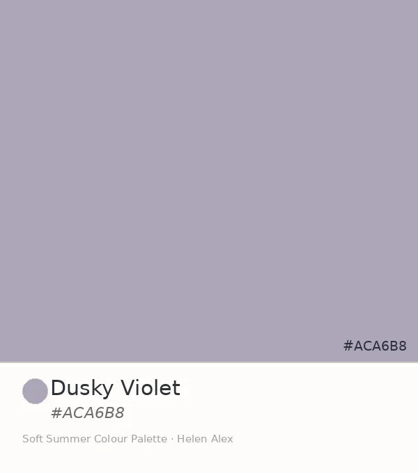
Soft Summer Dusky Violet: The Ultimate #ACA6B8 Color Guide
The Deepest Cool Accent in the Soft Summer Palette, and the One the Arc Has Been Building Toward
Every colour family in this palette has had a deepest member. The blue-grey family has Steel Mist. The violet family has been waiting for its own. Dusky Violet, hex #ACA6B8, is it.
It is the most characterful, most present, and most purely violet of all the cool-neutral swatches in the Soft Summer palette — and yet it sits, unmistakably, at the same low chroma as every colour that came before it.
Dusky Violet · Soft Summer Colour Palette · Helen Alex
Quick answer, if you’re short on time
Dusky Violet (#ACA6B8) is an official Soft Summer accent. Its Munsell profile — value 7, chroma 2, in the pure violet hue family (5P) — makes it the most violet and most characterful of the season’s cool-neutral family, and the first of the five established swatches to sit in the pure violet rather than the blue-violet zone. In the wardrobe, it functions as the season’s deepest muted accent.
The Analyst Perspective — Reading #ACA6B8 on the Munsell Scale
Strip the name and read the numbers. #ACA6B8 converts to Munsell value 7, chroma 2, in the pure violet hue family at approximately 5P — medium-light value, the lowest readable chroma, and a hue position that has crossed fully out of the blue family into violet territory.
That hue position is what separates Dusky Violet from every swatch that preceded it. Soft Lavender sits at 5PB — still inside the blue-purple zone. Dusky Violet has moved to 5P — pure violet, no blue remaining in the hue direction.
Dusky Violet doesn’t approach pure violet apologetically. At chroma 2 it simply carries its hue at the quietest possible volume — and the fact that you can still read it as violet, even at that near-zero saturation, is what makes it the most characterful colour in the family.
The first in this family to sit outside the blue zone entirely — isolate it against white and the violet announces itself, quiet but unambiguous.
The value at 7 places it at the same depth as Slate Blue, but the hue has moved one full step clockwise around the colour wheel, from blue-violet to pure violet. Same value stair, different landing.
Dusky Violet ✦ new
Value 7 · Chroma 2 · 5P — pure violet
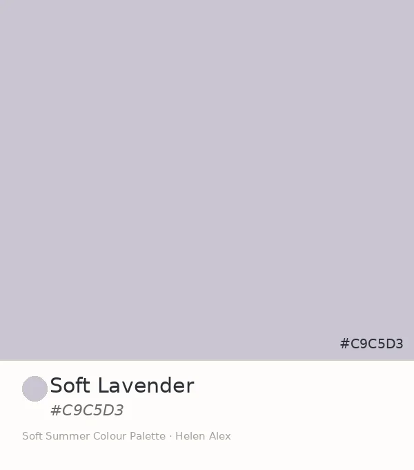
Soft Lavender
Value 8 · Chroma 2 · 5PB — violet-blue
Slate Blue
Value 7 · Chroma 2 · 7.5PB — blue-violet
Misty Blue-Grey
Value 8 · Chroma 2 · 5B — cyan-blue
Steel Mist
Value 6.5 · Chroma 1.5 · 10B — true blue
Five swatches, five hue positions — a complete arc from cyan-blue through true blue through blue-violet through violet-blue to pure violet. Dusky Violet is the last coordinate on that arc, and the one with the most visible colour character of the group.
The Nature Perspective — Where Dusky Violet Already Exists
Where Soft Autumn carries its equivalent depth in warm, smoked plum and dusky aubergine (see the Soft Summer vs Soft Autumn comparison), Soft Summer approaches the same depth from its cooler side — and the specific violet it reaches from that direction is what we find at #ACA6B8.
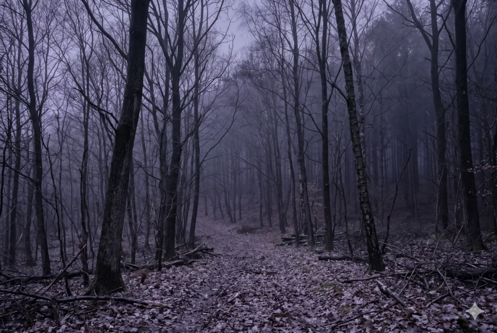
Think of autumn woodland mist at the hour before dusk — when the light is failing and the whole landscape shifts from green and grey into a particular cool violet that isn’t quite dusk but is already something different from daylight. That specific tone of October twilight, carried by the air before the sky actually darkens, is Dusky Violet exactly.
It lives in the landscape at one specific moment — not at noon, not in full dark, but in the transition between the two, when cool violet has entered the light and warmth has left it.
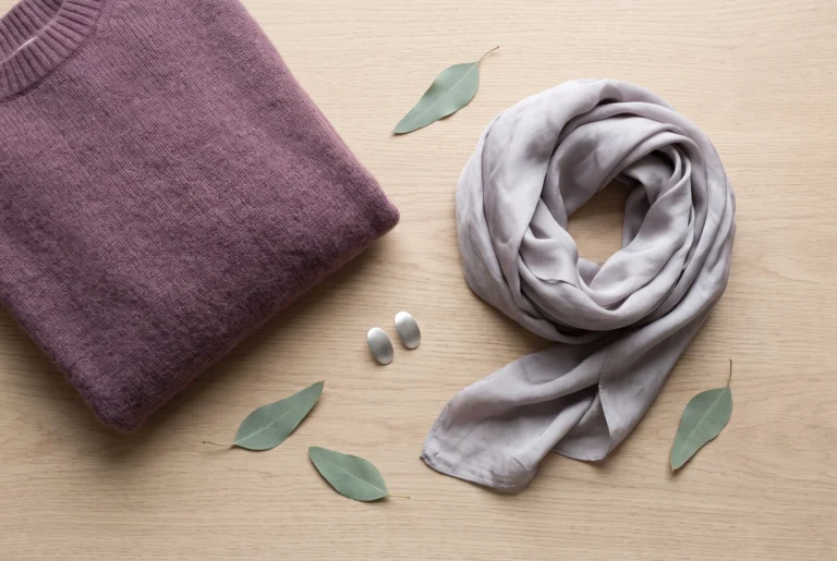
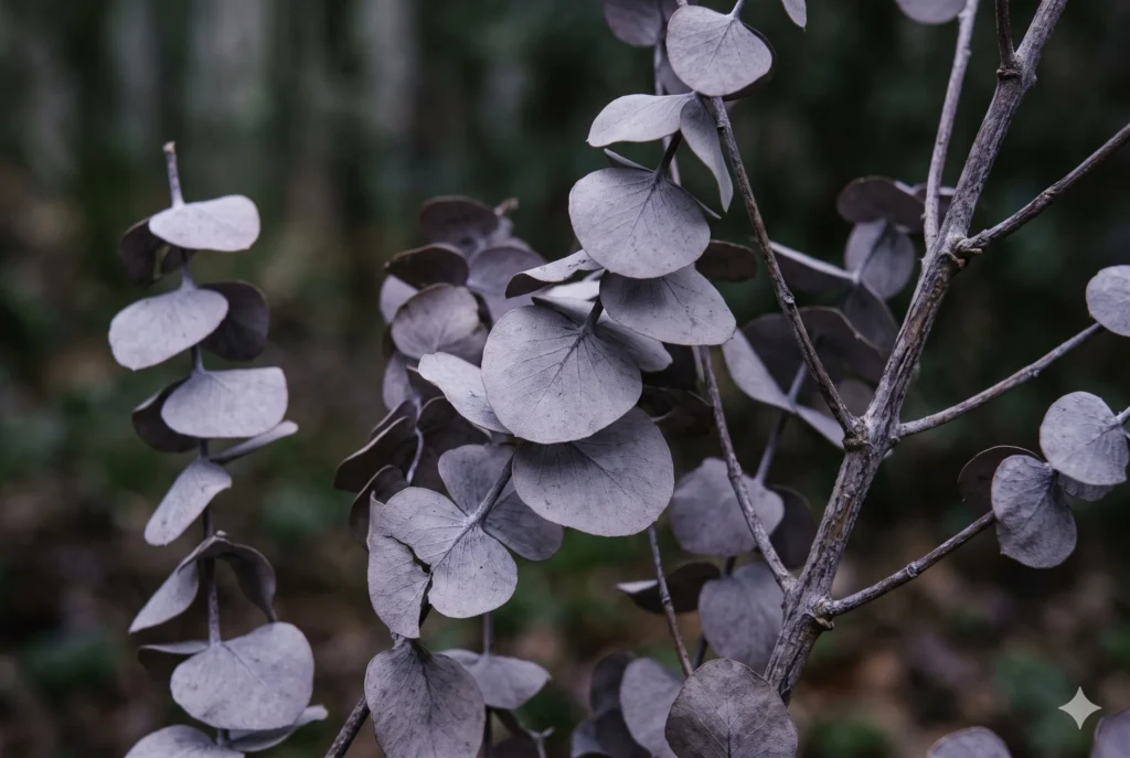
Old eucalyptus in deep shade holds this colour too — when the green-blue of the living leaf has been stripped back by shadow and flat light, what remains is a dusty, greyed violet that matches #ACA6B8 on the surface of each leaf. The colour eucalyptus reluctantly becomes when the light stops helping it.
The Wardrobe Perspective — A Muted Violet Accent, Still Restful
Of the five established cool-neutral swatches in this family, Dusky Violet is the only one that most people would describe as a “colour” rather than a “grey.” At chroma 2, it still qualifies as heavily desaturated — but the human eye reads violet before it reads grey, even at very low saturation.
That distinction matters for its wardrobe role. Where the four blue-grey swatches function as quiet backgrounds that dissolve into the palette, Dusky Violet functions as the accent the family was working toward — still muted enough to sit comfortably beside every other Soft Summer tone, but present enough to register as a deliberate choice.
Dusky Violet is what a Soft Summer reaches for when they want the palette to be seen without being loud about it.
🩶 Practitioner Note — Melanin Calibration
In my drapting sessions, Dusky Violet’s cool-neutral direction holds consistently across Soft Summer’s full Fitzpatrick range, from II through V. At deeper skin depths, the chroma 2 reading means the violet character can appear to deepen slightly against higher-melanin skin — which works in its favour as an accent. The temperature remains constant; what shifts at deeper Fitzpatrick depths is the visual weight of the contrast between skin and garment, not the colour’s own undertone.
The Complete Cool-Neutral Arc — Five Swatches, One Family
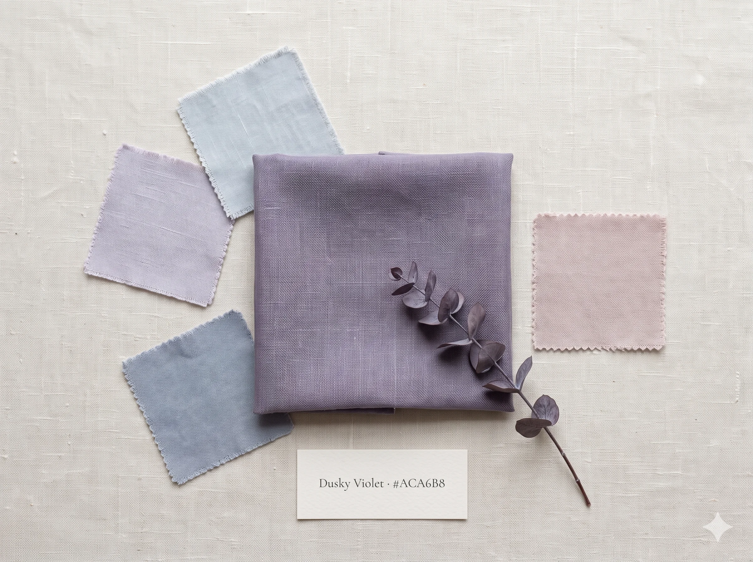
With Dusky Violet confirmed, the Soft Summer cool-neutral family is complete. The arc spans the full width of the cool colour wheel at the same low-chroma level — from the lightest cyan-blue through to the deepest pure violet, every coordinate sharing the same muted discipline.
The complete arc is visible here: the cool side of Soft Summer’s neutral family, read as a colour gradient from cyan-blue to pure violet, each shade at the same muted discipline, each occupying a different position on the hue wheel within that constraint.
| Swatch | Hex | Munsell | Hue Family | Character |
|---|---|---|---|---|
|
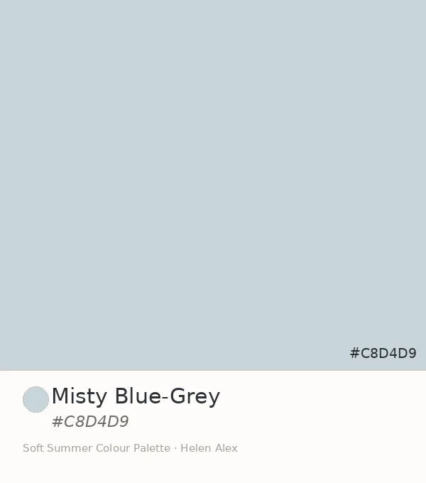
Misty Blue-Grey
|
#C8D4D9 | 5B 8/2 | Cyan-blue | Lightest, coolest, most receding |
|
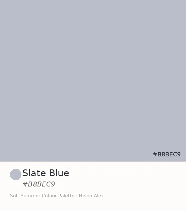
Slate Blue
|
#B8BEC9 | 7.5PB 7/2 | Blue-violet | Mid-depth, first violet trace |
|
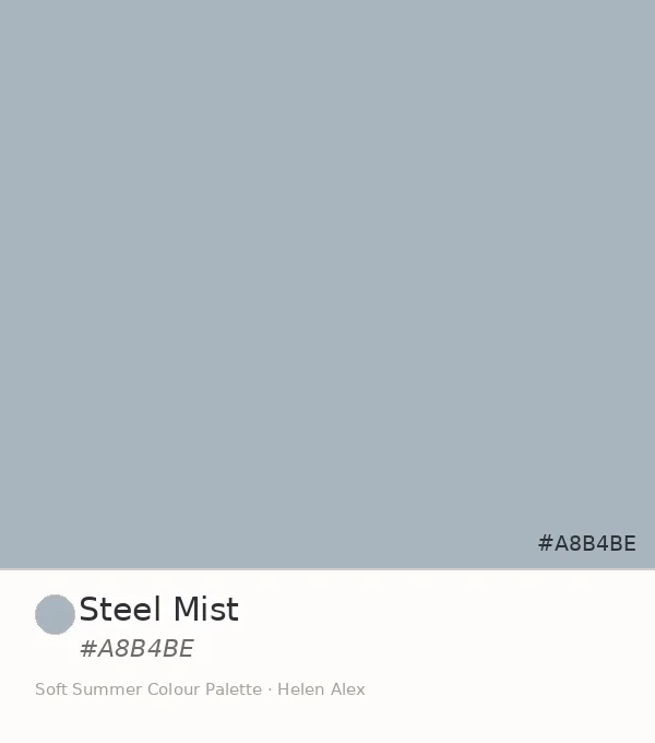
Steel Mist
|
#A8B4BE | 10B 6.5/1.5 | True blue | Deepest, most neutral, no hue pull |
|
Soft Lavender
|
#C9C5D3 | 5PB 8/2 | Violet-blue | Light, violet confirmed, bridge tone |
|
Dusky Violet ♦
|
#ACA6B8 | 5P 7/2 | Pure violet | Most characterful, deepest accent |
That table is also a practical palette reference. What connects all five is not matching colour — it’s matching discipline. The chroma ceiling of 2 is the shared rule, and within that rule, the hue can travel anywhere on the cool arc.
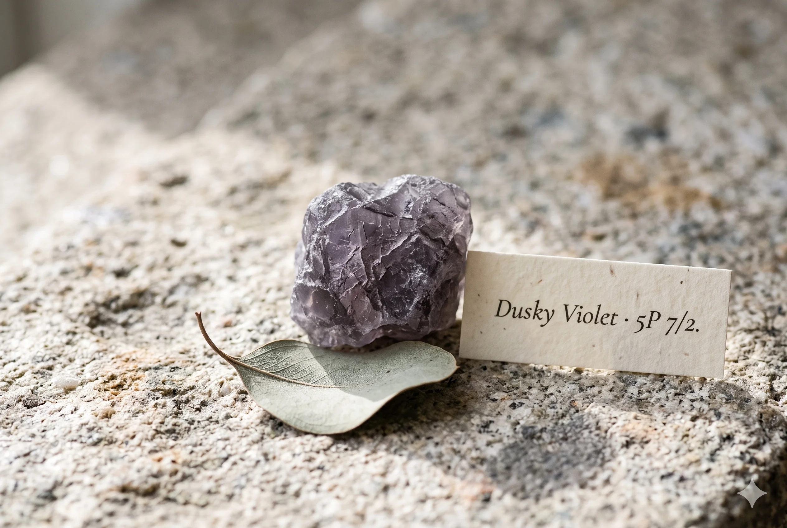
Three readings, one answer. The Munsell profile confirms pure violet at chroma 2 — the only swatch in the family to arrive in the violet hue family proper. The autumn woodland mist and the eucalyptus in shade confirm it exists this way outdoors, needing no saturation to make itself known. The wardrobe role confirms it is the accent the rest of this palette was always pointing toward.
Dusky Violet IS an accent swatch WITHIN the Soft Summer palette IN the 16-season framework — the deepest member of the cool-neutral family, earned by hue theory, confirmed in nature, and irreplaceable as the palette’s most characterful cool tone.
Take a ride through our soft summer gallery !
Frequently asked questions .
A Few Things People Ask Me
What is dusky violet color?
Dusky violet color is a medium-light, heavily desaturated pure violet at hex #ACA6B8. In the Sci/ART 16-season framework it is a confirmed Soft Summer accent — Munsell value 7, chroma 2, pure violet hue (5P) — the most characterful and most violet of the season’s five established cool-neutral swatches.
Is dusky violet a Soft Summer color?
Yes. Dusky Violet’s Munsell profile — value 7, chroma 2, pure violet hue — places it firmly inside the Soft Summer palette in the Sci/ART 16-season system. It is the fifth and deepest member of Soft Summer’s cool-neutral family, completing the arc from cyan-blue through pure violet.
What is the difference between dusky violet and soft lavender in the Soft Summer palette?
Both are confirmed Soft Summer cool-neutrals at low chroma, but Soft Lavender (#C9C5D3) sits at value 8 in the blue-purple hue family (5PB) — lighter and more blue. Dusky Violet (#ACA6B8) sits at value 7 in the pure violet hue family (5P) — one value step deeper and fully into violet territory.
What colors go with dusky violet in a Soft Summer wardrobe?
Dusky Violet pairs with the entire Soft Summer low-chroma family: Misty Blue-Grey, Slate Blue, Steel Mist, Soft Lavender, dusty rose, and muted sage. The rule is shared chroma level — any Soft Summer tone at chroma 2 or below sits naturally beside it without any visual competition.
Is dusky violet the same as lavender gray?
They are related but distinct. Lavender gray sits in the blue-purple zone with strong grey content. Dusky Violet (#ACA6B8) crosses into the pure violet hue family — it reads more violet than blue, making it the most characterful and most purple of Soft Summer’s established cool neutrals.
Yours in colour, Helen
The violet drapes are always the last I put up and the last clients want to take down. This one in particular has a way of making the whole palette feel suddenly complete — try it after you’ve lived with the others for a week.
For the full Soft Summer palette breakdown, see the Soft Summer Color Palette guide. To trace the arc from the beginning, read Misty Blue-Grey, Slate Blue, Steel Mist, and Soft Lavender.