Soft Summer vs Soft Autumn
Soft Summer vs Soft Autumn
Difference That Changes Everything
The One Difference That Changes Everything
Direct Answer — Soft Summer vs Soft Autumn at a Glance
Soft Summer and Soft Autumn share one defining quality: mutedness. Both are the lowest-chroma seasons in their respective families, and both look their best in soft, desaturated colours rather than vivid or saturated ones. The single dimension that separates them is thermal undertone. Soft Summer is cool — its muted colours carry a grey or blue-pink base. Soft Autumn is warm — its muted colours carry a golden, amber, or earthy base. Everything else — palette, metals, hair, makeup, the fabrics that look right — flows from this one distinction.
This guide is for those who have already confirmed they sit in the “soft” or muted category and are working to identify which side of the thermal axis they belong to. If you are still deciding whether you belong to the Summer or Autumn family at all, start with our Am I a Soft Summer? and the forthcoming Am I a Soft Autumn? guides. This comparison article has one specific intent: to separate these two sister seasons from each other — and nothing else.
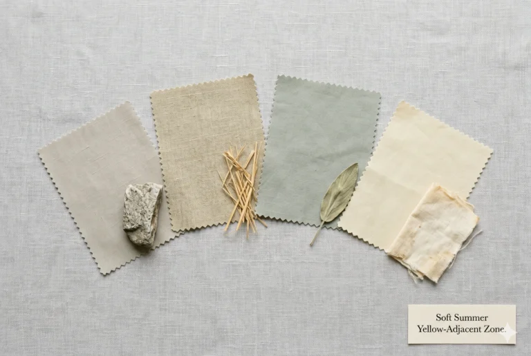
Primary · Muted / Secondary · Cool
Soft Summer
Cool · Muted · Medium depth
Misty, greyed, and cool. Colours carry a blue or grey-pink base. The softest, most muted season in the Summer family — and the one sitting closest to the Autumn boundary.
Primary · Muted / Secondary · Warm
Soft Autumn
Warm · Muted · Medium depth
Earthy, hazy, and warm. Colours carry a golden or amber base. The softest, most muted season in the Autumn family — and the one sitting closest to the Summer boundary.
The Two Seasons Through a Nature Lens
The confusion between Soft Summer and Soft Autumn is built into the structure of seasonal colour analysis itself. These are the two most muted seasons in the entire 12-season system — and they are adjacent to each other on the seasonal spectrum. They are, in the language of colour analysis, sister seasons: they share their primary characteristic (mutedness) while sitting on opposite sides of the thermal divide.
No other pair in the system creates more ambiguity. To understand what separates them, forget swatches for a moment and go outside.
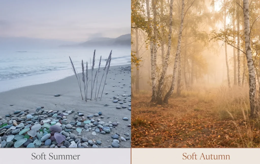
Soft Summer — The Scene It Lives In
Walk to the coast on an overcast August morning before the sun has burned through the cloud. The sea is a specific kind of grey-blue — not vivid, not icy, just quiet and cool. The wet pebbles on the shore hold colours that are almost impossible to name precisely: grey with a whisper of lavender, blue-grey with a hint of pale green, dull rose quartz. The dried sea grass is ashy rather than golden. There is a pervasive grey quality to every colour in the scene — as if each one has been dusted with the same fine coastal mist.
This is not a washed-out scene. It is not faded or dull. It is luminously soft — and unmistakably cool. Every colour in this landscape has a blue or grey-cool base. This is the Soft Summer colour palette.
Soft Autumn — The Scene It Lives In
Now walk into a woodland in early October at 8 in the morning. The mist is still present — the light is just as diffused, the colours just as muted. But the temperature of the scene is entirely different. The fallen leaves are the colour of dried apricots, pale terracotta, dusty fawn. The tree bark is warm brown. The moss has that specific yellow-green that reads as olive, not sage. The morning mist carries a golden quality — as if the light itself has been warmed from within.
This is not a warm, saturated autumnal scene. It is softly, hazily warm — muted but golden. The same mutedness as Soft Summer, pointed in a completely different thermal direction. This is the Soft Autumn colour palette.
The comparison reveals the essential truth: both scenes are muted. Both are low in contrast. Both have a softness that resists easy naming. The only thing that differs is the temperature of the light — one is cool coastal grey, one is warm woodland amber. That temperature difference, translated to the human face and applied through fabric and pigment, is the entire distinction between Soft Summer and Soft Autumn.
The One Dimension That Separates them
Every comparison guide you have read about these two seasons will mention undertone, contrast, saturation, and depth. These are all real dimensions — but in the Soft Summer vs Soft Autumn comparison, most of them are nearly identical. They share the same saturation level (both are the lowest-chroma of their families). They share a similar value depth (both are medium). They share the same primary characteristic (muted). The only dimension with a meaningful difference is thermal undertone.
The Fundamental Rule
In seasonal colour analysis, every season has a primary characteristic and a secondary characteristic. The primary characteristic dominates and is served first. The secondary characteristic is present but subordinate.
Soft Summer: Primary = Muted. Secondary = Cool. The coolness is present throughout but expressed softly — not starkly cool.
Soft Autumn: Primary = Muted. Secondary = Warm. The warmth is present throughout but expressed hazily — not intensely warm.
This means both seasons must always serve mutedness first. Neither tolerates vivid, saturated, or high-contrast colours. But where Soft Summer colours must always read cool (with grey as the dominant modifier), Soft Autumn colours must always read neutral-warm (with a golden or earthy modifier). Get the temperature wrong and even a correctly muted colour will fail.
Practitioner’s Observation — The Colour That Does the Sorting
“In more than 2,000 clinical drapting sessions, the fastest colour to resolve a Soft Summer vs Soft Autumn ambiguity is a dusty terracotta — a warm, earthy, muted orange-red. When I place this on a Soft Summer client, the skin invariably picks up a slight yellow or sallow quality — the warm base of the colour conflicts with the cool biology of the face. The same dusty terracotta on a Soft Autumn client creates immediate warmth, coherence, and luminosity — the skin appears to come alive. The separation is visible in seconds, even when 20 minutes of testing has not resolved it. The warm muted earthy tones are the key — not the grey muted cool ones.”
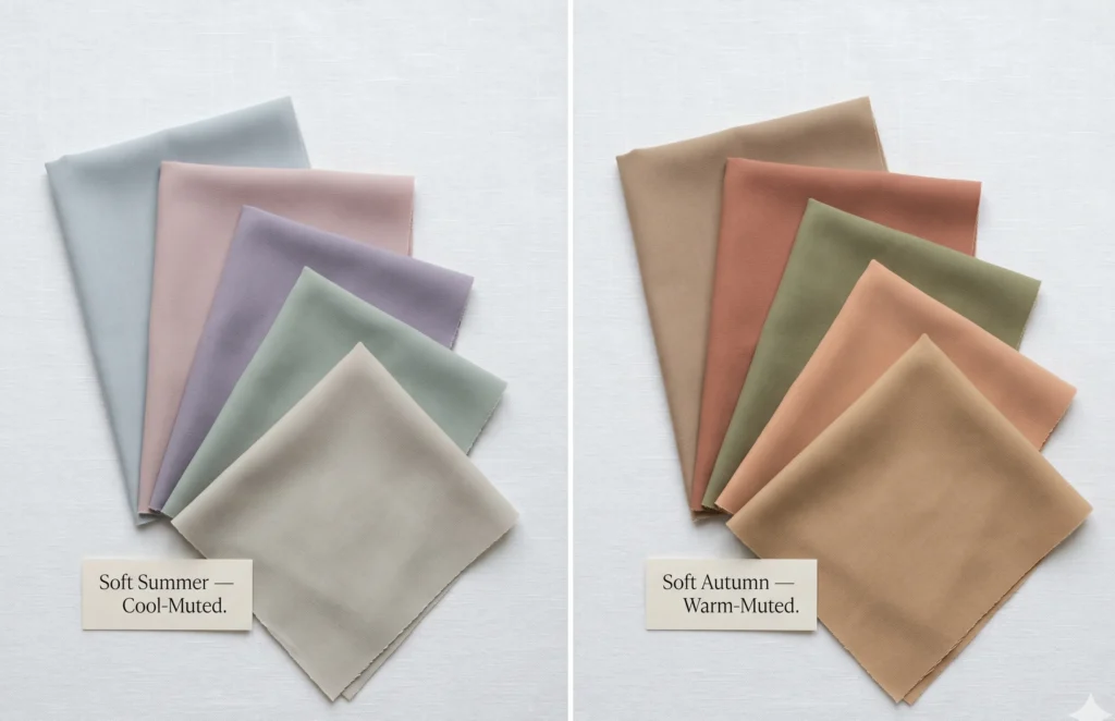
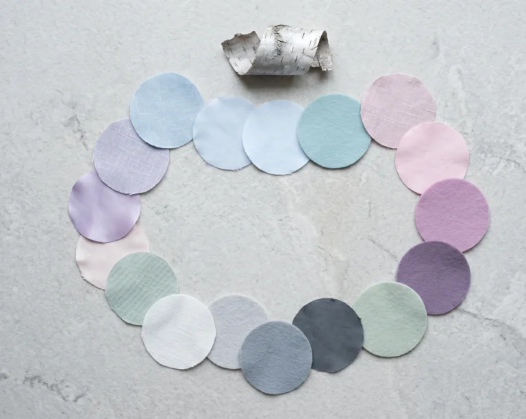
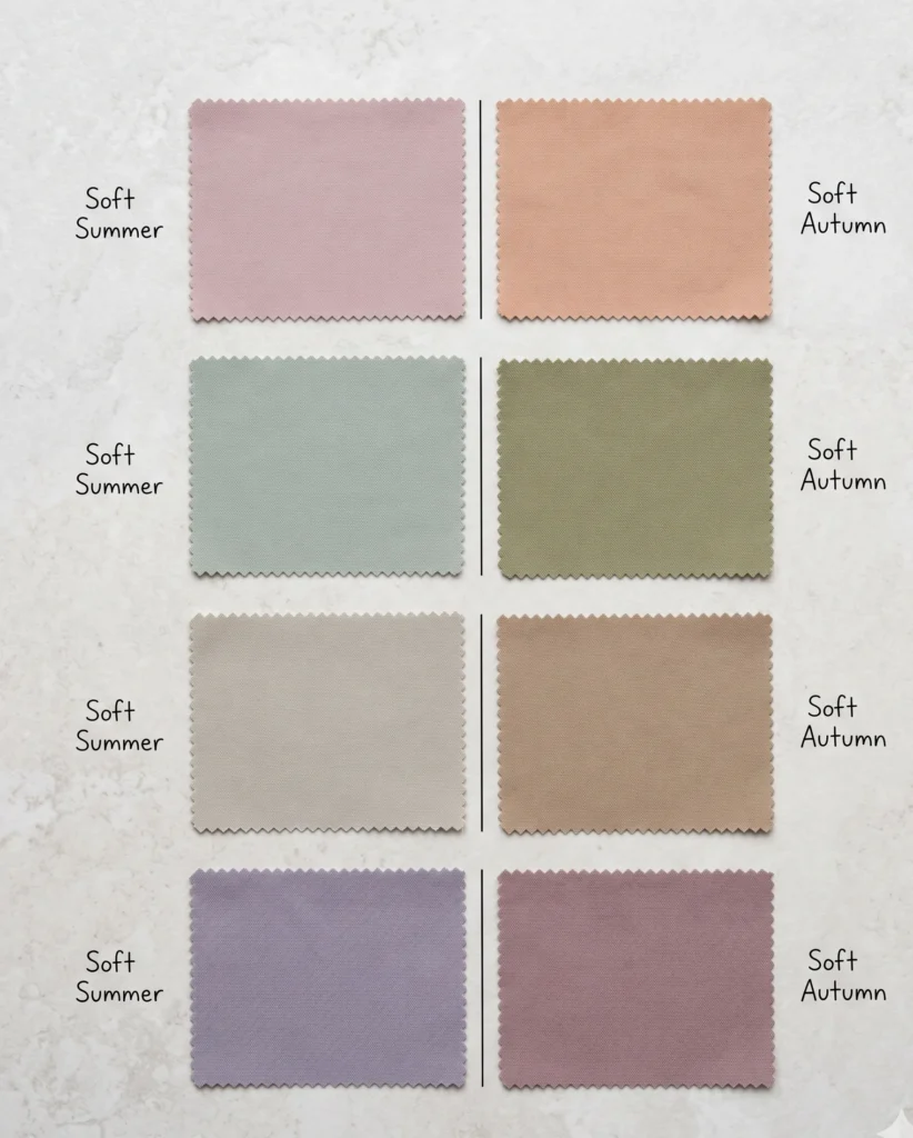
The Soft Summer vs Soft Autumn Colour Palette — Side by Side
The full Soft Summer and Soft Autumn colour palettes are each approximately 30–36 colours. The palettes are genuinely different in feel, even though they share a similar saturation level. The difference is not loudness — neither palette is loud. The difference is the direction of the grey: Soft Summer colours are greyed with a blue-cool modifier; Soft Autumn colours are greyed with a golden-warm or earthy modifier.
Soft Summer — The Palette Character
Soft Autumn — The Palette Character
The defining quality: grey is the dominant modifier. Every colour has a grey-cool quality — like dried flowers, sea glass, mist. Nothing reads warm or golden.
The defining quality: golden or earthy warmth is the dominant modifier. Every colour has a warm-muted quality — like dried spices, autumn leaves, hazy golden fog. Nothing reads grey-cool.
The Colour-by-Colour Comparison — What Changes in Each Family
|
Colour Family |
Soft Summer Version |
Soft Autumn Version |
|---|---|---|
|
The Pinks / Blushes |
Dusty rose — pink with significant grey, reads cool-dusty, closer to dried petal than fresh. Almost impossible to name as simply “pink.” |
Dusty peach / warm blush — pink with a golden or apricot base. Reads as slightly warm-pink rather than grey-pink. Still muted, but unmistakably warm. |
|
The Greens |
Muted sage / soft fern — green with grey mixed in. Reads grey-green. The cool, slightly ashy quality of dried sage leaves. |
Muted olive / warm moss — green with yellow-golden mixed in. Reads yellow-green. The warm, earthy quality of living moss or autumn foliage. |
|
The Neutrals (Dark) |
Cool greige / blue-charcoal — neutrals with a grey-cool or faintly bluish quality. Not pure warm beige. |
Warm taupe / camel / soft brown — neutrals with a golden or earthy quality. The Soft Autumn’s equivalent of the Soft Summer’s greige. |
|
The “Purples” |
Smoky lavender / dusky violet — purple heavily greyed down, reads almost as grey with a purple memory. |
Muted warm mauve / dusty plum — purple with a warm, slightly brown-red quality. Reads as earthy rather than grey-purple. |
|
The Blues |
Slate blue / misty blue-grey — genuinely blue-based, cool and greyed. A Soft Summer palette anchor. |
Very limited blue range — the few blues in Soft Autumn are the most muted, dusty versions and they must never read cool-clear. Most blues in the Soft Summer palette do not work in Soft Autumn. |
|
The Worst Colours |
Warm earthy oranges, golden yellow, camel, terracotta, warm coral, bright white, black. |
Cool icy tones, grey-blue, clear lavender, stark white, bright fuchsia, pure black. |
Physical Characteristics Compared
Both seasons share a characteristic blended, soft appearance — the kind where hair, skin, and eyes sit in a similar depth range and harmonise rather than contrast. The difference in how they present physically follows the same thermal logic as their palettes.
Soft Summer — Physical Patterns
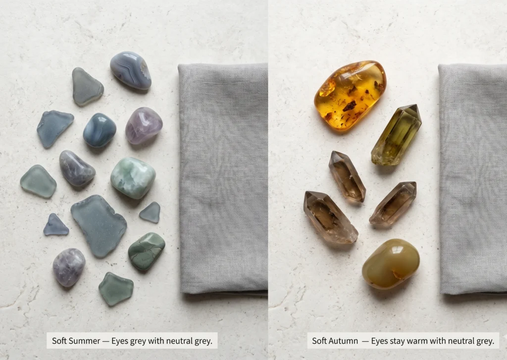
Eyes: Grey-blue, grey-green, grey-hazel, or muted cool brown. The defining quality is a grey overlay on the iris — the eyes appear to take on a grey cast when neutral grey is held near the face. Not vivid or bright. The cool or grey quality is visible even in warm-toned light.
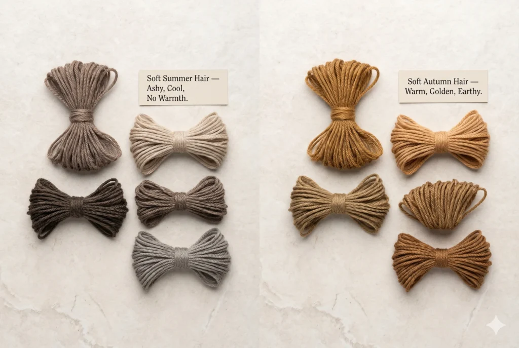
Hair: Medium ash blonde, light to dark ash brown. Always ashy and cool — the absence of golden or red pigment is the key indicator. In sunlight, may develop ashy rather than golden highlights. Grey hair integrates seamlessly.
Skin surface: Cool-neutral to neutral-cool. A pink or ashy quality to the surface tone. The skin may show visible blue-pink in under-eye shadows and at the lips. Tans cool pinkish-fawn rather than warm golden bronze.
Contrast: Low to medium — the lowest contrast of the Summer sub-seasons. Hair, skin, and eyes blend together into a harmonious muted whole. The overall impression is quiet and softly cool.
Soft Autumn — Physical Patterns
Eyes: Warm hazel, olive-green, soft warm brown, or occasionally warm grey-blue. The defining quality is an earthy or golden warmth in the iris — the eyes appear to warm rather than grey when neutral grey is held nearby. Hazel eyes are particularly common.
Hair: Golden brown, warm light-to-medium brown, dark warm blonde, occasionally warm ash brown with golden quality. Some red, copper, or warm amber undertone to the natural colour. Not purely ashy — a warmth is present even in darker hair.
Skin surface: Neutral-warm to warm-neutral. A golden, peach, or warm olive quality to the surface. Tans to a warm golden-fawn rather than a cool pinkish tone. May have a natural warmth or golden glow in certain lights.
Contrast: Low to medium — similar to Soft Summer. Hair, skin, and eyes blend together. The difference is in the warm quality of the blend rather than the depth of the contrast itself.
Practitioner’s Note — The Eyes Are the Fastest Read
“In clinical drapting, the grey eye test (holding a neutral grey fabric near the face and observing the eyes) is one of the most reliable quick indicators for separating these two seasons. Soft Summer eyes grey out — they develop a visible grey cast, enhancing their grey-blue or grey-green quality. The grey resonates with the cool grey pigmentation already present. Soft Autumn eyes stay warm — they remain hazel, olive-warm, or soft amber-brown when grey is introduced. The grey conflicts with the warm pigmentation rather than harmonising with it. This single test takes under 30 seconds and resolves ambiguity faster than most longer methods.”
4 Clinical At-Home Tests
These four tests directly target the Soft Summer vs Soft Autumn distinction. Perform all four in natural daylight, without makeup. Note the result of each, then read the pattern at the end.
01
The Cool Dusty Rose vs Warm Dusty Peach Test
Natural daylight · Two muted fabrics needed · Both same value and saturation
This is the most diagnostic test for these two seasons because it isolates temperature within the same saturation level. You need two fabrics of equal mutedness — one cool-dusty (dusty rose, grey-lavender, or muted mauve) and one warm-dusty (dusty peach, warm nude-pink, or muted terracotta). Hold each alternately near your face in natural daylight and observe the skin’s response.
The Nature Analogy for This Test
Imagine holding a piece of dried lavender (cool, grey-purple) near your face, then replacing it with a dried apricot petal (warm, dusty peach). Both are beautifully muted. Neither is vivid. But they point in opposite temperature directions. Your skin will align with one and faintly resist the other — the alignment creates luminosity, the resistance creates a subtle flatness.
✓ Points to Soft Summer
The cool dusty fabric — dusty rose or grey-lavender — makes your skin look more even, clearer, and lifted. The warm dusty peach introduces a slight yellow or sallow quality, or just reads as slightly “off” without being dramatically wrong.
✓ Points to Soft Autumn
The warm dusty peach or terracotta makes your skin look warmer, more glowing, and harmonious. The cool dusty rose drains a subtle warmth from the face — the skin may look slightly flat or washed of its natural glow.
02
The Grey Eye Test
One neutral grey fabric · Natural daylight · Mirror needed
Hold a plain neutral medium-grey fabric (not blue-grey, not warm-grey — genuinely neutral, like a classic grey jersey) near your face in natural daylight and look at your eyes in a mirror. This test is described in detail in the Am I a Soft Summer? guide, but it is equally relevant here as a thermal direction indicator.
✓ Points to Soft Summer
Your eyes take on a greyish quality — they grey out, regardless of their base colour. Grey enhances and resonates with the cool grey pigmentation present in Soft Summer colouring. The grey fabric looks natural against the face.
✓ Points to Soft Autumn
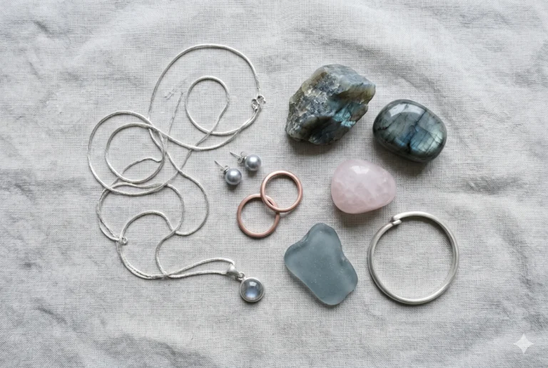
Your eyes remain warm — hazel, olive, or amber-brown — and the grey fabric looks slightly discordant rather than harmonious. The grey neither enhances the eyes nor works with the warm, golden pigmentation of Soft Autumn colouring.
03
The Silver vs Warm Gold Test
Two different metals needed · Natural daylight
Both Soft Summer and Soft Autumn look their worst in vivid, high-contrast metals. But their best metals differ. Hold a clearly silver piece of jewellery (or silver-coloured fabric) and a warm yellow-gold piece alternately near your face in natural daylight. Note the skin’s response — not which you prefer aesthetically, but which makes the face look more even, healthy, and aligned.
✓ Points to Soft Summer
Silver (especially brushed or matte silver) makes the skin look clearer and more even. Warm yellow gold introduces a slight yellow or sallow quality. Silver does not need to be brilliant — brushed silver is ideal.
✓ Points to Soft Autumn
Warm yellow gold or bronze creates an immediate warm glow — the skin looks more alive and luminous. Silver reads as cool and slightly stark. Gold does not need to be bright — antique gold, brushed bronze, and warm rose gold all work.
04
The Dusty Terracotta Test — The Decisive Separator
One warm muted earthy fabric · Natural daylight
This is the single fastest test for separating these two seasons, based on observing what happens when a warm muted earthy colour — specifically a dusty terracotta (warm, muted orange-red) — is placed near the face. This colour is central to the Soft Autumn palette and entirely absent from the Soft Summer palette for a reason that becomes physically visible the moment you test it.
Hold a fabric in dusty terracotta (a muted, earthy, warm orange-red — think dried autumn leaves, not vivid orange) near your face under natural daylight.
✓ Points to Soft Summer
Dusty terracotta introduces a yellow or sallow quality to the skin — the face picks up the warm orange-earth base of the colour and reads as slightly unwell or dull. This is the Soft Summer’s fundamental incompatibility with warm earthy hues, even muted ones.
✓ Points to Soft Autumn
Dusty terracotta makes the skin look warm, healthy, and dimensional. The warm earthy base of the colour resonates with the golden undertone of Soft Autumn skin. This is the Soft Autumn’s signature colour performing exactly as intended.
Why Terracotta Is the Best Diagnostic Colour
Terracotta is unambiguously warm and earthy — it sits at a specific point on the warm side of the spectrum where a Soft Autumn will find clear resonance and a Soft Summer will find clear resistance. Because both seasons are muted, the response is not dramatic — it is subtle. But it is visible and consistent. No other single colour differentiates these two seasons as reliably as dusty terracotta.
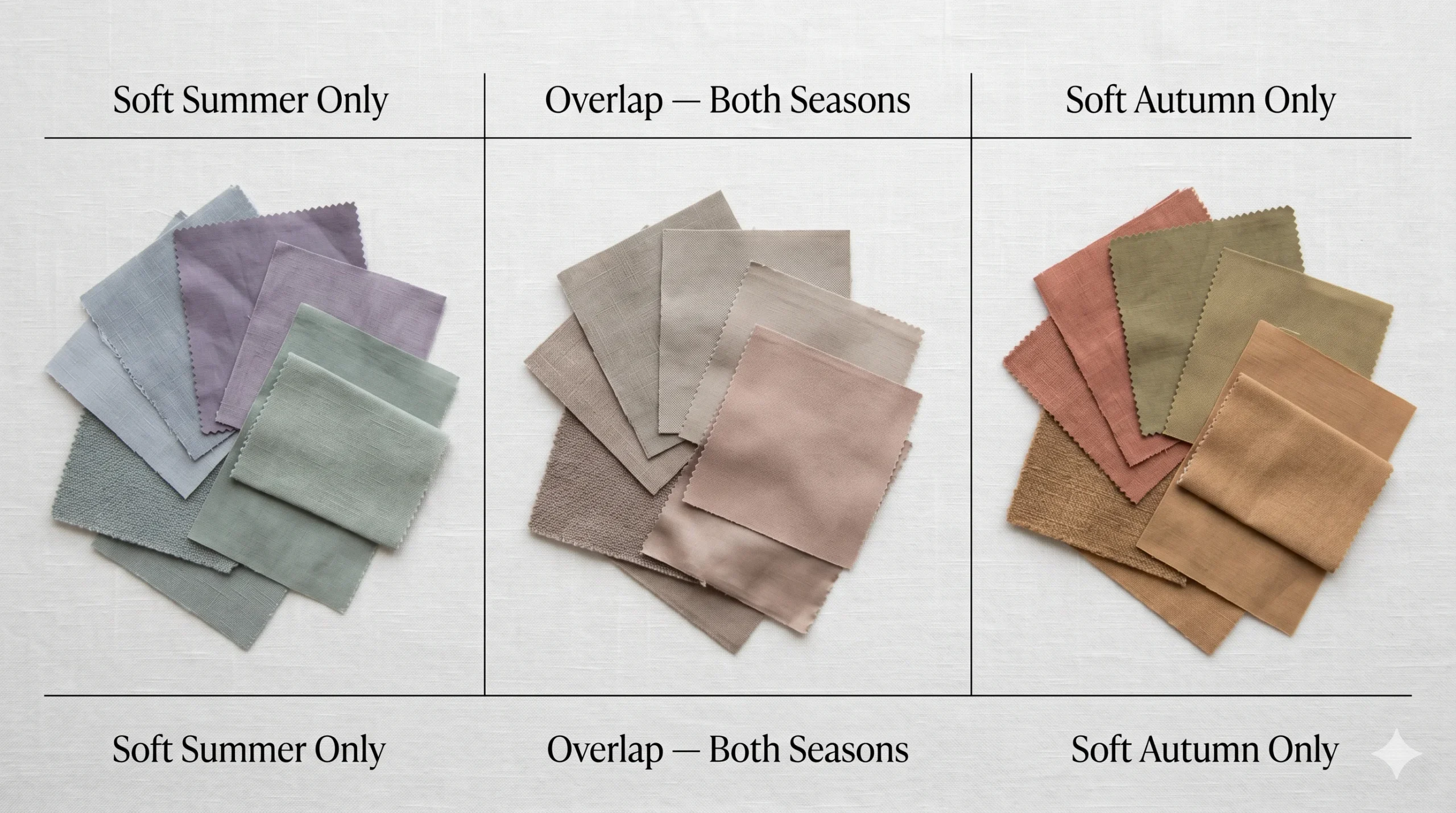
The Soft Summer–Soft Autumn Overlap Zone
One of the most common questions about this comparison: “Why do I seem to look good in both palettes? Can I be between the two?”
This question has a precise answer. Soft Summer and Soft Autumn are sister seasons — they share their primary characteristic (mutedness) and sit adjacent to each other on the seasonal flow. This means there is a narrow band of colours — mostly deeply neutral, very low-saturation shades — that sit close enough to the thermal midpoint to work across both seasons.
Deeply muted neutral taupes
— where the warmth is so reduced by grey that the colour sits at the thermal midpoint and neither confirms nor denies undertone.
Very muted grey-beiges
— where the warmth and cool qualities are so balanced that both seasons can absorb the colour without visible conflict.
Very muted grey-beiges
— where the pink-cool of Soft Summer and the warm-dusty of Soft Autumn both find partial resonance.
These overlap colours exist, but they represent the neutral midpoint of both palettes — not the most flattering colours for either season. Both seasons perform better in their distinctive signature colours (the cool greyed-blue for Soft Summer, the warm dusty terracotta for Soft Autumn) than in the shared overlap neutrals. The fact that some colours work across both does not mean the seasons are interchangeable — it means they share a narrow neutral zone at their shared boundary. By the way are you familiar with true summer color palette ?
Practitioner’s Note — On Being “Both”
“I regularly work with clients who have successfully worn both Soft Summer and Soft Autumn colours for years, and they are often sceptical that their season is one over the other. What I consistently observe in these cases is: the overlap colours work for them because those colours are genuinely neutral. But the distinctive signature colours — the dusty terracotta, the slate blue-grey, the warm camel, the smoky lavender — create a visible difference. One set makes the face luminous. The other set does not actively harm but simply does not serve. Knowing your home season is about identifying where maximum harmony lies, not just where minimum conflict exists.“
Styling — Wardrobe, Makeup, Hair, and Metals
Wardrobe — The Neutrals Tell the Story Fastest
Both seasons need to replace black (too stark for either muted palette) and bright white (too high-contrast for both). But what they replace these with is entirely different, and this is one of the fastest ways to sense which palette is yours.
Soft Summer Wardrobe
Dark neutral: Soft charcoal with a blue-grey quality, dark grey-blue, deep cool greige. Not warm brown, not warm navy.
Light neutral: Cool soft parchment, pale grey, cool ivory. Not warm cream, not golden beige.
Signature accent: Dusty rose, smoky lavender, muted sage. Colours that have grey as their primary modifier.
Fabric texture: Linen, brushed cotton, matte wool flannel, soft suede. Matte surfaces that reduce perceived chroma — the palette’s character is furthered by non-shiny textures.
Do read our helpful guide on soft summer hair color .
Soft Autumn Wardrobe
Dark neutral: Warm brown, dark warm taupe, deep warm camel, soft rust. Not cool grey, not blue-charcoal.
Light neutral: Warm cream, soft oatmeal, warm ivory. Not cool parchment, not grey-white.
Signature accent: Dusty terracotta, muted olive, warm peach-blush. Colours that have golden or earthy warmth as their primary modifier.
Fabric texture: Wool bouclé, suede, brushed velvet, textured linen. Warm, natural, slightly rough textures that echo the earthy organic character of the palette.
Makeup — Where the Difference Is Most Immediately Visible
Soft Summer Makeup
Foundation: Cool-neutral to neutral. The undertone must be cool or genuinely neutral — never warm or yellow-toned.
Blush: Dusty mauve-pink, cool greyed rose, muted cool berry. The blush should disappear into the skin and appear to be natural flushing rather than an added colour.
Lips: Dusty rose, muted cool berry, soft mauve, cool pinky-nude. Nothing warm, nothing orange-based.
Eyes: Greyed taupe, soft mauve, slate grey, muted cool brown. The eyeshadow should feel greyed and cool — not warm or golden.
Check our complete master guide on Soft summer makeup .
Soft Autumn Makeup
Foundation: Neutral to warm-neutral. The undertone should carry warmth — neutral-warm or warm foundations will harmonise better than cool-pink toned ones.
Blush: Warm peach, soft cinnamon, warm dusty rose with peach base, muted terracotta blush. The warmth makes the skin glow rather than reading as added colour.
Lips: Muted terracotta-nude, warm peachy pink, warm muted berry, dusty warm rose. Cool nudes and pinks will drain the warm quality of the complexion.
Eyes: Warm taupe, warm brown, caramel, muted warm olive, soft warm terracotta. Warm earthy eyeshadow tones are what make Soft Autumn eyes look dimensional.
Hair Colour — The Warm Test
Medium to dark ash blonde, light ash brown, dark ash brown. No golden, warm, or red tones — these introduce the warm undertone that conflicts with the cool biology of the season. Grey hair integrates naturally because grey is a core Soft Summer colour. If highlighting: the coolest, most ashy blonde available — “mushroom,” “mocha,” or “cool caramel” descriptions. Avoid anything called “honey,” “golden,” “warm brunette,” “auburn,” or “copper.”
Soft Autumn hair:
Warm light to medium brown, golden brown, warm dark blonde, occasionally warm ash brown where the golden quality is still present. Highlights in warm golden blonde, light caramel (genuinely warm, not cool), or warm copper-brown. Grey hair may slightly reduce the characteristic warmth of the colouring — warm highlight tones near the face can restore the season’s natural glow. Avoid overly ashy or cool-toned hair colours, which drain the warm quality of the face.
Soft Summer vs Soft Autumn Across All Skin Depths
The Soft Summer vs Soft Autumn distinction is frequently illustrated with a narrow range of light-to-medium skin tones. This represents only a fraction of the people who belong to these seasons. Both seasons occur across all skin depths — the distinction between them is undertone and chroma, not depth.
Depth Range
Soft Summer at This Depth
Soft Autumn at This Depth
Cool-Fair (Fitzpatrick I–II)
Cool pinkish or blue-pink undertone visible at the surface. Skin may show lavender in under-eye shadow. Hair ashy. Freckles cool grey-brown if present.
Warm peachy or golden undertone visible at the surface. Skin may show a warm golden glow in natural light. Hair warm-toned even if light. Freckles warm golden-red if present.
Cool-Medium / Olive-Cool (Fitzpatrick III–IV)
“Not warm olive” — the olive has a grey-blue bias rather than a golden-green bias. Silver looks natural. Cool muted tones prevent the grey-olive from reading sallow.
“Warm olive” — the olive has a golden-green quality. Gold looks natural. Warm muted earthy tones bring out the skin’s golden undertone without creating a conflict.
Cool-Deep / Deep-Cool (Fitzpatrick V–VI)
Rich deep skin with a blue-cool undertone. The shadow areas of the face (jawline, temples) carry a cool blue-grey quality. Cool muted tones harmonise; warm earthy tones may introduce a slight orange cast against the cool-deep skin.
Rich deep skin with a warm undertone — may appear as a warm red-brown, golden-brown, or warm deep olive. The shadow areas carry warmth rather than cool blue. Warm muted earthy tones harmonise and make the face glow; cool tones can flatten or grey the skin.
Note on Testing at Deeper Skin Depths
The drape tests above work at every skin depth — they test the skin’s response to external colour rather than its own visible undertone markers. At deeper Fitzpatrick levels, the dusty terracotta test (Test 4 above) is particularly reliable: the skin’s response to this warm earthy hue is visible at every depth and provides a clear cool vs warm signal regardless of the skin’s overall depth. The grey eye test also works at deeper depths because the warm pigments of Soft Autumn eyes resist the grey quality regardless of skin depth.Also get to know about True summer color palette.
The Complete Side-by-Side — All Dimensions
|
Dimension |
Soft Summer |
Soft Autumn |
|---|---|---|
|
Season family |
Summer (the darkest/most muted Summer) |
Autumn (the lightest/most muted Autumn) |
|
Primary characteristic |
Muted (soft, low chroma) |
Muted (soft, low chroma) |
|
Secondary characteristic |
Cool (blue-grey base) |
Warm (golden-earthy base) |
|
Thermal undertone |
Cool — blue or grey-pink at the base of every colour |
Neutral-warm — golden or amber at the base of every colour |
|
Chroma level |
Low — most muted of the Summer sub-seasons |
Low — most muted of the Autumn sub-seasons |
|
Value (depth) |
Medium — darkest of the Summer family |
Medium — lightest of the Autumn family |
|
Eye quality with grey fabric |
Greyed out — eyes enhance their grey quality |
Stay warm — eyes remain hazel/olive/warm-brown |
|
Best metal |
Silver (brushed/matte), white gold, muted rose gold (pink bias) |
Warm yellow gold (brushed/antique), bronze, warm rose gold |
|
Signature neutral |
Cool greige, blue-charcoal, soft parchment |
Warm taupe, camel, oatmeal, warm cream |
|
Signature accent colour |
Dusty rose, smoky lavender, muted sage |
Dusty terracotta, muted olive, dusty peach |
|
Most diagnostic test colour |
Dusty terracotta — skin pulls yellow/sallow (confirms Soft Summer by failing) |
Dusty terracotta — skin glows warm (confirms Soft Autumn by succeeding) |
|
Palette natural scene |
Misty coastal dawn — grey sea, pale lavender sky, ashy sand |
October woodland morning — golden fog, earthy leaves, warm moss |
|
Sister season |
Soft Autumn (shared primary: muted) |
Soft Summer (shared primary: muted) |
Frequently Asked Questions
What is the main difference between Soft Summer and Soft Autumn?
The single deciding difference is thermal undertone. Both seasons share the same primary characteristic — mutedness — and both sit at the lowest chroma point of their respective families. But Soft Summer is cool-dominant: its colours carry a grey or blue-pink base. Soft Autumn is neutral-warm: its colours carry a golden or earthy base. This one axis determines everything from which neutrals work, to which metals flatter, to which makeup tones perform best.
Is Soft Autumn warmer than Soft Summer?
Yes. Soft Autumn is warmer than Soft Summer. Soft Autumn sits within the Autumn season family and carries a neutral-warm undertone — its colours contain golden, amber, or earthy warmth at their base. Soft Summer sits within the Summer family and carries a neutral-cool undertone — its colours contain grey or blue-pink undertones. Both palettes are equally muted in saturation, but they travel in completely opposite thermal directions.
Can someone be both Soft Summer and Soft Autumn?
In the 16-season framework, each person has one home season. However, as sister seasons sharing a primary characteristic (mutedness), Soft Summer and Soft Autumn sit adjacent to each other on the seasonal spectrum. This means there is a narrow overlap zone of deeply neutral, very low-saturation shades that work across both. But the home season is always one, and identifying it correctly unlocks the full depth of the palette — the overlap zone represents the least distinctive colours in both palettes, not the most flattering.
What are the best colours for Soft Autumn vs Soft Summer?
Soft Summer best colours: dusty rose, soft grey-lavender, muted sage green, slate blue-grey, smoky mauve, cool greige. Avoid: warm earthy tones, golden yellow, terracotta, camel, warm coral, and black. Soft Autumn best colours: muted terracotta, warm taupe, dusty peach, olive green, soft camel, warm muted gold. Avoid: cool grey tones, icy blues, blue-pink hues, stark white, and bright black.
Soft summer vs soft autumn — which is more common?
Both are among the most common seasons in colour analysis, particularly in regions with Northern European, East Asian, Middle Eastern, and South Asian heritage demographics. Neither is significantly rarer than the other. What is statistically notable is that the Soft Summer–Soft Autumn boundary is one of the most frequently debated distinctions in the colour analysis community — not because one is rarer, but because the shared mutedness of both seasons makes the test of thermal undertone subtle enough to require deliberate testing rather than casual observation.
Soft summer vs soft autumn hair — what is the difference?
Soft Summer hair is always ashy, cool, and free of golden or red pigment — ash blonde, ash brown, mousy brown, cool dark brown. Soft Autumn hair carries a warm quality — warm light brown, golden brown, warm dark blonde, occasionally warm copper-brown. The single most reliable hair indicator: how do golden highlights look at the face? On a Soft Summer, warm golden highlights create a subtle conflict with the cool skin. On a Soft Autumn, warm golden highlights make the skin look more luminous and harmonious.
Your Implementation Task
After This Guide — Three Steps
The distinction between Soft Summer and Soft Autumn is real, measurable, and practically significant. Here is the exact sequence to confirm it for yourself:
Run the four tests in order above in natural daylight without makeup. All four. Not just the one that seems easiest. The pattern across all four is more reliable than any single test — particularly in a comparison this subtle.
The decisive test, if still uncertain: Dusty terracotta fabric near the face, natural daylight, no makeup. This single test resolves the majority of genuinely ambiguous cases because it targets the most diagnostic thermal distance between the two seasons. Yellow-sallow reaction confirms Soft Summer; warm luminous reaction confirms Soft Autumn.
Download the correct palette card: Soft Summer (36 colours with cool grey-based hues, hex codes, Munsell references) or Soft Autumn (36 colours with warm earthy-golden hues). The palette card is the practical tool — it makes every wardrobe and makeup decision faster and more accurate, at the point of purchase rather than after the fact.
You may also read our light summer vs. soft summer differences guide , also If the soft summers vs soft autumn question remains genuinely unresolved after all four tests, the most common reason is a genuinely neutral undertone — neither distinctly cool nor distinctly warm. Professional colour analysis under controlled drapting conditions is the most reliable resolution for boundary cases. The distinction is real; it just sometimes requires a calibrated environment and trained eye to see clearly. Check our soft summer color palette hub with all the 36 colors mentioned.