Slate Blue — The Soft Summer Neutral One Shade Deeper Than Fog
— A Colour Analyst’s Case for #B8BEC9 in the Soft Summer Palette
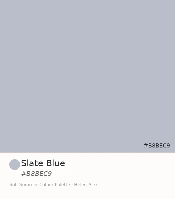
#B8BEC9 reads as an ordinary grey-blue until you measure it. Once you do, it settles into a specific, repeatable position — a textbook Soft Summer slate blue, one value step deeper and one degree more muted than its lighter sibling.
Quick answer, if you’re short on time
Slate Blue (#B8BEC9) is an official Soft Summer neutral. Its Munsell profile — medium-light value, very low chroma, cool blue-violet hue — sits inside Soft Summer’s muted family, deeper and slightly cooler than Misty Blue-Grey, and well outside True Summer’s clearer blues or Light Summer’s higher-value pastels. In a Soft Summer wardrobe, it works as a restful anchor in place of black.
The Analyst Perspective — Reading #B8BEC9 on the Munsell Scale
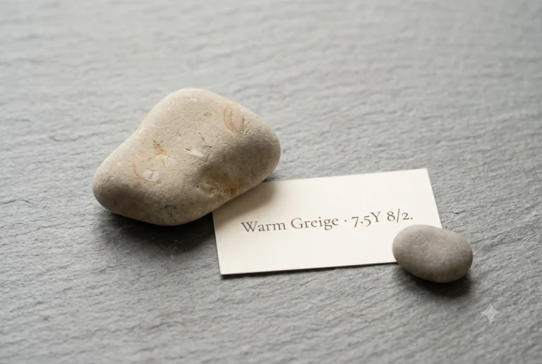
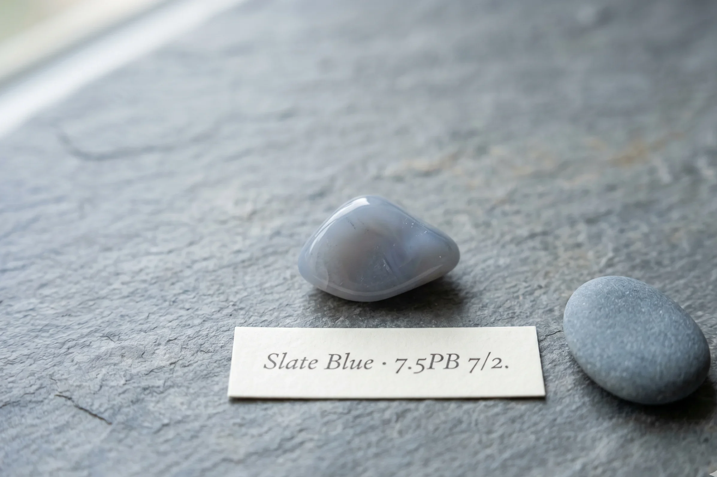
Strip away the name and look only at the numbers. #B8BEC9 converts to roughly Munsell value 7, chroma 2, in a cool blue-violet hue family — medium-light value, heavily desaturated chroma.
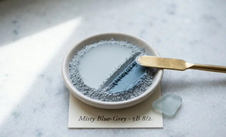
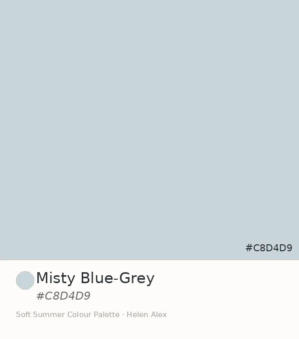
That value sits a full step below Misty Blue-Grey’s lighter 8, and the hue leans slightly more violet than cyan. Together, those two facts anchor slate blue firmly inside Soft Summer’s core register, not its lightest edge.
A colour doesn’t get to call itself neutral just because the eye says so. The chroma reading settles the argument before the conversation even starts.
e one thing fog never does — it tells you exactly how little colour is actually there.
Sits one value step under Misty Blue-Grey and a touch more blue than grey — isolated next to true grey, the violet undertone admits itself.
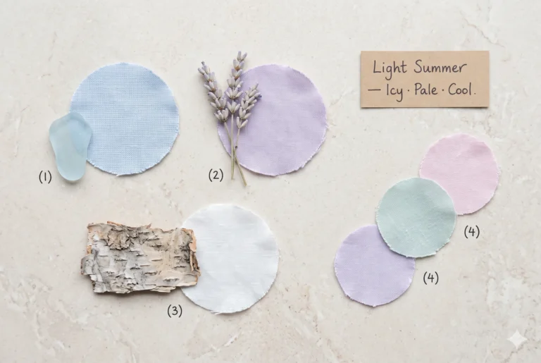
This is also where slate blue separates from its closest cool-family neighbours. True Summer holds a higher chroma — cleaner, more clearly blue. Light Summer holds Soft Summer’s same low chroma at a noticeably higher, more pastel value.
Slate Blue
Value 7 · Chroma 2 — deeper, blue-violet
Misty Blue-Grey
Value 8 · Chroma 2 — lighter sibling, cyan-blue
True Summer
Value 7 · Chroma 4 — cleaner, clearer blue
Light Summer
Value 9 · Chroma 2 — same mute, far lighter
Four coordinates, one shared cool-muted family. Slate blue claims exactly one of them — the deeper, quieter end of Soft Summer’s own blue range, not a blend of the other three.
The Nature Perspective — Where This Colour Already Exists
If you’ve read the Soft Summer vs Soft Autumn comparison, you know Soft Autumn answers grey with a bark-brown hush and a thread of ochre underneath. Slate blue carries that same restraint, just held in Summer’s cooler key.
It also sits beside Misty Blue-Grey as a sibling, not a duplicate — same family, one register deeper.
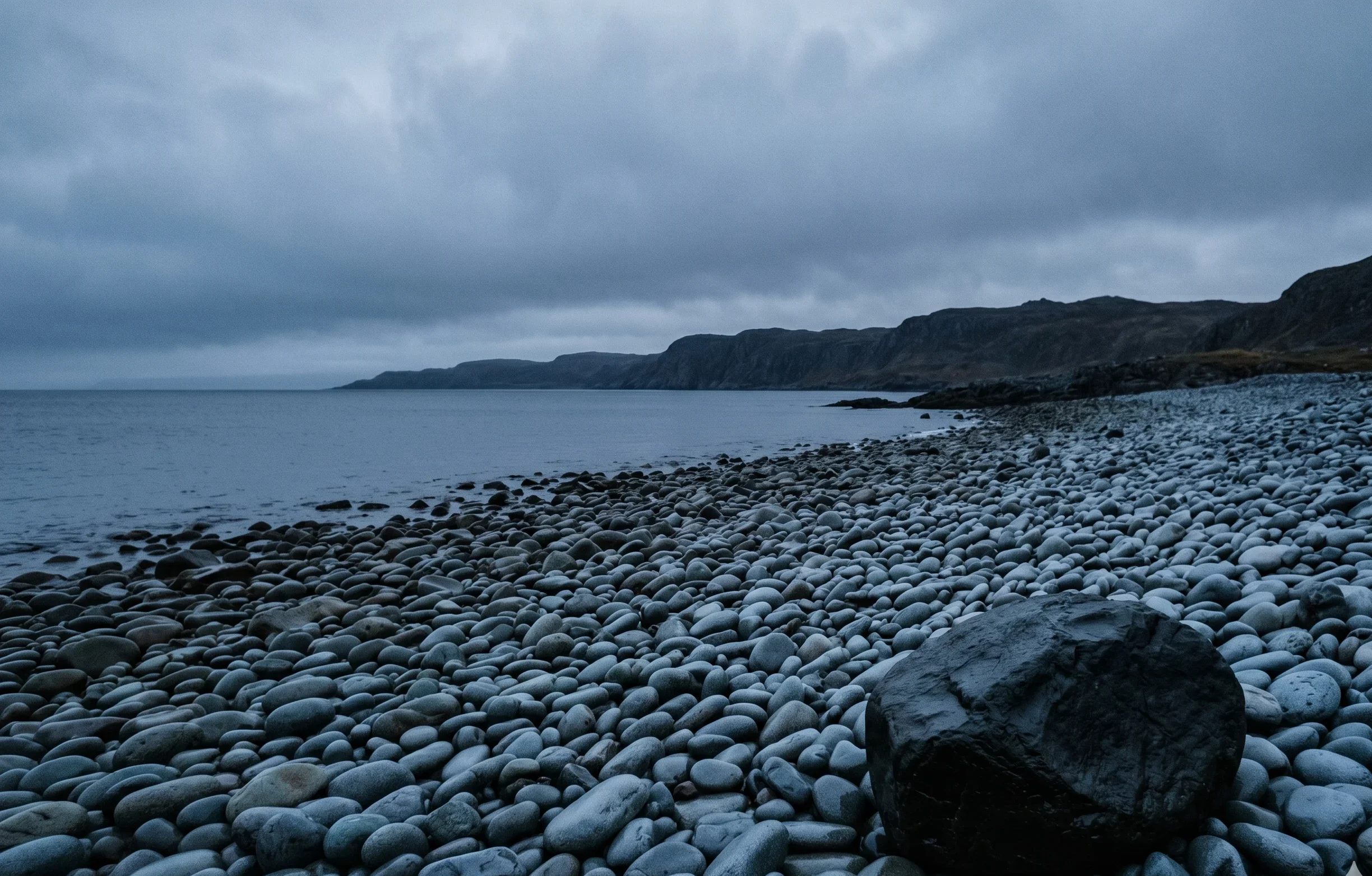
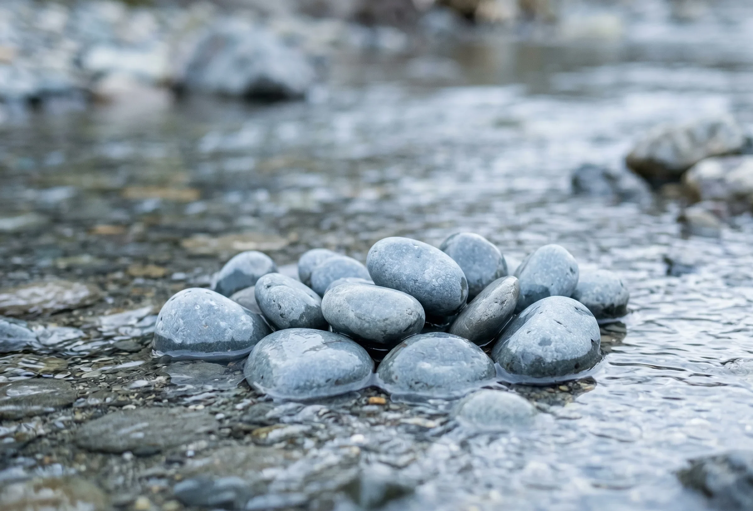
Picture weathered stones on a quiet shoreline as evening settles — no sun left to warm them, just the steady grey-blue they hold on their own. That held colour, with no light adding anything to it, is slate blue exactly as it exists outdoors.
Evening light doesn’t add weight to stone — it just stops arguing with the colour that was already there.
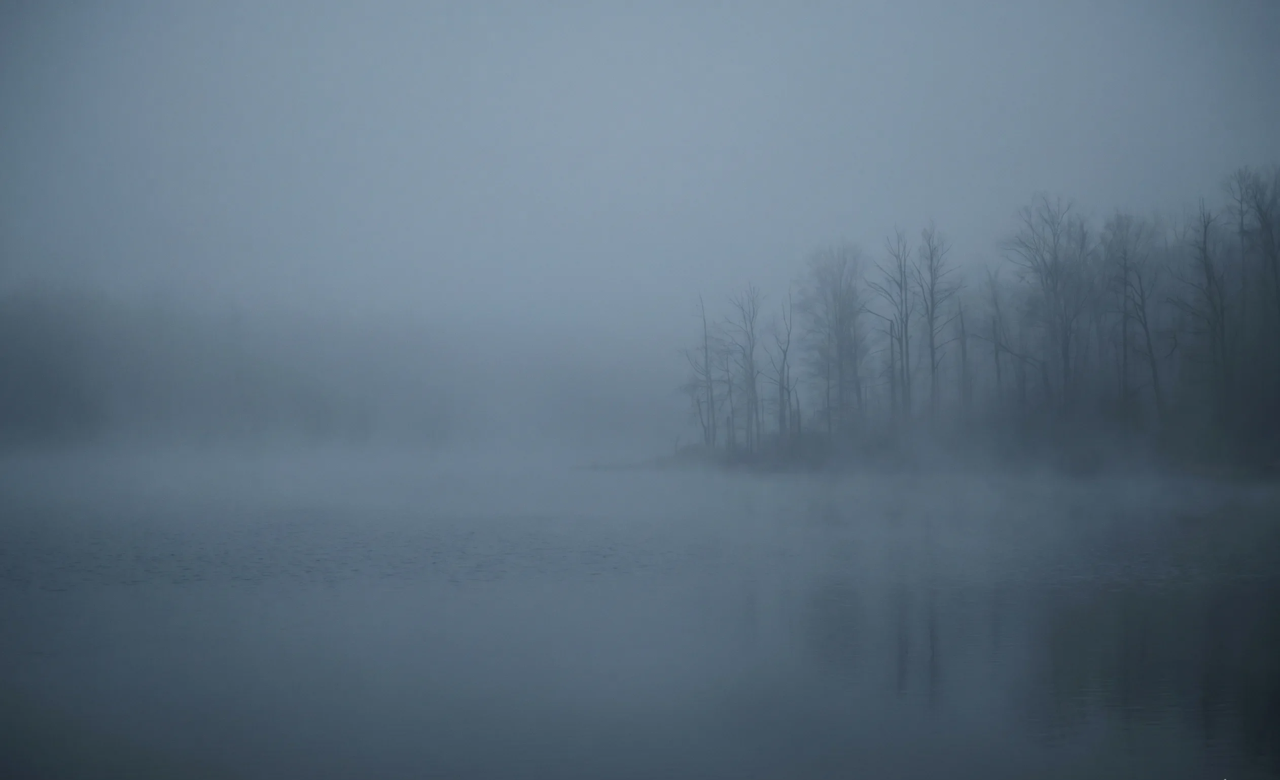
This isn’t a pigment colour. It’s what light looks like after travelling through moisture and losing its edges — an atmospheric tint, not a paint-chip colour.
The Wardrobe Perspective — A Restful Anchor, Not a Stark Neutral
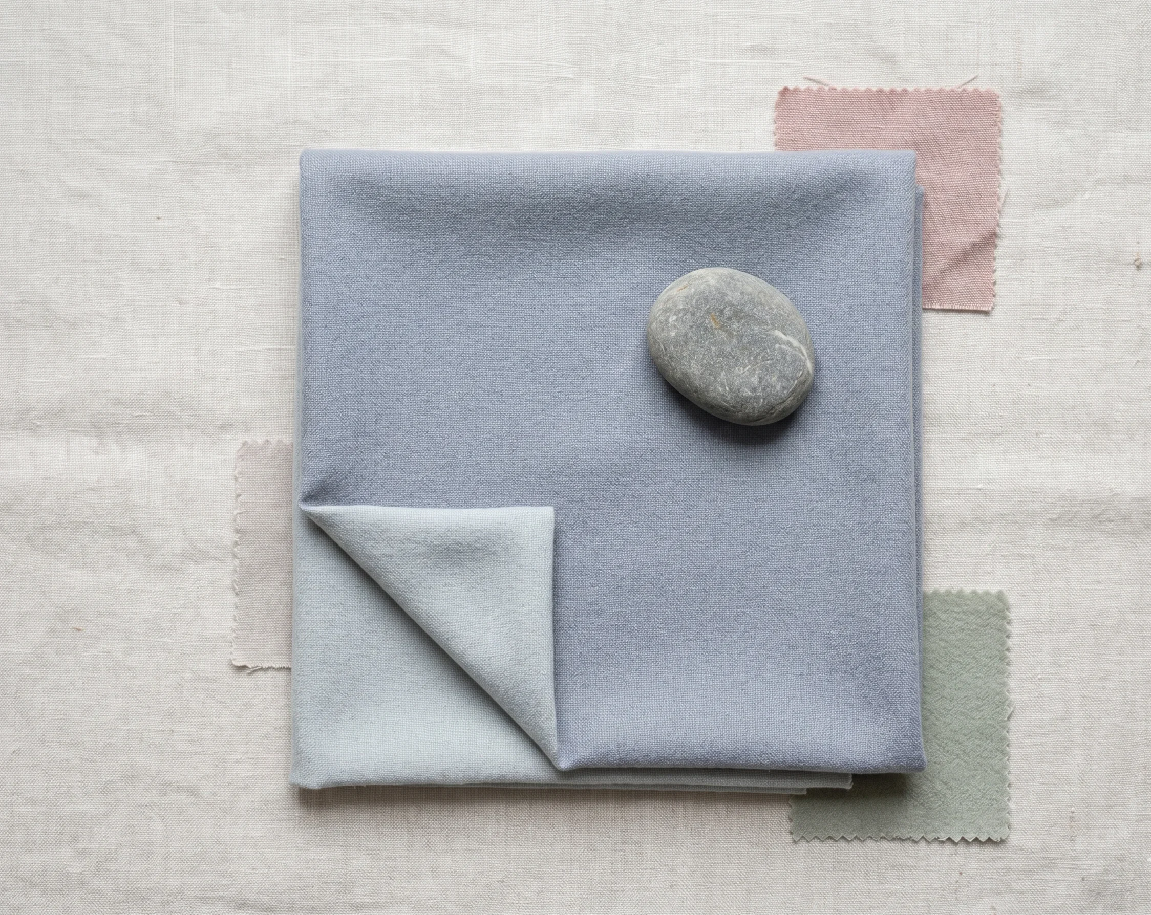
In a Soft Summer capsule wardrobe, the role usually given to black asks for more contrast than this colouring naturally carries. Optic white asks for the same thing from the opposite direction.
Slate blue functions instead as a restful anchor — present enough to ground an outfit, quiet enough to leave the wearer’s own low-contrast, blended biological features fully visible.
Slate blue doesn’t ask to be noticed first. It simply removes the one thing — stark contrast — that would otherwise compete with the face above it.
🩶 Practitioner Note — Melanin Calibration
In my drapting sessions, slate blue’s cool-neutral undertone reads consistently across Soft Summer’s full Fitzpatrick range, from II through V. What shifts at deeper skin depths is the contrast relationship between skin and garment, not the colour’s own temperature — slate blue stays cool and muted at every depth within the season, with no separate rule required.
Final Validation — Why Slate Blue Belongs
Three readings, one answer. The Munsell numbers confirm cool, muted, medium-light — one step deeper than Misty Blue-Grey, still well inside Soft Summer’s own register.
The coastal stone and the river pebble confirm it already exists exactly this way outdoors, with no warm light required to make it work.
The wardrobe role confirms it behaves the way Soft Summer’s low-contrast colouring needs a deeper neutral to behave — grounding, not competing.
Slate Blue IS a neutral swatch WITHIN the Soft Summer palette IN the 16-season framework — one value step deeper than Misty Blue-Grey, confirmed by theory, by nature, and by function.
Take a ride through our soft summer gallery !
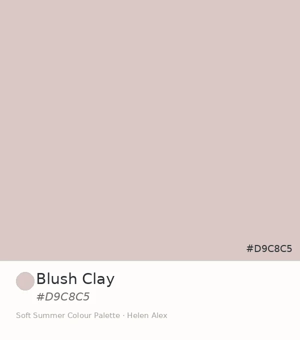
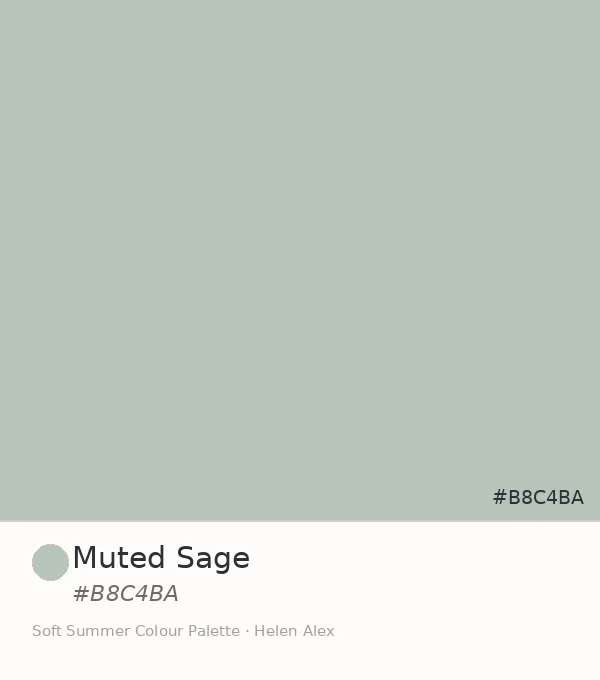
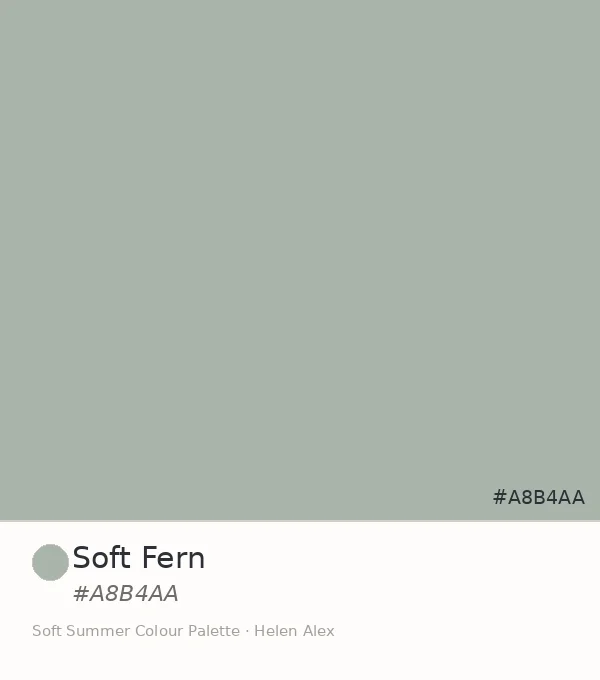
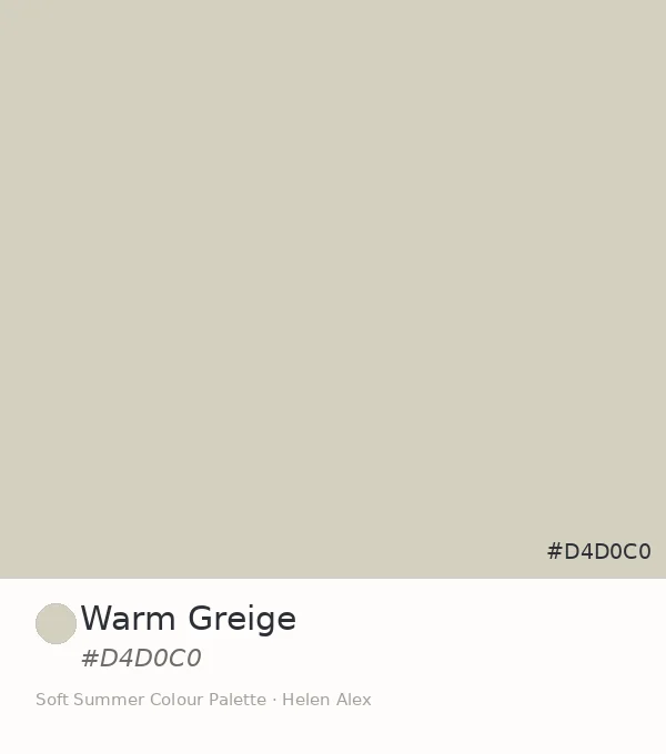
Frequently asked questions .
A Few Things People Ask Me
What is slate blue color?
Slate blue is a heavily desaturated, cool-neutral blue-violet, close to hex #B8BEC9. In the Sci/ART 16-season framework it sits inside the Soft Summer palette — Munsell value around 7, chroma around 2 — named for its resemblance to weathered grey-blue stone rather than any bright or clear blue.
What’s the difference between slate blue and dark slate blue?
Soft Summer’s slate blue sits at medium-light value with very low chroma — muted and quiet. Dark slate blue carries the same cool-violet hue at a notably lower value, closer to Soft Summer’s deepest accent range, and reads more like dusk than overcast daylight.
Is slate blue the same as Misty Blue-Grey?
No. Both are confirmed Soft Summer neutrals, but Slate Blue (#B8BEC9) sits one Munsell value step deeper and carries a slightly more blue-violet hue than Misty Blue-Grey (#C8D4D9), which leans closer to cyan-blue at a lighter value. They function as sibling tones, not duplicates.
What colors go with slate blue in a Soft Summer wardrobe?
Slate blue pairs naturally with Soft Summer’s other low-chroma neutrals and muted accents — dusty rose, soft sage, greyed lavender. The shared rule is chroma, not exact hue: any colour at Soft Summer’s muted saturation level sits comfortably beside it.
Does slate blue work for deeper Soft Summer skin tones?
Yes. The cool-neutral undertone direction holds across Soft Summer’s full Fitzpatrick range. At deeper skin depths the contrast relationship between skin and garment shifts, but slate blue’s temperature and chroma read the same way at every depth within the season.
Yours in colour, Helen
I’ve watched this exact swap save more wardrobes than any other single change — when black feels heavy and grey feels flat, slate blue is the depth in between. Try it before you buy anything new.
For the complete neutral and accent breakdown, see the Soft Summer Color Palette guide. To meet slate blue’s lighter sibling, read Misty Blue-Grey, Steel mist and soft lavender next.