Blush Clay Color (#D9C8C5): The Soft Summer Dusty Rose
Blush Clay —The Greyed Dusty Rose That Opens the Other Side of the Soft Summer Palette
Blush Clay Color (#D9C8C5): Soft Summer’s Dusty Rose Neutral
The previous five posts in this series introduced Soft Summer’s cool-blue and violet neutrals — a family that spans from cyan-blue through to pure violet at the same muted chroma level. This post crosses to the other side of the palette.
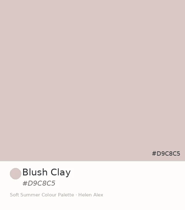
Blush Clay, hex #D9C8C5, is the first member of Soft Summer’s rose family. And it comes with a question that every introduction to a Soft Summer pink has to answer first.
If Soft Summer is a cool-neutral season, why does it have a pink that looks warm? The Munsell numbers answer that before the eye does.
Quick answer, if you’re short on time
Blush Clay (#D9C8C5) is an official Soft Summer neutral. Its Munsell profile — value 8.5, chroma 2, in the pink-red hue family (7.5RP) — confirms it as a greyed dusty rose at the lowest readable saturation. The grey content at chroma 2 absorbs the apparent warmth of the hue, making it read as cool-neutral in practice and placing it firmly inside the Soft Summer palette.
The Analyst Perspective — Why a Pink Belongs to a Cool-Neutral Season
The answer is in the chroma reading. #D9C8C5 converts to Munsell value 8.5, chroma 2, in the pink-red hue family at approximately 7.5RP — very high value, the lowest readable saturation, and a hue position that appears warm only because the hue family is warm.
At chroma 2, that warmth has been almost entirely absorbed by grey. The Soft Summer palette doesn’t avoid pink — it demands that pink appear at the same muted, grey-cast level as every other colour in the family. Blush Clay does exactly that.
Blush Clay is what pink looks like when it decides it would rather be a neutral than a colour.
#D9C8C5
Munsell ≈ 7.5RP 8.5/2
Reads as warm beside a cool grey — but the moment you set it beside True Autumn’s warm blush, the cool-neutral quality reveals itself immediately.
This is also where Blush Clay separates from what a warm-season pink looks like at the same lightness. Soft Autumn’s blush equivalents carry a peachy-apricot undertone that pulls distinctly warm. Soft Summer’s blush — this one — has had that peach rinsed out of it, leaving only the grey-rose that remains. (See the Soft Summer vs Soft Autumn guide for the full thermal comparison.)
Blush Clay ✦ new
Value 8.5 · Chroma 2 · 7.5RP — greyed rose
Soft Autumn blush
Value 8 · Chroma 4 · 5YR — peachy-warm
True Summer equiv.
Value 8.5 · Chroma 3 · 2.5R — slightly clearer
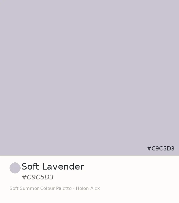
Soft Lavender
Value 8 · Chroma 2 · 5PB — cool-family sibling
Four coordinates, two sides of the palette. Blush Clay occupies the only confirmed rose position in the Soft Summer neutral family — the one that mirrors the cool-blue family in saturation discipline, but from the opposite hue direction.
The Nature Perspective — Where Blush Clay Already Exists
Soft Autumn’s version of this tone carries warm peach and aged amber — dusty rose rendered warm, the colour of terracotta seen through rose-tinted light. Blush Clay is the same territory approached from the cool side: the warmth rinsed out, the grey allowed in.
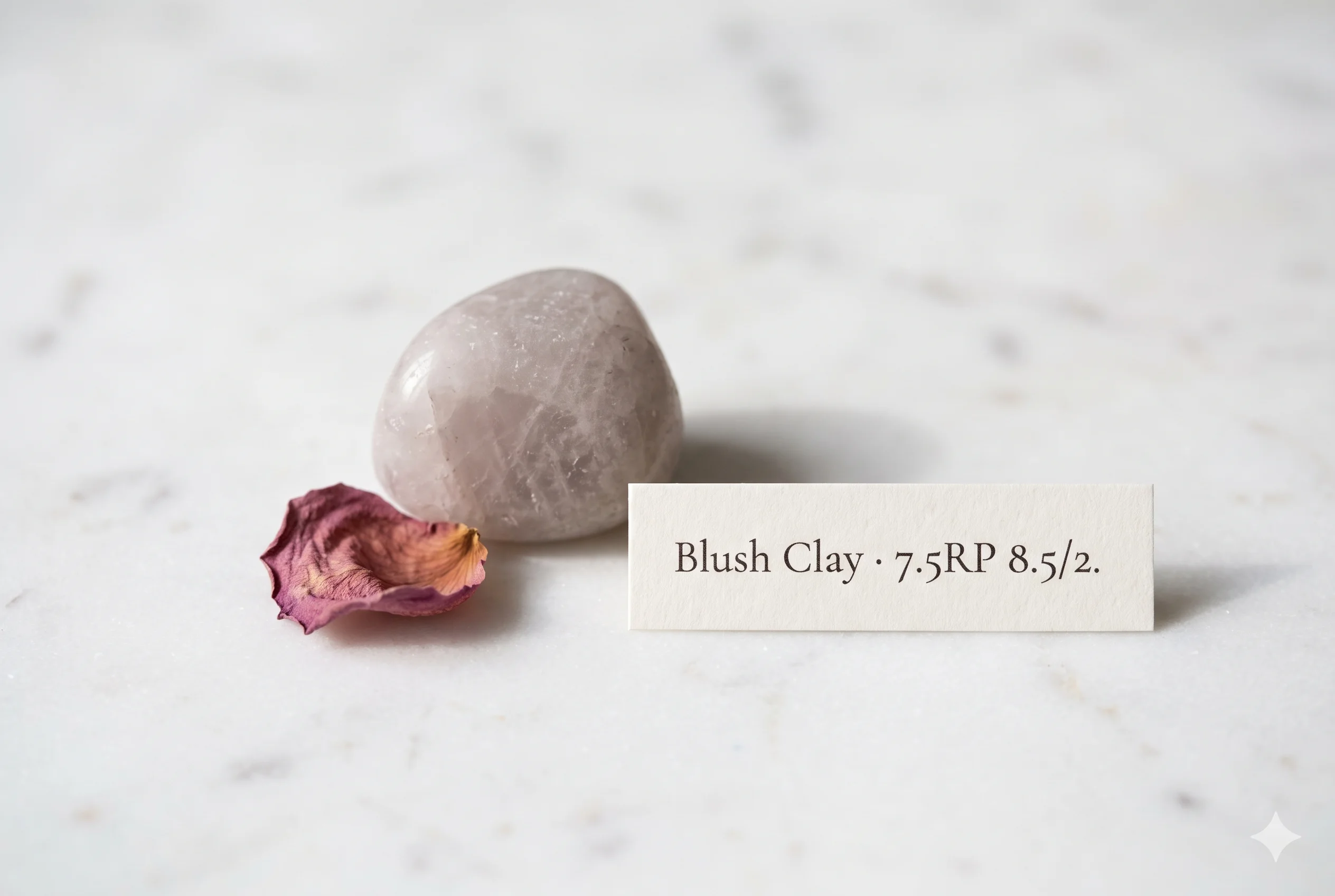
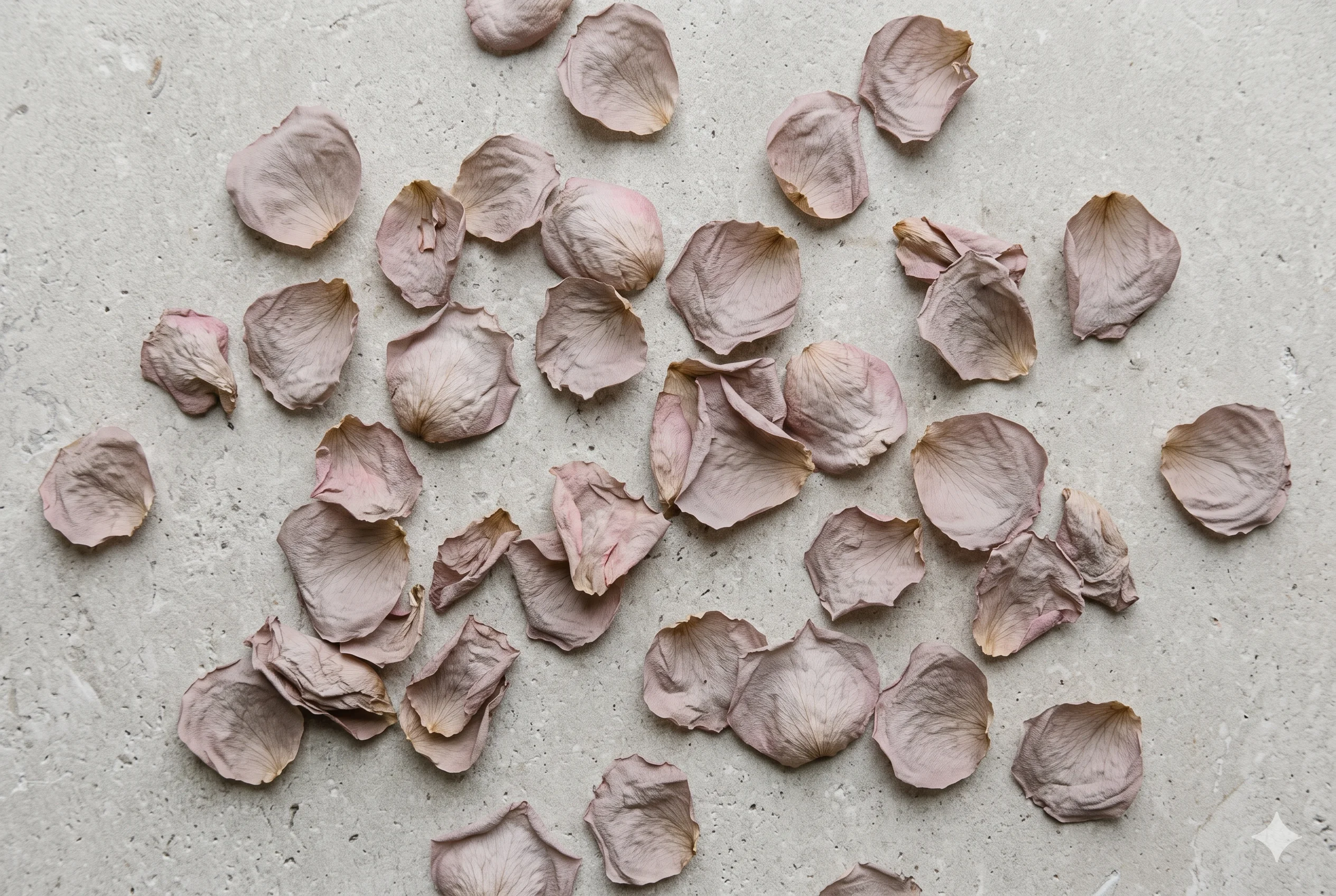
Think of a dried rose petal — not fresh, not the vivid pink of the moment it was cut, but what remains six months later on a windowsill where the light is flat and the air is cool. That greyed, dusty, barely-pink remnant is Blush Clay exactly. The rose is still there. It simply stopped insisting.
Dried rose petals are the purest natural example of what low chroma does to pink — the saturation leaves first, and what remains is this specific cool-neutral dusty tone. No warmth, no vibrancy. Just the afterimage of pink, held in grey.
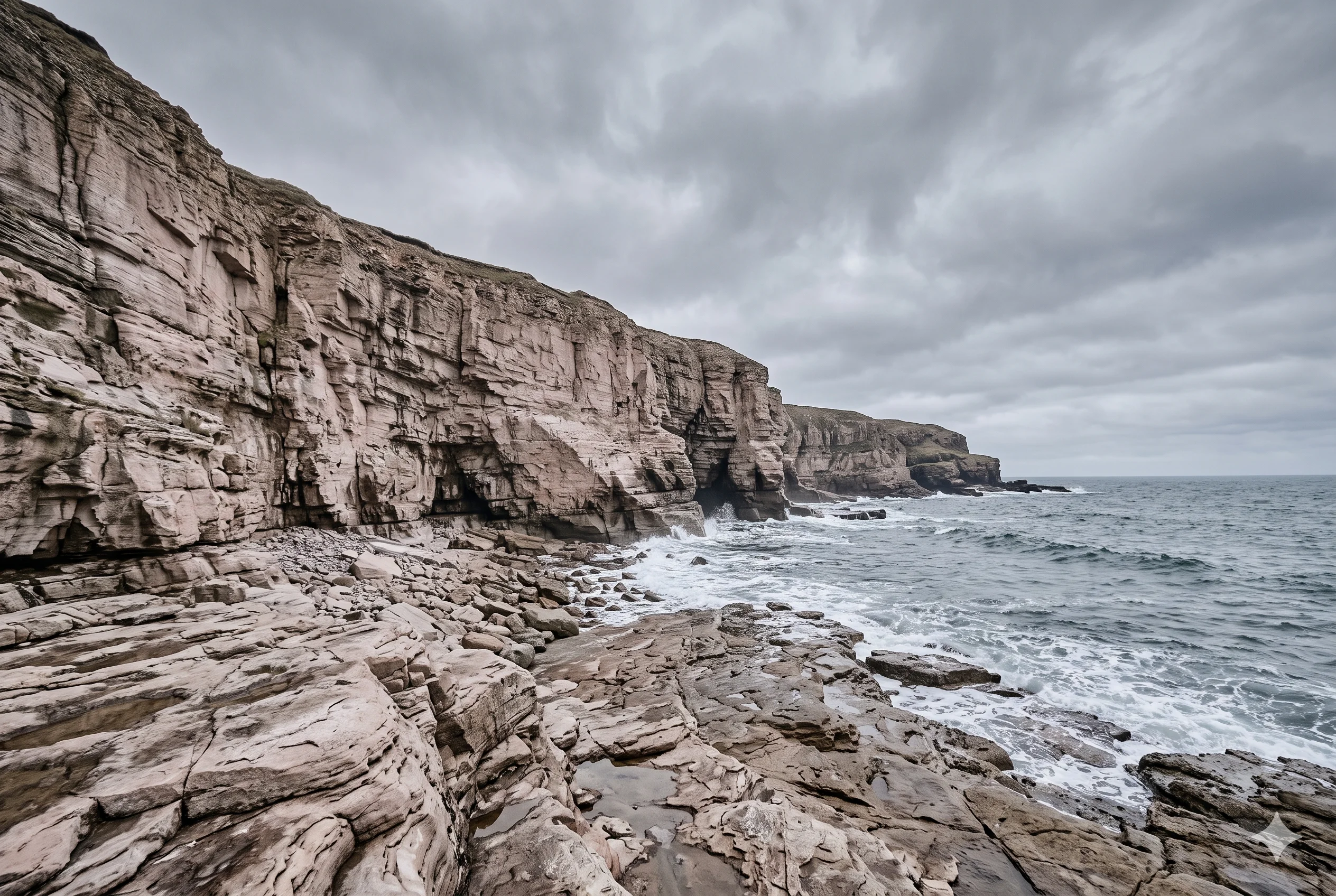
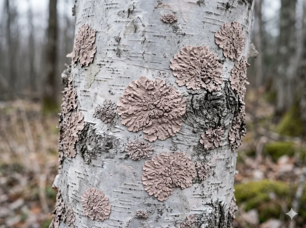
Pale coastal sandstone does this too — warm in geology, cool-neutral in overcast light. The same stone that glows amber in evening sun reads as exactly this tone under a flat, diffused sky. Blush Clay is what warm materials look like when the light stops helping them be warm.
The Wardrobe Perspective — The Rose-Wing Neutral
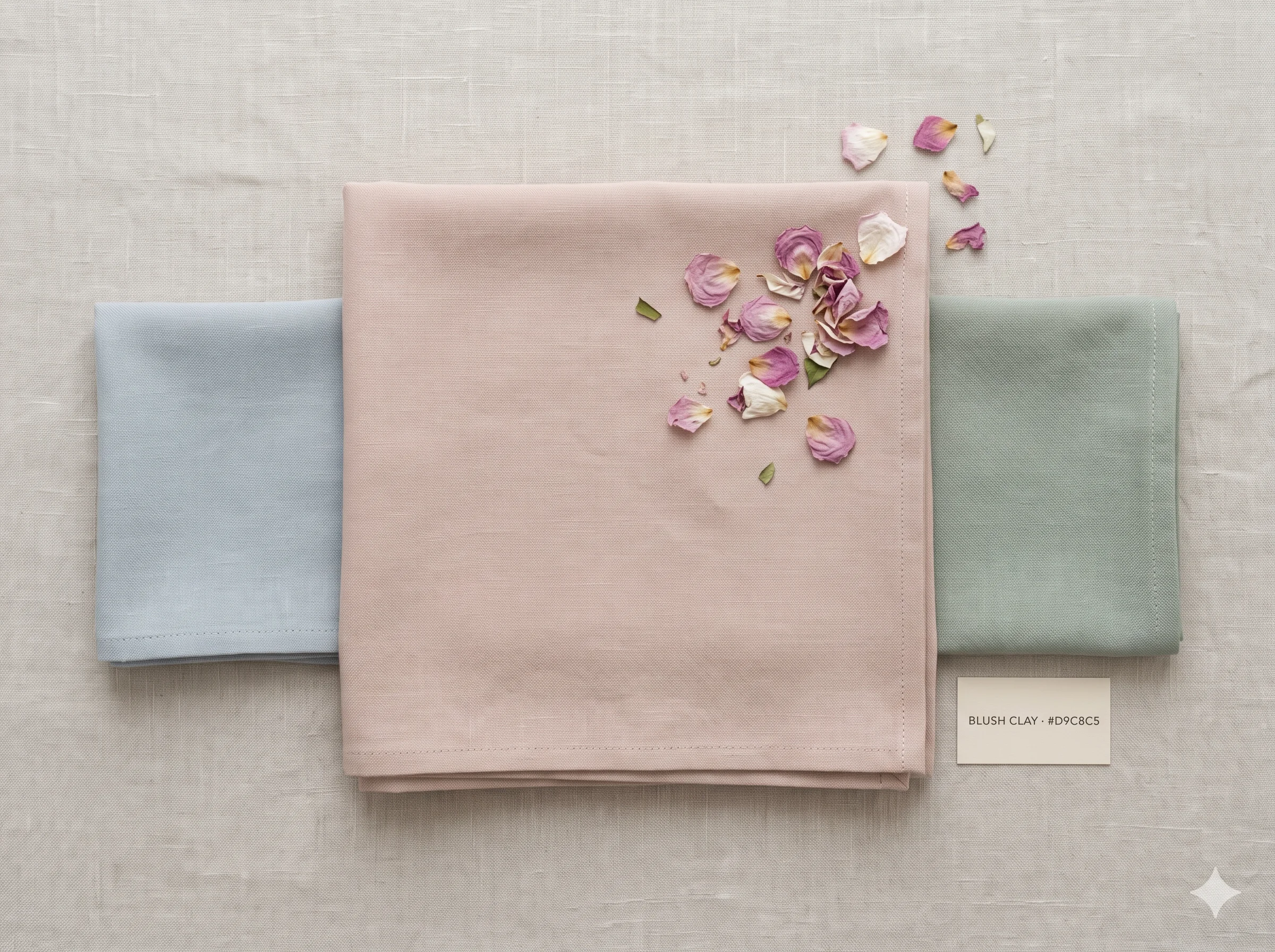
In a Soft Summer capsule wardrobe, the five cool-blue and violet swatches handle the blue wing of the palette. Blush Clay opens the rose wing — and its wardrobe role mirrors what the blues do on the other side.
It functions as a foundational neutral in the pink register: dusty and greyed enough to recede where needed, present enough to add the faint human warmth that pure blue-grey cannot offer. Think of it as a pale, cool-neutral version of the rose that a warm-season client would reach for in a vivid terracotta.
In practice, Blush Clay is often the first Soft Summer neutral that clients feel is “theirs” in a way the blues and violets aren’t. It’s warm enough to feel soft, and neutral enough to feel quiet — which is exactly the balance the season asks for.
🌸 Practitioner Note — Melanin Calibration
In my drapting sessions, Blush Clay’s cool-neutral direction holds consistently across Soft Summer’s full Fitzpatrick range, from II through V. Clinically, what I observe is that at deeper skin depths, the very low chroma makes the pink character almost invisible against higher-melanin skin — which is actually useful, as it functions as a softer near-neutral rather than a visible pink. The temperature direction stays constant; only the contrast relationship shifts by depth.
Both Wings of the Soft Summer Palette, Side by Side
With Blush Clay confirmed, the Soft Summer palette now has two wings visible — the five established cool-blue and violet neutrals on one side, and the first rose-family neutral on the other.
The arc from cyan-blue through pure violet is the cool wing. Blush Clay is the first coordinate on the rose wing — at the same chroma ceiling as everything before it, but in a completely different hue family. What connects them all is not matching colour. It is matching discipline.
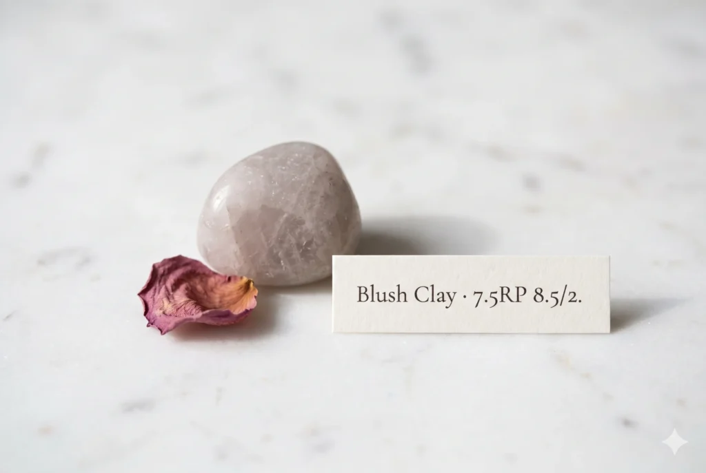
Three readings, one answer. The Munsell profile confirms pink-red hue at chroma 2 — warm in hue family, neutralised by grey in practice. The dried rose petal and the coastal sandstone in overcast light confirm it already exists this way outdoors, with no warmth needed to make it visible. The wardrobe role confirms it is the first coordinate in the rose wing that mirrors the blue-grey family in discipline and purpose.
Blush Clay IS a neutral swatch WITHIN the Soft Summer palette IN the 16-season framework — the rose-family answer to the five cool-blue neutrals, earned by the same rule that confirms all of them: very low chroma, cool or cool-neutral temperature in practice, and a value that sits within Soft Summer’s medium-light range.Check our complete resource on soft summer color palette cards ,swatches ,hex and color wheel.
Take a ride through our soft summer gallery !
Frequently asked questions .
A Few Things People Ask Me
What is blush clay color?
Blush Clay is a heavily greyed, very pale dusty rose at hex #D9C8C5. In the Sci/ART 16-season framework it is an official Soft Summer neutral — Munsell value 8.5, chroma 2, in the pink-red hue family (7.5RP) — the greyed, cool-neutral version of dusty rose that belongs to Soft Summer’s rose wing.
Is blush clay a Soft Summer color?
Yes. Although its hue direction appears warm, the chroma at 2 is low enough that grey absorbs most of the warmth. Blush Clay (#D9C8C5) reads as cool-neutral in practice, sits precisely inside the Soft Summer palette, and functions as the first confirmed rose-family neutral in the season’s muted cool arc.
What is the difference between blush clay and dusty rose?
Dusty rose is a broad category spanning warm and cool versions. Blush Clay (#D9C8C5) is the cool-neutral, very heavily greyed version — Munsell chroma 2, value 8.5 — where the pink character is barely present and grey dominates. It is Soft Summer’s dusty rose; warmer versions of dusty rose belong to Soft Autumn or True Autumn.
What colors go with blush clay in a Soft Summer wardrobe?
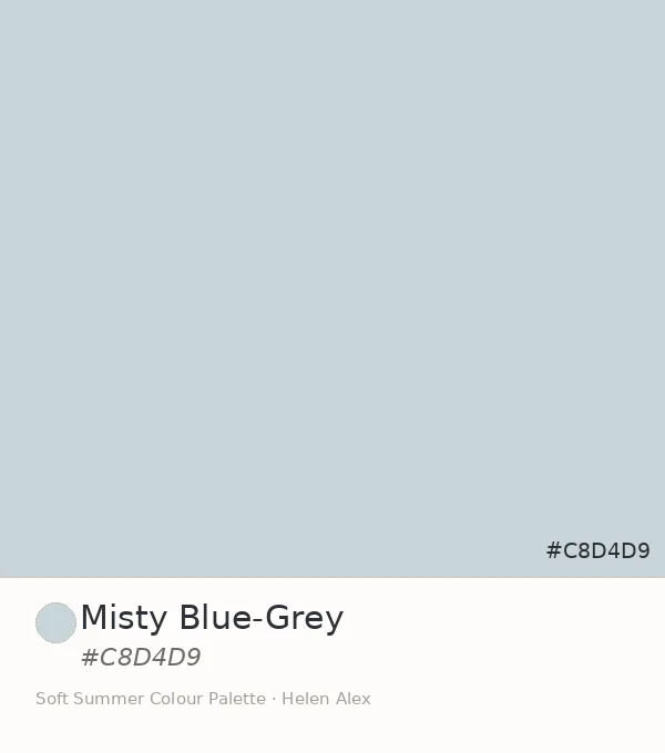
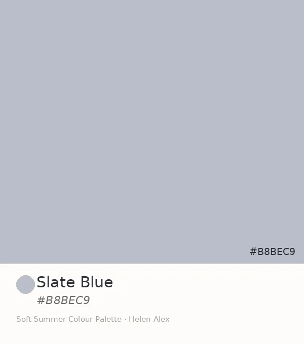
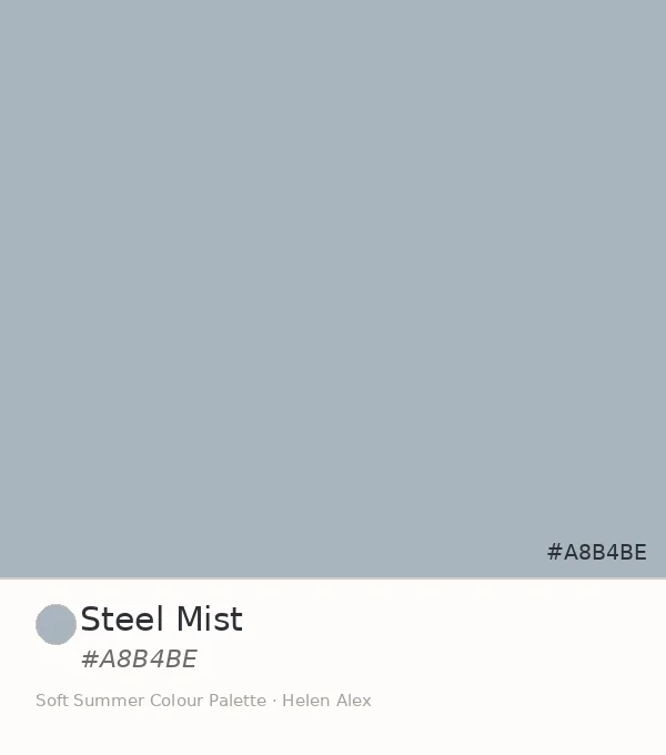
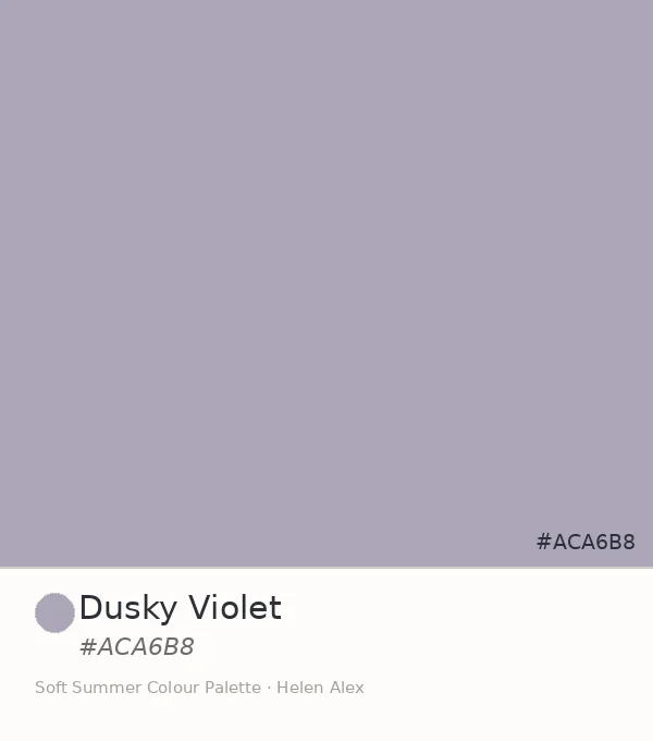
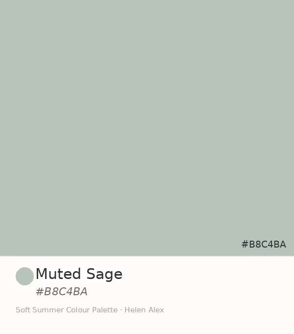
Blush Clay pairs with the entire Soft Summer low-chroma neutral family — Misty Blue-Grey, Slate Blue, Steel Mist, Soft Lavender, Dusky Violet, and muted sage. The rule is shared chroma level: any Soft Summer tone at chroma 2 or below sits naturally beside it, regardless of hue family.
Is blush clay warm or cool?
Blush Clay (#D9C8C5) sits in the warm hue zone of the Munsell system (7.5RP) but at chroma 2, which is low enough that the grey content absorbs the warmth. In practice it reads as cool-neutral — which is why it belongs to Soft Summer rather than a warm-season palette.
Yours in colour, Helen
The rose family in this palette is just as precise as the blue one — and Blush Clay is where it starts. Try it as your neutral before you try it as your colour, and notice what it does to the blues beside it.
For the full Soft Summer palette breakdown, see the Soft Summer Color Palette guide. To trace the cool-blue family that Blush Clay mirrors, read Misty Blue-Grey, Slate Blue, Steel Mist, Soft Lavender, and Dusky Violet.