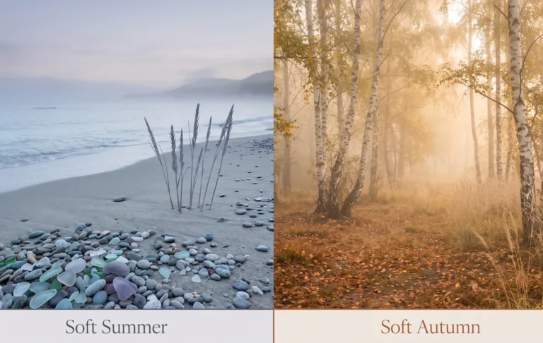
Light Summer Color Palette —The Definitive Season Guide
Light Summer Color Palette —The Definitive Season Guide
Direct Answer — The Light Summer Color Palette
The Light Summer color palette is cool-toned, very light in value, and softly muted. Signature colours include powder blue, pale mauve, soft lavender, icy pink, and cool mint. Every colour in the palette is cool (no warm or golden base), light (high LRV — close to white), and gently muted rather than vivid. Light Summer IS the lightest sub-season OF the Summer family IN the 16-season framework — it blends Summer’s cool undertone with Spring’s characteristic lightness.
What Is Light Summer?
Light Summer is one of the four sub-seasons in the Summer family of the 16-season colour analysis framework. It occupies a unique position: it is the bridge between True Summer and Light Spring — inheriting Summer’s cool undertone and Spring’s characteristically light, airy quality.
Of the four Summer sub-seasons, Light Summer has the highest LRV (Light Reflectance Value) in its palette — meaning its colours are the closest to white, the most delicate, and the most easily overwhelmed by depth or saturation.
The Nature Analogy — What Light Summer Looks LikePicture the inside of a seashell at dawn — that specific pale, cool iridescence that is neither white nor blue nor pink but a luminous combination of all three. Or silver birch bark catching low morning light: pale, cool, soft, and almost translucent in quality.
Every colour in the Light Summer color palette carries that luminous, pale, cool quality. Nothing is vivid. Nothing is dark. Nothing is warm. The palette reads as an early morning world before the day has fully asserted itself.
In the Munsell colour system, Light Summer colours cluster at very high value (V 7–9) and low-to-medium chroma (C 2–5), always with a cool hue. This high-value, low-chroma, cool-temperature address is what makes Light Summer the most delicate season in the Summer family.
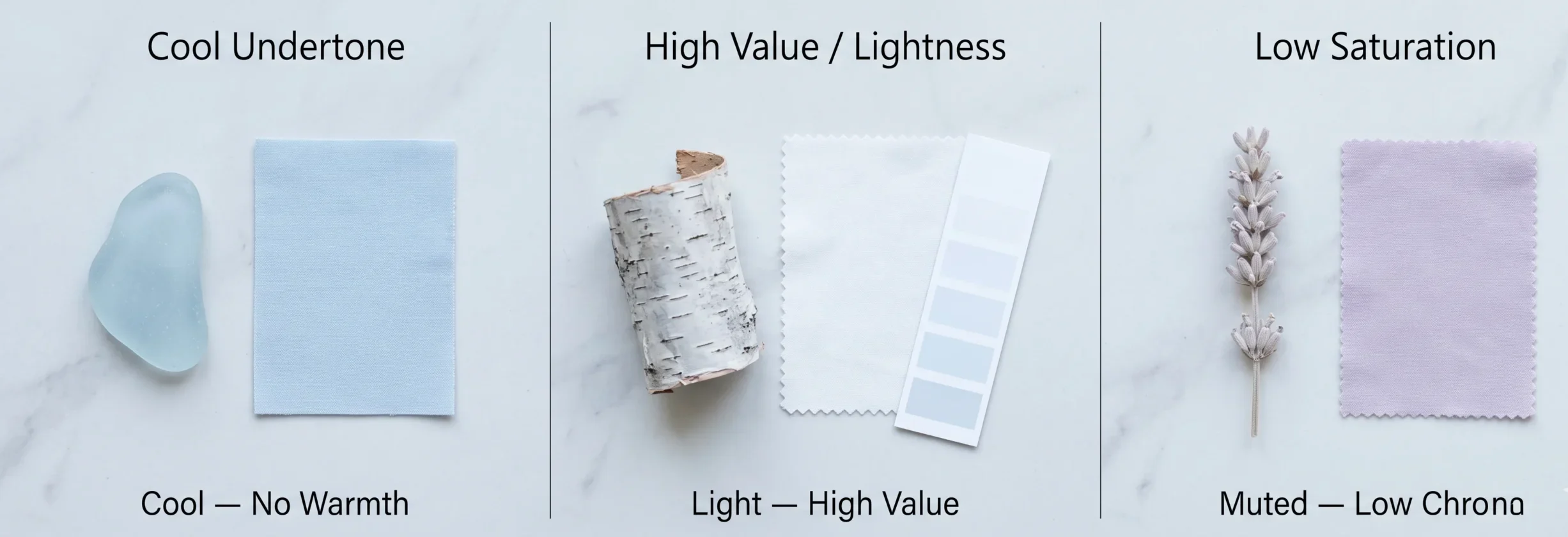
The Three Defining Coordinates of Light Summer
01
Cool Undertone
Blue-pink base. No warmth, no golden quality. This is the dimension shared with True Summer and Soft Summer. Every Light Summer colour is thermally cool — even the whites and near-whites carry a faint blue or pink-cool cast.
02
High Lightness (Value)
Very close to white — high LRV throughout. This is the dimension shared with Light Spring. Light Summer colours feel airy and pale. Dark, heavy colours from outside the palette create too much contrast and visually overwhelm this season’s delicate colouring.
03
Low Saturation
Gently muted rather than vivid. The saturation level sits below True Summer’s medium chroma — closer to Soft Summer but with more white mixed in rather than grey. Vivid cool colours are just as problematic as warm colours for this season.
Entity Relationship — Light Summer’s Place in the Framework
Light Summer IS a sub-season OF the Summer family IN the 16-season colour framework. It sits adjacent to Light Spring (shares lightness, differs in undertone temperature), True Summer (shares coolness, differs in lightness), and Soft Summer (shares coolness and muted quality, differs in value — Soft Summer is greyer, Light Summer is lighter).
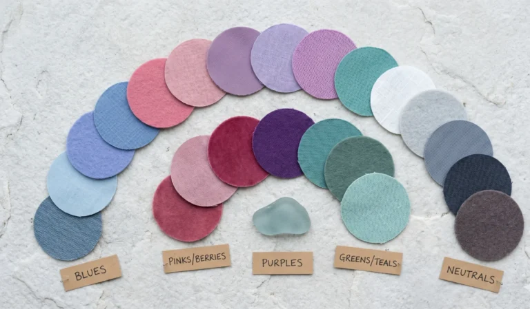
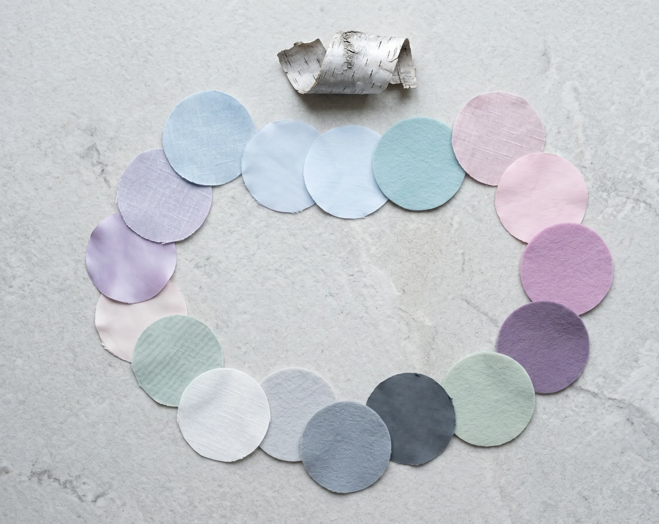
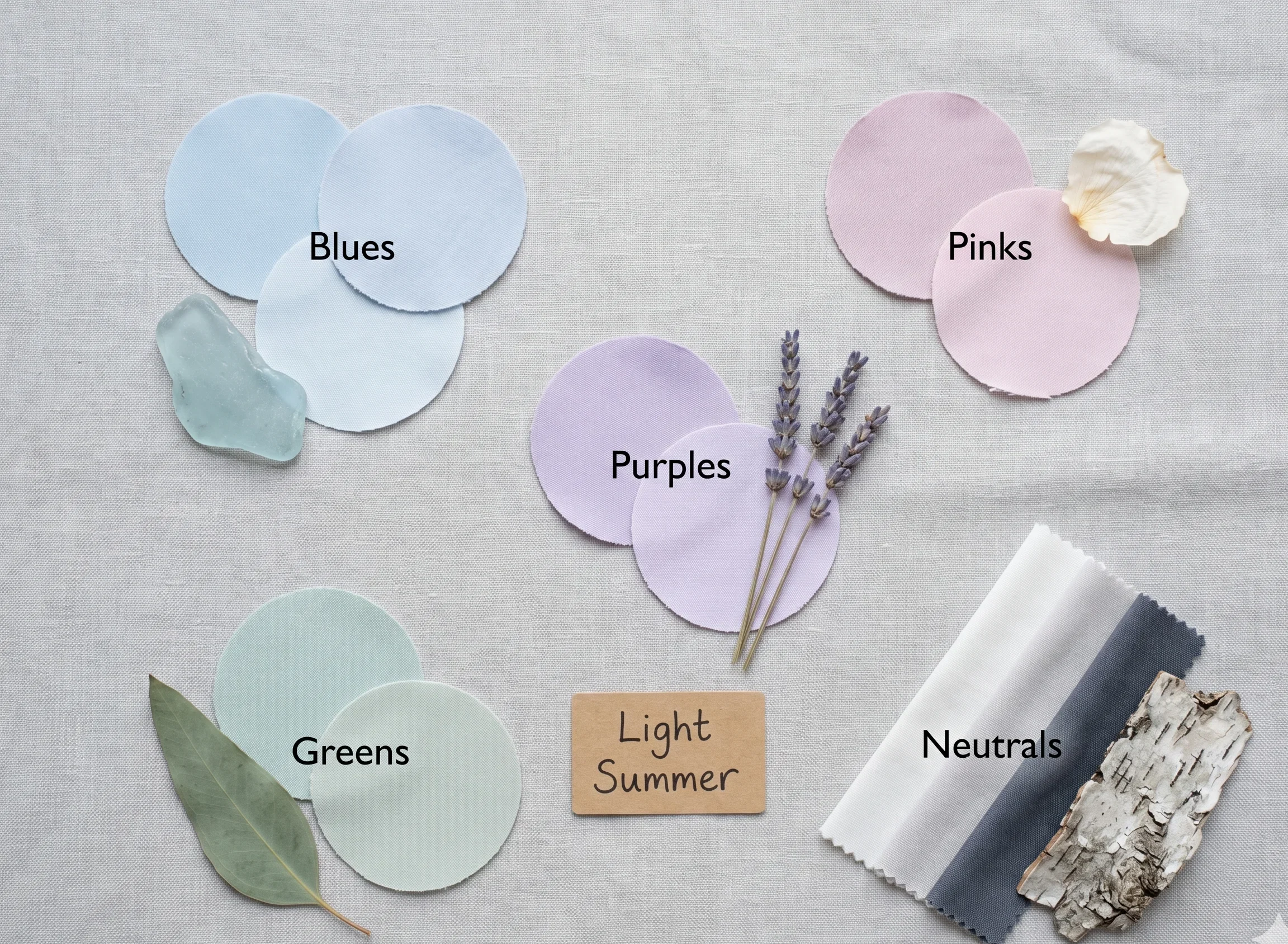
The Complete Light Summer Color Palette
Every colour below passes all three Light Summer tests: cool undertone, high lightness (LRV 60+), and low-to-medium saturation. The palette is divided into five families — blues, pinks, purples, greens, and neutrals.
Blues — The Heart of the Palette
4 colours
These pinks are the colour of the inside of a white rose — pale, cool, barely-there, but unmistakably pink. Not flesh, not white, not vivid — just that whisper of cool pink at the highest value range.
Powder Blue
#B8D4E8
Munsell: 5B 8/3
Pale Blue
#C5D4E8
Munsell: 2.5PB 8/2
Icy Sky Blue
#D8E4F0
Munsell: 5PB 9/2
Cool Aqua
#A8C8D0
Munsell: 7.5B 7/3
Pinks & Mauves
3 colours
Light Summer blues are pale and airy — like reflected sky in a shallow rock pool on a still morning. They are unmistakably blue but never vivid or heavy.
Pale Mauve-Pink
#DCC8D8 Munsell: 5RP 8/2
Icy Pink
#E8D0DC Munsell: 7.5RP 9/2
Soft Orchid
#C8A8C8 Munsell: 5P 7/3
Purples & Lavenders
2 colours
Think of lavender fields in early morning mist — that silvery-pale quality where the lavender is visible but not saturated, as if light itself has washed through the colour and diluted it to its most luminous form.
Soft Lavender
#D0C8E0 Munsell: 5P 8/2
Pale Violet
#DCD4E8 Munsell: 2.5P 8/2
Greens & Cool Mints
2 colours
Cool mint and pale sage — like young leaves seen through a frosty morning, or the pale green of sea glass worn smooth by a cool northern shore. Neither vivid nor warm, just cool and clear.
Cool Mint
#C0D0C8 Munsell: 5BG 8/2
Pale Sage
#C8D8D0 Munsell: 7.5G 8/2
Neutrals — The Foundation Layer
5 colours
Light Summer neutrals span from a barely-coloured near-white to a deep slate blue. The deep slate is the “black replacement” for this season — its deepest dark without the harshness of true black.
Cool Near-White
#F2F4F5 Munsell: N 9.5 (cool)
Pale Grey
#D8DCE0 Munsell: 5PB 9/1
Medium Grey-Blue
#B0B8C0 Munsell: 5PB 7/1
Deep Slate
#6C7A84 Munsell: 5PB 5/2
Barely-There Blush
#E8E0E4 Munsell: 5RP 9/1
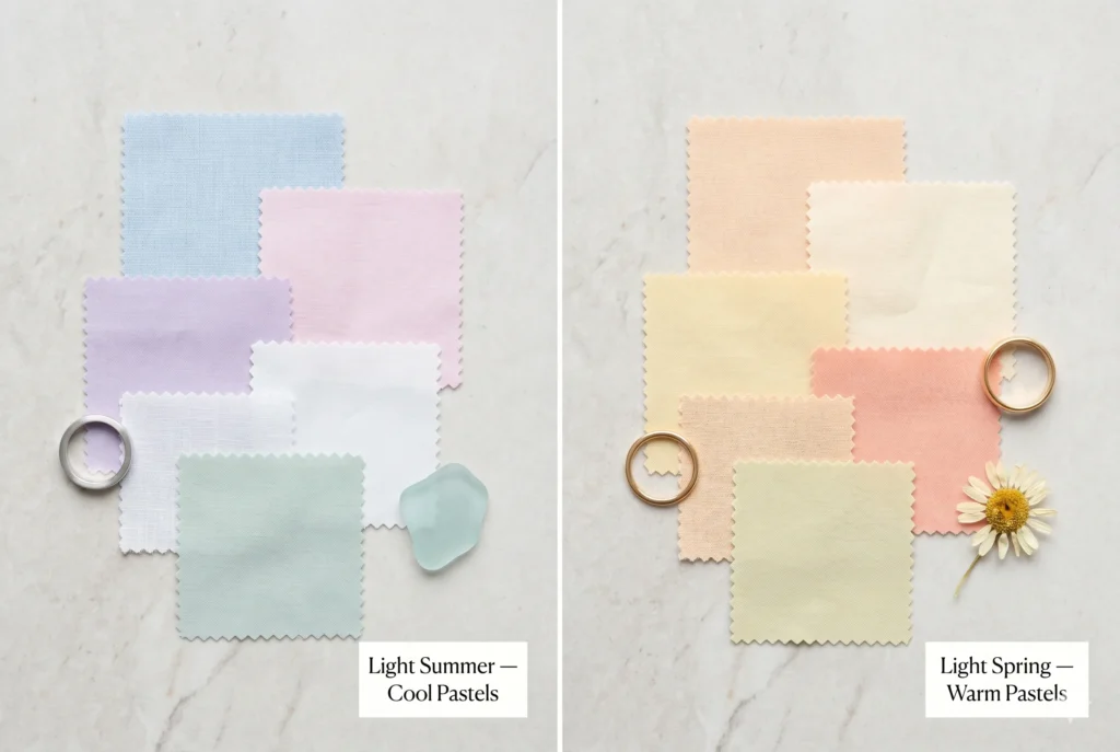
Light Summer vs Light Spring — The Most Commonly Confused Pair
Light Summer and Light Spring are the two most frequently confused seasons in the entire 16-season framework. They share the same quality of lightness — both palettes are pale, airy, and low in saturation. The single difference is temperature.
Light Summer
Cool · Light · Soft
Cool undertone (blue-pink base). Pastels read as slightly blue or grey-toned. The near-whites have a faint cool quality. Silver and platinum are the natural metal choices.
Key signal: “slightly blue-grey” quality to all colours
Light Spring
Warm · Light · Soft
Warm undertone (golden-peach base). Pastels read as slightly warm or peachy. The near-whites have a faint cream or warm quality. Rose gold and warm yellow gold are the natural metal choices.
Key signal: “slightly peachy-warm” quality to all colours
The One-Test Distinction
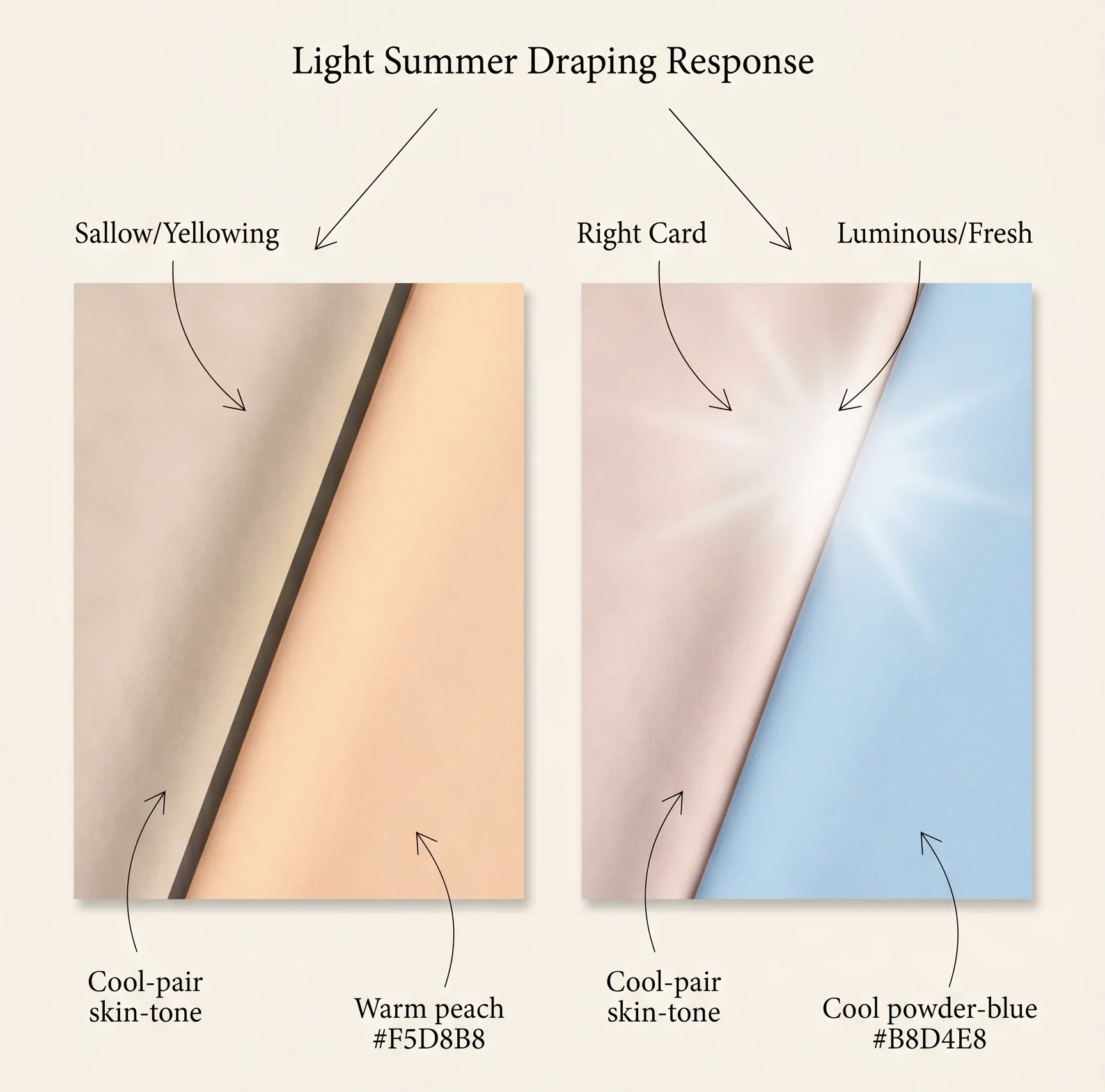
Hold a cool pale blue swatch and a warm pale peach swatch near your face in natural daylight. Which colour makes your skin look more even?
If the cool pale blue improves your skin tone (it reads as cleaner and more luminous) — you are likely Light Summer. If the warm pale peach improves your skin tone — you are likely Light Spring. This single temperature comparison, run in natural daylight, is the fastest and most reliable way to distinguish between these two seasons.
| Dimension | Light Summer | Light Spring |
|---|---|---|
| Undertone |
|
|
| Near-white quality |
|
|
| Pastels |
|
|
| Natural metal |
|
|
| Hair quality |
|
|
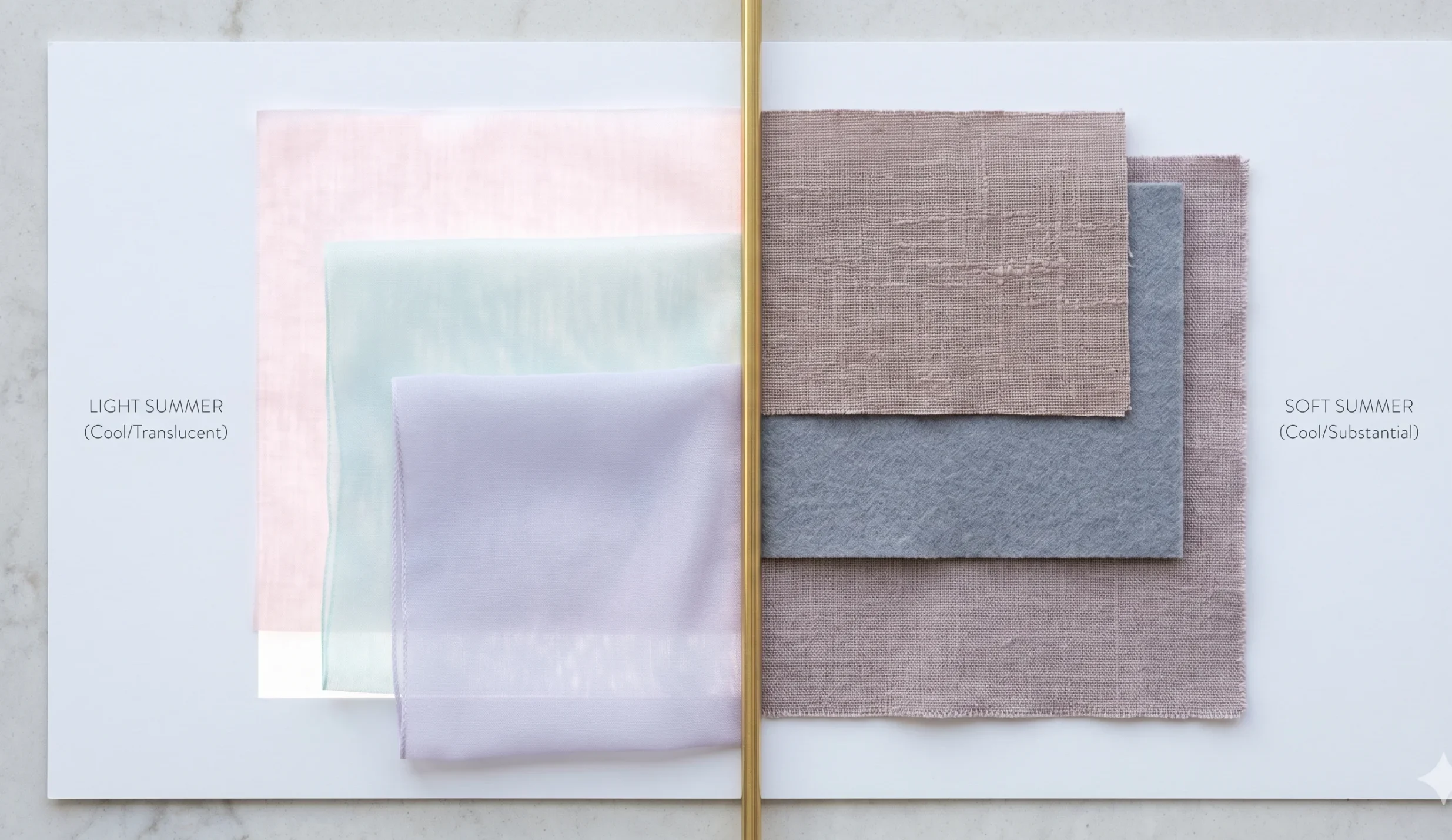
Light Summer vs Soft Summer — Both Cool, Different Energy
Light Summer and Soft Summer share the same cool thermal undertone. The difference is value versus grey modification.
|
Dimension |
Light Summer |
Soft Summer |
|
How colours are modified |
White added — colours are pale, airy, high LRV |
Grey added — colours are muted, dusty, lower LRV |
|
Blue reads as… |
Powder blue — pale and luminous |
Slate blue — muted and slightly smoky |
|
Pink reads as… |
Icy pink — almost transparent, barely-there |
Dusty rose — greyed, dried-petal quality |
|
Contrast ceiling |
Low — very pale palette, cannot absorb dark colours |
Low-to-medium — slightly more depth tolerated |
|
Overall impression |
Ethereal, luminous, airy — like early morning |
Dusty, blended, sophisticated — like late afternoon mist |
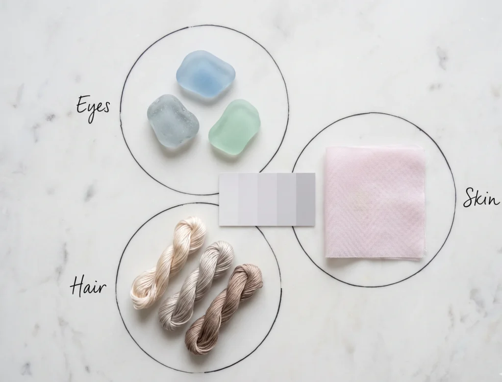
Light Summer Characteristics — Hair, Skin & Eyes
Light Summer characteristics follow the same three coordinates as the palette: cool, light, and soft — expressed through natural colouring.
Skin Quality
Light Summer skin is typically light to very light, with a cool pink or blue-pink undertone. The skin often has a slight translucent quality — the blue or lavender of veins may be visible at the temples, wrists, and inner arms. Overall skin luminosity is high; the face tends to look lit-from-within in the correct palette colours.
Hair
Natural hair ranges from light ash blonde to medium cool blonde, levels 7–10. Many Light Summer clients were very blonde as children and shifted to a medium ash blonde in adulthood. The hair has a characteristic ashy, cool quality — no golden or honey warmth. Even darker Light Summers have hair that reads as “mousy” rather than warm brown.
Eyes
Eyes are typically light — pale blue, grey-blue, grey-green, or very light hazel with a cool cast. The Light Summer eye tends to have a delicate, slightly diffused quality — like the colour in a piece of pale sea glass. There may be a visible ring but it reads as lighter and more delicate than the True Summer’s crisp limbal ring.
Practitioner’s Observation — Light Summer in Studio
“Light Summer clients are among the most dramatic transformations in a drapting session. When we move from deep or warm colours (which they commonly wear for ‘authority’) to a powder blue or pale lavender, the face immediately looks younger, clearer, and more luminous. The shift is instant and significant — sometimes shocking to clients who have worn dark or warm colours for years.”
Light Summer Hair Colors
Light Summer hair colour is one of the most specific in the Summer family — because Light Summer’s natural colouring is inherently light-range, the hair colour range is correspondingly narrow.
Avoid: golden blonde, honey blonde, strawberry blonde, warm brown, caramel — any hair shade with a warm, yellow, or orange quality conflicts with Light Summer’s cool undertone.
Light Summer Colors to Avoid
The Light Summer worst colors all fail for the same two reasons: they are either too warm (thermal conflict with the cool undertone) or too dark/vivid (contrast or chroma excess against the season’s light, delicate colouring). Both types of error produce the same result — the clothing becomes more visually present than the person wearing it. Must take our soft summer quiz to identify your coloring .
Light Summer at Every Skin Dept
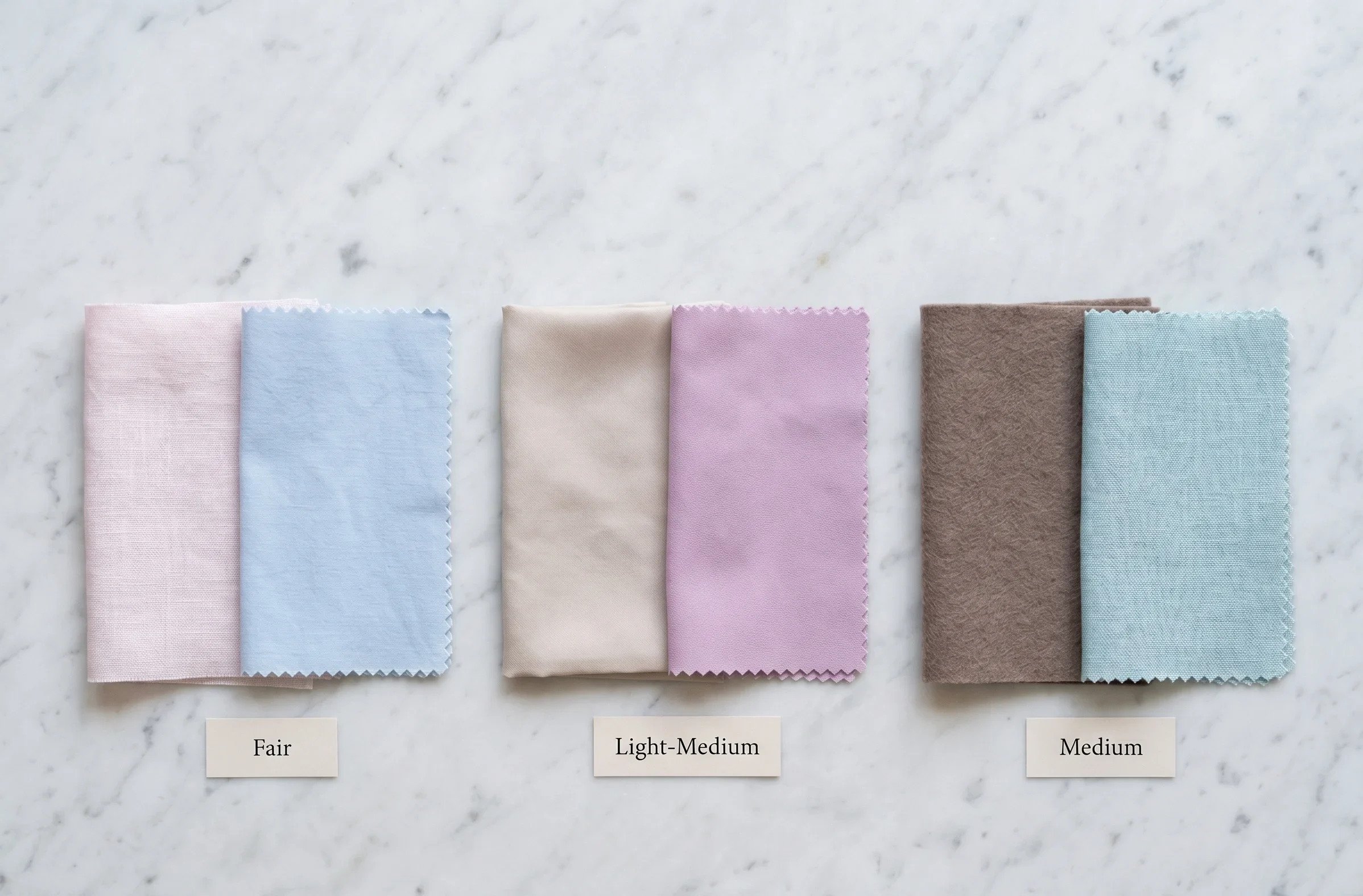
Light Summer characteristics occur across the skin depth spectrum — the season’s defining quality is the cool undertone and feature lightness, not a specific Fitzpatrick number. At deeper skin depths, Light Summer’s distinctive feature is an unusually light relative depth (features lighter relative to other family members at that depth) combined with the consistent cool undertone.
Note on Light Summer Across Ethnic Backgrounds”Light Summer is more common in Northern European, Scandinavian, and East Asian colouring than in many other backgrounds — but it does occur across all ethnic groups. The defining feature is always relative lightness of features combined with a cool undertone. I have worked with Light Summer clients across many backgrounds; the palette always confirms itself through the drapting test, not through assumptions about ethnic background.”
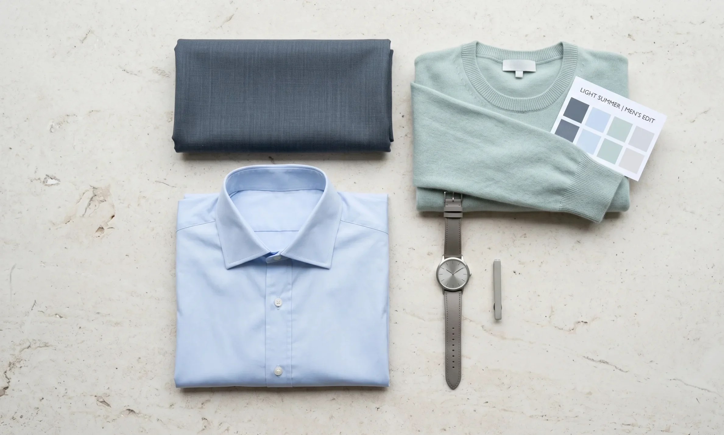
Light Summer for Men
Light Summer menswear follows the same three rules as the full palette: cool, light, and low in saturation. The challenge for men is resisting the “authority through darkness” instinct — heavy, dark colours actively work against Light Summer colouring.
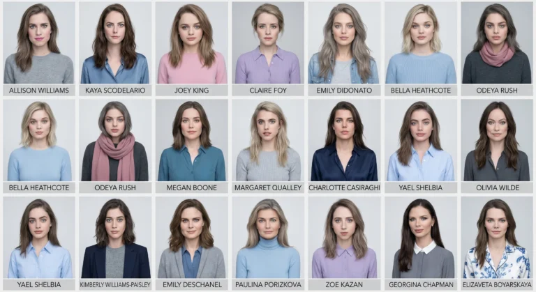
Light Summer Celebrity Examples
The following celebrities are frequently cited as Light Summer examples in the colour analysis community. These are observational assessments based on visible colouring, not professionally verified analyses.
| Name | Notable Colouring Features | Light Summer Indicator |
|---|---|---|
| Cate Blanchett | Ash blonde, pale blue-grey eyes, light cool skin | Consistently photographed best in cool pale pastels; warm colours reduce her luminosity |
| Gwyneth Paltrow | Ash champagne blonde, pale green-blue eyes, very fair cool skin | Her characteristic “cool blonde” styling aligns directly with Light Summer’s ash-blonde range |
| Naomi Watts | Light ash blonde, blue-grey eyes, very fair cool skin | Pale, clearly cool colouring with the characteristic Light Summer feature lightness |
| Meryl Streep | Ash blonde to silver, pale blue-grey eyes, fair cool skin | A natural grey transition that has been consistently praised — Light Summer grey is exceptionally flattering |
| Reese Witherspoon | Ash blonde, blue-green eyes, fair cool-neutral skin | Characteristic Light Summer lightness — looks most luminous in pale cool tones, slightly flat in warm golden tones |
Note: Celebrity colour analysis is observational and not professionally verified. These examples are provided as visual reference points only.
Light Summer’s Place in the Summer Family
🍃 Light Summer — Icy, Pale, Cool
🍃 Soft Summer — Dusty, Greyed, Cool
Light Summer Color Palette — FAQ
What is the Light Summer color palette
The Light Summer color palette is cool-toned, very light in value (high LRV), and softly muted. Signature colours include powder blue, pale mauve, soft lavender, icy pink, cool mint, and a neutral range from cool near-white to deep slate. Every colour is cool (no warm or golden base), light (close to white), and gently muted. Light Summer IS the lightest sub-season OF the Summer family IN the 16-season framework.
What is the difference between Light Summer and Light Spring?
The difference is undertone temperature. Light Summer is cool (blue-pink base) while Light Spring is warm (golden-peach base). Both are very light and low in saturation. Light Summer colours read as slightly cool or grey-toned. Light Spring colours read as slightly warm or peachy. The fastest test: cool pale blue flatters Light Summer; warm pale peach flatters Light Spring. Run this comparison in natural daylight.
What is the difference between Light Summer and Soft Summer?
The modification type differs. Light Summer has white mixed in — colours are pale, airy, and high in LRV. Soft Summer has grey mixed in — colours are muted, dusty, and slightly lower in LRV. Soft Summer’s palette reads as dusty and blended. Light Summer’s reads as pale and ethereal. Both avoid warm tones and are cool-toned throughout.
What hair colors suit Light Summer?
Pearl blonde, ash blonde (levels 8–10), and light ash brown (level 7–8). All Light Summer hair colours are cool, ashy, and free of golden warmth. Light Summer is one of the few seasons where very light blonde is genuinely the most natural and flattering colour range. Natural silver-grey is also exceptionally flattering for Light Summer as hair lightens with age.
What are the Light Summer worst colors?
Light Summer worst colors: warm golden tones (mustard, camel, orange, warm yellow), vivid saturated colours of any temperature, dark heavy colours that exceed the season’s low contrast ceiling (jet black, very dark navy, dark olive), and earth tones. Any colour that is warm, dark, or vivid overwhelms Light Summer’s delicate colouring — the fabric becomes more visually present than the face.
Can Light Summer wear black?
Black is outside the Light Summer color palette. Its extreme depth creates a contrast ratio that exceeds the season’s low-contrast ceiling, making the face appear pale and receding against the stark dark. The Light Summer dark neutral is deep slate (#6C7A84) — it provides professional depth and authority without the contrast overload of black. Deep slate near the face consistently flatters Light Summer where black does not.
Your Next Steps
Building Your Light Summer Wardrobe
- The Light Summer color palette comes to life most clearly in the wardrobe and in daily colour choices. Three immediate actions from this guide:
- Confirm your season — the temperature test: If you have not already, run the cool pale blue vs warm pale peach comparison in natural daylight. This single test distinguishes Light Summer from Light Spring more reliably than any physical feature description alone.
- Replace your dark neutrals: The most impactful single wardrobe change for most Light Summer clients is replacing black pieces near the face with deep slate (#6C7A84) or medium grey-blue (#B0B8C0). Hold each alternative near your face in natural light before your next wear. The difference is usually immediate and significant.
- Start with a single palette piece: A powder blue or pale lavender top is the fastest way to see the Light Summer palette in action on your own colouring. The goal is not to transform the wardrobe overnight but to build one verified piece as a reference point — a confirmed “yes, this is my colour” that you can return to when evaluating future purchases.
- For comparison with the muted sister season, see the Soft Summer Color Palette guide. For celebrity examples from both seasons, see the Soft Summer Celebrities guide and Light Summer Celebrities comparison.