Soft Autumn Color Palette
Soft Autumn Color Palette —
The Definitive Season Guide
Direct Answer — The Soft Autumn Color Palette
Quick Answer —
The Soft Autumn color palette is warm-neutral, low in saturation, and medium-low in contrast. Signature colours include terracotta, muted gold, soft olive, camel, and dusty plum. Every colour is muted — never vivid — and warm without ever turning bright or golden. Soft Autumn IS a sub-season OF the Autumn family IN the 16-season colour framework, sharing its muted quality with Soft Summer and its warm undertone with True Autumn.
What Is Soft Autumn?
Soft Autumn is one of the four sub-seasons in the Autumn family of the 16-season colour analysis framework. Its defining trait is mutedness — every colour in this palette has been pulled back from its most saturated, most obvious version.
The Soft Autumn color palette sits on three coordinates: a warm-neutral undertone (gold-brown base, never icy or blue-based), a low saturation (blended and dusty, never vivid), and a medium-low contrast between hair, skin, and eyes.
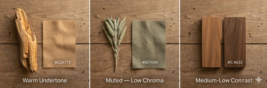
Warm doesn’t mean loud here. It means the colour has spent the afternoon in low autumn light and stopped trying to prove anything — terracotta that has faded a shade, gold that has settled into something closer to taupe.
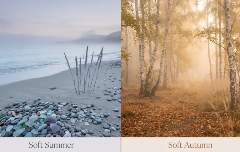
The Nature Analogy — What Soft Autumn Looks Like
Picture a woodland trail in late October, an hour before dusk. The light has gone soft and amber. The fallen oak leaves are not bright orange anymore — they’ve dried to a dusty rust. The bark on the trees has a warm grey-brown cast, not the cold grey of a winter forest.
Everything in this scene is warm. Nothing in it is vivid. That combination — warmth without brightness — is the entire signature of the Soft Autumn color palette. It is the season’s quiet, blended answer to the bold orange and gold of its more saturated Autumn siblings.
Soft Autumn is also sometimes called Soft Fall in American sources — same palette, regional naming difference. Whichever term a source uses, the underlying colour coordinates stay identical: warm, muted, medium-low contrast.
Warm-Neutral Undertone
Every colour has a gold, brown, or olive base — never blue or icy. This is the dimension Soft Autumn shares with True Autumn and Dark Autumn, and the dimension that separates it cleanly from the entire Summer family.
Low Saturation
Chroma doesn’t vanish in this palette — it just stops shouting and starts murmuring. Every colour is heavily greyed-down, sharing its mutedness directly with Soft Summer despite the opposite thermal direction.
Medium-Low Contrast
Hair, skin, and eyes sit in a blended, harmonious depth range. A 2024 study in the Journal of Color Research and Application linked low-contrast, muted-warm palettes to the most even perceived skin luminance for warm-undertone subjects with naturally low feature contrast.
Together these three coordinates describe a muted autumn color palette in the truest sense — warm, but never bright; blended, but never flat. Miss any one of the three and a colour, however attractive on its own, sits outside Soft Autumn’s range.
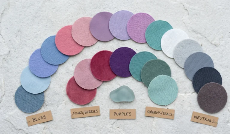
The Complete Soft Autumn ColorWarm Neutrals — The Foundation
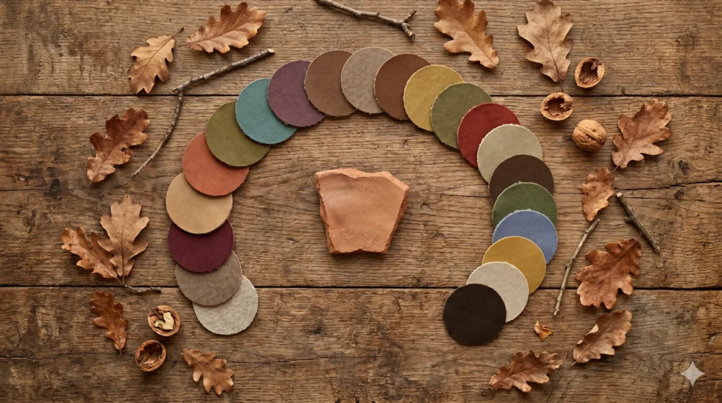
Palette — 36 Colours
This is the full Soft Autumn color palette, organised into eight families. Every colour below passes all three tests above — warm undertone, low saturation, and a depth that sits within the season’s contrast range.
Warm Neutrals — The Foundation
6 colours
Soft Summer’s cool greige, pulled toward firelight instead of fog — that’s the relationship. These neutrals carry the same blended, low-chroma quality, just shifted onto the warm side of the wheel.
Soft Cream
#E8DCC0
Munsell: 10YR 8.5/2
Oatmeal
#DCD0B8
Munsell: 10YR 8/2
Warm Taupe
#C8B8A0
Munsell: 7.5YR 7/3
Soft Khaki
#BCAE88
Munsell: 7.5Y 7/3
Warm Grey-Brown
#8C8070
Munsell: 7.5YR 5/2
One neutral in this family deserves a slower look — the kind that only reveals itself once it’s isolated from everything around it.
“Warm Stone” looks like plain beige until you pull it next to true neutral grey — there’s a quiet olive-gold cast doing all the work, and that hidden warmth is exactly what separates a Soft Autumn neutral from a Soft Summer one at the same lightness.
Browns & Camels
5 colours
Camel doesn’t dress up in this palette. It just stops apologising for being beige — and becomes the wardrobe’s quiet anchor instead of its compromise.
Soft Camel
#C2A172
Munsell: 7.5YR 6.5/4
Soft Toffee
#A87C52
Munsell: 7.5YR 5.5/4
Chestnut
#8B5E3C
Munsell: 5YR 4/4
Cocoa
#6E4B36
Munsell: 5YR 3.5/3
Walnut
#5C4632
Munsell: 7.5YR 3/2
Terracotta & Rust
4 colours
Soft Summer’s dusty rose, left out in October sun until the pink quietly turned to clay — this is the family that proves the two seasons share more DNA than their names suggest.
Soft Clay
#C08060
Munsell: 5YR 6/4
Terracotta
#BC6B45
Munsell: 5YR 5/5
Brick Rose
#B07060
Munsell: 7.5R 5.5/4
Muted Rust
#A8593C
Munsell: 2.5YR 4.5/5
Muted Gold & Olive
5 colours
Gold doesn’t sit still in this palette — it keeps sliding toward olive the moment no one’s watching, which is exactly why these two colour stories live in the same family rather than two separate ones.
Soft Mustard
#C2A050
Munsell: 7.5Y 6.5/5
Muted Gold
#B89048
Munsell: 10YR 6/5
Warm Sage
#9C9870
Munsell: 5GY 6/2
Moss
#7C7848
Munsell: 2.5GY 4.5/3
Olive
#807040
Munsell: 7.5Y 4.5/3
Muted Teals & Blues — The Cool Relief
Greens
4 colours
Eucalyptus dried on the stem for a week behaves differently from eucalyptus fresh off the branch — the blue-cool quality fades and a warm, dusty green takes its place. That dried version is this family.
Fern
#6B7A4C
Munsell: 7.5GY 4.5/3
Dried Eucalyptus
#7C8868
Munsell: 5GY 5.5/2
Muted Forest
#4F6B4C
Munsell: 5G 3.5/3
Muted Sea Green
#5C7A68
Munsell: 2.5BG 4.5/2
Muted Teals & Blues — The Cool Relief
4 colours
This is Soft Summer’s slate blue, the one cool note Soft Autumn is allowed to keep — every warm palette needs a small cool counterweight, and this muted, greyed-down blue-green family is Soft Autumn’s.
Soft Teal
#5C8078
Munsell: 5BG 4.5/3
Slate Blue-Green #5C7068 Munsell: 7.5BG 4/2
Muted Denim
#5C6C78
Munsell: 5PB 4/2
Dusty Cornflower
#7888A0
Munsell: 7.5PB 5.5/3
Berries & Plums
4 colours
The same muted-plum family that anchors Soft Summer’s eveningwear, pulled a few degrees warmer until the purple starts to remember it came from a brick kiln rather than a flower.
Dusty Mauve-Brown
#8C6058
Munsell: 7.5R 5/3
Brick Red #8C4030 Munsell: 5R 3.5/5
Soft Burgundy
#6C3038
Munsell: 2.5R 3/3
Muted Plum
#6C4858
Munsell: 5RP 3.5/3
Darks — The Black Replacement
4 colours
This is the same logic Soft Summer uses to replace black with soft charcoal — Soft Autumn replaces black with something equally deep, just warm enough to belong in this palette instead of fighting it.
Espresso
#3C2A20
Munsell: 7.5YR 2/2
Charcoal-Brown #3C342C Munsell: 7.5YR 2.5/1
Deep Olive
#38381C
Munsell: 7.5Y 2.5/2
Bittersweet Chocolate
#2C1E14
Munsell: 5YR 1.5/2
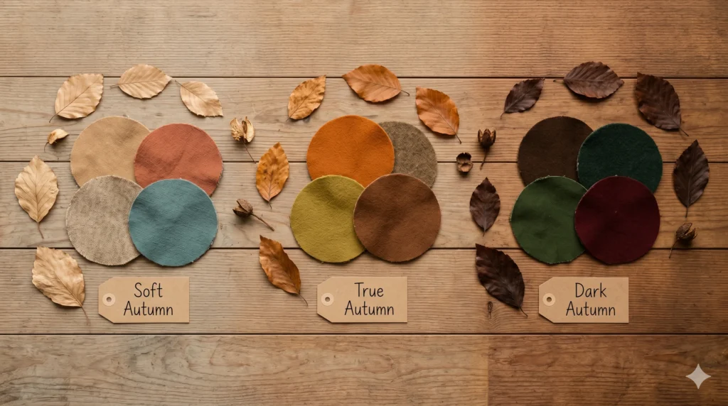
Soft Autumn in the Autumn Family
Soft Autumn does not exist alone. It sits inside a trio of Autumn sub-seasons in the 16-season framework — each warm, but differing in saturation and depth.
Warm + Muted +
Blended
The most muted, most blended of the Autumn family. Shares its low saturation with Soft Summer and its warm undertone with True Autumn.
Warm + Clear +
Rich
Higher saturation, more defined and “named” colours. A harvest field at midday rather than seen through afternoon haze.
Warm + Rich +
Deep
Deeper in value than Soft Autumn, with more saturation than this guide’s palette. Shares its depth with the Winter family, its warmth with True Autumn.
Disambiguating “Warm Autumn” — A Common Search Mix-Up
Many people search “Warm Autumn” expecting Soft Autumn, but these are different concepts. “Warm Autumn” is most often used as another name for True Autumn — defined primarily by undertone warmth at a higher saturation than Soft Autumn allows. Soft Autumn’s defining trait is mutedness first, warmth second. If a “warm autumn” palette you’ve seen looks vivid and rich rather than dusty and blended, you are likely looking at True Autumn, not Soft Autumn.
For the precise distinction between Soft Autumn and its cool-toned counterpart across the muted spectrum, see the dedicated Soft Summer vs Soft Autumn comparison guide — that piece covers the single defining variable (undertone temperature) in full depth, the same way saturation is the single variable separating True Summer from Soft Summer.
Soft Autumn Characteristics — Hair, Skin & Eyes
Soft Autumn characteristics follow the palette’s own coordinates: warm, muted, and blended — expressed through natural colouring rather than through clothing.
Hair
Hair here doesn’t compete with skin — it just deepens the same warm conversation by one shade. Natural Soft Autumn hair ranges from soft ash-brown-with-warmth to muted chestnut, typically levels 4–7, always with a gold or olive undercurrent rather than true ash or vivid copper.
Skin
Skin carries a warm-neutral undertone — golden, olive, or soft peach, but never bright or rosy-cool. The warmth is consistent rather than vivid; it reads as “soft glow” rather than “golden tan.” This warm-but-quiet quality is the clearest tell separating Soft Autumn skin from True Autumn’s more saturated warmth.
Eyes
Eyes are typically soft hazel, warm green, soft amber-brown, or muted blue-green — almost always with a visible gold fleck or warm ring somewhere in the iris. The overall quality is blended rather than crystalline; unlike True Summer’s defined limbal ring, Soft Autumn eyes diffuse warmth softly across the whole iris.
Practitioner’s Observation — Soft Autumn Characteristics in Studio”In my drapting sessions, the fastest confirmation for Soft Autumn is the olive drape test — a muted olive fabric held near the face. On a true Soft Autumn, the skin settles and looks healthier almost instantly. On a Soft Summer, the same olive will look slightly sickly. That one reaction, more than any feature description, tells me which side of the muted spectrum someone belongs on.”
Soft Autumn at Every Skin Depth
Soft Autumn occurs across the entire range of skin depths. The warm-neutral undertone and muted saturation are determined by biology, not by how much melanin is present — the season shows up identically at every Fitzpatrick level, just expressed through a different depth of neutral.
|
Skin Depth (Fitzpatrick) |
Soft Autumn Presentation |
Palette Resonance |
|
Warm-Fair (I–II) |
Subtle warm undertone — often described as “warm but not golden.” Hair light-to-medium brown with a gentle gold undercurrent rather than true ash. |
Oatmeal, soft camel, and warm sage create immediate harmony. Avoid jumping straight to espresso — warm taupe or walnut works better as the dark anchor at this depth. |
|
Warm-Light to Medium (II–III) |
Clear warm-neutral undertone. The classic, most frequently identified Soft Autumn presentation — hair medium warm brown, skin with a soft golden quality. |
The full range opens up. Terracotta, muted gold, and soft teal all resonate strongly here without further adjustment. |
|
Warm-Medium (III–IV) |
Undertone often reads as warm-olive or golden, frequently with a visible olive cast in the skin’s shadow areas. Hair deeper brown, still carrying warmth rather than ash or red. |
Olive, moss, and muted rust deepen beautifully. Walnut or chestnut becomes a wearable dark neutral — more flattering than reaching for pure black. |
|
Warm-Deep (V–VI) |
Rich warm undertone, often with a visible golden-red or copper cast in direct light. Hair deep warm brown to brown-black, the warmth still clearly present rather than cool or ashy. |
The deep darks in this palette — espresso, bittersweet chocolate, deep olive — become genuinely wearable “black replacements” since they share the same warm family. Brick red and muted gold read as especially luminous at this depth. |
Warmth doesn’t ask permission at any depth — it just changes which neutral gets to carry it, from oatmeal at the fairest end of the range to espresso at the deepest.

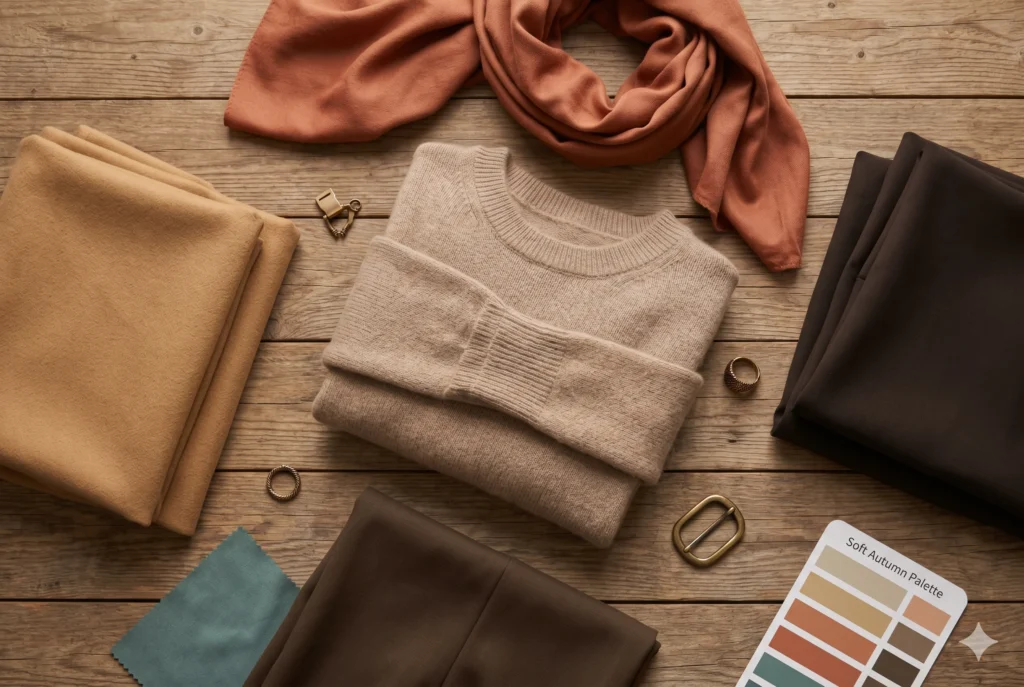
How Soft Autumn Wears It
The Soft Autumn color palette translates into a wardrobe built on warm, blended layering rather than sharp contrast. The same three rules apply to clothing as to everything else: warm undertone, muted saturation, gentle depth difference between pieces.
|
Foundation neutrals: |
warm taupe, soft camel, and oatmeal cover the majority of everyday base pieces — trousers, knitwear, outerwear — and pair correctly with everything else in the palette without further thought. |
|
The dark anchor: |
espresso or walnut replaces black in blazers, trousers, and footwear — same depth and versatility, none of the cool-toned harshness. |
|
Accent layer: |
terracotta, muted gold, and soft teal carry the season’s character — a terracotta scarf or a muted-gold knit does more for the face than any neutral can alone. |
|
Texture matters as much as colour: |
matte wool, brushed cotton, and suede all reduce perceived chroma — the same fabric logic that serves Soft Summer serves Soft Autumn, just on the warm side of the wheel. |
This warm-neutral, low-contrast formula happens to align closely with the “quiet luxury” aesthetic currently dominating 2026 fashion coverage — camel coats, walnut leather, oatmeal knitwear — which makes Soft Autumn one of the easier seasons to dress for using mainstream, readily available pieces rather than hunting for niche colours.
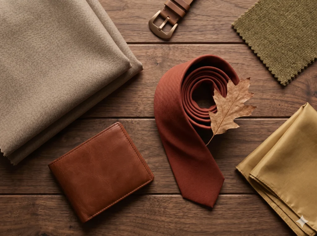
Soft Autumn for Men
A tie in this family doesn’t announce itself — it just makes the navy-adjacent suit look like it was always supposed to be warm. The Soft Autumn principles translate directly into menswear, with one notable difference from the cool seasons: warm metals belong here, not silver.
|
Suiting: |
warm taupe and walnut brown work as genuine alternatives to navy or charcoal — both provide professional depth without the cool-toned mismatch a true charcoal grey can create on warm undertone. |
|
Shirting: |
oatmeal, soft cream, and warm stone form the core rotation — all read as “white” in an outfit without the stark cool contrast of optical white. |
|
Knitwear: |
olive, moss, and muted rust bring real colour into casual rotation without looking like a costume choice. |
|
Accent — tie or pocket square: |
brushed bronze, antiqued gold, and warm copper-toned finishes resonate with Soft Autumn’s undertone — the inverse of the silver-only rule that governs the cool Summer seasons. |
|
Metals: |
brushed bronze, antiqued gold, and warm copper-toned finishes resonate with Soft Autumn’s undertone — the inverse of the silver-only rule that governs the cool Summer seasons. |
The Soft Autumn Menswear RuleIf a colour is described as “icy,” “jewel-toned,” or “cool-toned” — it sits outside this palette regardless of how well it photographs. The fastest evaluation test: hold any new piece next to walnut brown. If the two feel like they belong in the same warm, quiet family — it works. If the new piece suddenly reads cool by comparison — it doesn’t.
The Soft Autumn Menswear Rule If a colour is described as “icy,” “jewel-toned,” or “cool-toned” — it sits outside this palette regardless of how well it photographs. The fastest evaluation test: hold any new piece next to walnut brown. If the two feel like they belong in the same warm, quiet family — it works. If the new piece suddenly reads cool by comparison — it doesn’t.
Colors That Work Against This Palette
|
✗ Outside the Palette
|
✗ Outside the Palette
|
Black doesn’t soften for anyone in this palette. It just goes on standing apart from the warm, blended quality of the colouring around it — which is exactly why the espresso and bittersweet chocolate alternatives exist, doing the same structural job without the conflict.
The Myth Worth Busting
Myth: “Soft Autumn just means earth tones — brown, beige, and not much else.”
The myth doesn’t know about the blues and berries hiding at the back of this palette. Muted teal, dusty cornflower, soft burgundy, and muted plum are all genuinely Soft Autumn colours — they simply get overlooked because brown photographs more predictably as “autumnal” in a thumbnail grid.
A second version of the same myth: “muted means boring.” Mutedness is a saturation setting, not an emotion. A muted autumn color palette built correctly — terracotta against warm taupe, olive against soft gold — reads as rich and sophisticated, not flat. The richness just comes from depth and warmth working together, rather than from brightness alone.
Soft Autumn Color Palette — FAQs
What is the Soft Autumn color palette?
The Soft Autumn color palette is warm-neutral, low in saturation, and medium-low in contrast. Signature colours include terracotta, muted gold, soft olive, camel, and dusty plum. Every colour is muted rather than vivid, and warm without being bright or golden. Soft Autumn is a sub-season of the Autumn family in the 16-season colour framework, sharing its muted quality with Soft Summer and its warm undertone with True Autumn.
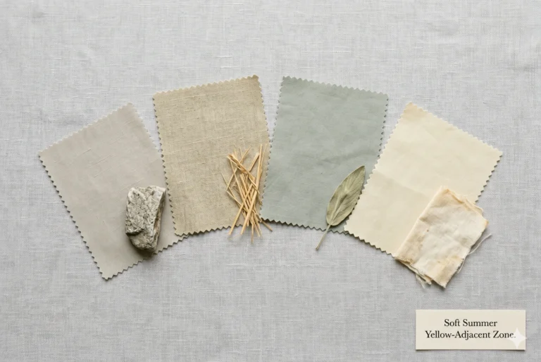
What is the difference between Soft Autumn and Soft Summer?
The difference is temperature, not saturation. Both seasons are equally muted — low chroma, blended, dusty. Soft Summer’s undertone is cool (blue-pink base); Soft Autumn’s undertone is warm-neutral (gold-brown base). The same low-saturation softness shows up as misty blue-grey in Summer and as warm taupe in Autumn. See the dedicated Soft Summer vs Soft Autumn comparison for the full diagnostic breakdown.
Is Soft Autumn the same as Warm Autumn?
No. These get confused because both sit in the Autumn family. Soft Autumn’s defining quality is mutedness — low saturation — with a warm-neutral undertone. “Warm Autumn” is most often used as another name for True Autumn, which is defined primarily by undertone warmth at a higher saturation than Soft Autumn allows. Soft Autumn is the quieter, more blended of the two.
What is the difference between Soft Autumn and True Autumn?
Saturation. True Autumn colours are richer and more saturated — a clear, defined warmth, easy to name at a glance. Soft Autumn colours are heavily muted — greyed-down, blended, harder to name precisely. Both share the same warm undertone direction. True Autumn is a harvest field at midday; Soft Autumn is the same field seen through afternoon haze.
Can Soft Autumn wear black?
Black sits outside the Soft Autumn color palette. It is both too cool in undertone and too high in contrast for this season’s warm, low-contrast colouring. The Soft Autumn alternative to black is espresso or bittersweet chocolate — dark, warm browns that provide the same wardrobe depth without the harsh, cool-toned contrast of true black.
What hair colors suit Soft Autumn?
Soft Autumn hair is warm but muted: soft chestnut, warm ash brown with a gold undercurrent, muted caramel, and warm-toned grey. The hair should never read as cool-ashy (Soft Summer’s territory) or as vivid copper (True Autumn’s territory) — it sits in the quiet middle, warm but never bright. A dedicated Soft Autumn Hair Color guide covers shade selection in full.
What colors should Soft Autumn avoid?
Soft Autumn should avoid true black, optical white, and any icy or vivid cool colour — electric blue, neon pink, bright fuchsia. These all introduce either excess contrast or a cool thermal direction that conflicts with the season’s warm, low-contrast, muted biology.
Your Implementation Task
Building Your Soft Autumn Color Palette in Real Life
The Soft Autumn color palette earns its place the moment it shows up in a real wardrobe, not just a swatch chart. Three immediate actions from this guide:
Run the olive drape test: Hold a muted olive fabric near your face in natural daylight. If your skin settles and looks healthier almost instantly, you’ve confirmed the warm-neutral undertone this entire palette is built on.
Replace one dark neutral: Swap a single black piece — blazer, trouser, or shoe — for espresso or walnut. This is the smallest possible change with the most visible result.
Add one accent colour: A terracotta scarf or a muted-gold knit is the fastest way to see this palette working on your own colouring, before committing to a full wardrobe rebuild.
For the cool sister palette, see the Soft Summer Color Palette guide, and for the precise comparison between the two, see Soft Summer vs Soft Autumn.
I’ve watched this exact swap — black to espresso — save more wardrobes than any other single change I recommend. Try it before you buy anything new.