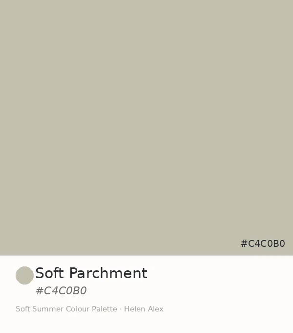
Soft Parchment Color (#C4C0B0): Soft Summer’s Aged Neutral
Soft Parchment —The Parchment Color That Lives on Old Paper, and Why It Belongs to Soft Summer
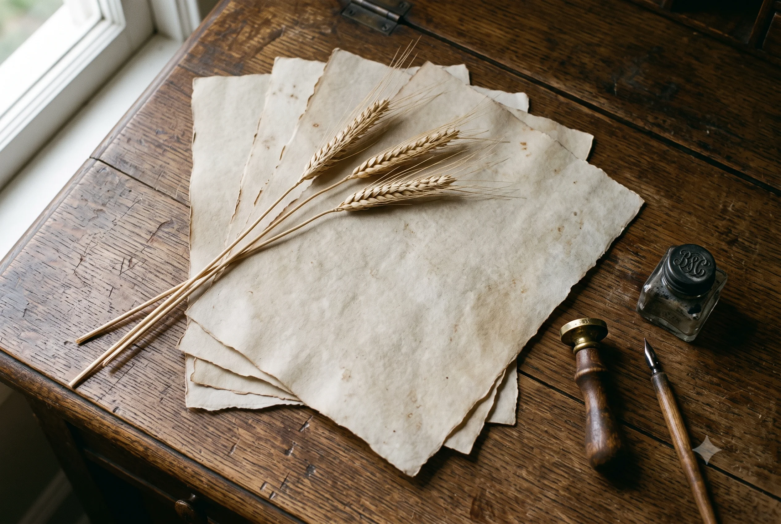
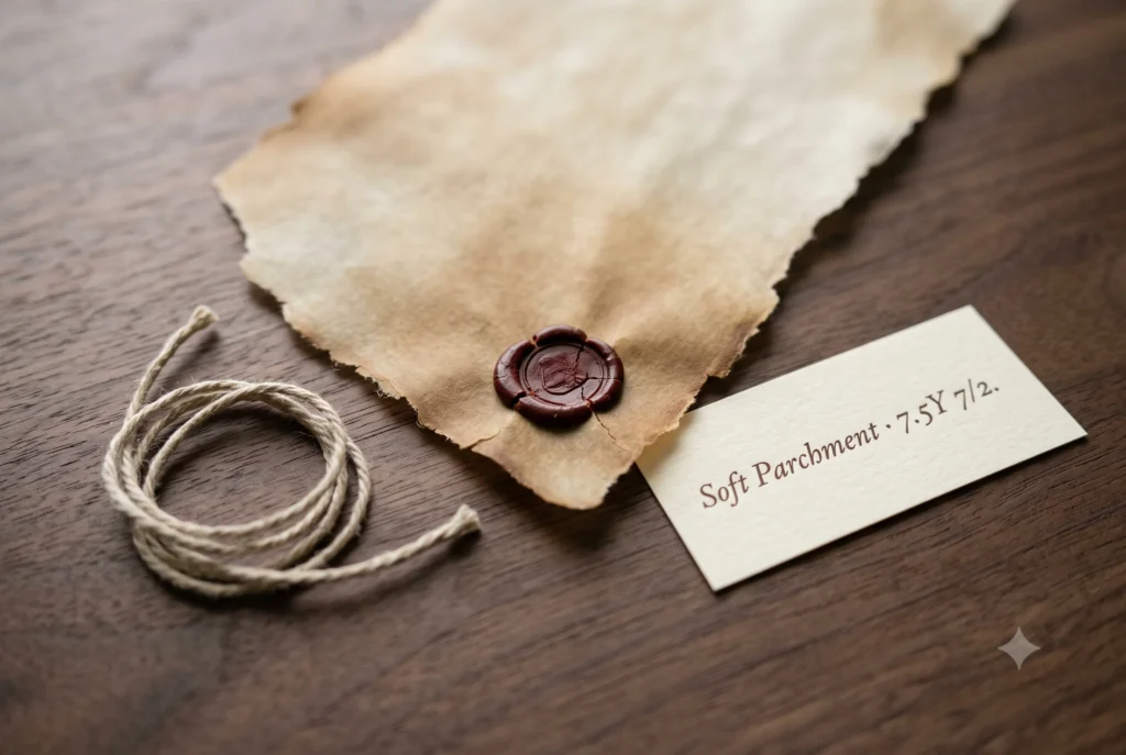
Hold an old manuscript page up to the light and you will see this parchment color before you can name it. Not white, not beige, not grey — the specific warm, dusted neutral that paper becomes after decades of sitting quietly in low light.
That colour, hex #C4C0B0, is the tenth confirmed member of the Soft Summer palette, and the one that finally gives Warm Greige a sibling.
Where Warm Greige sits light and airy at the edge of warmth, Soft Parchment sits one step deeper — closer to the colour of a page that has actually been read, folded, and kept.
Soft Parchment – Soft Summer Colour Palette – Helen Alex
Quick answer, if you’re short on time
Soft Parchment (#C4C0B0) is an official Soft Summer neutral. Its Munsell profile — value 7, chroma 2, in the warm yellow hue family (7.5Y) — places it one value step deeper than Warm Greige, completing a light-and-deep pair in the palette’s warm-neutral wing. It reads as the colour of aged paper: warm in origin, muted enough to function as a quiet neutral in clothing and styling alike.
The Analyst Perspective — One Step Deeper Than Warm Greige
Strip the name and read the numbers. #C4C0B0 converts to Munsell value 7, chroma 2, in the warm yellow hue family at approximately 7.5Y — the same hue address as Warm Greige, one full value step darker.
That relationship is not approximate. Run the colour math and the two swatches share an identical warmth ratio between their red, green, and blue channels — Soft Parchment is Warm Greige’s exact hue, simply carrying less light. Same warmth, less brightness.
Parchment color doesn’t fade so much as it remembers — every bit of brightness it loses, it keeps somewhere else as warmth instead.
Set it beside true white paper and the warmth admits itself instantly — beside true grey, it reads almost neutral. The whole colour lives in that contradiction.
Soft Autumn’s parchment runs noticeably warmer and more saturated — closer to aged ivory with real gold in it. See the Soft Summer vs Soft Autumn comparison for that thermal distinction in full. Soft Summer’s version, at chroma 2, keeps the warmth but trades the gold for grey.
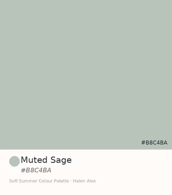
This pairing is structurally identical to two relationships already established in this series: Muted Sage and Soft Fern in the green wing, and Slate Blue beneath Misty Blue-Grey in the cool family. Every wing in this palette, it turns out, wants a light member and a deep one.
Soft Parchment ✦ new
Value 7 · Chroma 2 · 7.5Y — deeper warm-neutral
Soft Autumn parchment
Value 7.5 · Chroma 4 · 5Y — golden, clearly warm
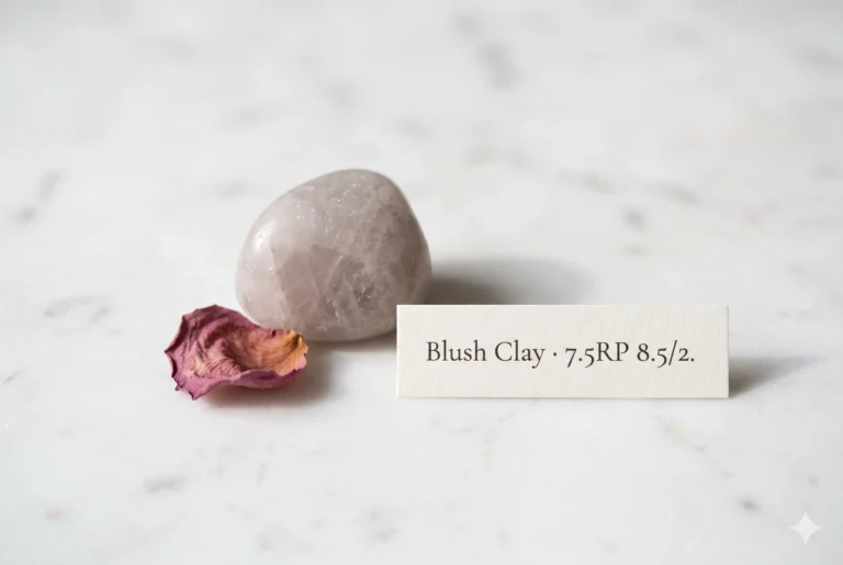
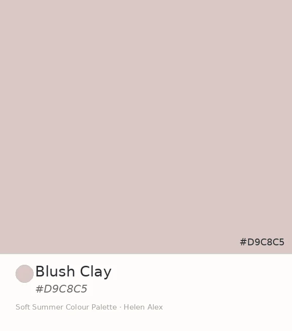
Blush Clay
Value 8.5 · Chroma 2 · 7.5RP — rose family, separate wing
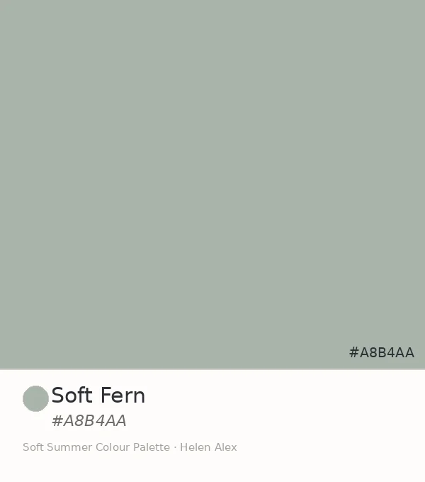
Soft Fern
Value 7 · Chroma 2 · 7.5G — same value, green family
What Color Is Parchment, Really? — The Nature Perspective
Parchment as a material was never paper at all originally — it was treated animal hide, which is why the colour has always carried this particular warmth. But the colour itself, the one we now associate with old documents, exists well beyond any desk drawer.
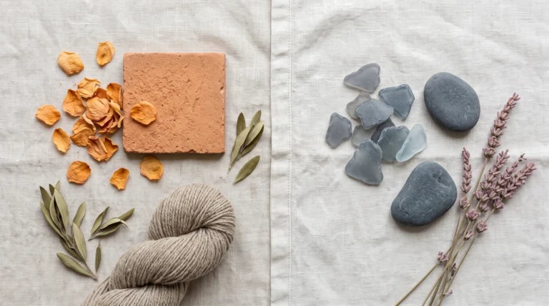
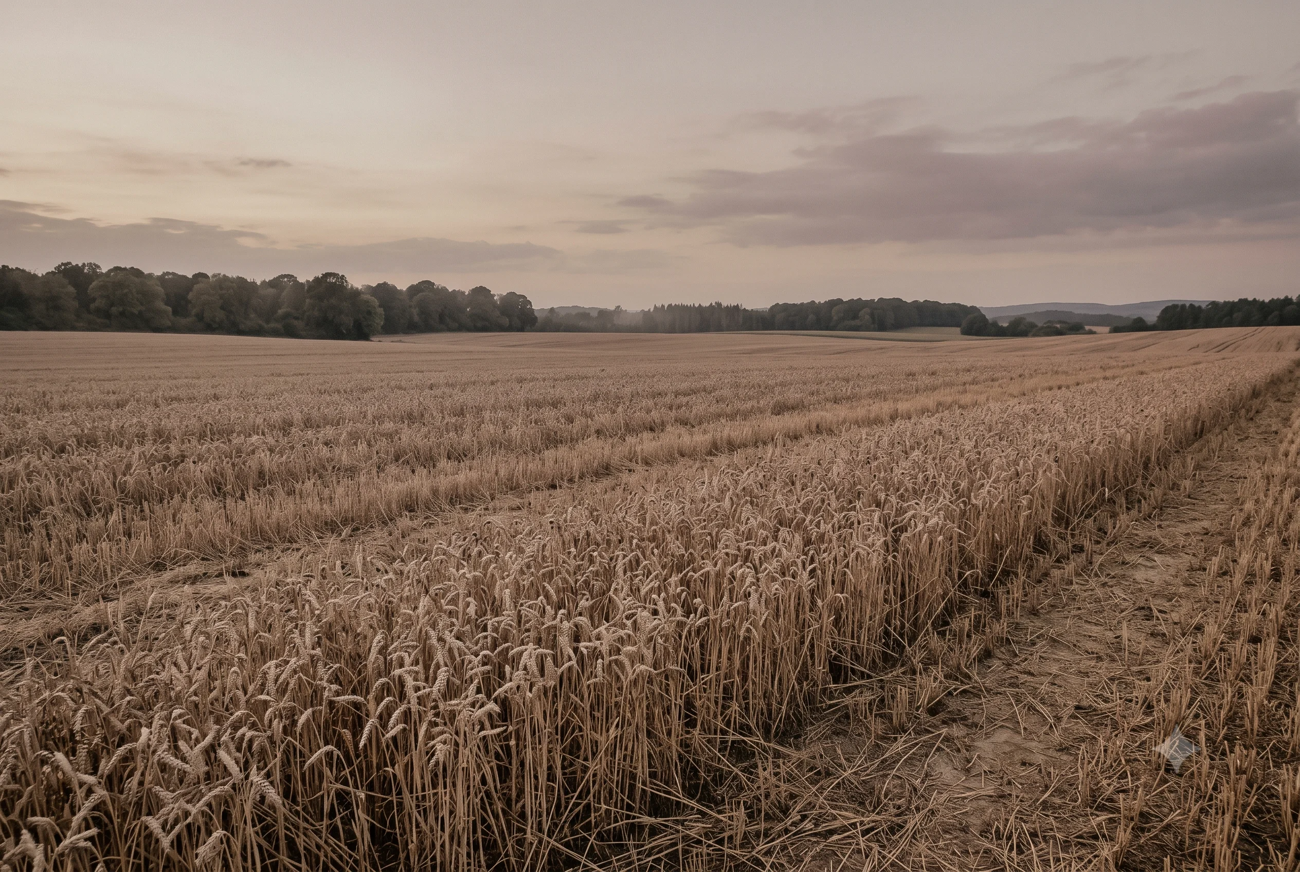
Think of a wheat field at the very end of summer, past harvest, the stalks left standing and dried under weeks of sun until every stem has gone the same dusted gold-beige. Seen at dusk, with the warm light fading and the colour settling into its quietest version of itself, that field is Soft Parchment exactly — warmth that has stopped trying to be bright.
A wheat field doesn’t choose to dry into this colour. It simply runs out of green to hold onto, and what’s left is the warm neutral underneath — the same logic that ages a page from white to parchment over decades of light.
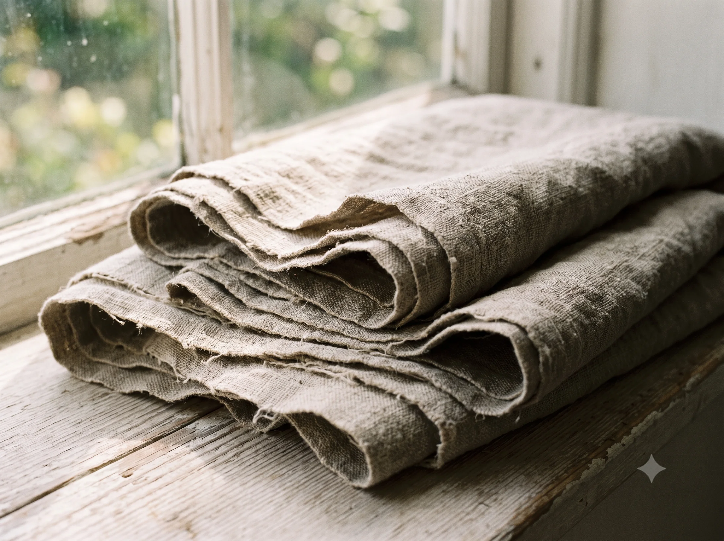
Raw linen left folded on a sunlit windowsill for years holds this colour too — the fabric’s original cream slowly pulled toward this exact dusted warmth by light it was never meant to sit in, fold after fold, until the whole cloth agrees on the same quiet tone.
The Wardrobe Perspective — A Deeper Warm-Neutral Anchor
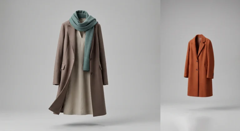
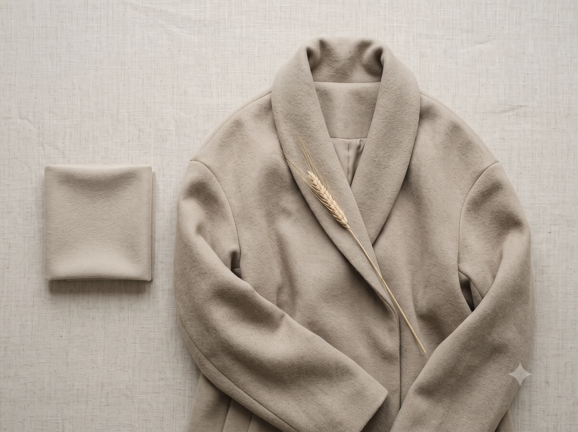
In a Soft Summer wardrobe that already holds Warm Greige as its lighter warm-neutral, Soft Parchment provides the deeper register — present enough to anchor an outfit the way a soft taupe or camel would, without the saturation that would pull it into Soft Autumn’s warmer territory.
It functions conceptually as a restful anchor in exactly the way the season’s blue-grey neutrals do, just from the warm side of the wheel: dusty, grayed, quiet enough to sit behind Soft Summer’s naturally low-contrast colouring rather than competing with it.
💄 Styling Echo — Beyond Clothing
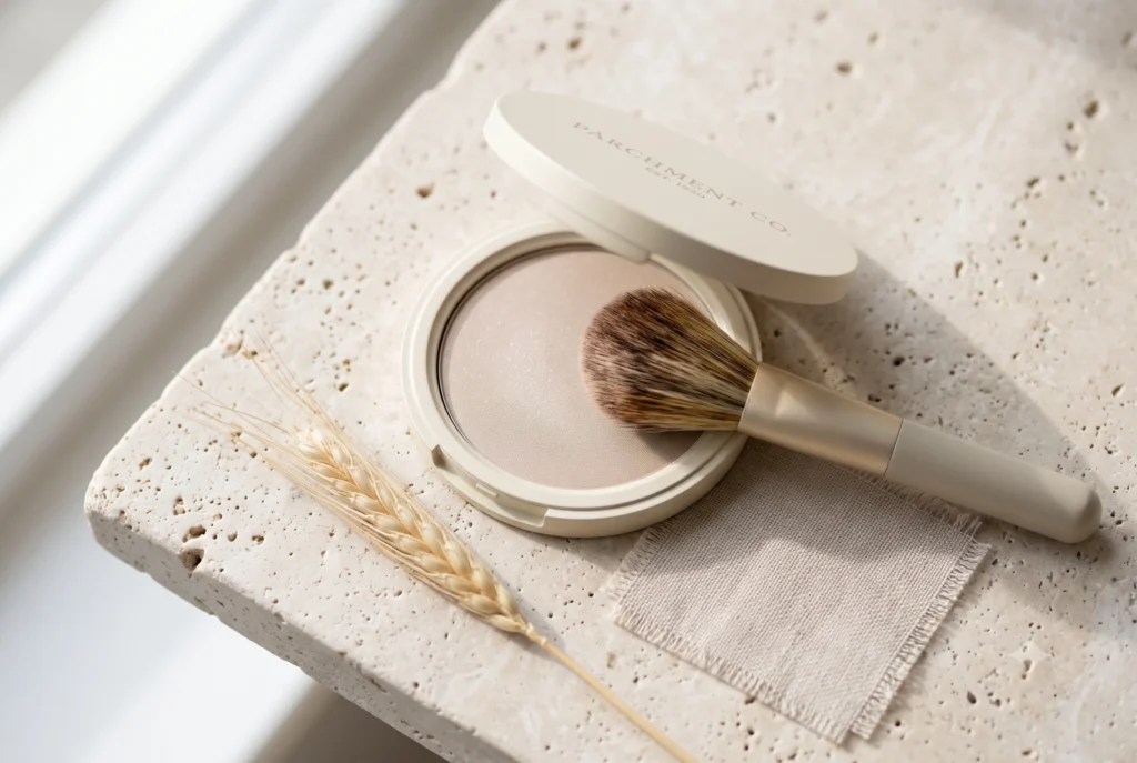
The same chroma-2 discipline that governs Soft Parchment in fabric carries directly into makeup and accessories — a warm, dusted neutral works the same way on an eyelid or in a leather good as it does in a coat.
For the full Soft Summer makeup palette, see the Soft Summer Makeup Guide; for complete wardrobe formulas, see the Soft Summer Capsule Wardrobe guide. Here, one image is enough to make the point.
🌾 Practitioner Note — Melanin Calibration
In my drapting sessions, Soft Parchment’s warm-neutral quality holds consistently across Soft Summer’s full Fitzpatrick range, from II through V. At deeper skin depths, the colour’s warmth becomes a quiet asset rather than a clash — it never pushes into the orange or gold territory that would conflict with a cool-neutral undertone, regardless of how much melanin is present.
Ten Swatches, Four Wings — The Soft Summer Palette in Full
With Soft Parchment confirmed, the Soft Summer palette reaches a clean structural symmetry. Every wing except the rose wing now holds an internal light-and-deep pair — a small piece of order that says more about the framework’s coherence than any single swatch could.
The full strip below shows all ten swatches at once — the cumulative palette this series has confirmed, one swatch at a time, each placed by Munsell theory rather than instinct.
16-Season Wheel — Ten Neutrals, Four Wings, One Discipline
Three readings, one answer. The Munsell profile confirms warm yellow hue at chroma 2, value 7 — one step deeper than Warm Greige, sharing its exact hue ratio. The dried wheat field and the sun-aged linen confirm the colour already exists outdoors and in textile alike, needing nothing but time and light to produce it. The wardrobe and styling roles confirm it functions as a deeper warm-neutral anchor across clothing, accessories, and even makeup, never crossing into the saturation that would pull it toward a warmer season.
Soft Parchment IS a neutral swatch WITHIN the Soft Summer palette IN the 16-season framework — the deeper sibling to Warm Greige, completing the warm-neutral wing the same way Soft Fern completed the green wing, by Munsell theory, by nature, and by the quiet discipline that holds every wing of this palette to the same chroma ceiling.
Check our complete resource on soft summer color palette cards ,swatches ,hex and color wheel.
Take a ride through our soft summer gallery !
Frequently asked questions .
A Few Things People Ask Me
What color is parchment?
Parchment is a pale, warm-leaning beige-grey, the colour of aged paper or vellum. The Soft Summer version, hex #C4C0B0, sits at Munsell value 7, chroma 2, in the warm yellow hue family — heavily muted, so the warmth registers as a whisper rather than a clear beige.
Is Soft Parchment a Soft Summer color?
Yes. Soft Parchment (#C4C0B0) is a confirmed Soft Summer neutral. Its Munsell profile — value 7, chroma 2, warm yellow hue (7.5Y) — places it one value step deeper than the season’s Warm Greige, completing a light-and-deep pair within the palette’s warm-neutral wing.
What is the difference between Warm Greige and Soft Parchment?
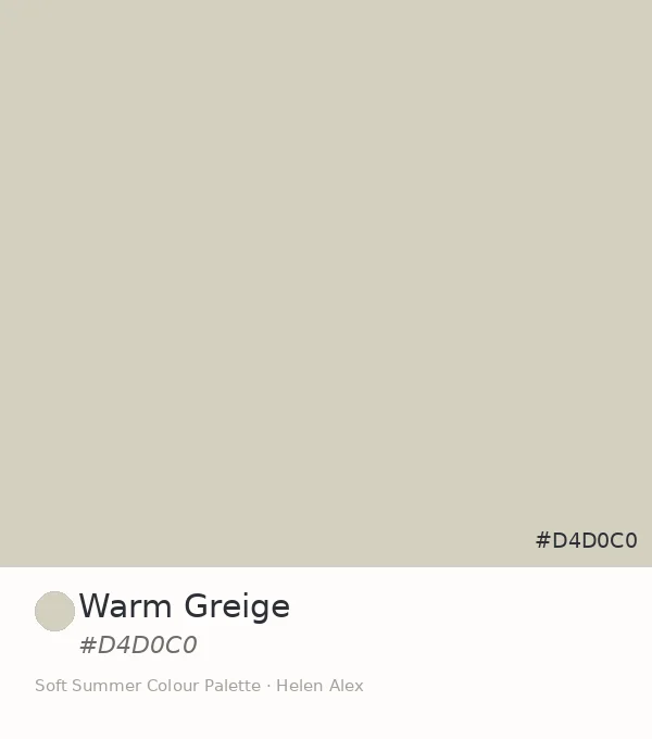
Both sit in the same warm yellow-grey hue family at chroma 2. Warm Greige (#D4D0C0) sits at Munsell value 8 — lighter, airier. Soft Parchment (#C4C0B0) sits at value 7 — one step deeper, with slightly more visual weight, functioning as the warm-neutral wing’s accent to Warm Greige’s background role.
What is the parchment color hex code in the Soft Summer palette?
The Soft Summer parchment swatch carries hex code #C4C0B0. Its Munsell notation is approximately 7.5Y 7/2 — warm yellow hue, medium value, very low chroma. This is the specific aged-paper neutral that belongs to the Soft Summer colour season.
What colours pair with Soft Parchment in a Soft Summer wardrobe?
Soft Parchment pairs naturally with the entire Soft Summer low-chroma family — cool blues and violets, the green wing, and especially its own lighter sibling, Warm Greige. The governing rule is shared chroma level: any Soft Summer tone at chroma 2 or below reads as a quiet companion to it.
Yours in colour, Helen
I’ve watched this exact swap save more wardrobes than any other single change — swap your darkest beige for this one, and notice how much less it fights with everything else you own. Try it before you buy anything new.
For the complete Soft Summer palette breakdown, see the Soft Summer Color Palette guide. To meet Soft Parchment’s lighter sibling, read Warm Greige next.