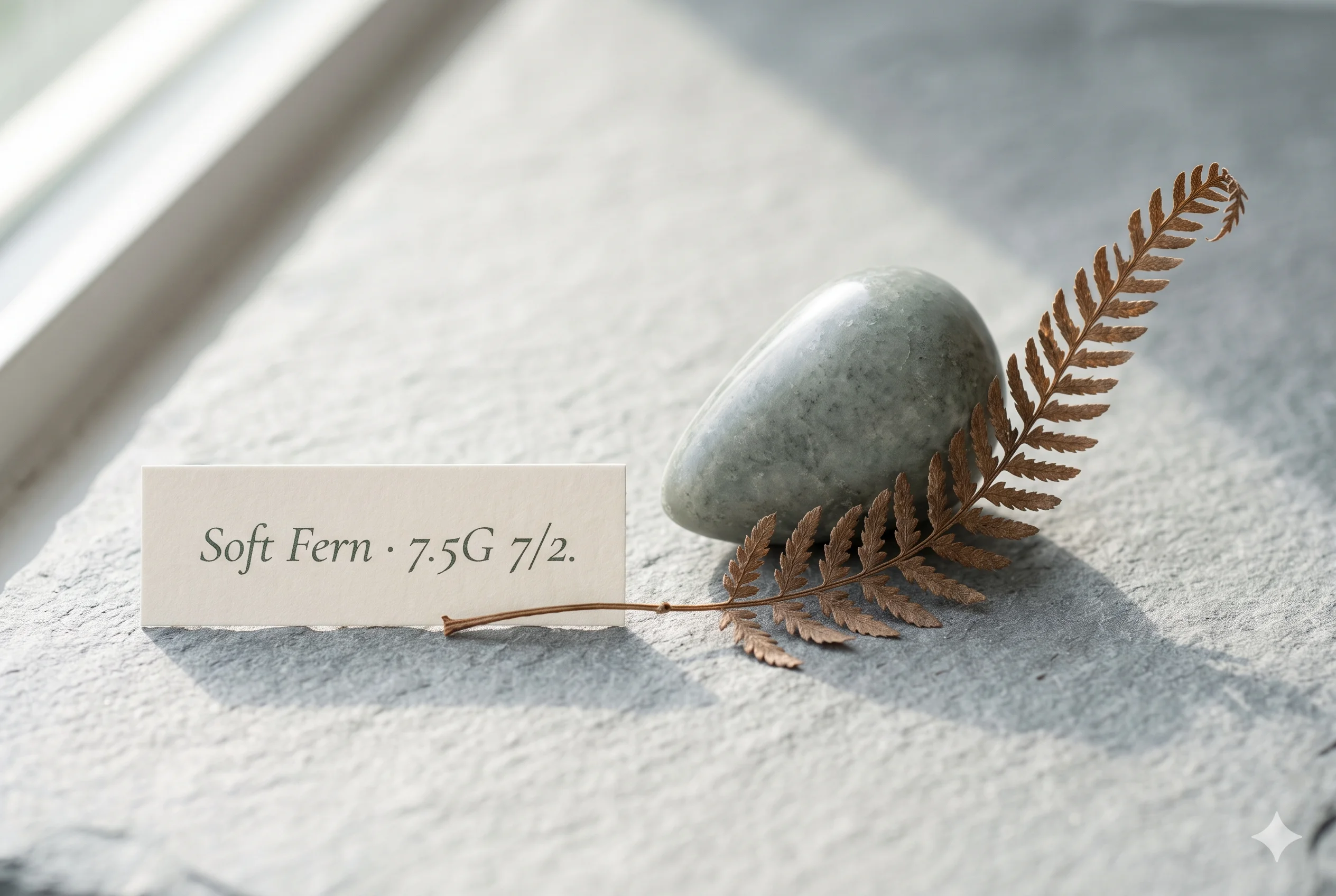
Soft Fern Color (#A8B4AA): The Soft Summer Green Accent
Soft Fern —The Fern Green That Only Exists When There Is No Sun
Every fern colour you see in full sunlight is the wrong shade of green for this palette. Vivid, fresh, yellow-inflected — that is what happens to fern green when the sun reaches it. Remove the sun entirely, put the same frond in deep woodland shade, and something shifts.
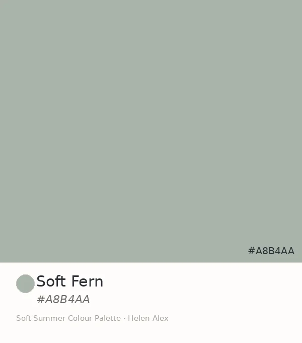
The green darkens, cools, and loses its warmth in one step. What remains — at hex #A8B4AA — is the fern colour that only the shade produces, and the second confirmed green in the Soft Summer palette.
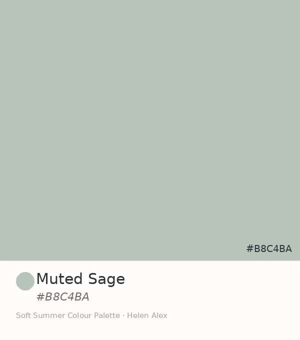
If Muted Sage is the cool grey-green at medium-light value, Soft Fern is its deeper sibling — one Munsell value step lower, with slightly more visual weight, and unambiguously rooted in shadow rather than haze.
Quick answer, if you’re short on time
Soft Fern (#A8B4AA) is an official Soft Summer neutral. Its Munsell profile — value 7, chroma 2, in the pure green hue family (7.5G) — positions it one value step deeper than Muted Sage, confirming it as the second member of the green wing in the Soft Summer palette. In the wardrobe it functions as the deeper green accent: present enough to carry visual weight, muted enough to remain quiet.

The Analyst Perspective — One Step Deeper Than Muted Sage
Strip the name and read the numbers. #A8B4AA converts to Munsell value 7, chroma 2, in the pure green hue family at approximately 7.5G — medium value, the lowest readable saturation, and a hue position that sits within the same cool green zone as its sibling, one value step lower.
That single value step — from 7.5 to 7 — is the whole distinction between Muted Sage and Soft Fern. Both share the same cool hue family and the same chroma ceiling of 2. The difference is simply how much light the green appears to be holding.
Fern green doesn’t lose its character as it darkens into shade — it just becomes less about the green and more about the shadow it’s carrying.
Set it beside Muted Sage and you notice the darker weight immediately — same hue family, same chroma, one value step separates them and that step accounts for everything.
Soft Autumn carries its equivalent green with a warm, yellow-olive cast — see the Soft Summer vs Soft Autumn comparison for the full thermal breakdown. Soft Fern is the cool version at this exact value: the same level of depth, the yellow removed, the grey in its place.
Soft Fern ✦ new
Value 7 · Chroma 2 · 7.5G — deeper, shaded green
Muted Sage (sibling)
Value 7.5 · Chroma 2 · 5G — lighter, hazed green
Light Summer equiv.
Value 7 · Chroma 2 · 7.5G — same depth, airier
Soft Autumn equiv.
Value 7 · Chroma 4 · 5GY — warm yellow-green
The Soft Autumn comparison is the one that matters most for understanding Soft Fern’s place. Same depth, same quietness — completely different temperature direction.
The Nature Perspective — The Green That Lives Below the Canopy
There are two kinds of fern green. The one you photograph in a garden in July under direct noon light — warm, bright, yellow-inflected. And the one you find in a beech wood on an overcast afternoon, where the canopy has filtered everything and only grey-green remains.
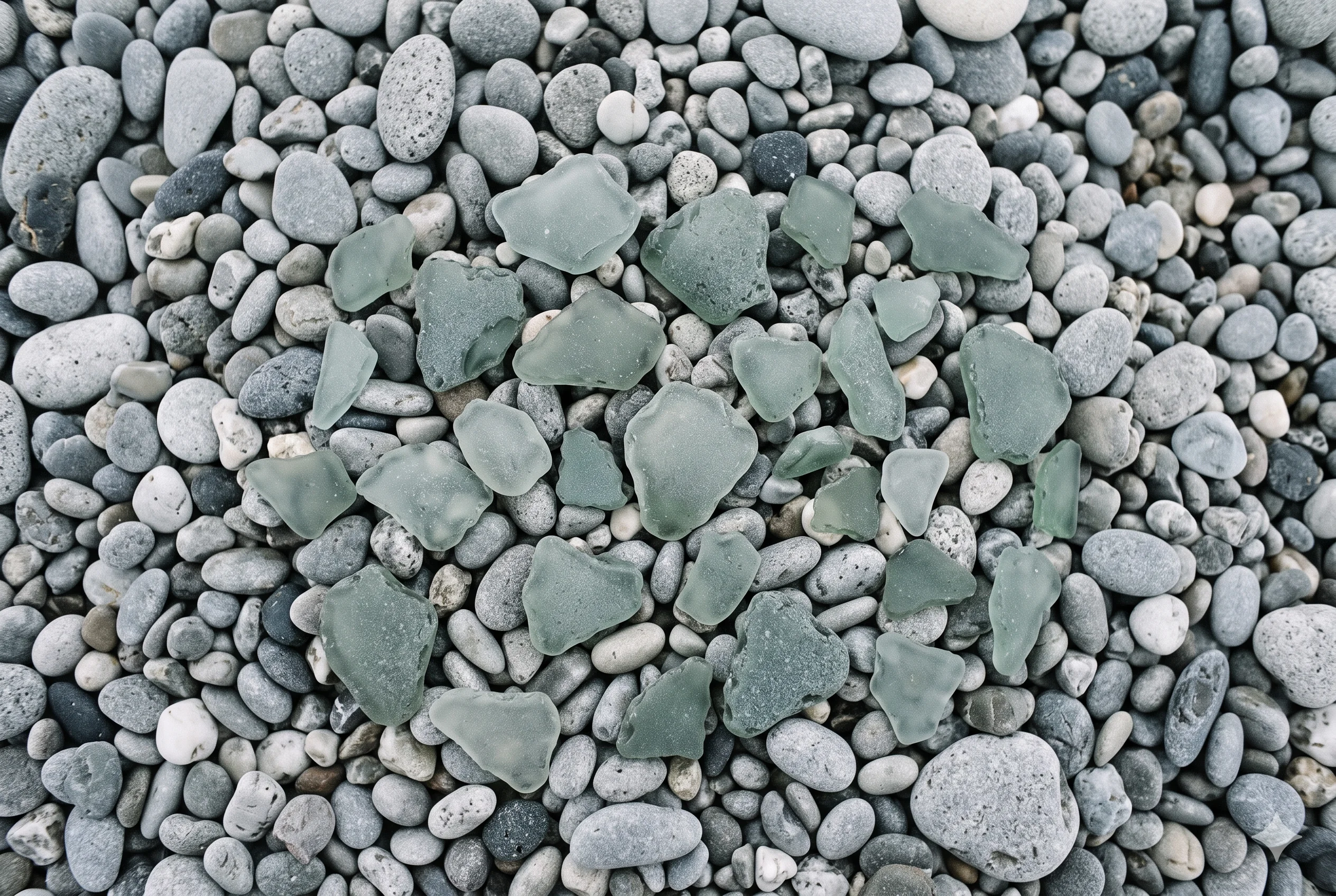
Think of sea glass in a green bottle tint — not the vivid aqua of clear sea glass, but the specific cool grey-green of older, thicker glass that has been in the water long enough for the salt to work on it. That grey-green, held up to a flat sky, is exactly the colour of #A8B4AA. Green that has been washed of its warmth.
Sea glass is one of the most precise natural references for this colour precisely because the transformation it undergoes — colour being cooled and muted by the persistent action of cold water and grey light — is structurally identical to what produces Soft Fern from ordinary fern green.
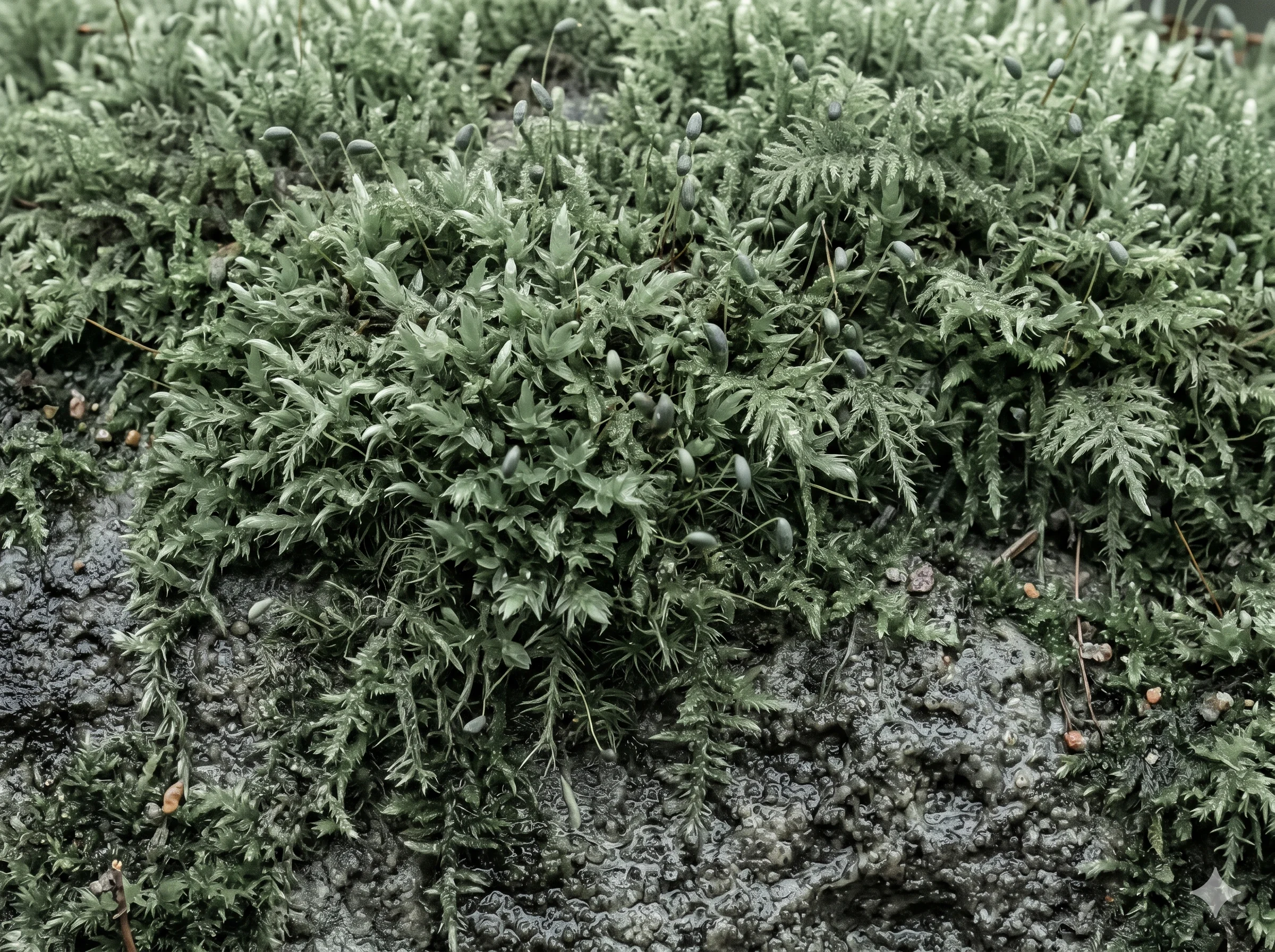
Moss on a north-facing stone wall in November holds this colour too — the green that grows where the sun never reaches, and has therefore never had to perform warmth. It knows this colour instinctively: grey-green, matte, entirely at home in the shade that built it.
The Wardrobe Perspective — The Deeper Green Accent
In a Soft Summer wardrobe that already holds Muted Sage as its lighter green neutral, Soft Fern adds the same green family at one step more presence. The two function as a pair rather than duplicates — one for the background, one for the accent.
Soft Fern is the green a Soft Summer reaches for when they want the colour to read rather than merely support. It has enough value depth to hold its own beside the blues and the rose tones without receding entirely — which is exactly what makes it the green-wing accent rather than the green-wing neutral.
The dusty, grey-green quality means it never creates hard contrast. It provides visual weight without the kind of colour statement that would overwhelm Soft Summer’s naturally blended, low-contrast colouring.
🌿 Practitioner Note — Melanin Calibration
In my drapting sessions, Soft Fern’s cool-neutral green direction holds consistently across Soft Summer’s full Fitzpatrick range. At deeper Fitzpatrick depths (IV–V), the slightly lower value of Soft Fern (7 vs Muted Sage’s 7.5) means it creates a touch more contrast against deeper skin tones — which is useful, as it reads more clearly as a colour choice. The temperature stays cool-neutral; what shifts at depth is only the visibility and contrast, never the hue quality.
The Green Pair — Muted Sage and Soft Fern Together
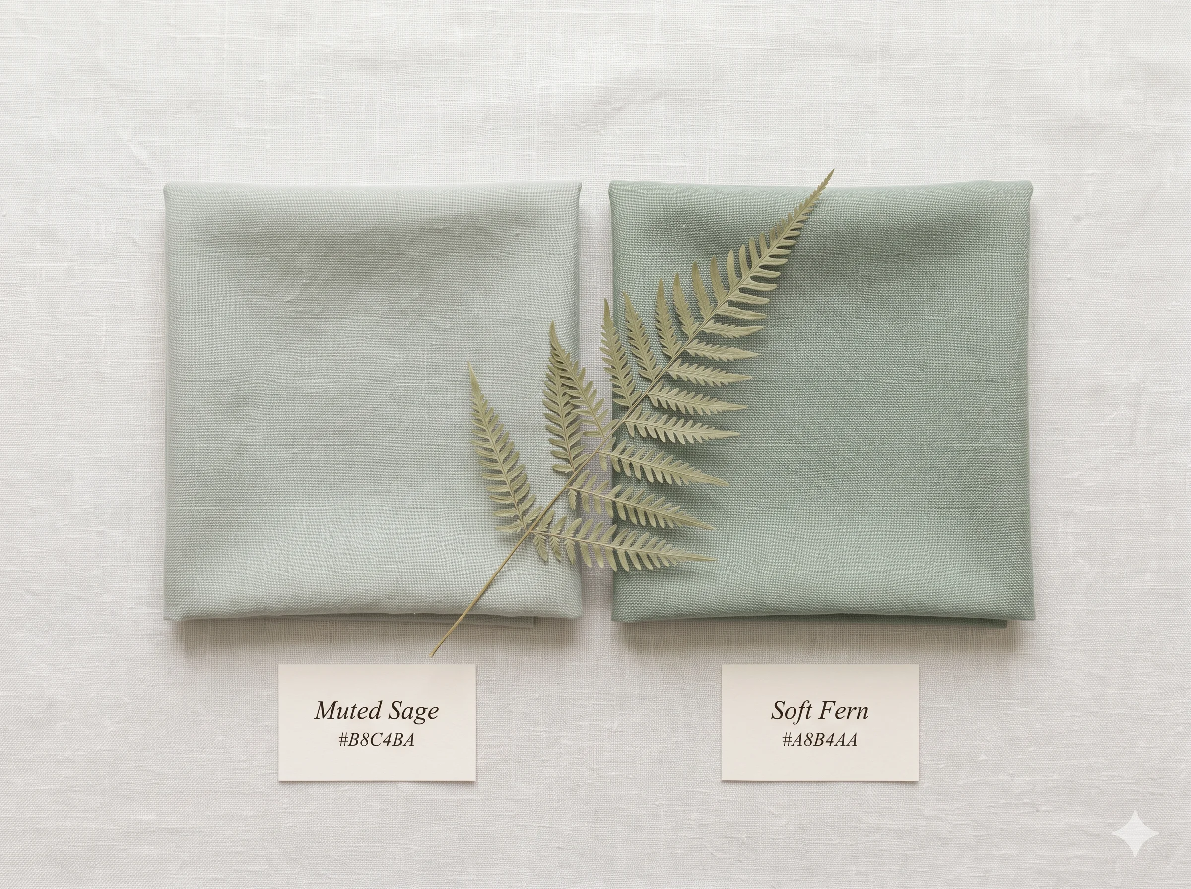
With Soft Fern confirmed, the Soft Summer palette’s green wing now has two confirmed members. Muted Sage and Soft Fern are a sibling pair within the green family — same hue zone, same chroma discipline, one value step apart.
Muted Sage
#B8C4BAValue 7.5 · lighter, hazed quality
Soft Fern →
#A8B4AAValue 7 · deeper, shaded quality
The difference between the two is subtle but functional. Muted Sage works as a background neutral — it recedes slightly and supports other colours. Soft Fern works as an accent — it holds its position more assertively while remaining well within the same muted discipline.
Eight swatches, three directional wings, one chroma discipline. The palette has a blue-violet family, a rose family, and now a confirmed two-member green family — each wing built on the same principle of colour held at the muted register.
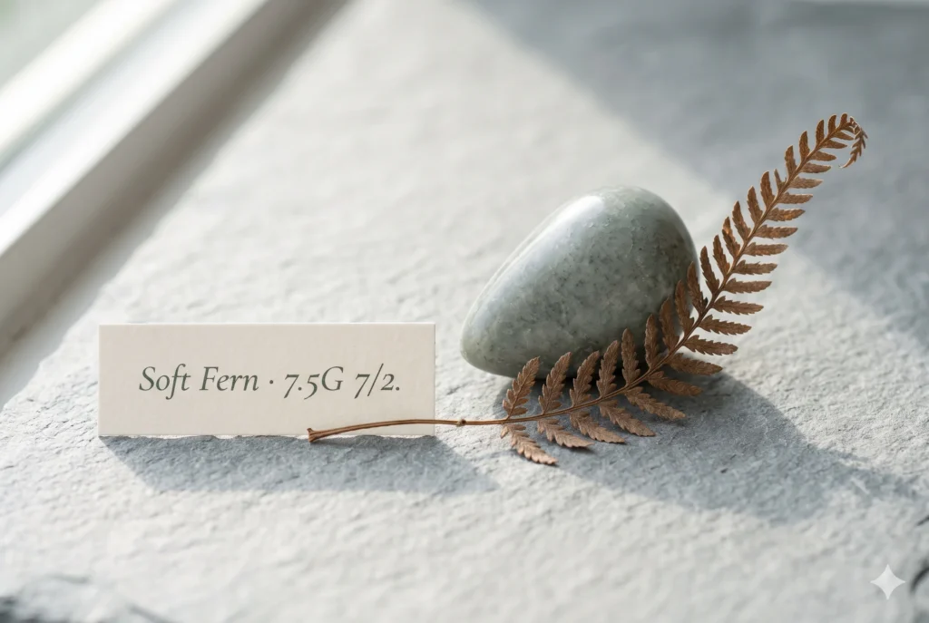
Three readings, one answer. The Munsell profile confirms cool green at value 7 and chroma 2 — one step deeper than Muted Sage, at the exact value where green sits fully in shade.
The sea glass and the moss on north-facing stone confirm it already exists outdoors this way, needing no warmth to sustain it. The wardrobe role confirms it is the accent to Muted Sage’s neutral — the green the palette uses when it needs to be seen, not merely present.Check our complete resource on soft summer color palette cards ,swatches ,hex and color wheel.
Take a ride through our soft summer gallery !
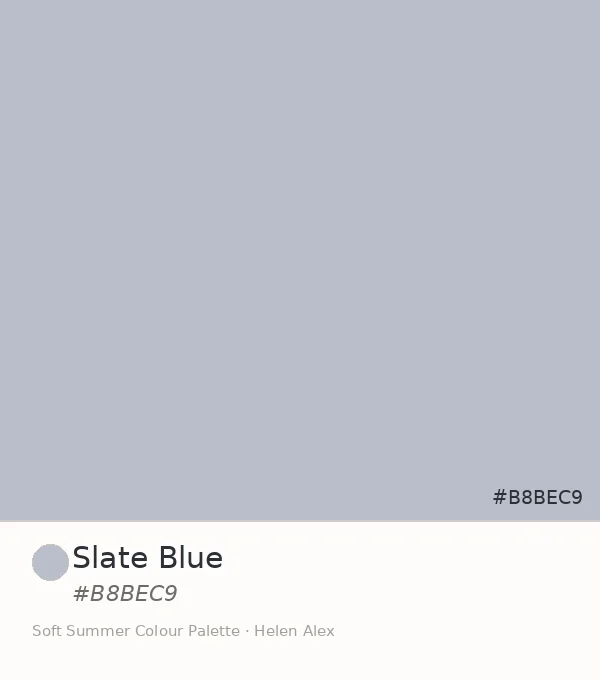
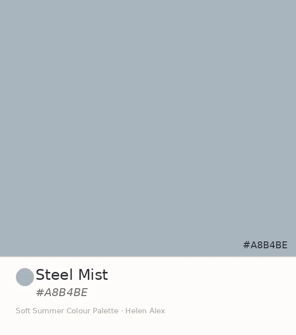
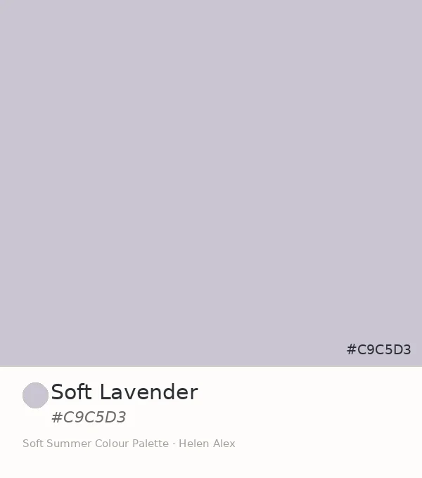
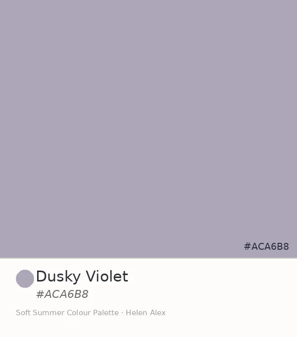
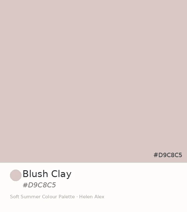
Soft Fern IS a neutral-accent swatch WITHIN the Soft Summer palette IN the 16-season framework — the second confirmed green-wing member, one Munsell value step deeper than Muted Sage, and the colour that completes the green family the same way Steel Mist completes the blue family: by providing depth without departing from discipline.Also read the detailed account on Warm summer color palette.
Frequently asked questions .
A Few Things People Ask Me
What is soft fern color?
Soft Fern color is a heavily greyed, cool grey-green at hex #A8B4AA. In the Sci/ART 16-season framework it is a confirmed Soft Summer neutral — Munsell value 7, chroma 2, pure green hue (7.5G) — the fern green that only exists in shade, where all yellow warmth has been removed from the green and grey has fully entered.
Is soft fern a Soft Summer color?
Yes. Soft Fern (#A8B4AA) is a confirmed Soft Summer neutral. Its Munsell profile — value 7, chroma 2, cool pure green — positions it as the second member of the green wing in the Soft Summer palette, one value step deeper than its sibling Muted Sage, serving as the green-wing accent.Get to know about the place of green in soft summer color palette.
What is the soft fern color palette relationship in Soft Summer?
In the Soft Summer palette, Soft Fern (#A8B4AA) is the deeper sibling of Muted Sage (#B8C4BA). Both sit in the cool grey-green hue family at chroma 2. Soft Fern’s Munsell value of 7 versus Muted Sage’s 7.5 gives it slightly more visual weight, making it the green accent to Muted Sage’s green neutral.
What is the difference between soft fern and fern green?
Fern green as a colour concept spans a wide range from vivid warm greens to muted cool ones. Soft Fern at #A8B4AA is specifically the cool, heavily desaturated, shaded version at Munsell chroma 2 — value 7, green hue (7.5G). It belongs to the Soft Summer palette rather than any warm-green category.
What colours pair with soft fern in a Soft Summer wardrobe?
Soft Fern pairs with the entire Soft Summer low-chroma neutral family. It works particularly well beside Muted Sage as a green-family pair, and beside the cool blues as a cross-wing combination. The governing rule is shared chroma — any Soft Summer tone at chroma 2 or below reads naturally beside it.
Yours in colour, Helen
I’ve watched this specific green do something the other swatches in the series don’t — it makes people stop and reconsider what “green in a wardrobe” actually means. Spend a week with Muted Sage first, then bring in Soft Fern. The progression is always more convincing than either shade alone.
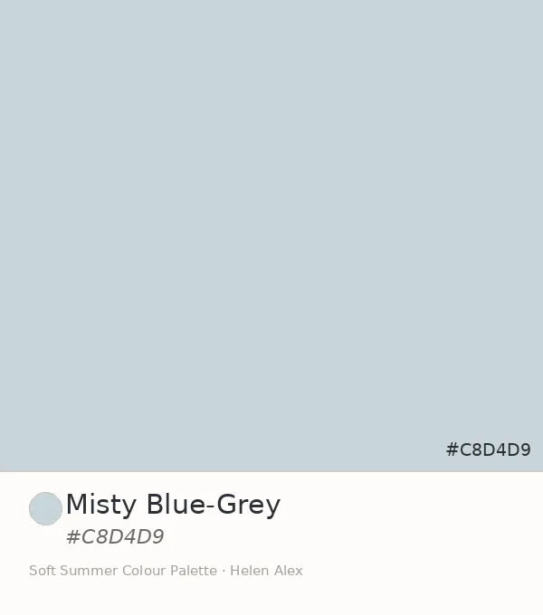
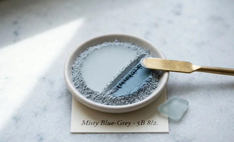
For the complete Soft Summer palette breakdown, see the Soft Summer Color Palette guide. To follow the full swatch series from the beginning, start with Misty Blue-Grey and trace the arc through to the green family via Muted Sage.
Such a wonderful and through description of the complexities and nuances of Soft Summer. 🙂
Thank you so much!
Rosa
Thanks Rosa Seay .We are glad you liked it .