Where Green Actually Lives in the Soft Summer Palette
Soft summer green palette ,the best greens and olive verdict
Olive green shows up on every “colours to avoid” list for Soft Summer within about two sentences. Fair enough — olive earns that reputation honestly. But somewhere between the warnings and the actual soft summer green palette already sitting quietly in this site’s own swatch library, a real question gets lost: If olive’s out, is green out entirely?
What’s been missing is the piece that puts them side by side, explains why olive doesn’t get an invitation while sage does, and actually answers the outfit and makeup questions people keep asking around this exact topic. So let’s sort it properly.
Quick answer, if you’re short on time — Green does belong in the soft summer green palette, but only its cool, muted end. Muted Sage and Soft Fern are the two confirmed residents. Warm, saturated olive doesn’t fit — that’s Soft Autumn’s colour — and vivid emerald is too intense for this palette’s low-chroma range. Want the full breakdown on either shade? Their dedicated guides go much deeper than this piece does.
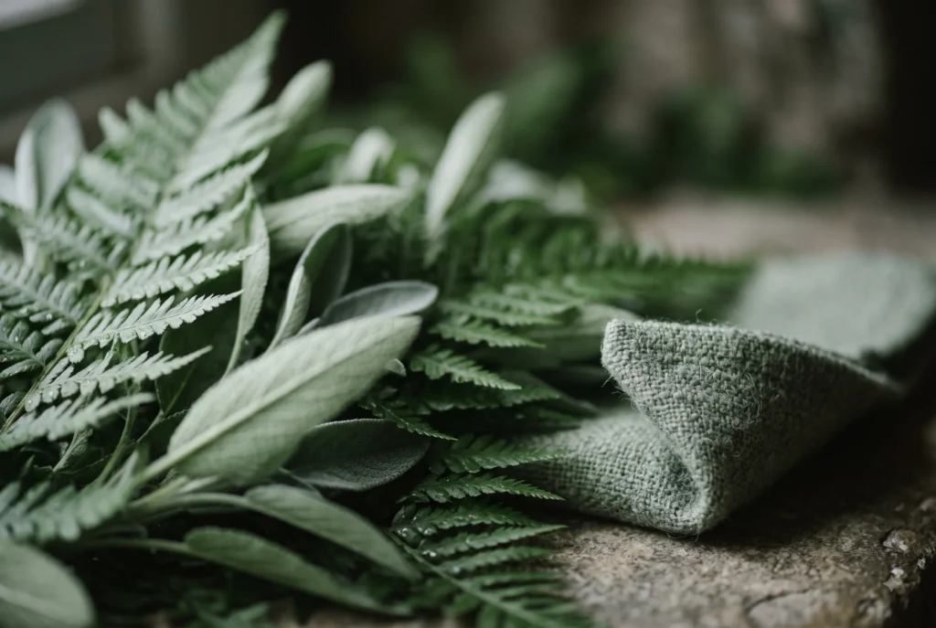
Where Green Actually Sits
The Soft Summer wheel runs blue into green into neutral along one arc. Green’s real estate on that arc is narrow — bounded by a cool blue-green on one side, and the exact point where warmth creeps in and it stops being Soft Summer’s green and starts being Soft Autumn’s olive.
That boundary is the whole story. Everything else in this piece is really just this one wheel, explained.
neighbourhood
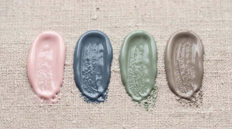
- Slate Blue — the cool edge
- Steel Mist
- Muted Teal-Green — the bridge
- Soft Fern
- Muted Sage
- Olive → this is Soft Autumn’s territory now
Shades of green in soft summer palette
I’ve already given Soft Fern and Muted Sage their own full breakdowns — hex codes, pairing formulas, the works. This is just the introduction. The depth lives on their pages.
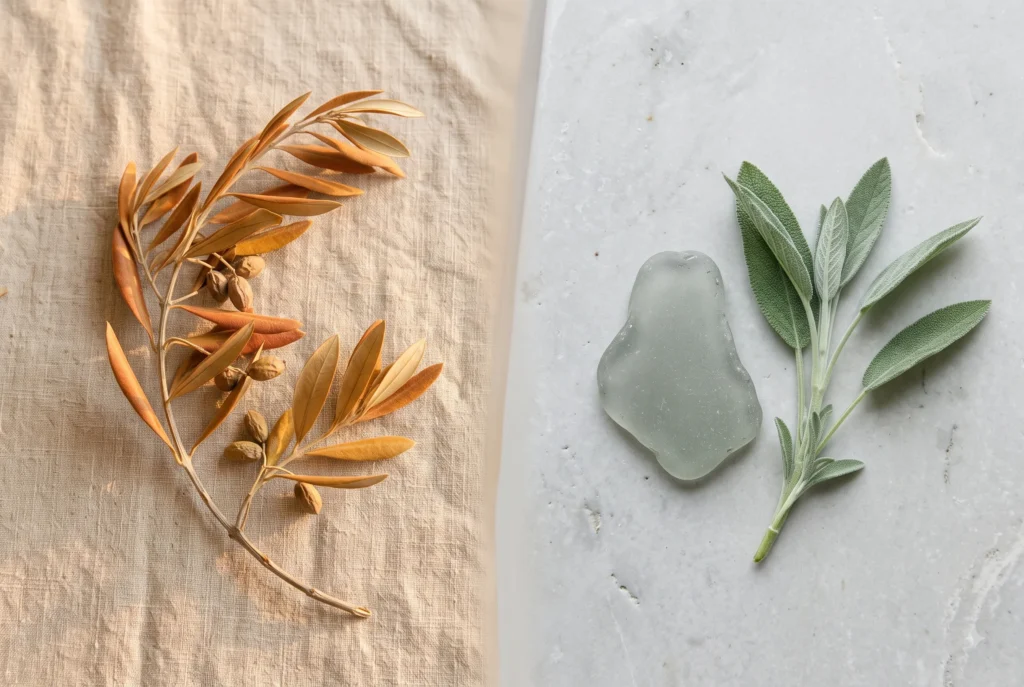
Fern leans a touch more blue and sits a shade deeper. Sage is lighter and greyer — closer to the neutral end of the family. Side by side they’re close enough to wear together in the same outfit without competing, which is rarer than it sounds for two colours from the same family.
Read the full pieces here: Soft Fern and Muted Sage.
“Soft Fern reads as a fairly ordinary green on its own — until you set it next to a true moss or olive. The blue sitting underneath becomes obvious immediately. That blue is the entire reason this shade belongs here and olive doesn’t.”
So What About Olive place in soft summer palette?
Olive’s warmth is the problem, not its darkness. Soft Summer’s whole foundation is cool — blue-pink undertone, no gold, no earth. Olive carries a yellow-brown base that sits directly against that foundation instead of alongside it.
Is olive green a soft summer colour, then? Not really — not the version you’d find in a wardrobe labelled “olive.” That colour belongs to Soft Autumn, where it’s genuinely one of the stars. A heavily greyed, cool-leaning khaki can graze the boundary between the two seasons, but that’s the exception carrying the argument, not the rule.
If olive keeps showing up in your closet because you love it — Muted Sage is the closest thing this palette has to an answer for that impulse. Same quiet, earthy energy. None of the warmth working against you.
And Emerald? Teal? The Vivid End of Green Shade
Emerald is the opposite problem from olive — it’s cool enough, but far too saturated. That clarity and intensity is a Winter colour, not a Soft Summer one. Wear it and the green becomes the loudest thing in the room; your face goes quiet by comparison.
Teal is more interesting, because a muted teal-green genuinely works — it’s the bridge colour on the wheel above, sitting right between Slate Blue and Fern. The vivid, saturated teal you’d find in a swimsuit ad doesn’t; the dialled-back, greyed version does.
This is also where the “does blue-green look bad on shaded soft summer” question actually gets answered. It doesn’t — not because of skin depth, but because chroma is the variable that matters here, not depth. A muted teal-green reads just as harmoniously on deeper Soft Summer skin as it does on fair skin. What breaks the harmony is saturation creeping up, at any depth.
Wearing It — What Green Actually Pairs With
Green in this palette works best as a supporting colour, not the outfit. A few combinations that consistently work in real wardrobes:
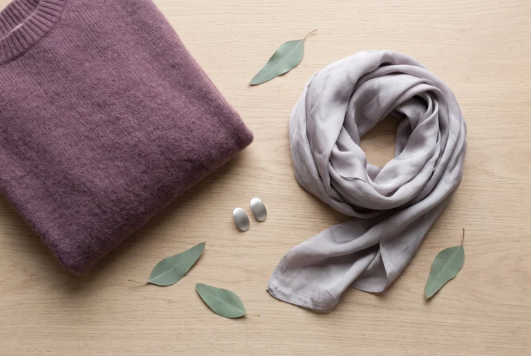
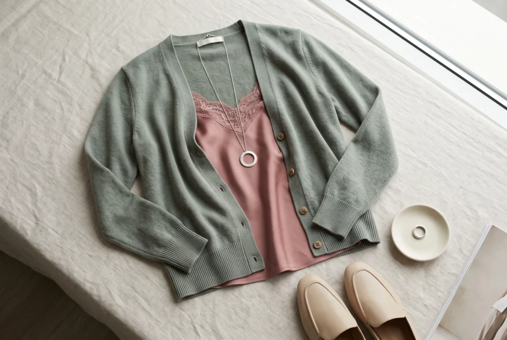
Sage cardigan, dusty rose underneath. The cool-muted pink brings warmth to the face without fighting the green’s temperature.
Fern skirt or trouser, warm greige on top. Greige is neutral enough to let the green do the talking.
Either green, with soft charcoal as the anchor. Not black — soft charcoal carries the same cool undertone the green needs, where true black introduces contrast this palette doesn’t ask for.
Metal-wise, this is silver territory, same as everywhere else in the Summer family. In my own wardrobe, sage and a brushed silver chain is the combination I reach for most in early autumn, right before the actual Autumn colours take over the rest of the season.
Green in Makeup — Realistically, That Means Eyeshadow
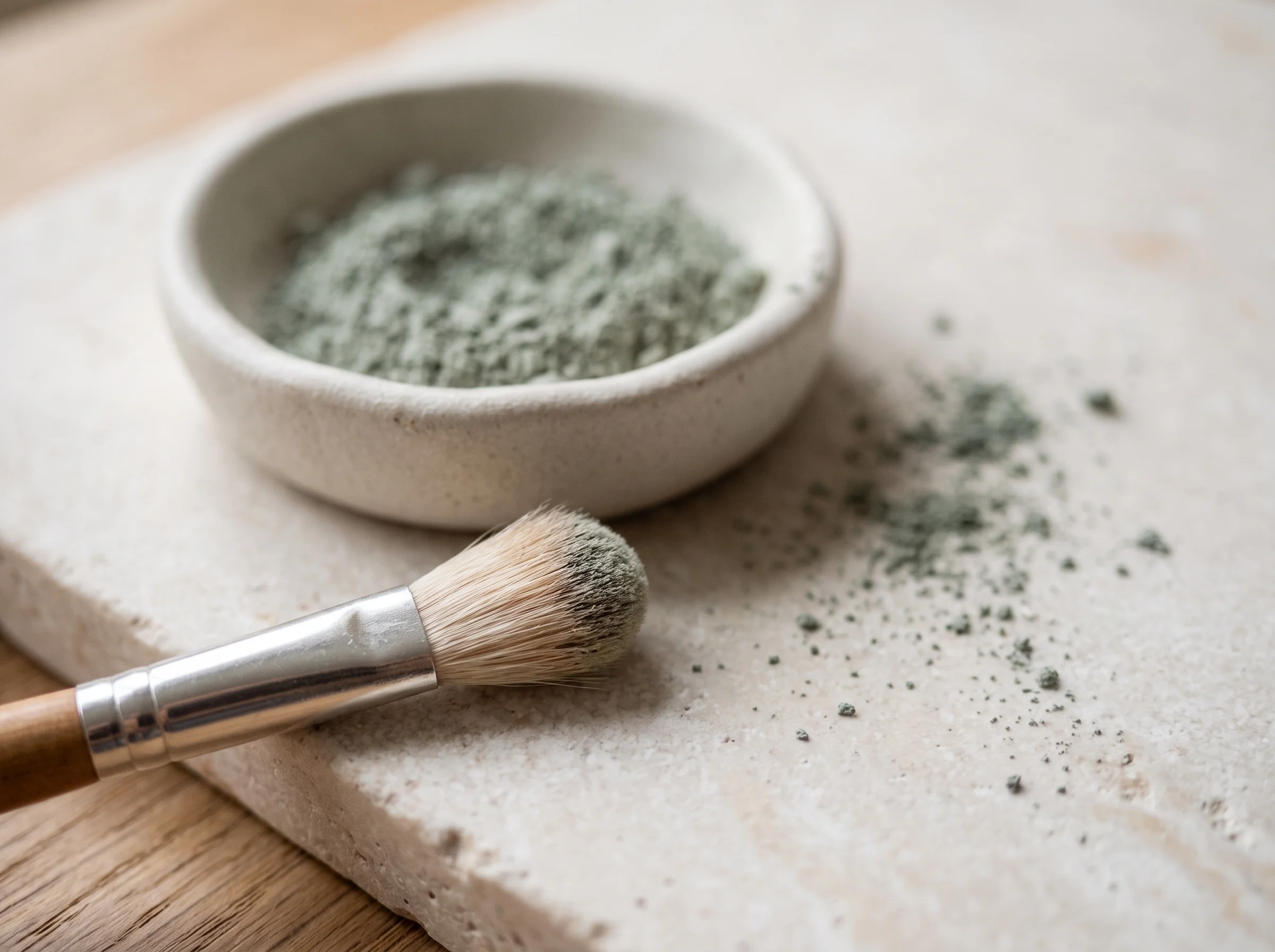
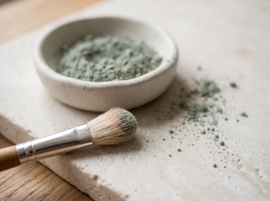
Green rarely shows up in blush or lip colour for any season, Soft Summer included. Where it genuinely earns a place is eyeshadow — and a muted moss or sage shadow does something interesting against this season’s natural eye colours.
Against blue or grey-blue eyes, a soft sage shadow pulls warmth toward the iris without overpowering it. Against soft hazel, it deepens the green fleck already present rather than fighting it. Either way, the shadow should stay matte or lightly satin — shimmer pushes chroma up exactly where this palette needs it to stay down.
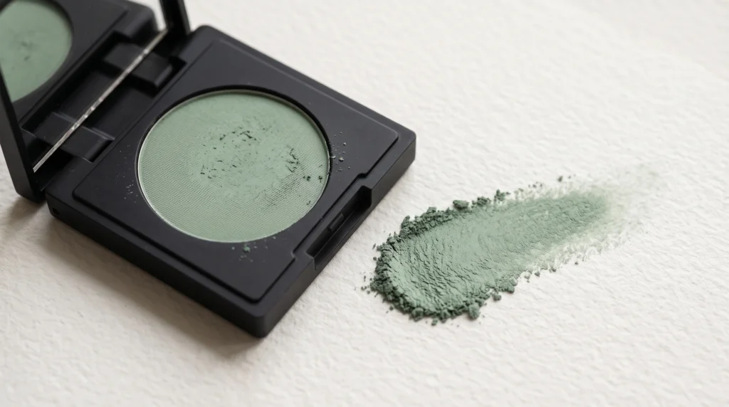
On depth: the shade itself doesn’t need to change across skin tones, but the pigment intensity can. A single light layer reads clearly on fair skin; deeper skin can carry a slightly more built-up layer of the same sage shadow without it reading as more vivid than intended — the extra pigment is absorbing into more melanin, not adding saturation.
One quick note before we move on — if you landed here searching for soft summer green eyes rather than green clothing, that’s a real and separate topic. It’s covered as part of the season’s natural characteristics on the main Soft Summer Color Palette guide, not here.
A Few Things People Ask Me
Can Soft Summer wear olive green?
Not true olive — its warmth runs against this palette’s cool base, and it belongs to Soft Autumn instead. A heavily greyed, cool-leaning khaki can graze the boundary, but it’s the exception, not the rule.
Does blue-green look bad on a deeper Soft Summer?
No — chroma is what matters here, not depth. A muted teal-green reads just as harmoniously on deeper Soft Summer skin as it does on fair skin, as long as the shade stays muted rather than tipping into a bright, saturated teal.
What is the difference between Soft Fern and Muted Sage?
Fern leans slightly more blue-cool and sits a touch deeper; Sage is a fraction lighter and greyer. Side by side they’re close enough to wear together, but each has its own full breakdown with exact hex and styling detail.
Can Soft Summer wear emerald green?
Emerald’s saturation is too high for this palette — that clarity and intensity belongs to Winter, not Soft Summer. A muted, dialled-back version of the same hue family works; the vivid jewel-tone version doesn’t.
That’s the whole trick — two real greens, one clear boundary, and a lot of confusion that dissolves once you see the wheel.
Yours in colour,
Helen
If you’re ready to build the rest of the outfit around it, the capsule wardrobe guide is where that lives.