Soft Summer Yellow —Can You Wear It?
Can Soft Summers wear Yellow ? The Precise Answer
Direct Answer — Can Soft Summer Wear Yellow?
Yes — but only a very specific narrow band. Most yellows are too warm and too vivid for Soft Summer’s cool undertone and low-chroma palette. The yellows that work are heavily greyed and cool-shifted: cool citron-grey, muted lemon with a blue or grey cast, and soft greyed butter yellow where the warmth has been significantly neutralised. These shades are genuinely difficult to find. Standard golden yellow, warm mustard, vivid lemon, and warm butter yellow all fall outside the Soft Summer palette.
Why Yellow Is the Hardest Colour for Soft Summer
Yellow is thermally the warmest colour on the visible spectrum. It carries more yellow-warm energy at any saturation level than any other hue — even when muted, it retains a distinctly warm quality. This is physics, not preference.
Soft Summer has a cool thermal undertone. The skin, eyes, and hair all read cooler than warm. Placing yellow near a cool face is like placing a lit candle in a blue-grey coastal scene — the warmth does not blend, it announces itself.
The Nature Analogy — Why Yellow and Cool Skin Conflict
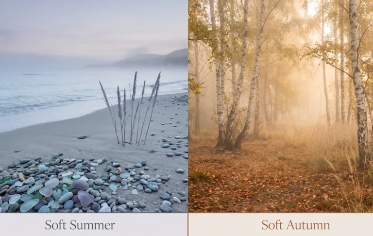
Picture morning light on an overcast August coast — the sea is grey-blue, the pebbles are cool grey, the sky holds a pale lavender quality. Everything is in thermal harmony. Now introduce a jar of golden honey into this scene. It does not blend. It reads as foreign — not because it is ugly, but because it belongs to a different light temperature entirely.
That is what most yellows do near Soft Summer skin. The skin is the cool coastal scene. The yellow is the honey jar. The temperature conflict is immediately visible in natural light — the skin picks up the warmth of the yellow and reads as slightly sallow rather than cool and clear.
This does not mean Soft Summer can never wear yellow. It means the yellow must first have its warmth significantly reduced — to the point where it reads more as a cool greyed-green than a classic yellow. At that point, the thermal conflict becomes manageable.
The Yellow Spectrum — Where Soft Summer Fits
Yellow is not one temperature. It spans from its warmest expression (vivid warm gold, orange-yellow, warm mustard) to its coolest (lemon with blue cast, citron with grey modifier, pale cool primrose). Soft Summer occupies the extreme cool-muted end of this spectrum — the narrow zone where the warmth has been sufficiently neutralised.
Greyed
Lemon
Citron
Lemon
Butter
Butter
Lemon
Yellow
Mustard
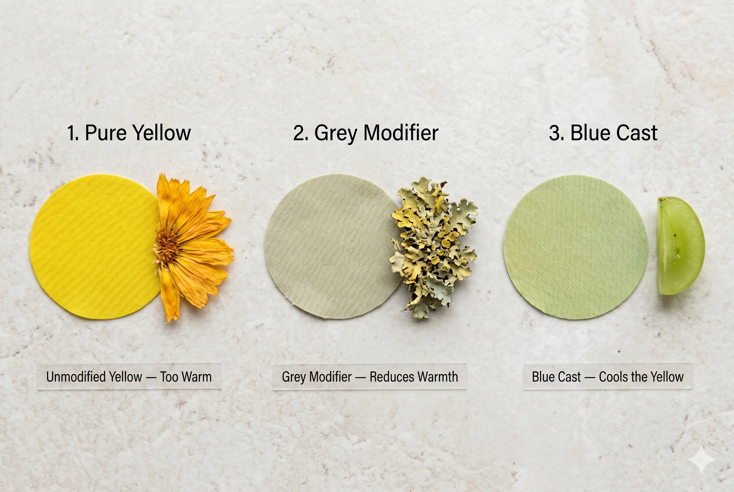
The Two Yellow Modifiers That Matter
What makes a yellow work or fail for Soft Summer comes down to two variables: the grey modifier and the blue cast.
- Grey modifier: When grey is mixed into yellow, it reduces the chroma (saturation) and partially neutralises the warm thermal energy. A heavily grey-modified yellow reads as a complex neutral rather than a clear warm hue.
- Blue cast: When yellow contains a slight blue shift, the resulting citron or cool lemon direction partially counteracts the warmth. The blue and yellow thermal energies partially cancel each other, landing the colour in a cooler position on the thermal spectrum than pure yellow.
- The Soft Summer yellow must have significant grey modification OR a noticeable cool/blue cast — ideally both. A yellow that reads immediately and unmistakably as “yellow” on the shelf is almost certainly outside the Soft Summer range.
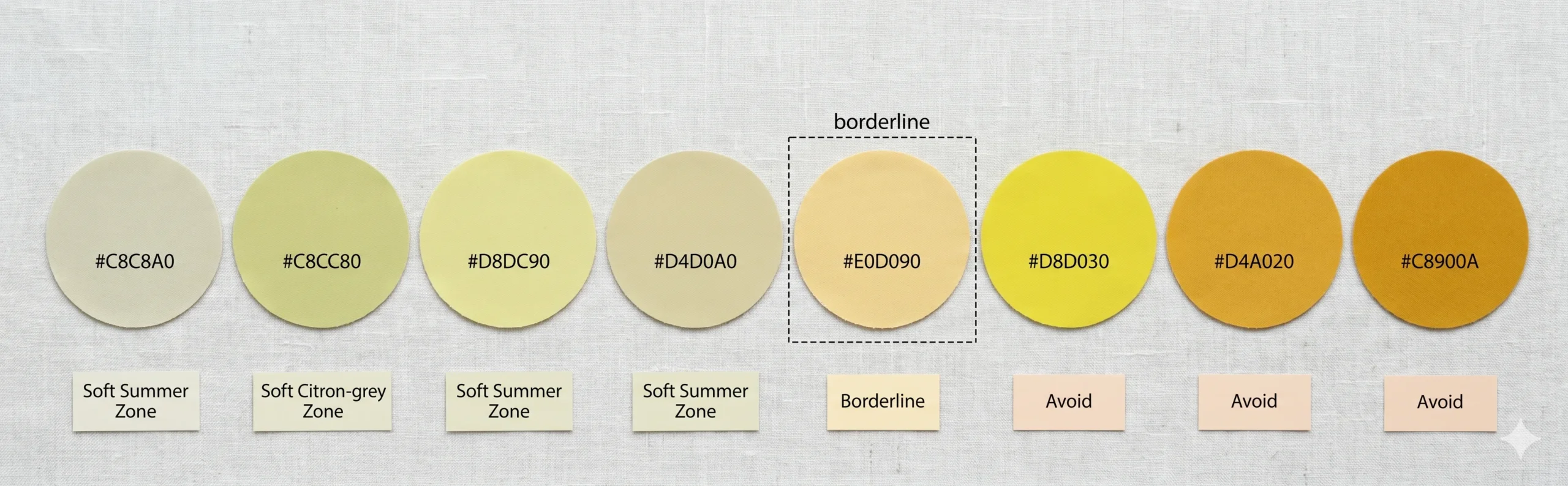
The Yellows That Work — Specific Shades with Hex Codes
These are the specific yellow shades that sit within or at the edge of the Soft Summer palette. They are all difficult to describe in a store because they do not look obviously “yellow” to most people — that ambiguity is precisely what makes them correct.
Cool Greyed Lemon
#C8C8A0
✓ Soft Summer
Cool Citron-Grey
#C8CC80
✓ Soft Summer
Pale Cool Lemon
#D8DC90
✓ Soft Summer
Greyed Butter
#D4D0A0 ✓ Outer Edge
Yellow Parchment
#E0DCC0 ✓ Yellow-Adjacent
Warm Butter
#E0D090 ~ Borderline
Vivid Lemon
#E8D820 ✗ Avoid
Golden Yellow
#D4A020 ✗ Avoid
Warm Mustard
#C8900A ✗ Avoid
What These Correct Yellows Have in Common
Look at the swatches marked ✓ above. They share three qualities: they are light in value (high LRV — they do not have weight or density), they are muted in saturation (the yellow quality is present but not dominant), and they are ambiguous — when you look at them, your first instinct might be “is that yellow-green? Or grey-yellow?”
That ambiguity is the crucial signal. A yellow that is immediately and unambiguously identifiable as “yellow” is almost always outside the Soft Summer chroma range.
Practitioner’s Observation — Studio Notes on Yellow “Yellow is the single most commonly mishandled colour in Soft Summer wardrobes. I see clients arrive in what they describe as a ‘soft’ or ‘pale’ yellow, but when we hold it in drapting conditions, the face immediately picks up the warmth — a slight sallow quality that makes the under-eye shadows more visible and the skin surface less even. The issue is always the same: the yellow they chose was pale but not grey-modified. Pale and muted are different operations. For Soft Summer, yellow must be muted (grey-modified), not just pale.“
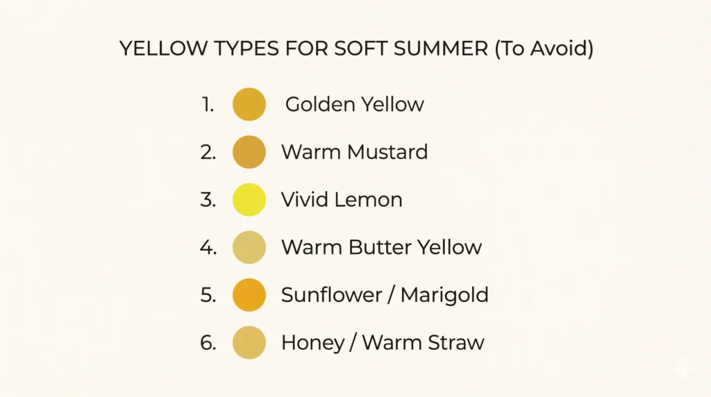
The Yellows to Avoid — And Why Each One Fails
|
Yellow Type |
Why It Fails for Soft Summer |
What Happens at the Face |
|
Golden Yellow |
Maximum warm thermal conflict. Yellow + orange base. Both temperature and chroma exceed Soft Summer’s tolerance simultaneously. |
Skin reads as clearly sallow in natural light. Under-eye shadows darken. The warmth of the fabric competes with and overwhelms the cool biology of the face. |
|
Warm Mustard |
Heavily warm-orange base. Even more thermally conflicting than golden yellow because of the added orange-brown quality. |
The warmest possible yellow-orange direction. Skin appears sallow and flat. Often described as “making you look unwell.” |
|
Vivid Lemon |
Chroma excess. Vivid lemon has high saturation — even if slightly cool in temperature, the brightness exceeds Soft Summer’s low-chroma tolerance. |
Face looks flat beside the vivid yellow. The colour takes over visually. Even a correctly-cool vivid lemon overwhelms the naturally muted colouring. |
|
Warm Butter Yellow |
The warm version of butter yellow has a distinctly golden-cream quality. The warmth is subtle but consistent. |
Subtle but visible sallow quality at the face in natural daylight. Often passes in artificial lighting — which is why it gets bought and then doesn’t work when worn outside. |
|
Sunflower / Marigold |
Both temperature and saturation conflict. Saturated warm yellow-orange. The most direct thermal opposite of Soft Summer’s cool-muted palette. |
Immediately visible sallow effect. The most obvious yellow failure on cool-toned skin. |
|
Honey / Warm Straw |
Warm amber-yellow with a golden quality. The “honey” descriptor itself signals the warm thermal direction that conflicts with cool undertone. |
Creates a warm cast to the face. Looks better on Soft Autumn and warm Spring colouring — the season families where golden warmth resonates with the skin’s biology. |
Is Butter Yellow a Soft Summer Colour?
This is the question I get most often about yellow and Soft Summer. The answer is nuanced — because “butter yellow” is not a precise colour. It is a description range that spans from warm cream-yellow to cool greyed-yellow.
✓ The Butter Yellow That Works
✗ The Butter Yellow That Doesn’t
A butter yellow where the warmth has been significantly reduced by grey mixing. The colour reads as ambiguous — you might describe it as “is that yellow or is that greige?” The yellow quality is a whisper, not a statement.
In the Munsell system, this sits at low chroma (C 2–3) with moderate value (V 7–8). The grey content is at least as dominant as the yellow warmth.
In nature: the colour of dried wheat stalks in winter light — the yellow quality is clearly present but the grey and brown modifiers have quieted it significantly.
A butter yellow where the cream-warmth is the dominant quality. The yellow reads as soft and creamy — but it reads as warmly soft, not cooly soft. Most commercial “butter yellow” garments fall here.
The warm cream base introduces a golden undertone that conflicts with Soft Summer’s cool biology. At moderate warmth, the effect is a subtle sallow quality in the skin. At higher warmth, it is immediately visible.
The test: lay the garment beside a piece of warm golden fabric. If the butter yellow reads in the same thermal family as the warm gold — it is the wrong butter yellow for Soft Summer.
The Butter Yellow Trap in Stores
Most “soft” or “pastel” yellow garments sold in mainstream retail are warm-buttery rather than cool-greyed. The warmth looks subtle on the hanger and in artificial store lighting. It becomes visible in natural daylight against cool-toned skin. Always evaluate yellow garments in natural light before buying. Artificial lighting distorts thermal undertone significantly.
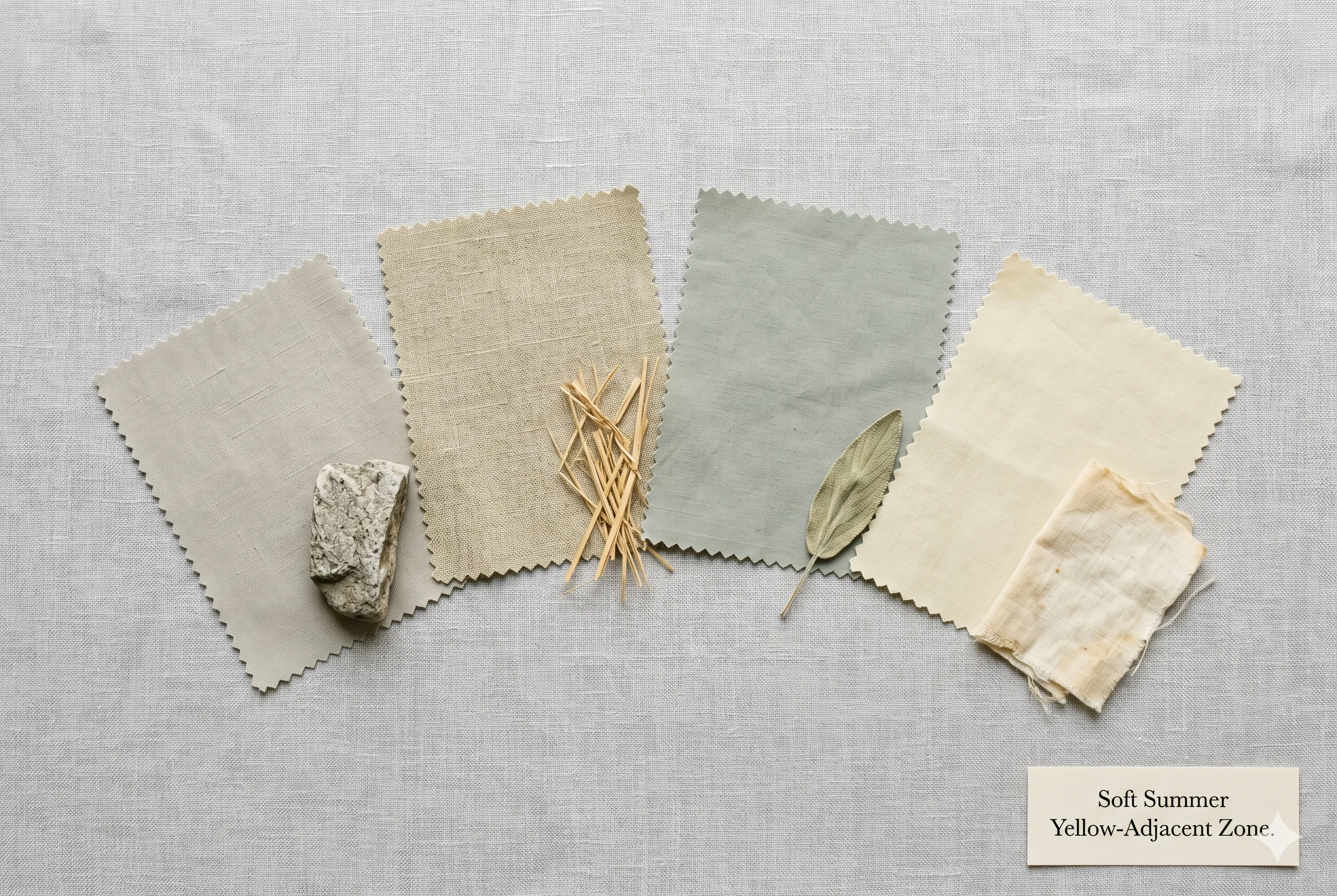
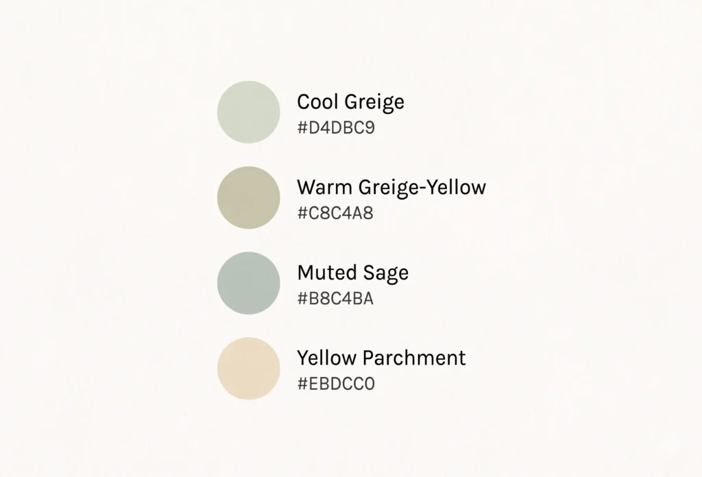
Yellow-Adjacent Colours That Work Better
For Soft Summer clients who love yellow but struggle to find the correct version, several yellow-adjacent colours in the Soft Summer palette deliver a similar aesthetic without the thermal conflict.
Yellow-Adjacent Soft Summer Alternatives
Think of the colour of dried sage leaves in full sun — that specific grey-green-yellow that has had its warmth muted by weeks of sunlight on ashy leaf surface. It reads as a “warm neutral” rather than a yellow. This is the zone where Soft Summer finds its best yellow-adjacent colours.
Or the colour of weathered stone in an overcast garden — a warm grey-beige with the faintest yellow quality that reads as neutral rather than warm. These are the colours that give Soft Summer the warmth and light that yellow promises, without the thermal conflict that most yellows create.
|
Colour |
Hex |
Why It Works |
The Yellow Connection |
|
Cool Greige |
#D4D0C0 |
The warmest neutral in the Soft Summer palette — cool enough to avoid thermal conflict, warm enough to read as light and warm-adjacent. |
The grey content moderates the warmth to the palette level. Reads as “warm neutral” rather than distinctly cool. |
|
Warm Greige-Yellow |
#C8C4A8 |
Sits at the warmest acceptable point in the Soft Summer neutral range. The yellow quality is barely perceptible — primarily greige with a yellow memory. |
The grey content moderates the warmth to the palette level. Reads as “warm neutral” rather than distinctly cool. |
|
Cool Greige |
#D4D0C0 |
The warmest neutral in the Soft Summer palette — cool enough to avoid thermal conflict, warm enough to read as light and warm-adjacent. |
Provides the “light and warm” reading that yellow is meant to create, without the thermal conflict. |
|
Muted Sage |
#B8C4BA |
A grey-green that shares the yellow-green direction without yellow’s warmth. Reads as lighter and more spring-like than the deeper greens. |
Gives the green-yellow quality of cool citron without any of the warmth. The closest Soft Summer colour to a classic yellow-green. |
|
Yellow Parchment |
#E0DCC0 |
The warmest version of Soft Summer’s near-white — a parchment with a very faint yellow quality that reads as warm-white rather than distinctly yellow. |
Creates the “warm and luminous” quality of yellow without any of the saturation. Works as a light neutral with a yellow connection. |

The Drape Test for Yellow
01
The Yellow Temperature Test
Natural daylight required · Two yellow fabrics needed
Hold a vivid or warm yellow fabric near your face in natural daylight. Then replace it with the coolest, most greyed-down yellow you can find. Observe the skin — not the fabric. You are looking for two things: does the skin look sallow or yellow-tinted with either fabric? And which fabric makes the face look more even and three-dimensional?
For Soft Summer, neither a vivid yellow nor a warm butter yellow should produce a “glowing” response. If a yellow makes your skin look warm and luminous, you likely have warm undertone (Soft Autumn or Spring direction). If a cool greyed-yellow simply looks “clean” without the sallow effect of vivid yellow — that is the closest you will get to yellow in the Soft Summer zone.
✓ Cool Greyed Yellow Works
The skin reads as even and clear without picking up warmth. No sallow quality visible. The fabric reads as complex and slightly ambiguous in colour. This is the Soft Summer yellow zone.
✗ Warm Yellow Fails
The skin picks up a slight yellow or sallow quality — most visible under the eyes and at the lips. The warmth of the fabric is imposing itself on the cool undertone of the face. This yellow is outside the Soft Summer palette.
02
The Naming Ambiguity Test
Hold the fabric at arm’s length and ask a simple question
Hold the yellow garment at arm’s length and ask yourself: “Is this clearly yellow, or could it also be described as grey-green, greige, or lime-grey?” If it is immediately and unambiguously yellow — it is likely too vivid for Soft Summer.
✓ Ambiguous — Likely Works
“Is that grey-green? Or is it yellow-grey? Or maybe greige with a yellow cast?” — This level of naming ambiguity indicates enough grey modification to bring the chroma within Soft Summer’s range.
✗ Immediately Yellow — Avoid
“That’s clearly yellow.” — No ambiguity. The yellow quality dominates the grey modification. This is outside the Soft Summer palette regardless of how pale or soft it looks.
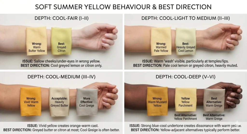
Yellow on Every Skin Depth — Melanin-Calibrated
The thermal conflict between yellow and cool undertone applies at every skin depth. It is the undertone, not the depth, that determines yellow compatibility. A deep cool-toned Soft Summer has the same thermal conflict with vivid yellow as a fair cool-toned Soft Summer.
|
Depth Range |
Soft Summer Yellow Behaviour |
Best Yellow Direction |
|
Cool-Fair (Fitzpatrick I–II) |
Yellow warmth creates visible sallow quality — skin appears yellowed at the cheeks and under-eye area in natural light. |
Cool greyed lemon or citron only. Warm butter yellow reads as discordant even at its palest. |
|
Cool-Light to Medium (II–III) |
Yellow introduces a warm “wash” to the skin surface — particularly visible in the lip and temple area where the cool undertone is most pronounced. |
Pale cool lemon or greyed citron. The grey modifier must be heavy enough to neutralise the warmth at this depth range. |
|
Cool-Medium (III–IV) |
The skin has a cool-neutral quality. Vivid warm yellow creates an orange-warm cast that can be particularly visible against medium cool-toned skin, which often has a noticeable ashy or grey quality. |
Greyed butter or cool citron at most. Yellow-adjacent cool greige is often more effective than any yellow in this range. |
|
Cool-Deep (V–VI) |
The cool-deep Soft Summer undertone has a blue-cool quality that creates a particularly visible contrast with warm yellow. The warm-cool conflict may read as an orange-cool dissonance rather than a sallow effect. |
Yellow-adjacent warm greige or yellow parchment. The full yellow spectrum is generally challenging at cool-deep depths — the yellow-adjacent alternatives typically perform better. |
A Note on Yellow at Deeper Skin Depths
“In studio work with clients at deeper Fitzpatrick depths who have Soft Summer colouring, I observe that the yellow-adjacent colours — warm greige, yellow parchment, and cool citron — consistently outperform any yellow in the palette. The undertone conflict at deeper depths often produces a more immediately visible response than at lighter depths, which paradoxically makes the test clearer and easier to read.”
Soft Summer Yellow — FAQs
Can Soft Summer wear yellow?
Yes — but only in a narrow, heavily-modified zone. The yellow must be cool-shifted (blue or grey cast) and heavily muted (low chroma). Cool citron-grey, greyed butter yellow, and pale cool lemon with a blue-grey cast are the correct Soft Summer yellows. Most commercially available yellows — vivid lemon, golden yellow, warm butter, mustard — fall outside the Soft Summer palette due to thermal conflict with the season’s cool undertone.
Is butter yellow a Soft Summer colour?
It depends on the specific butter yellow. A heavily greyed butter yellow (where the grey modifier is as dominant as the warmth) sits at the outer edge of the Soft Summer palette. A warm cream-butter yellow (where the warmth reads as golden or creamy rather than grey-modified) sits outside the palette. The test: hold it near your face in natural light. If the skin reads as warmer or more sallow — the butter yellow is too warm. If it reads as simply light and slightly complex — it may be the correct type.
What skin tones look good in yellow?
Warm-undertone skin tones (Spring and Autumn season families) generally perform best in yellow because the warm base of yellow resonates with their warm biological undertone. Cool-undertone skin tones (Summer and Winter families) require heavily modified yellows — greyed-down or blue-shifted versions. Soft Summer, with its cool-neutral undertone, can only wear yellow at its most muted and cool. Warm Autumn and warm Spring colouring typically look their best in vivid golden yellows.
Why does yellow look bad on me?
Yellow “looks bad” when the thermal warmth of the yellow conflicts with the cool thermal undertone of the skin. Yellow is the warmest colour on the spectrum — its warm base creates a temperature mismatch with cool skin, making the face appear slightly sallow or yellow-tinted in natural light. This is not about yellow being an objectively bad colour — it simply belongs to the warm side of the thermal spectrum, and cool-toned skin belongs to the cool side. The solution is using a heavily grey-modified, cool-shifted yellow rather than avoiding yellow entirely.
What is a cool-toned yellow?
A cool-toned yellow is a yellow that has been modified with blue, green, or grey to shift its thermal direction away from the warm yellow spectrum. Cool citron (green-yellow with grey modifier), pale lemon with a blue cast, and grey-modified soft yellow are the most common cool-toned yellows. They still read as yellow but the warmth has been partially neutralised. These are the only versions of yellow that sit within the Soft Summer palette’s cool-muted zone.
Is mustard yellow a Soft Summer colour?
No. Mustard yellow — whether warm amber-mustard or deeper golden mustard — sits firmly in the warm season palette (Soft Autumn, True Autumn, Warm Spring). Its warm orange-yellow base creates direct thermal conflict with Soft Summer’s cool undertone. Of all the yellow family shades, mustard is the farthest from the Soft Summer zone. Soft Autumn clients typically love mustard; the same shade on a Soft Summer will create an obvious sallow effect on the face.
Your Implementation Task
Working with Yellow as a Soft Summer
Working with Yellow as a Soft SummerYellow is genuinely one of the most difficult hues to navigate in the Soft Summer palette — but it is not impossible. Here is the practical approach:
- Find the correct yellow with one test: Stand in natural daylight and hold any yellow garment near your face. If your skin reads as sallow, yellowed, or flat — the yellow is too warm. If the skin simply reads as “unchanged” without warmth — you may be at the cool edge of the Soft Summer yellow zone.
- Use the naming ambiguity rule: If you can immediately call it “yellow” without hesitation, it is probably too vivid or warm. The correct Soft Summer yellow is the one you might also call “grey-green” or “greige with a yellow quality” or “pale citron.”
- Consider the yellow-adjacent alternatives first: Cool greige, warm greige-yellow, muted sage, and yellow parchment all create the light, warm-adjacent quality that yellow promises — without the thermal conflict. These are safer and more consistently available in retail.
- When shopping: Look for descriptions like “cool citron,” “pale sage-lemon,” “greyed yellow,” “muted lime,” or “grey-green.” Avoid: “golden yellow,” “butter yellow” without further qualification, “mustard,” “honey,” “sunflower,” or “marigold.”