Soft Colors What they are, how they differ from pastels, and how to find your own soft palette
Soft Colors Explained: Muted Palettes, Swatches & Hex Codes
Quick answer
Soft colors — also called muted colors — are shades with lower chroma, made by adding grey rather than white or black to a pure hue. In seasonal color analysis, they define two palettes: Soft Summer (cool, grey undertone) and Soft Autumn (warm, golden undertone). The opposite of soft is bright or clear — colors that stay fully saturated.
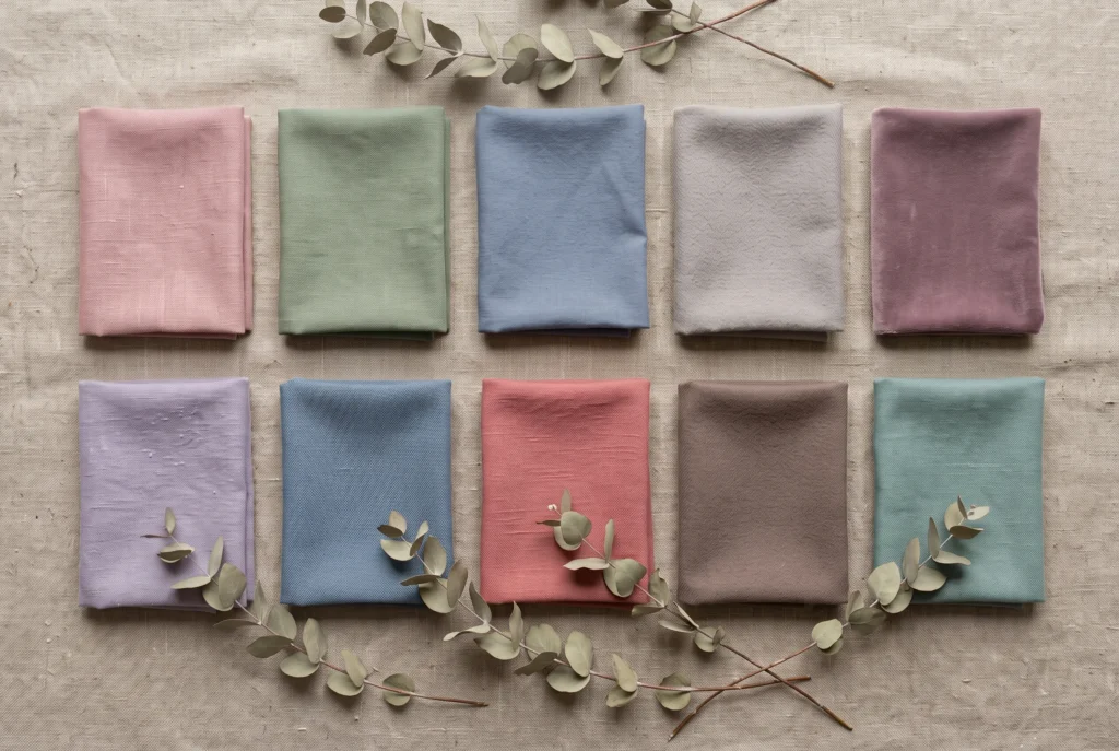
What Are Soft Colors?
“Soft” is not about how light a colour is. It’s about how much grey sits inside it.
Every colour is doing three things at once: hue (is it blue, or pink, or green), value (how light or dark it is), and chroma (how saturated, how far from grey). “Soft” and “bright” are both talking about that third one — chroma.
A bright colour holds onto its full saturation. Think traffic-cone orange, or the pink on a highlighter pen.
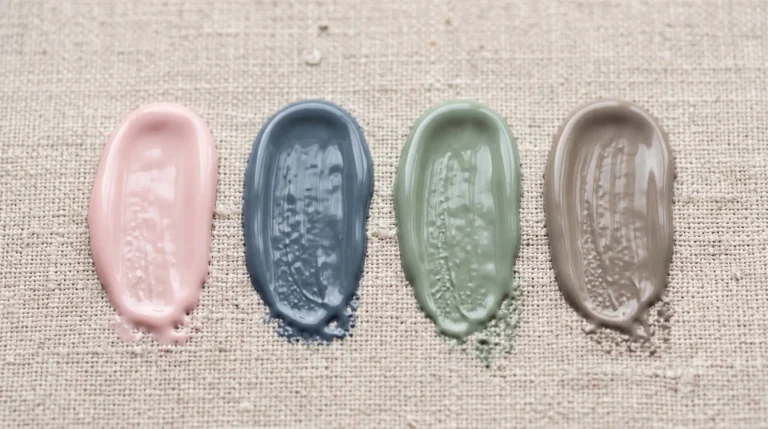
A soft colour has grey worked into it instead. The hue is still there. Somebody has just turned the intensity down.
Put those two side by side and the hue is nearly identical — both sit in the same pink family. The fuchsia is loud. The rose has had grey folded in until it settled into something quieter.
Picture weathered driftwood left out on a beach through an entire grey summer. The colour hasn’t disappeared. It’s just stopped shouting.
In practice, when a client says a colour “washes them out,” the hue is rarely the actual problem. The chroma is.
Soft colours aren’t a season by themselves. In the Sci/ART 16-season framework, “soft” becomes a season through two palettes built on this lower-chroma foundation: Soft Summer, which stays cool, and Soft Autumn, which turns warm. Same idea, different temperature.
So: soft colours are the same hues as their bright counterparts, just with the saturation turned down.
Soft vs. Bright vs. Pastel
People use “soft,” “muted,” and “pastel” like they’re the same word. They aren’t quite.
Pastels are made by adding white. Soft or muted colours are made by adding grey. That one distinction explains almost every mix-up between the two.
| What Changes | Soft / Muted | Bright / Clear | Pastel |
|---|---|---|---|
| Made by adding | Grey | Nothing — full saturation | White |
| Chroma | Low to medium | High | Low to medium |
| Value | Medium | Medium | High — light |
| Reads as |
Dusty rose
soft sage
|
Fuchsia
emerald
|
Baby pink
mint
|
| Season family | Soft Summer, Soft Autumn | Winter, Spring (clear types) | Light Summer, Light Spring |
That’s the whole trick to telling them apart at a glance: pastel asks “how pale is this?” Soft asks “how much grey is in this?”
“Soft” and “muted” get used almost interchangeably in casual writing — and on the wheel, they’re doing the same job. This site still splits them into two guides: this one leans into gentleness and contrast, while the full muted colors guide goes deeper on the grey-and-chroma mechanics, with its own colour wheel diagram.
Soft Summer: Where “Soft” Meets Cool
Soft Summer: Where “Soft” Meets Cool
Soft Summer is a sub-season of the Summer family, in the Sci/ART 16-season framework.
It’s built on three things at once: a cool undertone, a soft (low-to-medium) chroma, and a medium value that never dips to true black or lifts to paper white. No hard edges anywhere in the palette.
The best comparison is an overcast sky an hour before rain — cool, hazy, without a hard edge in it anywhere. That’s the temperature Soft Summer is built on.
In Munsell terms, this sits in the blue hue family, mid value, low-to-moderate chroma — nowhere near the saturated end of a paint-chip wall. Screen luminance runs roughly in the mid-50-percent range, consistent with Soft Summer’s medium-value ceiling: never near-black, never paper-white.
In practice, this is the swatch that convinces skeptical clients Soft Summer isn’t just “grey.” Held under the same light as a bright royal blue, it doesn’t look dull. It looks calmer — and the skin next to it looks calmer too.
Soft Summer has a sister palette built on the same low-chroma foundation, warmed up instead of cooled down: Soft Autumn. The two share the softness. They part ways on temperature — Soft Summer stays cool and grey, Soft Autumn turns warm and golden.
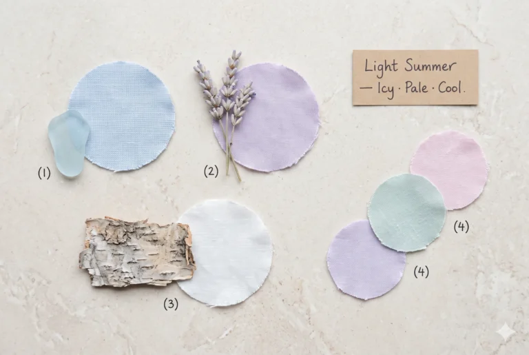
Inside its own family, Soft Summer sits between two closer relatives. Light Summer keeps the same cool temperature but lifts the value — everything gets lighter, more delicate. Cool Summer keeps a similar value but pushes the chroma back up — same coolness, more saturation. Soft Summer is the one that stays quietest on both counts.
The Soft Summer Palette — Hex Codes & Swatches
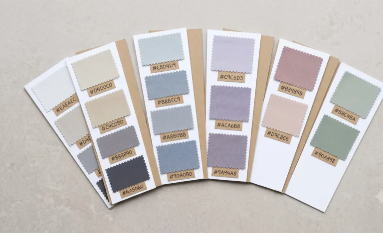
Twelve places to start. Not a locked list — a working palette.
Each swatch below is built the same way: a cool undertone with grey worked into the chroma, kept inside Soft Summer’s medium-value band. Tap any swatch to copy its hex code.
| Colour Name | Hex | RGB | Undertone |
|---|---|---|---|
|
Soft Rose
|
#D8A7B1 | 216, 167, 177 | Cool |
|
Muted Watermelon
|
#C97D82 | 201, 125, 130 | Cool |
|
Dusty Plum
|
#9B7E8C | 155, 126, 140 | Cool |
|
Misty Lavender
|
#B3A8C4 | 179, 168, 196 | Cool |
|
Periwinkle Mist
|
#9AA9C9 | 154, 169, 201 | Cool |
|
Slate Blue
|
#7A8CA3 | 122, 140, 163 | Cool |
|
Soft Denim
|
#6E8A98 | 110, 138, 152 | Cool |
|
Sea Glass Teal
|
#7FA39A | 127, 163, 154 | Cool - Neutral |
|
Soft Sage
|
#8A9A86 | 138, 154, 134 | Cool - Neutral |
|
Dove Grey
|
#B7B0AC | 183, 176, 172 | Neutral - Cool |
|
Soft Taupe
|
#9B8D8B | 155, 141, 139 | Neutral - Cool |
|
Cool Cocoa
|
#8C7368 | 140, 115, 104 | Neutral - Cool |
The Soft Summer drape wheel — the same twelve swatches, arranged the way they'd sit in a draping session.
How the Palette Reads Across Skin Depth
Soft Summer isn't a skin-depth category. It's an undertone-and-chroma category.
That means it shows up on the fairest skin and the deepest skin alike — always cool, always low-chroma — just sitting at a different depth position.
The detail that actually matters is contrast: the gap between your own skin's light-reflectance value (LRV — essentially, how much light a surface bounces back) and the LRV of whatever sits closest to your face. Soft Summer's whole palette is built on a narrow, gentle contrast range. The twelve swatches differ mainly in how deep or light your own natural contrast runs, not in which hues you're allowed near your face.
The lighter half of this palette — dove grey, misty lavender, soft denim — sits close to the skin's own LRV. Worn close to the face, these barely register as "colour" at all. They just read as calm.
This is the depth position the palette was built around. The full range reads fairly evenly here, and most of the twelve swatches will work close to the face without much adjustment.
The lighter end of the palette can sit too close to the skin's own LRV to register as intentional colour, rather than washing toward beige. The fix isn't switching seasons — it's shifting emphasis toward the richer half of the same palette: slate blue, dusty plum, cool cocoa, worn close to the face, with the paler tones moved to accents — a lining, a cuff, a bag — rather than a blouse.
Same palette, same undertone, same chroma ceiling. The only thing that moves with depth is which of the twelve swatches to lead with.
Editorial overhead flat-lay on a graduated background of five neutral paper card stocks running left to right from pale ivory to deep espresso brown. NO human subjects, no skin, no body parts of any kind. Draped across the gradient at each position: matching strips of five Soft Summer fabric swatches — dusty rose (#D8A7B1), slate blue (#7A8CA3), dusty plum (#9B7E8C), sage green (#8A9A86), dove grey (#B7B0AC) — repeated identically over each card so the same palette is visible against every depth value. Diffused overhead light, soft even shadow, no direct flash, no props beyond fabric and card stock. Crop ratio 16:9.
Alt text
Soft Summer fabric swatches shown against a gradient of light-to-deep neutral card stock, illustrating how the same muted cool palette reads across different skin depths.
Wearing Soft Colour — Wardrobe, Makeup, Home
In the Wardrobe
Lead with one Soft Summer piece close to the face — a scarf, a blouse, a jumper — and let everything else stay quiet around it. Structure and texture do the work that high contrast does for other seasons.
The one thing to avoid: pairing a soft piece with true white or true black. Both fight the muted chroma and make the soft colour look flat instead of quiet.
In Makeup
Rose and plum-family lip and blush tones stay closest to this palette's own logic. Orange-based warm tones pull against the cool undertone, even at low intensity.
On the Walls
The same logic carries over to paint — soft, cool-greyed neutrals read as calm rather than cold. That's a big enough topic to deserve its own guide; see the full soft summer paint colours breakdown for actual product-matched shades.
Editorial overhead flat-lay on a light oak surface. NO human subjects. An open wardrobe capsule laid flat: a slate blue cardigan, dusty rose blouse, dove grey trousers, and a cool cocoa leather belt, folded and arranged in a loose diagonal row. One small ceramic dish holding two dull-silver rings to the side. No text, no watermarks, no logos. Diffused natural window light, calm editorial styling. Crop ratio 3:2.
Alt text
A Soft Summer capsule wardrobe flat-lay in slate blue, dusty rose, dove grey, and cool cocoa, showing how soft muted colors work together in real clothing.
Two Mistakes Almost Everyone Makes
Mistake 1: Treating "soft" as "boring"
Someone feels washed out — usually because they're wearing a too-pale version of the palette, or pairing it with true white or black — and overcorrects with one jarring bright accent. That single bright piece breaks the whole harmony the soft palette was building.
The fix is smaller than it feels: swap the pale piece for a deeper swatch from the same palette, not a bright one from a different chroma family entirely.
Mistake 2: Confusing "soft" with "pastel"
Chasing "soft" by buying chalky, pale pastel pieces. They read as washed rather than rich-but-quiet, because pastel and soft solve for different things — lightness versus saturation. Check chroma, not just how pale something looks on the hanger.
Frequently Asked Questions
What are soft colors?
Soft colors, also called muted colors, are hues with lower chroma, made by mixing in grey rather than white or black. They sit between fully saturated bright colors and pale pastel colors. In seasonal color analysis, soft colors define the Soft Summer (cool) and Soft Autumn (warm) palettes.
What's the difference between soft colors and pastel colors?
Pastels are made by adding white to a hue, which raises its value and lightens it. Soft or muted colors are made by adding grey, which lowers chroma without necessarily lightening the color. A soft rose can sit at nearly the same depth as a bright pink, only quieter.
What's the hex code for soft pink?
There's no single official hex code — soft pink covers a range. A reliable starting point in the Soft Summer palette is #D8A7B1, a dusty, cool-toned rose with medium value and low chroma. Adjust the grey level up or down for a more or less muted result.
Is Soft Summer the same as Soft Autumn?
No. Both share the same low-chroma, soft quality, but Soft Summer carries a cool, grey undertone and Soft Autumn carries a warm, golden undertone. They're sister palettes in the same soft chroma family, not the same season.
How do soft colors work with deeper or richer skin tones?
The same principle applies at every depth: keep the colors closest to the face working with your own natural contrast level. Deeper Soft Summer coloring generally reads best in the richer half of the palette — slate blue, dusty plum, cool cocoa — worn close in, with the lighter tones used as accents.
What's a good starting hex for soft sage green?
8A9A86 is a workable starting point — a cool, greyed sage at medium value. It reads as calm rather than minty because the chroma is pulled down. Nudge the grey up slightly for a more Soft Summer-true version.
Are soft colors the same as muted colors?
Not quite. "Soft" leans on gentleness — lightness and low contrast. "Muted" leans specifically on grey — reduced saturation. Soft Summer relies on both at once. See the full muted colors guide for where each one sits on the color wheel.
Next Steps
Yours in colour, Helen