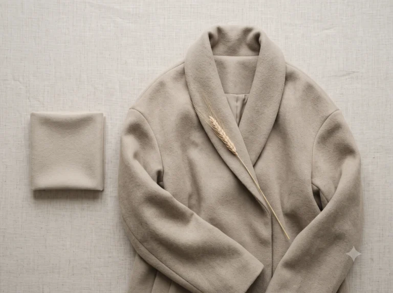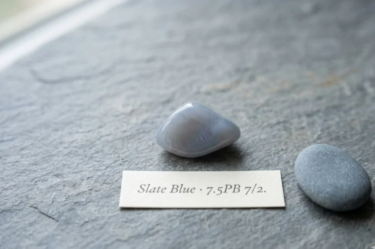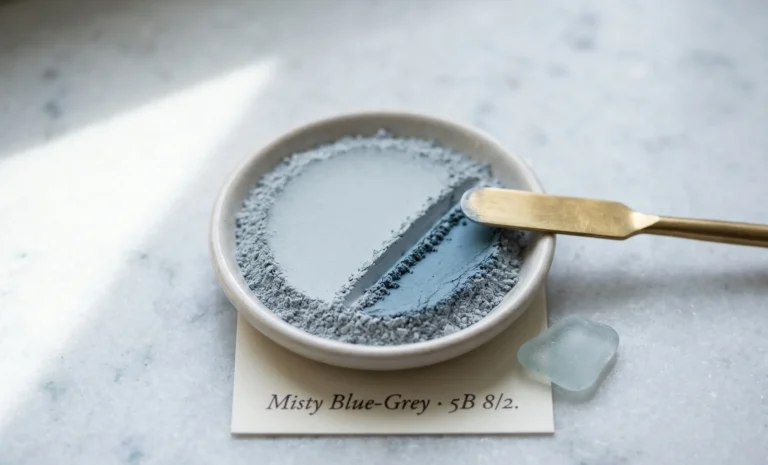
Soft Summer Neutrals The Complete Colour Palette Guide
Soft Summer Neutrals Palette Guide & Swatches |
In Short
Soft Summer neutrals are the desaturated, cool-based colours — charcoal, taupe, soft white, soft navy, and their close relatives — that anchor a Soft Summer wardrobe in place of true black or bright white. Every one is greyed by Autumn’s muting influence, which keeps contrast low and stops a neutral from fighting your natural colouring.
What Actually Makes a Colour “Neutral” for Soft Summer
Everyone says Soft Summer means muted colour. Almost nobody says what that actually means for the plain stuff — the trousers, the coat, the tee you reach for without thinking.
Here’s the short version. A true Soft Summer neutral is desaturated, cool-to-neutral at the base, and sits at a medium value. No yellow underneath. No shine fighting for attention.
That’s different from an accent. Dusty blue and sage show up on plenty of “Soft Summer neutral” colour charts. They’re not, not really. They’re muted, yes — but they still ask to be noticed. A neutral’s job is the opposite: hold the outfit together, then get out of the way.
Soft Summer neutrals sit inside the wider Soft Summer palette, which is one of three Summer sub-seasons — Light, Soft, and Cool — inside the Sci/ART sixteen-season system.
Picture morning fog sitting over water. It has no colour of its own. It just softens everything underneath it. That’s the actual job every neutral on this page is doing.
Soft Autumn gets a similar muting effect from the opposite direction — warmth pulled down by grey, instead of coolness pulled down by warmth. Stand a Soft Autumn mushroom next to this page’s mushroom and the softness matches. The undertone is where the two seasons split.
If you want the fuller answer to what makes any colour “neutral” in the first place, that’s covered on its own here — this page stays inside what actually belongs on a Soft Summer.
Every Soft Summer Neutral, at a Glance
There are Twenty-two colours and four families in soft summer neutral palette . Here’s the whole set before we go through them one by one.
The Greys
Grey
Taupe, Brown & Beige
White & Light
Dark & Coloured
Spruce
Wear three of these in one outfit and you’re right at the edge of what the eye can hold before it starts looking busy. Two is the safer number most days — one for the base, one for contrast.
How These Read Across Skin Depths
Fair, cool-based skin and charcoal or soft white sit close in contrast to each other, so none of the harshness true black causes ever shows up.
Medium, neutral-to-cool skin and taupe, greige, or mushroom sit almost at skin level. That’s the “no effort” look people mean when a colour seems to disappear on someone — in the good way.
Deeper, cool-based skin and charcoal, aubergine, or deep spruce read as rich rather than flat. None of them is desaturated enough to look chalky against more melanin, and none is saturated enough to fight it either.
The constant across every depth isn’t the skin tone itself. It’s undertone and value. A cool-based neutral at the right value works at any depth; a warm one won’t, however deep or fair the skin underneath it. (More on undertone and depth specifically, here.)
The Grey Family — Your Everyday Foundation
Soft Summer runs grey at the root more than any other family here, so this is where most wardrobes should start.
(You’ll see this family spelled “gray” just as often in searches — same six colours either way.)
Charcoal Grey
#3B3B3DWet slate roof tiles after rain, the light gone out of them.
Wear it: blazers, trousers, boots — the everyday stand-in for black.
View Full Style Guide →Slate Grey
#6E7581The sky an hour before a storm actually breaks.
Wear it: knitwear that pairs easily with dusty blue or mauve.
View Full Style Guide →Dove Grey
#B6B2ACA pigeon’s wing caught in low winter light.
Wear it: soft blouses and tailoring, in place of crisp white.
View Full Style Guide →Pewter
#8D8A81Old cutlery left unpolished on purpose.
Wear it: trousers and bag hardware — the coolest metal-adjacent neutral you own.
View Full Style Guide →Heather Grey
#A5A29BMoorland grass in late afternoon, grey shot through with a whisper of violet.
Wear it: marled knitwear and easy weekend layers.
View Full Style Guide →Blue-Grey
#5E6A72 · also called steel greyThe sea and the sky meeting on an overcast morning, barely a seam between them.
Wear it: outerwear and denim-adjacent trousers.
View Full Style Guide →Cool Summer’s version of this family runs a full shade icier — less grey, more true blue underneath. If your slate looks better with more ice mixed in than warmth, that’s usually the tell you’re closer to Cool Summer than Soft.
The Taupe, Brown & Beige Family — Warmth Without the Yellow
Every warm neutral has a cooler twin somewhere. This is the family where Soft Summer finds its version.
Taupe
#8A8077Wet sand a few steps back from the tideline.
Wear it: the single most useful neutral on this whole page — trousers, coats, bags.
View Full Style Guide →Greige
#B3AA9CFog sitting low over a ploughed field, grey and brown too tired to argue.
Wear it: tailoring and knitwear that read expensive without trying.
View Full Style Guide →Ash Brown
#6D5C50Coffee gone cold, all the warmth drained out of it.
Wear it: leather goods, boots, belts.
View Full Style Guide →Rose Beige
#C5A79AThe inside of a shell, pink held back by a wash of grey.
Wear it: knitwear near the face — the correct answer when you reach for camel.
View Full Style Guide →Cocoa
#5A4636Dark chocolate a day past its shine.
Wear it: deep layering pieces for colder months, kept strictly on the grey side of brown.
View Full Style Guide →Mushroom
#ADA396The underside of a field mushroom — no shine, barely a colour, and exactly right.
Wear it: the quietest possible basic tee or trouser.
View Full Style Guide →Stone
#A7A08DA pebble pulled from a cold stream, dried a day in the shade.
Wear it: trousers and outerwear — it goes with everything else on this page.
View Full Style Guide →Studio Read
Taupe vs. Greige
Side by side, these two get mixed up constantly. Taupe carries a whisper of pink in the undertone — hold it next to rose beige and they agree instantly.
Greige swaps that pink for a cooler, greyer cast. Hold it next to dove grey instead, and the resemblance is obvious.
Same value, same softness, different root. That’s the entire difference between a taupe that flatters and one that leaves you looking tired.
Cool Summer barely touches this family at all — true cool seasons skip brown almost entirely. If half your instinct says taupe or mushroom, that’s a Soft Summer signal on its own.
The White & Light Family — Softening Pure White
Not every neutral has to sit pale or mid-value. This family carries the darkest, richest options Soft Summer has, without tipping into the hard contrast that undoes the whole effect.
Soft White
#F1EEE8Cloud cover at seven in the morning, not the blue-white glare of noon.
Wear it: the direct swap for a stark white tee or shirt.
View Full Style Guide →Oyster
#E6DFD3The inside of a shell — pale, faintly grey, no shine to speak of.
Wear it: blouses and silk-look separates.
View Full Style Guide →Pearl
#E7DFD8Oyster’s close cousin, one shade warmer with a touch more shimmer.
Wear it: eveningwear, where oyster would read too flat.
View Full Style Guide →Parchment
#EBE3CEOld paper left too long in a sunny window.
Wear it: the warmest neutral here — use it sparingly, paired with taupe rather than the cooler greys.
View Full Style Guide →Light Summer can wear these same four names lighter and clearer, with less grey mixed through. Soft Summer’s version always keeps a touch more haze — that’s the real difference between the two palettes at the pale end.
The Dark & Coloured Neutrals — Depth Without Harshness
Not every neutral has to sit pale or mid-value. This family carries the darkest, richest options Soft Summer has, without tipping into the hard contrast that undoes the whole effect.
Soft Navy
#384759Denim after fifty washes, the last of the ink gone to a whisper.
Wear it: the real alternative to a black blazer or trouser. Skip stark midnight navy — it reads almost as hard as black.
View Full Style Guide →Marine Blue
#3A5262The sea a mile out, more grey than blue from that distance.
Wear it: knitwear and coats, one shade deeper than dusty blue.
View Full Style Guide →Faded Denim
#6E87A0Jeans worn in for a decade, the colour gone soft at the knee.
Wear it: literal denim, and any knit that borrows its tone.
View Full Style Guide →Deep Muted Spruce
#3D4A41 · also called pinePine seen through fog, green pulled almost the whole way to grey.
Wear it: coats and outerwear for the colder end of the year.
View Full Style Guide →Aubergine
#4C3542 · also called muted plumDamson skin in low light, the purple gone quiet.
Wear it: the evening version of black — trousers, dresses, boots.
View Full Style Guide →Light Summer’s closest equivalent to soft navy stays a shade paler across the board. Soft Summer is where this family gets its full depth, right up to aubergine — a colour Light Summer skips almost entirely.
Wearing Soft Summer Neutrals — How to Actually Build the Wardrobe
Once you know which neutrals are yours, the next question is how to wear neutral colors so the outfit still looks intentional, not just safe.
Start with four pieces: one grey, one from the taupe family, one white or light neutral, one dark or coloured neutral. That’s your whole foundation before a single accent colour enters the picture.
Cap any single outfit at two or three neutrals. A fourth one, and the eye stops reading “calm” and starts reading “trying too hard.”
Charcoal trousers, dove–grey blouse, pewter belt.
Taupe coat over a soft–white tee, faded–denim trousers.
An aubergine slip dress, pewter jewellery, bare skin.
Stone trousers, heather–grey knit, soft–navy coat.
Finish matters as much as the colour itself. A matte charcoal behaves like Soft Summer’s own colouring; a glossy, patent version of that exact same charcoal fights it. Shine reads as contrast, whatever hue it’s sitting on top of.
A Cool Summer capsule built the same way drops taupe and rose beige entirely and doubles the grey instead. Soft Summer is the one Summer sub-season where brown genuinely belongs in the neutral wardrobe.
These same names carry past the wardrobe, too, into nail polish, eyeshadow, and jewellery finishes. That’s detailed enough to deserve its own guide, which is coming next.
Which Neutrals Soft Summer Should Actually Avoid
Knowing what to skip matters as much as knowing what to buy. Here’s where the four families above actually break down.
| Avoid | Why It Fights Soft Summer | Wear Instead |
|---|---|---|
Jet Black |
Full-strength black creates more contrast than Soft Summer’s soft colouring can support — it flattens the face by comparison. | Charcoal Grey, or Soft Navy for a change of temperature |
Optic White |
The same problem in reverse. A shot of pure brightness the skin can’t match, so the face reads dull beside it. | Soft White, Oyster, or Pearl |
Warm Camel / Honey Beige |
Camel carries a gold undertone that pulls warmth into the face — the opposite of what a cool base needs. | Rose Beige or Taupe |
Chestnut / Warm Chocolate |
Same issue, deeper. Any brown carrying red or orange fights a cool undertone on sight. | Ash Brown or Cocoa |
Golden Taupe / Khaki |
Not every “taupe” is cool. Plenty of khaki-leaning taupes slide straight into olive and green-gold. | Greige, Mushroom, or Stone |
Bright or Inky Midnight Navy |
A navy this saturated behaves like black in disguise — same contrast problem, different name. | Soft Navy or Marine Blue |
Seven Neutrals That Do What Black Can’t
Black gets asked to do a lot of different jobs: tailoring, evening, outerwear, leather. Split those jobs up, and none of these seven ever needs to fight your own colouring to do them.
Charcoal Grey
Daytime tailoring — trousers, blazers
Soft Navy
The second-most versatile neutral you own
Aubergine
Evening — dresses, occasion trousers
Deep Muted Spruce
Coats and outerwear
Cocoa
Leather goods — boots, belts, bags
Blue-Grey
Denim and casual outerwear
Ash Brown
The warmer leather option, next to cocoa
If black is genuinely non-negotiable — a uniform, a dress code — keep it away from your face and break it up with texture. Otherwise, reach for one of the seven above first.
Soft Summer Neutrals — Quick Answers
Can Soft Summer wear black?
Not against the face, no. Full black creates more contrast than Soft Summer’s muted colouring can hold, which flattens the complexion by comparison. Charcoal grey or soft navy do the same job without the harshness. If black is unavoidable, keep it away from the face and break it up with texture.
What is the best neutral colour for Soft Summer?
Taupe. It pairs with every other neutral on this page, reads as expensive rather than plain, and never clashes with the cool undertone Soft Summer needs. If you’re building a wardrobe from nothing, taupe is where to start.
Is grey a neutral colour for Soft Summer?
Yes — more than any other family, grey is the backbone of Soft Summer’s neutrals. Charcoal, slate, dove, and pewter cover nearly every use a wardrobe needs, from tailoring to knitwear to accessories.
Can Soft Summer wear navy?
Yes, as long as it’s soft or faded rather than stark midnight. A navy this dark and saturated behaves like black in disguise, creating the same harsh contrast Soft Summer’s colouring can’t support.
Can Soft Summer wear beige?
Only the cool version. Rose beige and taupe work because the undertone stays neutral-to-cool; camel and honey beige carry too much gold and pull warmth into the face.
Is taupe a neutral colour?
Yes, and it’s arguably the most universal neutral across every colour season, not just Soft Summer. What changes season to season is which taupe — Soft Summer’s version stays close to grey, without tipping warm.
What’s the real difference between Soft Summer and Cool Summer neutrals?
Value and warmth, not colour. Cool Summer’s neutrals run icier and higher-contrast; Soft Summer’s are the same base hues, pulled down half a shade by a touch of Autumn’s muting influence.
Next Steps
- Pick one grey and one dark or coloured neutral first. That’s your foundation, before anything else.
- Swap one black item you already own for its match from the avoid table above.
- Hold two candidates next to your face in daylight before buying either. The difference between taupe and warm beige is obvious the moment you actually look.
- Build outward from there. Accents come after the neutrals are settled, never before.
I’ve watched one blazer swap — black to charcoal — change how a person’s entire wardrobe reads, more than any accent colour ever managed on its own. Start there.Yours in colour, Helen
See how these neutrals sit inside the full Soft Summer colour palette.