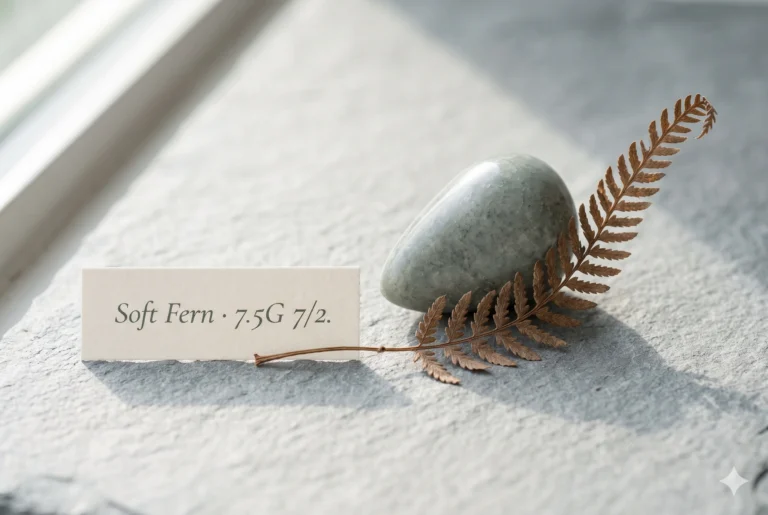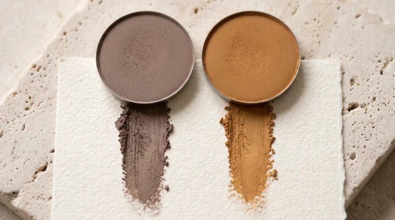
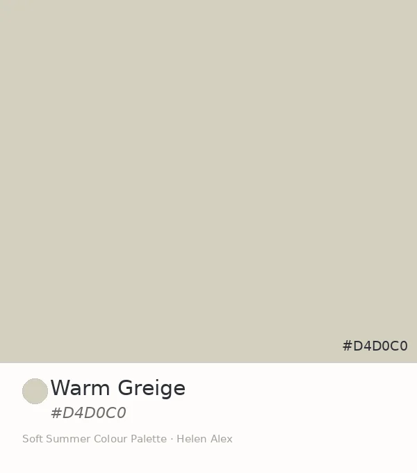
Warm Greige Color (#D4D0C0): Soft Summer’s Warm Neutral
Warm Greige —The One Warm-Hued Neutral That Belongs in the Soft Summer Palette, and the Proof Behind It
A warm-hued greige in a cool-neutral season sounds like a mistake. The name makes it worse — Warm Greige, placed deliberately inside the Soft Summer palette. But the Munsell reading settles the argument before the eye has time to form an opinion.
At chroma 2, the warm yellow-grey at #D4D0C0 has so little saturation that the warmth is barely there. The grey absorbed it. What remains is a neutral that leans warm only in comparison with something genuinely cool — which in a Soft Summer wardrobe is precisely where it earns its place.
This post is about how a warm-hued greige colour belongs to a cool-neutral season, and what that tells us about the actual shape of the Soft Summer palette.
Quick answer, if you’re short on time
Warm Greige (#D4D0C0) is an official Soft Summer neutral. Its Munsell profile — value 8, chroma 2, in the warm yellow-grey hue family (7.5Y) — confirms it as a heavily greyed, near-neutral beige where the warmth barely registers. At chroma 2, even a warm-hued greige reads as neutral rather than warm in practice. In the Soft Summer palette, it functions as the first member of the warm-neutral/beige wing.
The Analyst Perspective — Is Greige Warm or Cool?
Both. The word describes a category, not a temperature. Greige — grey plus beige — can sit in the cool-blue-grey zone or the warm-yellow-grey zone of the Munsell system. #D4D0C0 sits in the warm zone, at approximately hue 7.5Y (yellow-grey family), value 8, chroma 2.
The hue address is warm. The chroma reading changes everything. At chroma 2, Soft Summer’s entire palette operates: this is the saturation level where grey dominates the colour, the temperature becomes a whisper, and a warm greige colour reads as near-neutral in isolation.
Warm Greige is what a warm colour becomes when it decides it would rather be a neutral — and makes just enough progress in that direction to qualify.
Place it beside a true warm beige and it reads cool. Place it beside a cool blue-grey and it reads warm. At chroma 2, the temperature is contextual rather than absolute — which is what makes it workable in a muted palette.
Soft Autumn’s greige carries the same warm hue address but at a higher chroma — approximately chroma 3–4 — where the yellow reads clearly and the warm temperature dominates. See the Soft Summer vs Soft Autumn comparison for the full thermal breakdown. Warm Greige at chroma 2 is Summer’s version: the yellow still present but outnumbered by grey.
Side by side, the warm-vs-cool difference at chroma 2 is visible but subtle. In a wardrobe context — where colours are experienced beside skin tone, not beside each other — the distinction becomes a gentle warmth rather than an argument about temperature. That subtlety is the whole reason this colour belongs here.
Warm Greige ✦ new
Value 8 · Chroma 2 · 7.5Y — warm yellow-grey
Soft Autumn greige
Value 8 · Chroma 4 · 5Y — warm, clearly beige
Blush Clay (sibling)
Value 8.5 · Chroma 2 · 7.5RP — warm-pink family
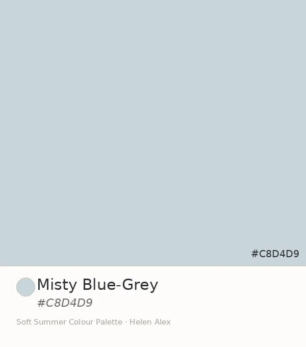
Misty Blue-Grey
Value 8 · Chroma 2 · 5B — cool equivalent
The pairing of Warm Greige and Misty Blue-Grey at the same value and chroma but opposite temperature positions shows the palette’s full range: the same muted discipline holding at both ends of the warm-cool spectrum.
The Nature Perspective — The Warm That Goes Quiet
Most greige in the world around us is the colour of materials that started out warm and have been progressively cooled by weather, shade, and time. Warm Greige is the colour of warmth in its most patient state — still present, too muted to assert itself.
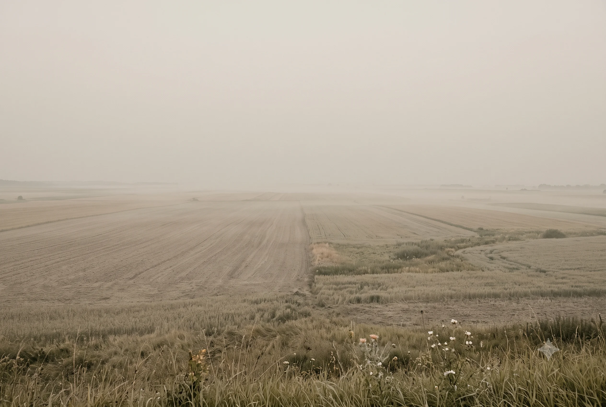
Think of August morning haze over open country — not the gold of midday, not the grey of rain, but the specific warm-grey that fills the hour before the sun has properly arrived. The air is faintly warm, the light is flat, and the landscape reads as a muted warm neutral rather than either golden or overcast. That atmospheric moment is Warm Greige exactly.
August morning haze is one of the most precise natural references for this colour because it captures the transitional quality that makes Warm Greige distinctive — warm enough to notice, grey enough not to dominate.
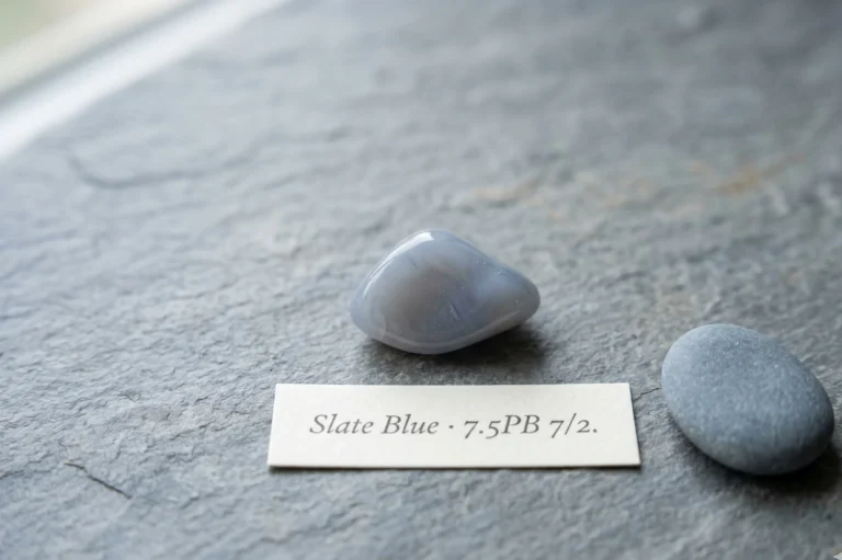
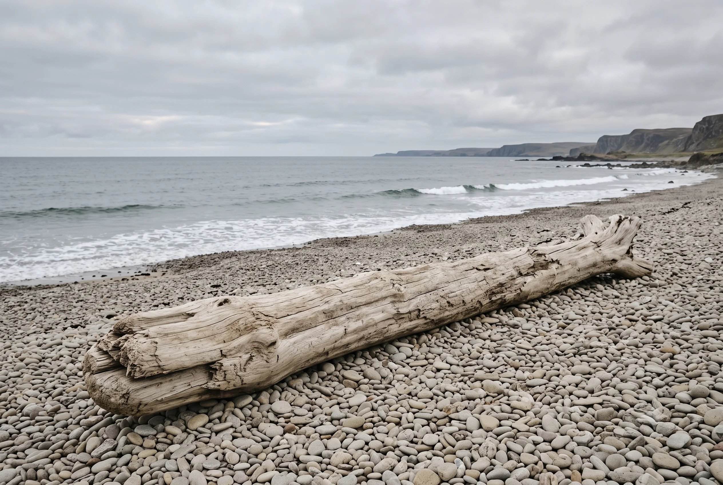
Dry river stones on an overcast riverbank hold this colour too — where the stone’s natural warm mineral content has been muted by shade and the absence of direct light into a warm neutral that reads as neither distinctly beige nor distinctly grey. River stones under open shade are Warm Greige in geology.

The Wardrobe Perspective — The Warm-Neutral Foundation
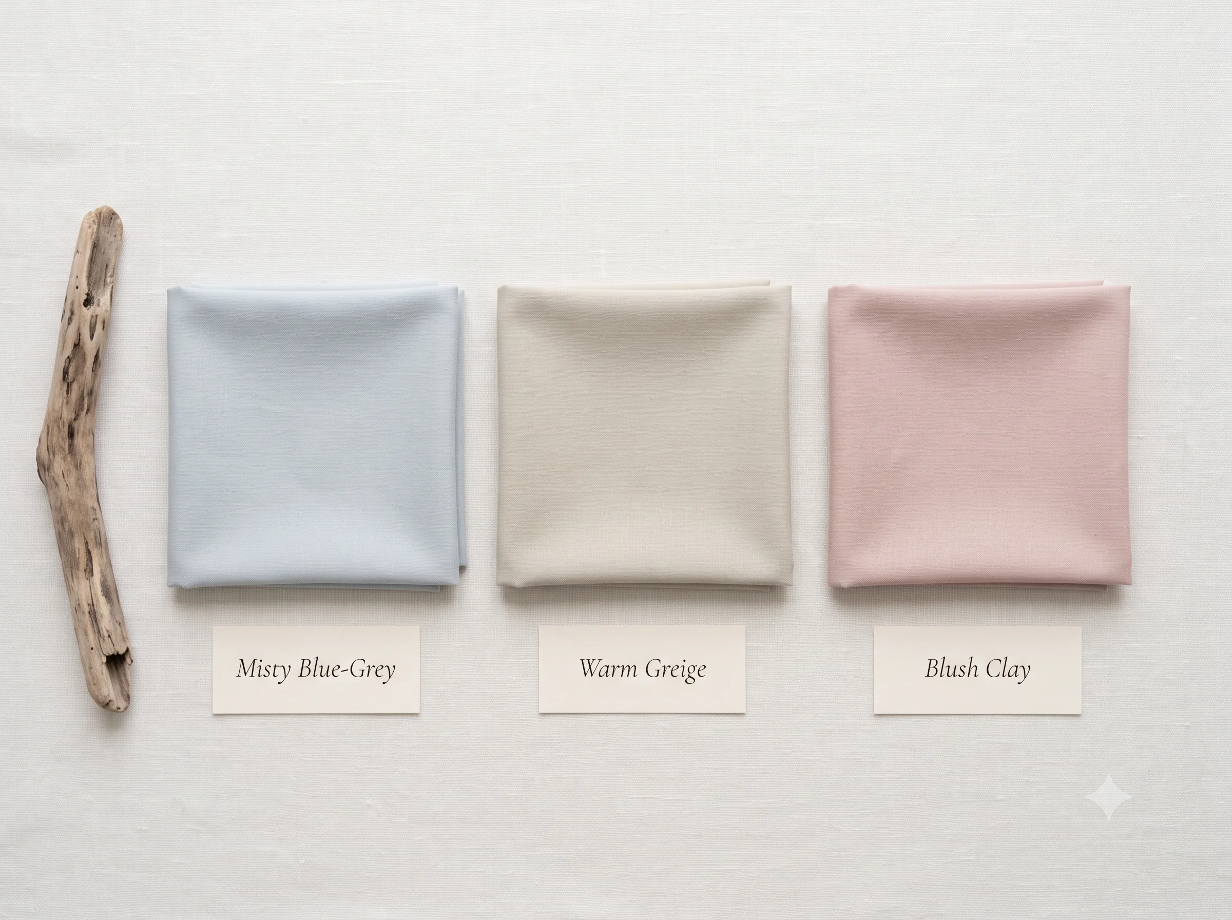
In a Soft Summer wardrobe that already holds five cool-blue neutrals, two greens, and a dusty rose, Warm Greige introduces the one quality none of those provide — a warm-hued beige that reads as neutral but provides a gentle warmth when worn beside the palette’s cooler members.
That interaction is its wardrobe purpose: not to be warm, but to introduce warmth as a quality rather than a temperature. Placed beside Misty Blue-Grey or Steel Mist, Warm Greige reads as the warmer of the two without either tone breaking the muted discipline that makes the whole palette coherent.
Warm Greige is the colour that makes the palette feel inhabited rather than simply cool — and in a cool-neutral season, that distinction matters.
🌾 Practitioner Note — Melanin Calibration
In my drapting sessions, the near-neutral quality of Warm Greige at chroma 2 behaves consistently across Soft Summer’s full Fitzpatrick range. At deeper skin depths (Fitzpatrick IV–V), the warm quality becomes slightly more visible — which is useful, as it adds a quiet warmth to a combination that might otherwise read as exclusively cool. The temperature whisper that makes this colour interesting in lighter colourings becomes a gentle warmth that reads beautifully at deeper depths.
Four Wings — The Complete Shape of the Soft Summer Palette
With Warm Greige confirmed, the structural map of the Soft Summer palette is fully visible. It has four directional wings — not a single cool family, but a full spectrum of muted colour held at the same discipline of chroma 2.
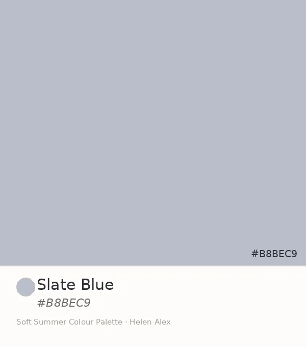
Cool Blue–Violet Wing
5 Neutrals · Cyan → Violet
Warm-Adjacent Wing →
Blush Clay + Warm Greige
Green Wing
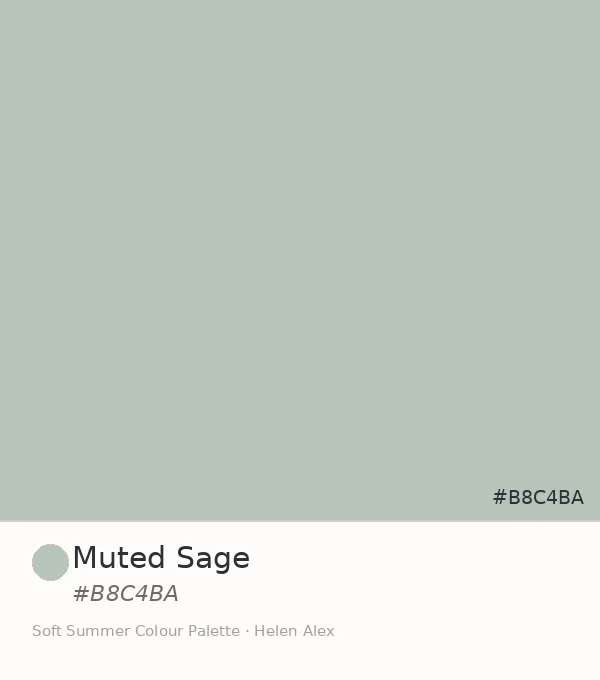
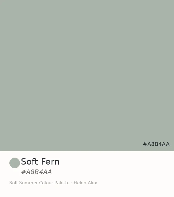
Muted Sage + Soft Fern
The Palette at Full Width
Cool → Warm → Green · All at Chroma 2
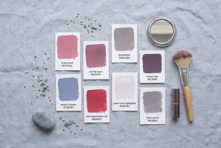
Nine swatches, four wings, one chroma ceiling. What the palette shows is not a cold season — it shows a muted season that spans the full range of hue directions while holding every colour at the same quiet saturation level. Warm Greige is the proof of that range.
Eight swatches, three directional wings, one chroma discipline. The palette has a blue-violet family, a rose family, and now a confirmed two-member green family — each wing built on the same principle of colour held at the muted register.You may also like reading about the warm summer color palette .
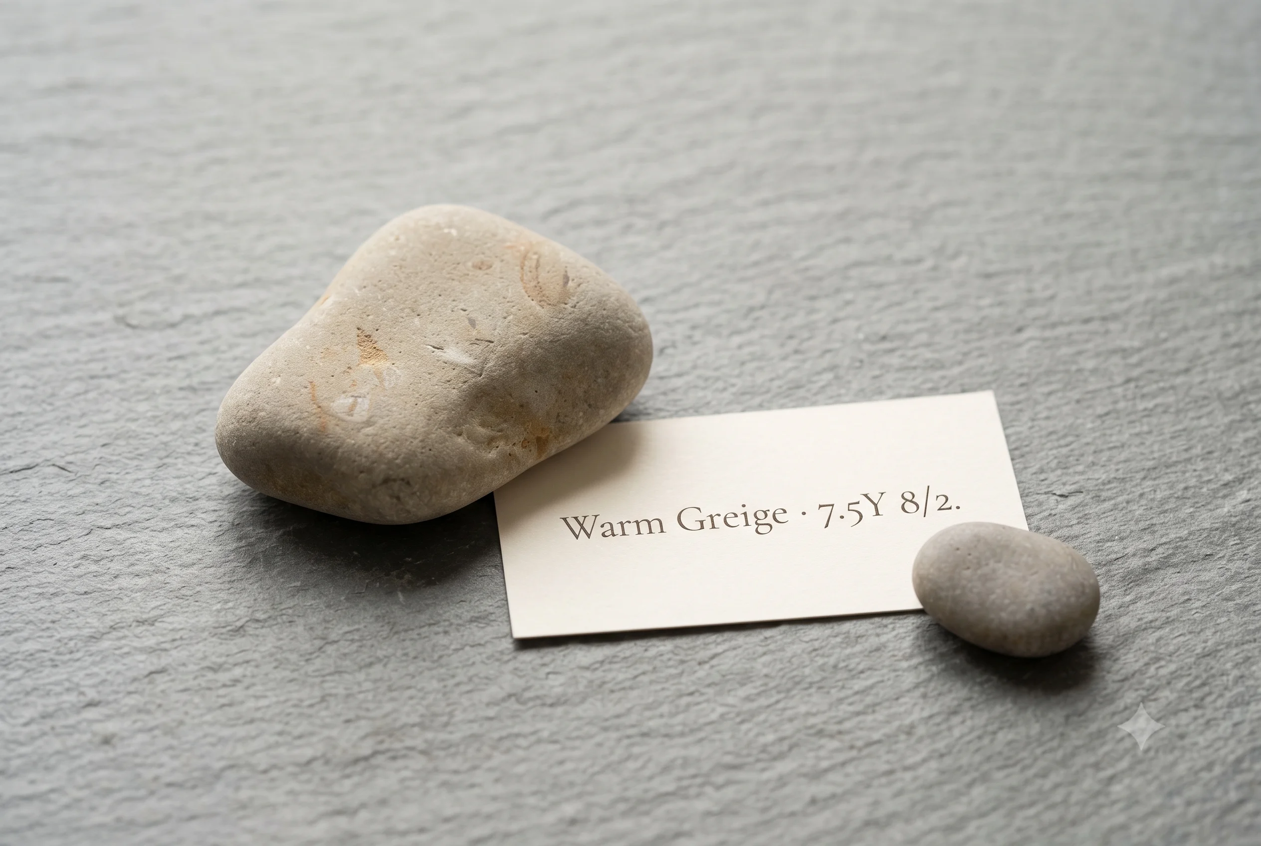
Three readings, one answer. The Munsell profile confirms warm yellow-grey hue at chroma 2 — the warm register present but overwhelmed by grey content in practice. The August morning haze and the dry riverstone confirm it already exists this way outdoors — warmth without heat, present without dominating. The wardrobe role confirms it is the fourth-wing opener: the colour that proves Soft Summer spans warm and cool alike, provided every tone keeps the same quiet discipline.
Warm Greige IS a neutral swatch WITHIN the Soft Summer palette IN the 16-season framework — the first warm-hued greige in the palette, confirmed by Munsell theory, found in nature, and indispensable for showing the full shape of what a muted, cool-neutral season actually contains.Check our complete resource on soft summer color palette cards ,swatches ,hex and color wheel.
Take a ride through our soft summer gallery !
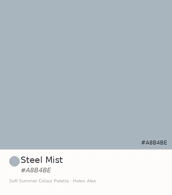
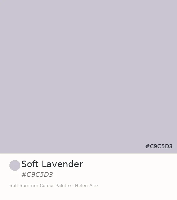
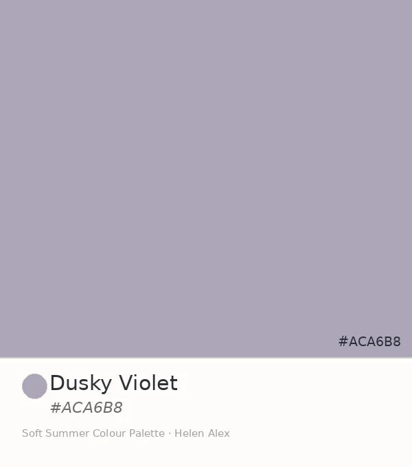
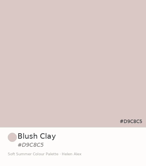
Frequently asked questions .
A Few Things People Ask Me
Is greige warm or cool?
Greige can be either. Warm greige sits in the yellow-grey zone of the Munsell system — warm in hue direction. But at very low chroma (2 or below), grey dominates so completely that warm greige reads as near-neutral in practice. Warm Greige at #D4D0C0 falls precisely here, which is why it belongs to the cool-neutral Soft Summer palette.
What is warm greige color?
Warm greige color is a light, heavily desaturated beige-grey with a warm (yellow) hue direction. In the Soft Summer palette, the version at hex #D4D0C0 sits at Munsell value 8, chroma 2, hue 7.5Y — where the warmth is barely present because the grey content has absorbed most of the yellow.
Can Soft Summer wear warm greige?
Yes. Warm Greige at chroma 2 reads as near-neutral rather than warm in practice — the grey absorbs the warmth. This is why Soft Summer can include a technically warm-hued greige: the saturation is too low for the temperature to dominate. The colour reads muted, not warm, which is the qualifying condition for the Soft Summer palette.
What is the difference between soft greige and warm greige in colour analysis?
Soft greige is any greige at very low chroma — the grey is dominant. Warm greige specifies the hue direction: yellow-grey rather than blue-grey. Warm Greige (#D4D0C0) is soft AND warm — very low chroma in a warm hue family — which is the specific combination that earns it a place in the Soft Summer palette.
What colours go with warm greige in a Soft Summer wardrobe?
Warm Greige pairs with the entire Soft Summer low-chroma neutral family — cool blues, violets, greens, and dusty rose. It works particularly well beside the cool-blue neutrals, where its barely-there warmth creates a quiet enrichment. The governing rule is shared chroma: any Soft Summer tone at chroma 2 or below reads naturally beside it.
Yours in colour, Helen
This one surprises people every time — they expect a cool-neutral season to refuse anything warm-hued, and then Warm Greige goes up and the whole room relaxes. Try it beside the blues before you decide it doesn’t belong. The combination does the convincing.
For the complete Soft Summer palette breakdown, see the Soft Summer Color Palette guide. To explore why warm and cool tones share the same muted discipline, see the Soft Summer vs Soft Autumn comparison — the thermal distinction is most visible there.