Soft Summer Colors to Avoid — The Complete Contrast Guide.
Soft Summer Colors to Avoid —And Precisely Why Each One Fails
Direct Answer — Soft Summer Colors to AvoidSoft Summer should avoid: black, bright white, all warm golden and earthy tones, vivid saturated colours of any hue, and high-contrast outfit combinations. These all fail for one of two precise reasons — they either exceed the season’s medium-contrast ceiling, or they introduce warm thermal conflict with the cool undertone. Every colour to avoid can be replaced with a correctly calibrated Soft Summer alternative that delivers the same visual function without the conflict.
Why Some Colors Fail on Soft Summer
Colour fails on a person not because the colour is “wrong” in the abstract, but because it mismatches one or more of the three biological dimensions of the person’s colouring: undertone, saturation, and contrast level.
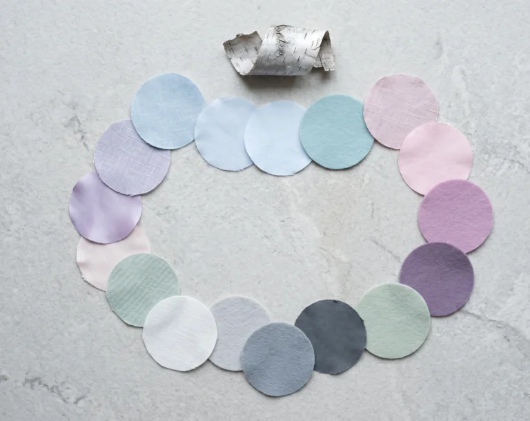
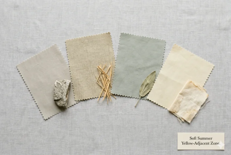
Soft Summer has very specific coordinates on all three:
Undertone
Cool — blue or grey-pink based. Any colour with a warm, golden, or orange base conflicts immediately with the skin’s biology.
Saturation
Muted — low chroma. Vivid, saturated colours exceed the skin’s natural saturation level and compete with rather than support the face.
Contrast
Medium — low to medium. High-contrast colours and combinations exceed the contrast ceiling, making the face appear pale and drawn against the clothing.
A colour that fails on Soft Summer always violates at least one of these three. The most damaging mistakes violate all three simultaneously — which is exactly what wearing black near the face does: it introduces maximum contrast (wrong), creates an achromatic void that de-saturates the face by comparison (wrong), and provides no undertone warmth or coolness to support the skin (inert but damaging at high contrast).
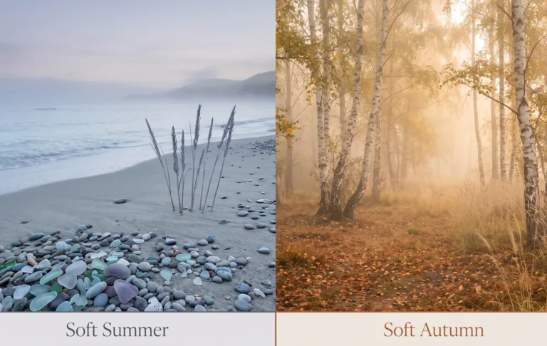
The Nature Analogy — What Wrong Colours Do
Picture a soft, weathered dove feather — the characteristic grey-blue-pink of Soft Summer colouring. Now place it on a sheet of jet black card. The feather does not glow. The black dominates. The feather’s delicate, muted quality disappears into the contrast.
Now place the same feather on a piece of pale grey-blue linen. The feather is suddenly luminous — its cool, subtle tones resonate with the surface beneath it rather than being overwhelmed by it. This is what the right colour does to a Soft Summer face, and what the wrong colour undoes.
The Black Problem — And the Myth That Black Suits Everyone
Black is the most culturally embedded colour in modern wardrobes. It is called safe, classic, and universally flattering. It is not universally flattering. This is one of the most persistent myths in personal styling — and for Soft Summer clients, it is the most consequential one.
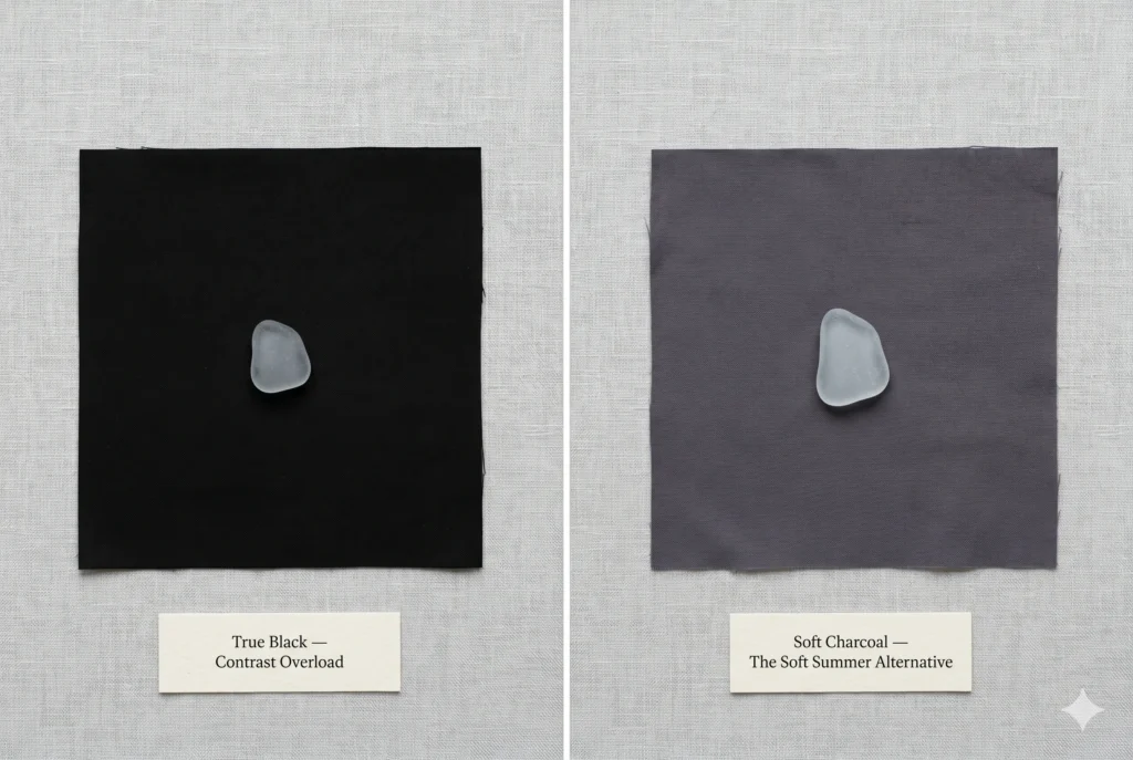
True Black
Contrast Overload + Chroma Void
Black creates the maximum possible value contrast against skin and hair. Soft Summer’s medium-contrast colouring — where hair, skin, and eyes sit in a similar depth range — cannot absorb this level of contrast without the face appearing pale, drawn, and visually receding. The black advances; the face retreats.
In clinical drapting, black near a Soft Summer face consistently produces the same comment from clients and observers: “you look tired.” Not because they are tired, but because the high contrast of black against low-contrast colouring creates a visual stress that reads as fatigue.
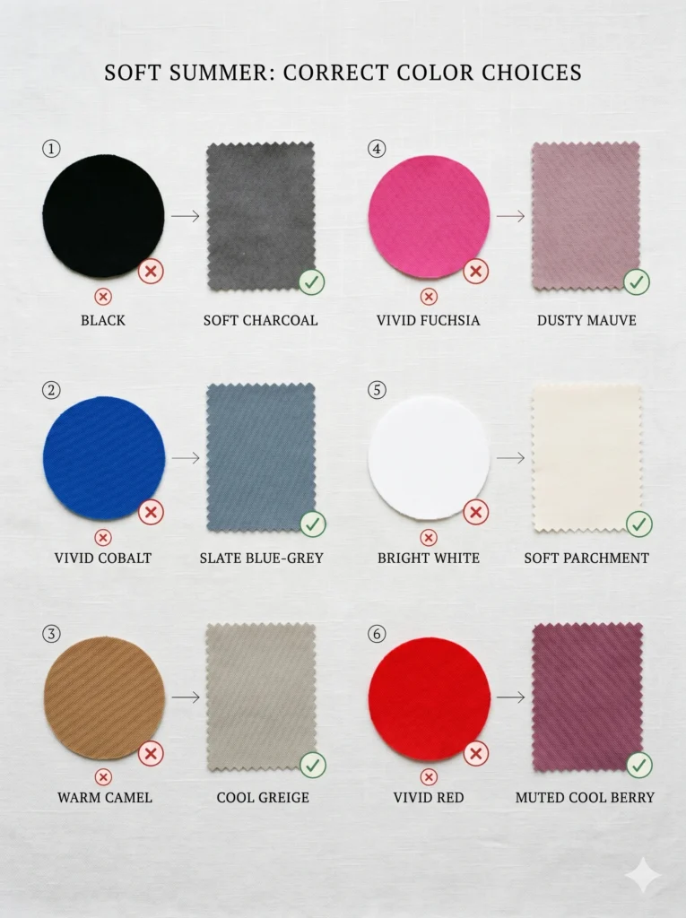
Soft charcoal (#4A4858), dark cool grey-blue (#505865), deep cool navy-grey
Myth Debunked — “Black Suits Everyone”
Black suits the Winter season family (Dark Winter, True Winter, Bright Winter) and some high-contrast Autumn depths — colouring that has a high natural contrast between hair, eyes, and skin. For these seasons, black simply matches what is already there.
For Soft Summer — and Light Summer, Light Spring, and many Soft Autumn types — black does not match what is already there. It dramatically exceeds it. A colour that works for a High Winter does not work for a Soft Summer any more than the same glasses prescription works for two people with different vision. Safe is not the same as flattering.
Where Black Can Live in a Soft Summer Wardrobe
Completely avoiding black in the modern wardrobe is a significant ask. The practical approach:
Below the waist only:
Black trousers, skirts, or shoes create far less impact than black near the face. The face is the compositional focal point — what happens at the neckline and shoulders matters most. Black at the ankle is a much smaller problem than black at the collar.
Broken by a Soft Summer colour near the face:
A soft charcoal blazer over a dusty rose blouse, for example. The black-adjacent element is separated from the face by a correctly calibrated Soft Summer colour that intercepts before the contrast reaches the face.
Accessories at a distance:
A black bag, belt, or shoe does not create the same facial contrast effect as a black turtleneck. The distance from the face means the contrast effect is minimal.
Why Bright White Drains Soft Summer
Bright / Optical White
Contrast Overload from Below + Chroma Clash
White creates the opposite contrast problem from black — instead of making the face look pale against a dark backdrop, vivid optical white makes the face look slightly grey and dull against an aggressively bright surface. The white “wins” in the LRV (Light Reflectance Value) competition, pushing the medium-value Soft Summer skin tone toward the middle and away from looking healthy.
Optical white — the kind used in crisp shirts and stark white garments — also has a slight blue-bright quality that creates a cold, artificial effect against the naturally warm-cool balance of Soft Summer skin.
Soft parchment (#F5F2EE), cool ivory, pale grey-white, off-white with a blue-grey cast.
The distinction between optical white and the correct Soft Summer white is subtle but visible. Soft parchment and cool ivory both read as “white” in an outfit but have a lower LRV — they do not compete with the face’s own light value. They sit below the face’s light value rather than exceeding it. This small difference in brightness is the difference between looking washed-out and looking fresh.
All Warm Tones — The Thermal Conflict
Warm colours — any colour with a yellow, golden, orange, or warm-red base — create a thermal conflict with Soft Summer’s cool undertone. The conflict is not subtle once you know how to read it. The warm fabric introduces its warmth into the light bouncing near the face, and the cool-toned skin absorbs it as yellow or sallow.
Think of it this way. A cool autumn morning: the air is crisp and blue-grey. If you place a warm amber lantern on the table, the room reads warm — and everything cool in the scene suddenly looks cold and uncomfortable by contrast.
That is what warm fabric does to a cool face.
Golden Yellow
Orange
Terracotta
Warm Red
Camel
Warm Brown
Warm Gold
Warm Peach
Golden Yellow
Maximum Thermal Conflict
Yellow is the warmest colour on the spectrum — and golden yellow amplifies this further with a warm, saturated base. Against Soft Summer’s cool-toned skin, golden yellow introduces a yellow cast to the face that is immediately visible in natural light.
Soft lemon with a grey-cool cast, cool muted chartreuse — never warm, always greyed.
Orange and Terracotta
Thermal Conflict + Saturation Excess
Orange and its earthy relative terracotta are the direct thermal opposite of the Soft Summer palette. Both carry a warm, saturated orange-red base. Against cool-toned skin, orange creates an orange “shadow” — the face picks up the colour temperature and reads as unwell rather than complemented.
Cool muted teal (the actual opposite of warm orange on the cool axis), dusty blue-grey
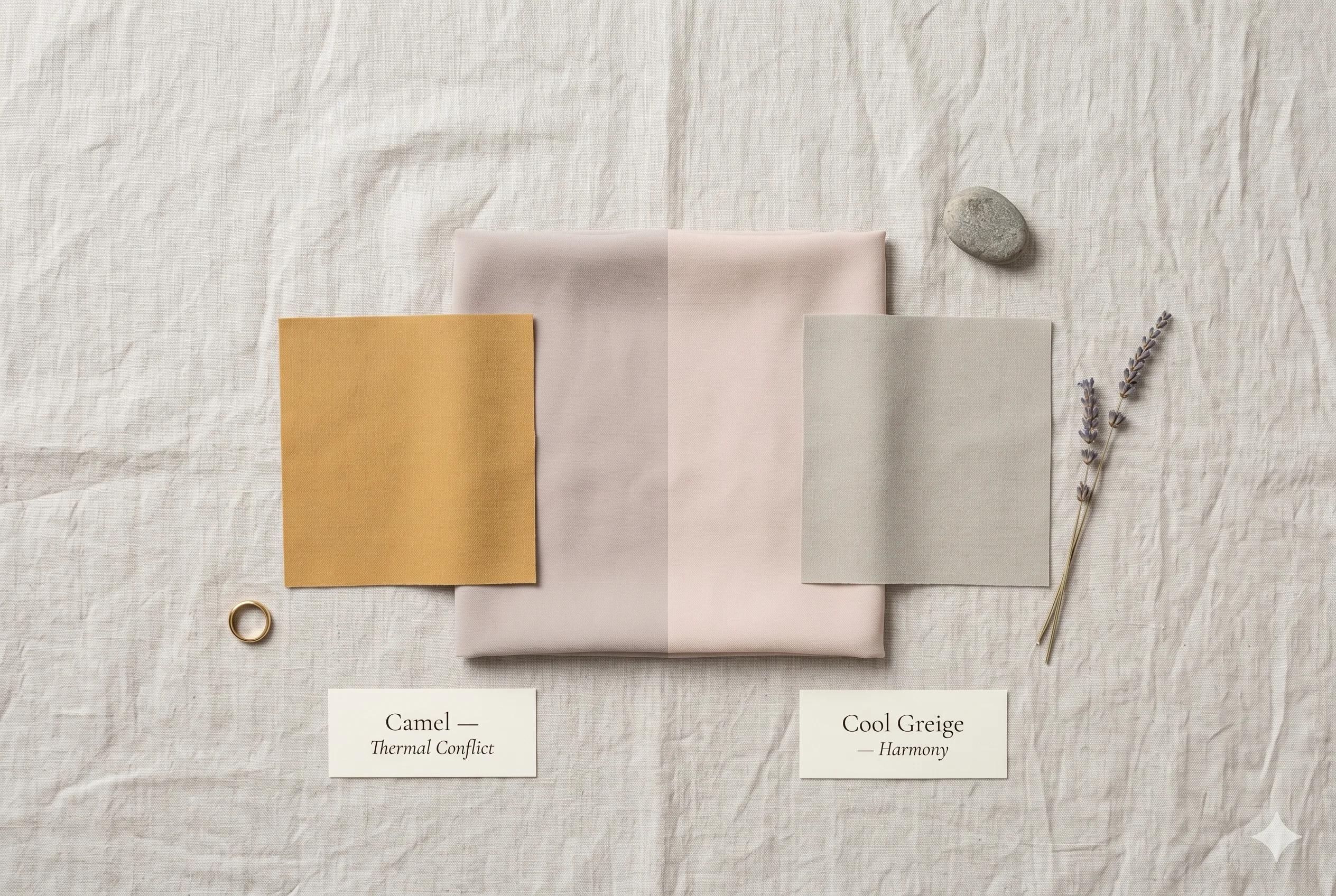
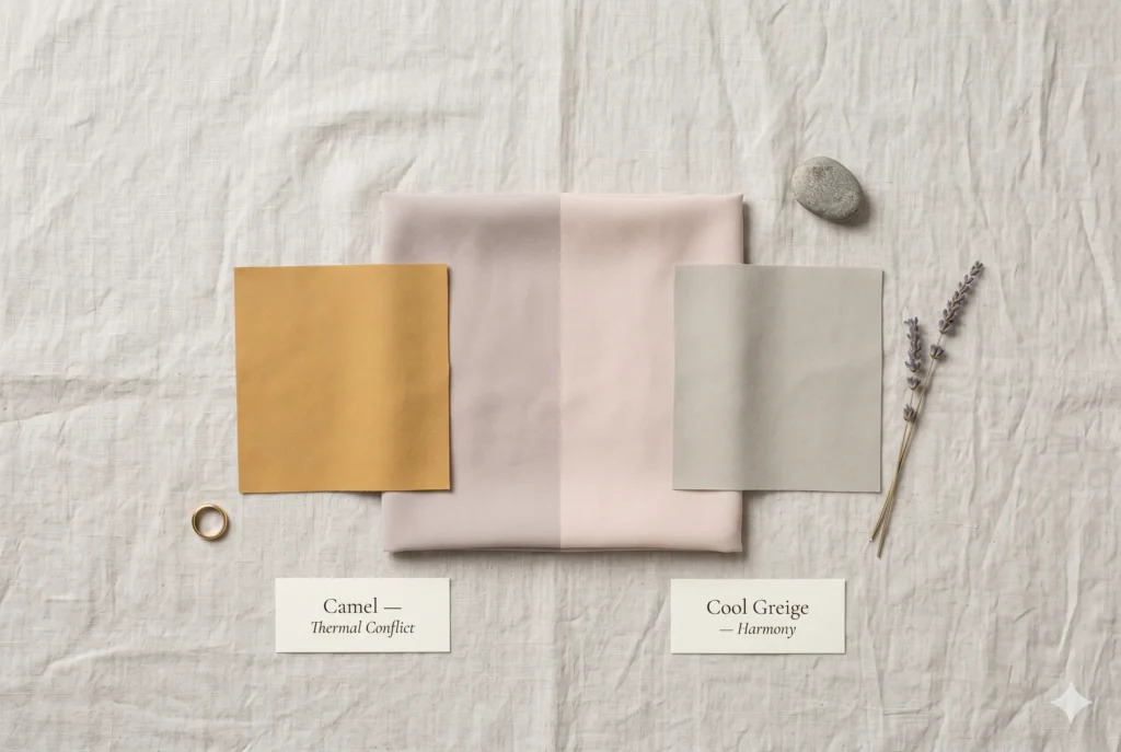
Camel and Warm Beige
Warmth in the Neutral Zone
Camel and warm beige are often seen as “safe” neutrals — and they are, for warm seasons. For Soft Summer, they introduce the same golden-warm quality as the more obviously warm colours, but in a subtler way. The result is not as jarring as orange, but it consistently makes the cool-toned skin look slightly sallow or dull — as if the face has lost its natural glow.
Cool greige (#D4D0C0), warm greige (permitted in the Soft Summer palette’s neutral zone), cool sand
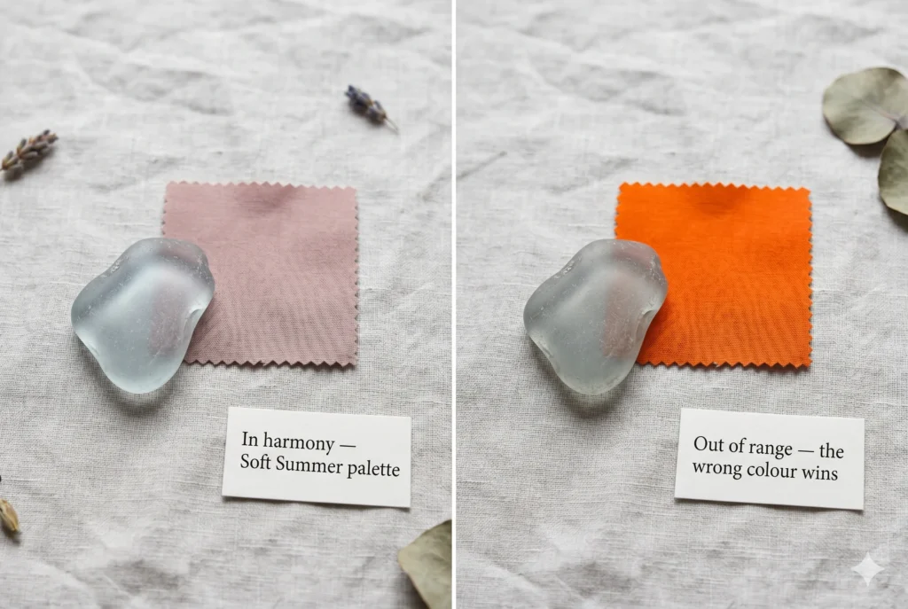
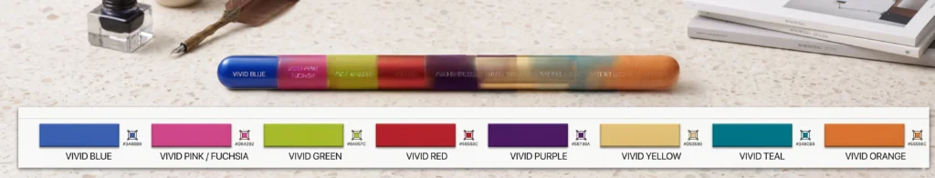
Vivid and Saturated Colours — The Chroma Conflict
Beyond the thermal conflict of warm colours, Soft Summer also has a specific saturation ceiling. The season’s colouring is inherently low-chroma — muted, greyed, and soft in its pigmentation.
When a vivid, highly saturated colour is placed near this colouring, the colour exceeds the chroma level of the face and takes over the visual composition.
This happens regardless of temperature. A vivid cool blue has the same “takes over from the face” problem for Soft Summer as vivid orange — just in a different temperature direction. The issue is not warmth in this case. It is saturation.
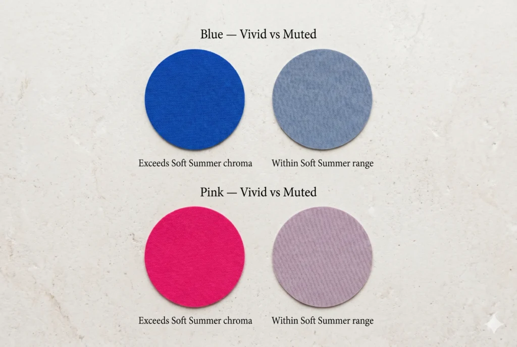
Vivid Cool Blue
Chroma Excess — Even in the Right Temperature Direction
This is a common trap: vivid blue is cool-toned — so surely it works for Soft Summer? The temperature is correct. The saturation is not. A bright royal or cobalt blue is so chromatically intense that it exceeds the face’s saturation level. The face looks greyed-out beside it rather than complemented by it.
Muted slate blue (#B8BEC9), dusty blue-grey, soft periwinkle — same cool direction, reduced chroma
Vivid Pink / Bright Fuchsia
Saturation Excess + Cool Face Looks Flat By Comparison
Fuchsia and vivid pink are cool in temperature — which correctly serves the undertone. But their high chroma overwhelms Soft Summer’s low-saturation colouring. The face does not look vivid beside a vivid colour; it looks washed out. The palette equivalent of fuchsia for Soft Summer is a muted dusty mauve — cool in temperature, reduced in saturation.
Soft dusty mauve (#C9C5D3), muted cool berry, dusty rose — cool but greyed-down
Vivid Red
Dual Conflict — Saturation AND Warmth
Vivid red is the worst of both worlds for Soft Summer: it is warm (most reds carry a yellow-orange base) AND vivid (high chroma). Even a “cool” vivid red has enough chromatic intensity to overwhelm the face. The Soft Summer version of red is a muted, cool, berry-toned deep red — darkened and greyed significantly from vivid red.
Muted cool berry (#907080), muted wine-plum, cool cranberry — red direction, muted.
High-Contrast Colour Combinations
This is the least-discussed Soft Summer avoidance category — and one of the most practically important. It is not just individual colours that matter. Contrast between colours in an outfit creates a visual effect that can exceed the season’s colouring even when each individual colour is within the palette.
Soft Summer’s natural colouring is low-to-medium contrast. The season reads as harmonious and blended. When an outfit creates dramatically more contrast than the person’s natural colouring — through dark-light pairings, complementary colour opposites in full saturation, or large-scale high-contrast prints — the clothing overwhelms the person rather than serving them.
✗ High-Contrast — Exceeds Soft Summer
Black and white pairing. Maximum possible contrast. The Soft Summer face cannot compete — it will look pale, drawn, and visually small between the two extremes.
✓ Low-Contrast — Within Soft Summer Range
Soft charcoal and cool greige. Meaningful tonal difference — visible depth contrast — but within the medium-contrast range the season can absorb.
✗ Vivid Complementary Pair — Wrong
Vivid red and vivid blue together — complementary-adjacent and both at full saturation. The outfit creates a visual energy that completely overwhelms Soft Summer’s muted colouring.
✓ Muted Analogous Pair — Right
Slate blue and soft lavender — analogous, muted, cool, low contrast. The outfit creates depth and interest while staying within Soft Summer’s contrast ceiling.
High-Contrast Prints and Patterns
The same principle applies to prints. A large-scale black-and-white geometric print creates the same contrast overload as wearing black and white separately. Soft Summer’s print guide:
Large-scale bold geometric prints with high light-dark contrast
Black and white stripe or check of any scale
Animal prints with vivid warm tones (cheetah, leopard in warm-orange versions)
Vivid floral on a stark white or black background
Soft watercolour florals in muted palette tones on a greige or cool ivory background
Heathered or tweed textures in the Soft Summer colour range — tonal rather than high-contrast
Delicate small-scale print with low visual contrast between pattern and background
Tone-on-tone prints — one colour family at varying depths within the Soft Summer range
What to Wear Instead — The Complete Substitution Table
Every colour that fails on Soft Summer has a calibrated replacement that delivers the same wardrobe function without the conflict. The substitution table below covers every major avoidance category:
|
Colour to Avoid |
Why It Fails |
Soft Summer Alternative |
|---|---|---|
|
True Black |
Contrast overload — exceeds medium-contrast ceiling |
Soft charcoal, cool dark grey (#4A4858) |
|
Bright White |
LRV competition — face looks dull by comparison |
Soft parchment, cool ivory (#F5F2EE) |
|
Golden Yellow |
Maximum warm thermal conflict |
Cool muted yellow-green, soft citron with grey |
|
Orange / Terracotta |
Warm thermal + chroma conflict |
Muted cool teal, dusty blue-grey (#98B4B8) |
|
Camel / Warm Beige |
Subtle warm conflict in neutral zone |
Cool greige, warm greige (palette-approved, #D4D0C0) |
|
Copper / Auburn |
Warm-red thermal conflict + chroma |
Rose brown, dusty mauve-rose (#B8A0A8) |
|
Vivid Blue |
Chroma excess — overwhelms low-saturation colouring |
Slate blue, misty blue-grey (#B8BEC9) |
|
Vivid Pink / Fuchsia |
Chroma excess despite cool temperature |
Soft dusty lavender, muted mauve (#C9C5D3) |
|
Vivid Red |
Warm thermal + chroma — dual conflict |
Muted cool berry-wine (#907080) |
|
Vivid Green |
Chroma excess + warm-leaning hue |
Muted sage, soft grey-green (#B8C4BA) |
|
Vivid Purple |
Chroma excess |
Dusky violet, smoky lavender (#ACA6B8) |
|
Warm Dark Brown |
Warm thermal conflict + high contrast |
Cool dark grey, soft charcoal-navy (#606870) |
The One Test That Confirms Everything
Every avoidance category above can be confirmed in real time with one test. It requires no colour analysis knowledge and no special equipment. Just natural daylight and honesty.
The Drape Test — Using It to Identify Wrong Colours
Hold a garment or fabric near your face in natural daylight — not artificial indoor light, which distorts colour temperature significantly. Look at your face, not the fabric. Ask one question:
Does the fabric make my skin look more even, clearer, and lifted? Or does it make the shadows darker, the skin flatter, or my features smaller?
You do not need to understand why. The face always tells the truth. A colour that exceeds contrast will make the face recede. A colour that introduces thermal conflict will make the skin read sallow. A colour that exceeds chroma will make the face look flat beside it.
The question is not “do I like this colour?” The question is “what does it do to the face?” These are different questions with different answers.
Take our Soft summer quiz .
In my studio practice, I extend this to a second observation: what do other people say when you wear a colour? Correct palette colours produce comments like “you look rested,” “did you change something about your hair?”, “you look great today.” Wrong palette colours produce either silence, or comments about the garment itself rather than the person. “That’s a great shirt” means the shirt is more visible than the person. “You look great” means the person is more visible than the shirt. That is the goal.
Soft Summer Colors to Avoid — FAQs
What colors should Soft Summer avoid?
Soft Summer should avoid five categories: (1) True black — contrast overload. (2) Bright white — LRV competition. (3) All warm, golden, earthy tones — thermal conflict with cool undertone. (4) Vivid saturated colours of any temperature — chroma excess. (5) High-contrast colour combinations in outfits. Every avoidance has a Soft Summer alternative that delivers the same function without the conflict.
Can Soft Summer wear black?
Black is not in the Soft Summer palette. It creates a contrast ratio that significantly exceeds the season’s medium-contrast ceiling, making the face appear pale and drawn. The alternative is soft charcoal, cool dark grey, or deep cool navy-grey — colours that provide depth without the harshness of true black. Black can be tolerated below the waist (away from the face) but should be avoided at the neckline and collar.
Does black suit everyone?
No. Black suits high-contrast colour seasons — primarily the Winter family and some deep Autumns — whose natural colouring already has significant contrast between hair, skin, and eyes. For low-to-medium contrast seasons like Soft Summer, black exceeds the contrast ceiling and creates an ageing, draining effect near the face. The ubiquity of black as a “safe” choice does not make it a universally flattering one.
Can Soft Summer wear warm colours?
Warm colours — orange, golden yellow, terracotta, caramel, warm brown, warm peach — are outside the Soft Summer palette. They conflict with the season’s cool undertone, making the skin read as slightly yellow or sallow in natural light. The one exception: warm greige sits at the Soft Summer palette’s neutral boundary — it is warm enough to read as neutral but grey-muted enough to avoid thermal conflict. Any colour warmer than warm greige is outside the zone.
Can Soft Summer wear vivid colours?
Vivid, fully saturated colours exceed the Soft Summer chroma tolerance, even when they are cool in temperature. A vivid blue is thermally correct for Soft Summer but chromatically wrong — it overwhelms the face’s naturally low saturation. The solution is always a greyed-down version of the same hue: slate blue instead of cobalt, dusty mauve instead of vivid purple, muted sage instead of vivid green. The direction is right; the saturation must be reduced.
What is the Soft Summer alternative to navy?
Soft Summer can wear navy — but specifically a muted, greyed navy rather than a crisp, saturated nautical navy. The correct Soft Summer navy reads as a very deep blue-grey rather than a bright, vivid blue-dark. It should feel more like midnight mist than clear ocean. Crisp nautical navy has too much chroma clarity; the Soft Summer version needs grey mixed in to reduce the saturation to palette level.
Your Implementation Task
Auditing Your Wardrobe Against This Guide
- The most practical use of this guide is a wardrobe audit — ideally done in natural daylight, holding each item near the face and observing the skin’s response honestly.
- Start with the contrast extremes: Pull out anything black or bright white. These are the highest-impact avoidances. Replace black near-face items with soft charcoal or cool dark grey alternatives. Replace bright white with soft parchment or cool ivory.
- Check the warm zone: Any item described as caramel, golden, copper, terracotta, warm brown, or orange falls into the avoidance category. Hold each one near your face in daylight and observe the skin quality — the test will confirm what the colour description already suggests.
- Evaluate saturation: Any colour that reads immediately and definitively vivid — whether warm or cool — is likely too saturated. The Soft Summer palette test: if you can name the colour instantly and clearly, it may be too chromatic. If the colour is slightly ambiguous — “is that grey-blue or dusty lavender?” — it is likely in the right chroma range.
- Download the Soft Summer colour palette card as a shopping reference. Having the correct palette present at the point of purchase makes it possible to compare rather than guess — and prevents the most common wardrobe errors before they happen.