The Soft Summer Blue-Grey Hiding in Plain Sight
— A Colour Analyst’s Case for Misty Blue-Grey, #C8D4D9
#C8D4D9 looks like an ordinary pale grey until you put a number on it. The moment you do, it stops being neutral and becomes something specific — a textbook Soft Summer blue grey, with a cool cast no warm-season eye would ever reach for.
Quick answer, if you’re short on time
Misty Blue-Grey (#C8D4D9) is an official Soft Summer neutral. Its Munsell profile — medium-light value, very low chroma, cool blue hue — sits inside Soft Summer’s muted, cool-neutral family, not True Summer’s cleaner blues or Light Summer’s higher-value pastels. In a Soft Summer capsule wardrobe, it works as a soft alternative to black or white.
The Analyst Perspective — Reading #C8D4D9 on the Munsell Scale
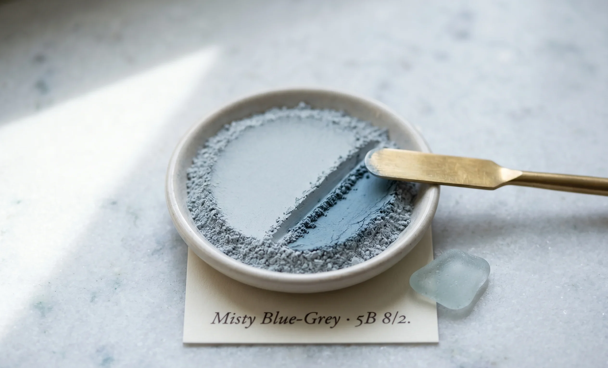
Strip away the name and look only at the numbers. #C8D4D9 converts to roughly Munsell value 8, chroma 2, in the cool blue hue family near 5B — medium-light value, very low chroma. That combination is Soft Summer’s signature, not an approximation of it.
Value 8 keeps this colour out of Soft Summer’s deepest, dusk-toned neutrals, but it stays well short of Light Summer’s airy, near-pastel range. Chroma 2 is the real tell — there is barely enough saturation left to argue with.
Numbers don’t soften just because the eye wants to call something “plain grey.” The chroma reading does the one thing fog never does — it tells you exactly how little colour is actually there.
Looks like a simple pale grey until it sits beside true white — that’s when the blue steps forward and any trace of warmth disappears completely.
This is also where Soft Summer parts ways with its two cool-family neighbours. True Summer holds a cleaner, slightly higher-chroma blue. Light Summer holds the same low chroma at a noticeably higher, more pastel value.
Soft Summer
Value 8 · Chroma 2 — grey-cast, muted
True Summer
Value 7 · Chroma 4 — cleaner, clearer blue
Light Summer
Value 9 · Chroma 2 — same mute, lighter
Three seasons, three coordinates, one shared cool hue family. Misty Blue-Grey occupies exactly one of those coordinates — not a blend of the other two.
The Nature Perspective — Where Misty blue Already Exists
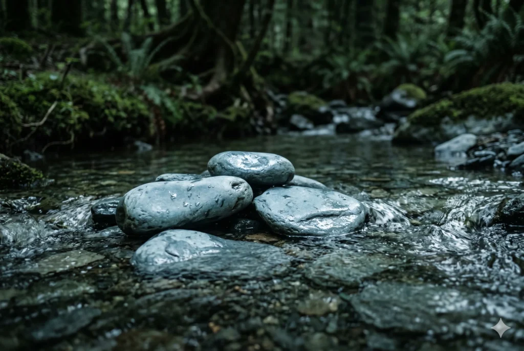
If you’ve read the Soft Summer vs Soft Autumn comparison, you already know Soft Autumn’s answer to grey — warm, rhino-hide taupe with ochre hiding underneath. Misty Blue-Grey is that same low-chroma instinct, just rinsed in Summer’s cooler light.
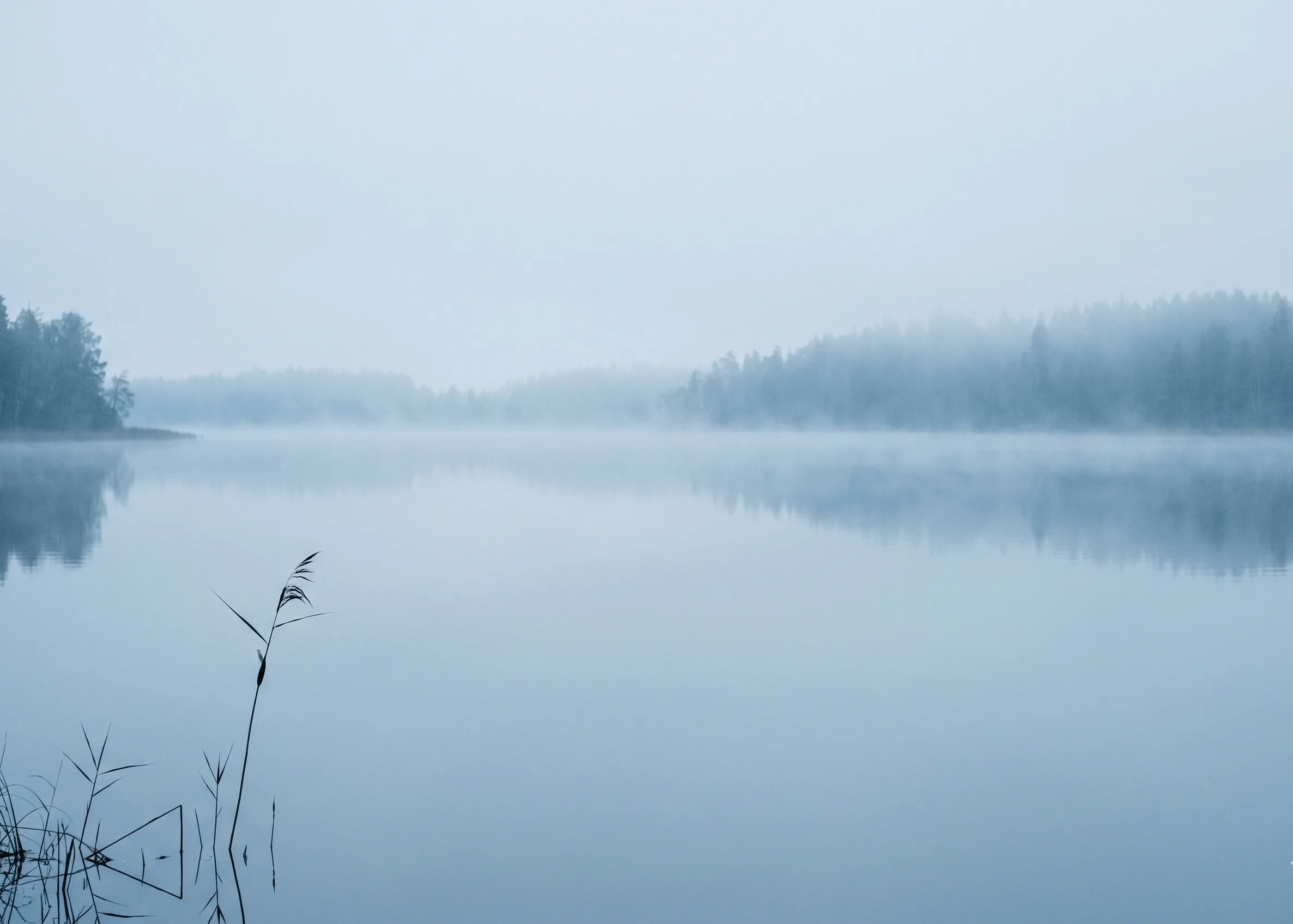
Picture early morning fog sitting over a still lake before the sun has fully cleared it — the water grey-blue, the far shore dissolved, every hard edge gone soft. That suspended, breath-held moment is Misty Blue-Grey exactly as it occurs in nature.
Fog doesn’t add colour to a landscape — it subtracts everything else until this is what’s left standing.

This isn’t a pigment colour. It’s what light looks like after travelling through moisture and losing its edges — an atmospheric tint, not a paint-chip colour.
The Wardrobe Perspective — A Soft Anchor, Not a Stark Neutral
In a capsule wardrobe built for Soft Summer, the hardest neutral to place is rarely black. Pure black sits at a contrast level Soft Summer’s blended colouring doesn’t naturally carry — and stark white does the same from the opposite direction.
Misty Blue-Grey solves both problems from the middle. It anchors a wardrobe the way black is meant to, without forcing the rest of the face to compete with the garment.
Misty Blue-Grey doesn’t compete for attention — it holds the room together and lets the wearer’s own colouring take the credit.
🩶 Practitioner Note — Melanin Calibration
In my drapting sessions, the cool-neutral logic of Misty Blue-Grey holds steady across Soft Summer’s full Fitzpatrick range, from II through V. What shifts at deeper skin depths is the contrast value relative to the garment — never the undertone direction. A deeper Soft Summer reads this colour as cool and muted exactly the same way a lighter Soft Summer does; the framework doesn’t need separate rules here, only attention to value placement near the face.
Final Validation — Why Misty Blue-Grey Belongs
Three readings, one answer. The Munsell numbers confirm cool, muted, medium-light. The fog and the wet slate confirm it already exists exactly this way in the physical world.
The wardrobe role confirms it behaves the way Soft Summer’s colouring needs a neutral to behave — present, quiet, never competing.
This is a colour that already knew where it belonged. The framework just gave it the right address.
Misty Blue-Grey IS a neutral swatch WITHIN the Soft Summer palette IN the 16-season framework — confirmed by theory, by nature, and by function, not chosen because it happens to be pretty.
Frequently asked questions .
A Few Things People Ask Me
Is blue-grey a Soft Summer colour?
Yes. Blue-grey at low chroma and medium-light value is one of Soft Summer’s defining neutrals. Misty Blue-Grey (#C8D4D9) sits well inside the Munsell range Soft Summer occupies — cool hue, value around 8, chroma around 2 — making it a structurally confirmed Soft Summer tone.
What makes Misty Blue-Grey different from a True Summer grey?
True Summer’s greys sit at a slightly higher chroma — cleaner, with more visible blue. Misty Blue-Grey’s chroma is lower, around 2, giving it Soft Summer’s characteristic fog-like, grey-cast muting rather than True Summer’s clearer, more defined cool edge.
Can Soft Summer wear blue-grey instead of black or white?
Yes, and it’s a swap I recommend often. Pure black and stark white both sit at a contrast level higher than Soft Summer’s naturally blended colouring. Misty Blue-Grey anchors a wardrobe the way black does, without forcing the face to compete with the garment.
What is the Munsell value of Soft Summer’s blue-grey neutral?
Misty Blue-Grey converts to approximately Munsell value 8, chroma 2, in the cool blue hue family near 5B. That medium-light value keeps it darker than Light Summer’s near-pastel range while staying well short of Soft Summer’s deeper, dusk-toned neutrals.
Does Misty Blue-Grey work for deeper Soft Summer skin tones?
Yes. The cool-neutral undertone logic holds across Soft Summer’s full Fitzpatrick range. What shifts at deeper skin depths is the contrast value relative to the garment, not the temperature direction — Misty Blue-Grey remains cool and muted at every depth within the season.
Yours in colour, Helen
I’ve watched more Soft Summer clients reach for black out of habit than any other mistake in this work — swap it for this one grey and the whole face exhales. Try it before you replace anything else.
For the complete neutral and accent breakdown, see the Soft Summer Color Palette guide. For how this grey behaves next to Soft Autumn’s warm answer to it, the Soft Summer vs Soft Autumn comparison is the natural next read.