Soft Summer vs Soft Spring: Undertone, Palettes & Swatches
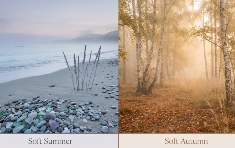
Soft Summer vs Soft Spring The Cool-Muted vs Warm-Muted Color Palette Comparison
Quick Answer
Soft Summer and Soft Spring are both muted palettes, which is the confusing part — the split is undertone. Soft Summer runs cool (ash, dove, muted berry); Soft Spring runs warm (honey, camel, soft peach). Soft Spring isn’t one of the three official Sci/ART Spring types — it’s a warm-muted zone between Light Spring and Soft Autumn. Test it: dusty mauve against soft peach — whichever brightens your skin wins.
Soft Summer vs Soft Spring
Both are muted. Both photograph “soft.” That’s the whole confusion in two words.
Soft Summer is cool-muted — grey mixed into every hue. Soft Spring is warm-muted — cream and honey mixed in instead of grey. Same softness, opposite temperature.
One thing before the comparison: Soft Spring isn’t one of the three official Sci/ART Spring types (Bright, True, Light). It’s a term tonal and extended systems use — sometimes “Toned Spring” — for the warm, muted zone between Light Spring and Soft Autumn. The comparison below holds regardless of which system you’re using.
- Where they overlap: both muted, both light-to-medium contrast, both read as “soft” rather than “bold.”
- Where they split: undertone (cool vs. warm) and how the mutedness is built (grey vs. cream).
- What Soft Spring isn’t: a standard type in every system — see “Which One Are You, Really?” below.
The Quick-Glance Diagnostic between the color seasons
Skip ahead — here’s the whole comparison in one table:
Hue, Value & Chroma
Soft Summer and Soft Spring share one dimension and split on two.
Hue — Undertone
Soft Summer’s undertone runs cool: ash, dove, muted berry. Soft Spring’s runs warm: honey, camel, soft peach. This is the dimension that never bends.
Value — Lightness
Both sit light-to-medium. Neither is a dramatically light season the way Light Spring or Light Summer are — the “soft” in both names is doing real work here.
Chroma — How the Mutedness Gets Built
This is the nuance most guides skip. Soft Summer mutes with grey — genuinely lower saturation, like a fog sitting over the hue. Soft Spring softens with cream and warmth instead of grey, so a muted Soft Spring colour never looks dirty the way an over-greyed warm colour can. Same word, different mechanism.
Chroma ≈5
Hue leaning orange-red
Chroma ≈3
Hue leaning pink-red
Same lightness family — the chroma nearly halves, and the hue slides from orange toward pink. That’s the entire Light-Spring-to-Soft-Summer shift, in two numbers.
Soft Peach is honey caught mid-pour, not quite gold yet. Dusty Mauve is closer to faded denim left through a whole summer of washes — the colour’s still there, just worn soft.
The Palettes, Side by Side
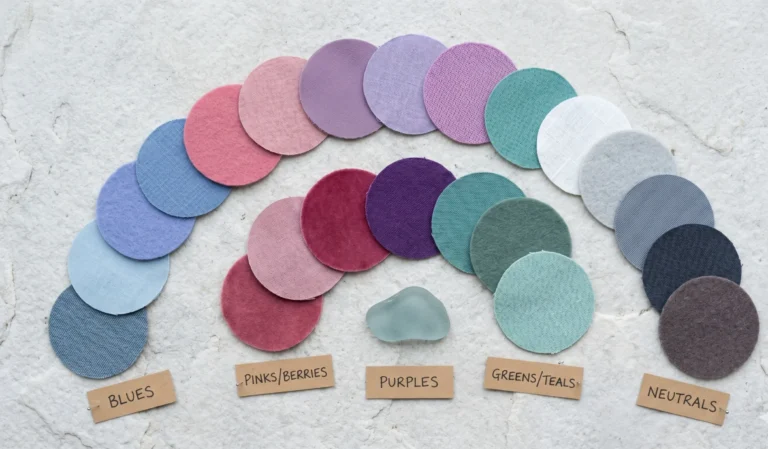
Matched by role, not just listed — so the difference is obvious at a glance:
Run the Litmus Test
This is the fastest home version of a professional drape — and close to what r/coloranalysis threads walk through when this exact question comes up.
The Coral Test
Hold a soft peach or salmon-coral swatch at your jaw in daylight, then switch to a dusty mauve. One lifts your skin and makes your eyes look clearer. The other sits there — not harsh, just flat, like it’s not really talking to your skin.
The Neutral Test
Repeat with camel or warm cream against charcoal or slate. Same logic: the neutral that goes quiet and blends in is yours. The one that turns chalky or muddy is not.
The pattern that shows up again and again: a true Soft Spring under Soft Summer’s greys and cool mauves picks up a grey, slightly tired cast. A true Soft Summer under Soft Spring’s peachy-golden tones looks flushed or sallow instead of warmed up. Whichever direction the “wrong” swatch pushes your skin is the answer.
Worst Colors & Makeup, at a Glance
Short version: Soft Summer struggles with anything too bright or too warm. Soft Spring struggles with anything too icy or too stark.
Full lists with swaps: Soft Summer Colors to Avoid
Metals & Makeup, at a Glance
Same undertone logic, applied to what’s already in your jewelry box.
Summer
Soft Summer’s silver preference runs on the same logic covered in the True Summer Jewelry & Metals Guide.
Which One Are You, Really?
If your own colour analysis used Sci/ART specifically, “Soft Spring” won’t be one of the three results you can get for Spring. The closest official matches are a muted-leaning Light Spring or a light, warm-leaning Soft Autumn — Soft Spring sits in the gap between them.
Across Every Skin Depth
Both palettes span real range in skin depth — undertone and chroma matter more than how fair or deep the skin is.
Soft Summer stays cool and muted at every depth: fair skin shows a soft ashy quality, deeper cool skin shows a richer, muted cool depth — never warm. Soft Spring stays warm and muted at every depth too: fair skin shows the undertone as a soft golden glow, deeper warm skin shows a richer honey warmth — never ashy.
FAQ
Am I Soft Summer or Soft Spring?
Hold a dusty mauve swatch and a soft peach swatch at your jaw in daylight. If the mauve brightens your skin and the peach looks flat or sallow, you’re Soft Summer. If the peach warms you up and the mauve looks grey or tired, you’re Soft Spring.
Is Soft Spring a real color season?
It’s real in tonal and extended colour-analysis systems, but it isn’t one of Sci/ART’s three official Spring types (Bright, True, Light). Sometimes called Toned Spring, it describes the warm, muted zone between Light Spring and Soft Autum.
What’s the difference between Soft Summer and Soft Spring makeup?
Soft Summer leans into mauve and plum lipsticks with silver-toned accents. Soft Spring leans into peach, nude-salmon, and coral lipsticks with warmer, satin-gold accents.
How does Soft Spring compare to Soft Autumn?
Both are warm and muted, but Soft Spring stays lighter and closer to Light Spring’s freshness, while Soft Autumn sits deeper and closer to Deep Autumn’s richness. Soft Spring is essentially Soft Autumn’s lighter, brighter edge.
What is the dulling test?
A quick way colour-analysis communities check undertone: hold a cool, muted colour and a warm, muted colour against bare skin. Whichever one makes the skin look grey, flat, or sallow — instead of brighter — is the wrong undertone.
Can Soft Summer and Soft Spring share any colors?
A little. A soft, muted aqua or teal sits cool enough for Summer and gentle enough to avoid reading icy for Spring, making it one of the few colours both seasons can usually wear.
Where to Go From Here
Once the undertone question is settled, the fastest next step is reading your season’s full palette end to end — every hex, every neutral, every borrow-safe accent.
I’ve watched the camel-versus-charcoal test settle more “am I warm or cool” arguments in five minutes than a whole afternoon of quizzes — try it before you buy anything new.