Light Summer vs True Summer Two cool palettes, one real difference
Light Summer vs True Summer: Color Palette Guide & Drape Test
Quick answer
Light Summer and True Summer are both cool, muted branches of the Summer family — the split comes down to depth and undertone purity. Light Summer stays light and blends a soft neutral into its coolness. True Summer runs a shade deeper and is cool through and through, with no neutral drift at all. If pale colours make you glow but medium tones flatten you, you’re Light Summer. If it’s the reverse, you’re True Summer.
Same Family, Different Signal
Light Summer and True Summer are both sub-seasons of the Summer family in the Sci/ART 16-season framework — which means they start from the same place. Cool undertones. Muted colour, never the saturated kind. A soft, blended look rather than sharp contrast.
That’s exactly why people mix them up.
Stand a Light Summer swatch next to a True Summer one and the family resemblance is obvious: the same coolness, the same quiet softness, the same instinct to avoid anything warm or bright. The palettes overlap at the edges — a pale lilac sits comfortably in both.
The difference shows up somewhere else entirely. Not in temperature. In how far each palette is willing to go.
The One Real Difference That Matters
Everything else on this page branches from a single question: how deep, and how purely cool?
Light Summer answers “light” first. Its colouring sits close to the surface — pale, airy, gently blended — and its undertone carries a whisper of neutral alongside the cool. That neutral drift is small. It’s still unmistakably a cool palette. It just isn’t quite as strict about it as its sibling.
True Summer answers “cool” first. There’s no neutral drift at all — the undertone runs cool from the lightest tint to the deepest shade in the palette. Because that coolness is uncompromising, True Summer can carry a bit more depth without the colour turning heavy. Light Summer needs to stay pale to look right. True Summer has room to sit at medium-light and medium.
Depth on one axis, undertone purity on the other. Light Summer sits high and slightly neutral; True Summer sits mid-depth and fully cool.
Interactive Matrix Tool
Click or hover over a sub-season dot on the graph above to explore exactly why it sits where it does on the lightness and temperature scales.
Light Summer at a Glance
- Skin
- Light to fair, cool-neutral undertone — occasionally a soft peachy-pink cast near the Light Spring border
- Hair
- Light to dark ash blonde, or a soft light ash brown — no warmth, no red or gold
- Eyes
- Light blue, soft grey, or pale green — gentle rather than piercing
- Contrast
- Very low. Hair, skin and eyes all sit close together in value
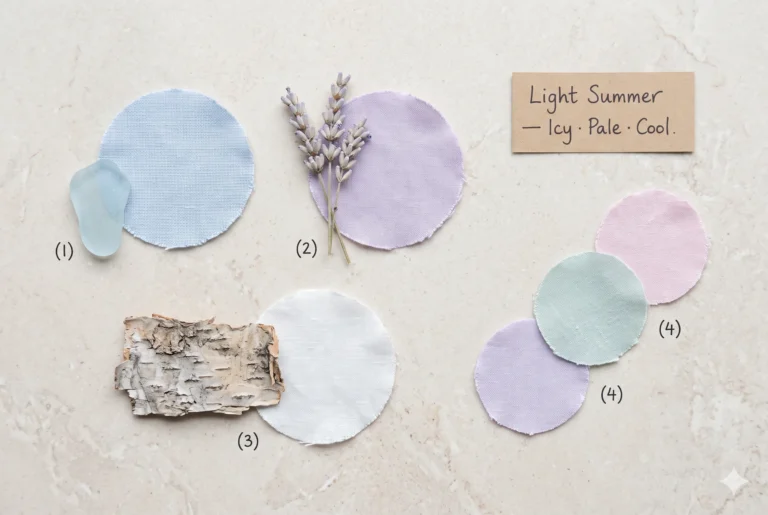
Think of it as sea foam catching the light for a second, then softening back into the water.
Powder Blue
#B7CDD9a soft, airy blue
Explore ShadePrimrose Blush
#E8CFD1pale, gentle pink
Explore ShadeLilac Haze
#CBC0D6light, dreamy purple
Explore ShadeSea Foam
#C3D6CEfresh, cool green
Explore ShadeDove Grey
#C9CBCAsoft, versatile neutral
Explore ShadePearl Coral
#E3C6BFbarely-there warmth, worn very light
Explore ShadeTrue Summer at a Glance
- Skin
- Light-medium to medium, distinctly cool — sometimes a rosy or faintly grey cast
- Hair
- Ash brown, ash blonde, or mousy brown — cool and flat, no gold or red warmth
- Eyes
- Blue, grey-blue, grey-green, or soft hazel with a grey quality
- Contrast
- Low to medium. Enough definition to register, never sharp
True Summer is frosted blueberry under a cloudy sky — cool enough to feel almost blue-tinted, never quite dark.
Light Summer vs True Summer: Side-by-Side
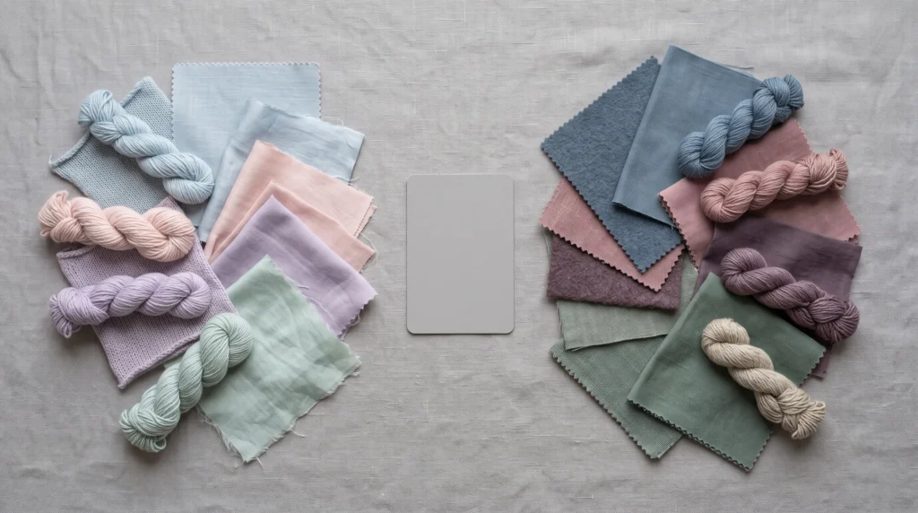
Once the swatches are in front of you, the pattern from the diagram above turns into something you can shop from.
Light Summer vs True Summer, dimension by dimension
| Dimension | Light Summer | True Summer |
|---|---|---|
| Undertone | Neutral-cool | Purely cool |
| Depth | Light to very light | Light-medium to medium |
| Contrast | Very low | Low to medium |
| Saturation ceiling | Stays delicate throughout | A step deeper, still muted |
| Best colours | Powder blue, primrose, lilac haze | Slate blue, dusty rose, soft plum |
| Best neutrals | Dove grey, soft ivory | Charcoal mist, cool taupe-grey |
| Avoid | Anything warm, dark, or saturated | Anything warm, stark, or neon |
Studio Read
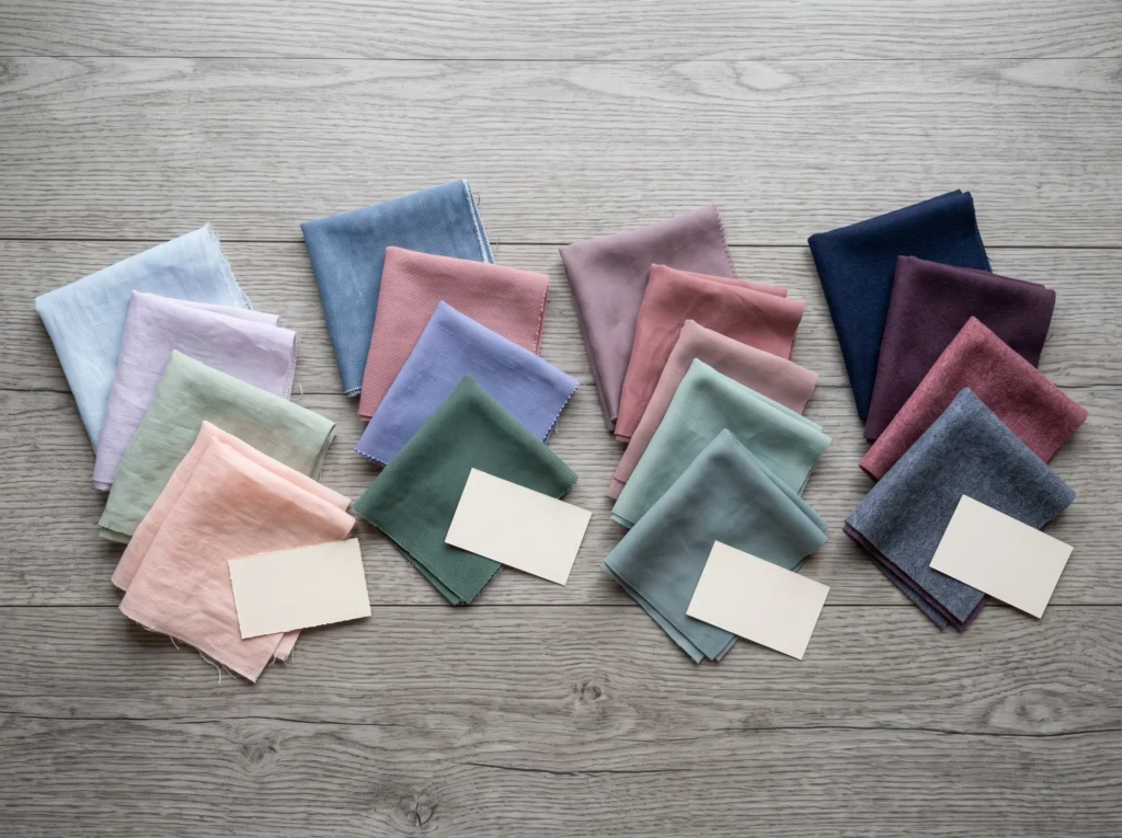
Lay a pale lilac swatch and a slate-blue swatch next to each other under the same light, and the difference reads instantly — no reference card needed. The lilac sits close to white : high value, barely-there saturation. The slate carries real pigment; still muted, but with weight to it.
Hold each against fair skin in turn. The lilac tends to disappear into it, flattering in its lightness. The slate reads as a deliberate colour choice rather than an extension of the skin tone.
That’s the test in miniature. Does the colour recede, or does it register as its own thing? Recede — lean Light Summer. Register — lean True Summer.
Three Quick Self-Tests
Best done in natural daylight near a window, with a clean face and no other colour competing near it.
The Value Test
Hold your palest pastel — powder blue or lilac haze — against your face. Swap it for a medium tone: slate blue or dusty rose . Which one lights you up? Pale winning is Light Summer. Medium holding its own is True Summer.
The Undertone Test
Try a neutral-cool greige near your face. Light Summer usually wears it fine. True Summer tends to look a little dull or sallow in anything drifting toward warm-neutral.
The Blonde Test
A very light ash blonde sitting easily against your skin points to Light Summer. If pale blonde washes you out while a cool medium-to-dark brown looks balanced instead, that’s True Summer.
Where the Rest of the Summer Family Fits
Light Summer and True Summer aren’t the whole story — the Summer family has two more members worth placing on the map before you commit.
Soft Summer
Where True Summer stays clean and clear, Soft Summer gets pulled toward grey — like the same slate blue left out in overcast weather a little longer, the pigment still there but hazier.
Soft Summer shares the family’s coolness but sits deeper and more muted than either Light or True Summer, leaning toward Autumn’s neighbourhood rather than Spring’s. It’s a different page’s territory — see the full Soft Summer palette for the complete comparison.
Cool Summer
This one causes a different kind of confusion — not because it’s a separate palette, but because several 16-season frameworks use “Cool Summer” as another name for the exact position True Summer occupies here: purely cool, medium depth. If a comparison elsewhere calls something Cool Summer and it looks identical to what’s described here as True Summer, that’s usually why.
A smaller number of systems do draw a genuine line between the two. Worth checking which framework any given guide is using before treating results as directly comparable.
The Neighbour Everyone Confuses This With: Light Spring
This mix-up isn’t about depth at all — both seasons are light. It’s about temperature.
Runs warm. Golden undertone, and it comes alive in warm, clear colour — coral, warm aqua, peach.
Runs cool. The same coral that makes a Light Spring glow tends to flatten a Light Summer’s complexion, pulling it toward sallow.
The fastest check: hold a warm coral and a cool pink side by side near your face. Glow in the coral — Light Spring. Glow in the pink — Light Summer.
This border gets its own deep-dive treatment — worth reading in full if you’re genuinely torn between the two. Light Spring vs Light Summer, compared in detail →
Across Every Skin Depth
Summer colouring shows up at every skin depth, fair through deep. The underlying logic doesn’t change with depth — only the specific shades that apply it.
What stays constant: a cool undertone, a preference for muted over saturated colour, and a contrast level between skin, hair and eyes that sits low rather than high, whatever that skin’s own depth happens to be.
On Fair to Light-Medium Skin
Light Summer’s lightest values sit close to the skin’s own value — that’s exactly what produces the soft, blended look the palette is known for. The lower the difference in value between skin and fabric, the softer the effect reads.
On Medium to Deep Skin
The same low-contrast principle holds, but it’s expressed through the palette’s relationship to the skin’s own depth rather than through paleness alone. A deep-skinned Light Summer still wants soft, blended, cool colour placed close to the face. A deep-skinned True Summer carries the medium-muted end of its palette with genuine richness, because the coolness of the undertone reads the same regardless of how deep the skin sits.
Undertone itself is identified the same way at any depth — by how the skin responds to warm colour placed close to it versus cool, not by how light or dark the skin is to begin with.
Frequently Asked Questions
What’s the real difference between Light Summer and True Summer?
Depth and undertone purity. Light Summer stays light with a soft neutral drift inside its coolness. True Summer runs a shade deeper and is cool with no neutral drift at all. Both are muted — neither wears warm, earthy, or high-saturation colour well.
How do I know which one I am?
Hold a pale lilac and a medium slate blue against your skin in daylight. If the pale one lights you up and the deeper one feels heavy, you’re Light Summer. If the reverse happens, you’re True Summer.
Is True Summer the same as Cool Summer?
Often, yes — several 16-season frameworks use “Cool Summer” as an alternate name for True Summer’s purely-cool, medium-depth position. A few systems split them slightly differently, so check which framework a guide is using before comparing results directly .
How do I tell Light Spring from Light Summer?
Temperature, not lightness — both are light. Light Spring is warm and golden, and glows in warm coral and peach. Light Summer is cool; those same warm shades turn its complexion sallow, while cool pastels do the glowing instead.
Are Light Summers cool-toned or warm-toned?
Cool-toned, with a gentle neutral drift inside that coolness — never warm. That small neutral lean is what separates Light Summer from True Summer’s fully cool undertone, not a shift toward warmth.
What if I feel caught between the two?
Common, especially near the palettes’ lightest and medium-light overlap. Focus on one test: does a medium-depth muted tone like slate blue read as balanced or heavy on you? Balanced leans True Summer; heavy leans Light Summer.
Which One Fits?
Start with the value test and the undertone test above — together they settle most cases in under five minutes. If you’re still between the two, the Studio Read section is worth rereading slowly with actual swatches in hand, not just on screen.
“The swap that changes the most wardrobes I see isn’t a whole new palette — it’s trading one wrong-depth neutral for the right one. Start there before you touch anything else.” Helen Alex