Muted ColorsWhere they sit on the color wheel, and the palettes built from them
Muted Colors Explained: Color Wheel, Hex Codes & Palettes
Quick answer
Muted colors are hues with reduced saturation, created by adding grey — or a complementary color — rather than white or black. They sit at low-to-medium chroma while keeping a mid-range value. On a color wheel, muted isn’t a location, it’s a distance from the center: the closer to the neutral core, the more muted a hue becomes. Soft Summer (cool) and Soft Autumn (warm) are built on this quality.
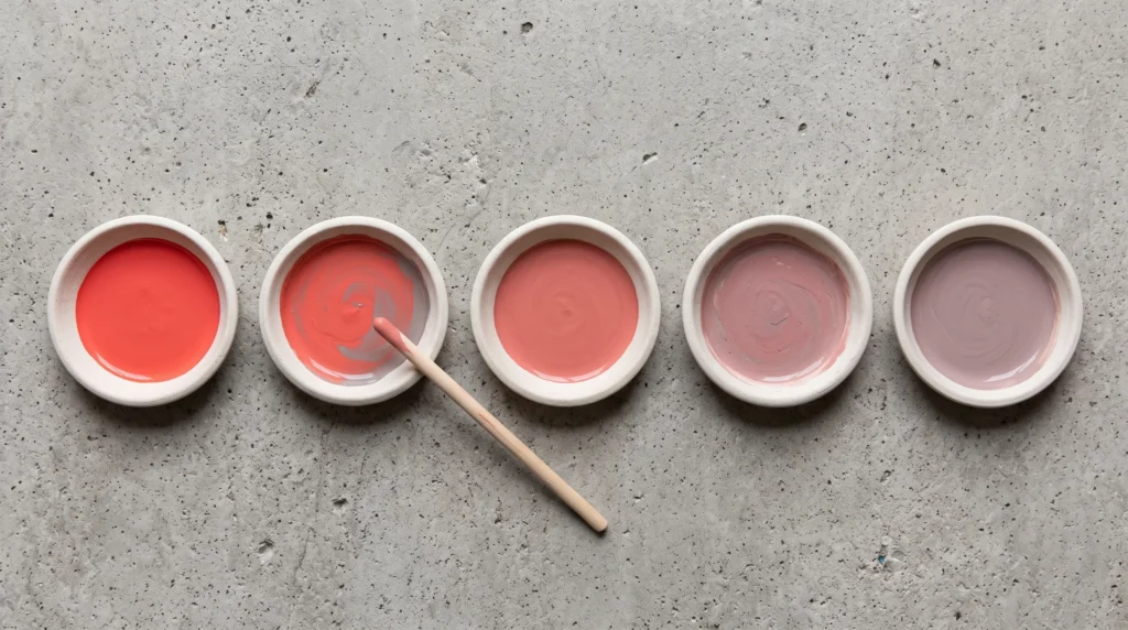
Defining Muted Color: Chroma, Saturation, and Grey
A muted color hasn’t lost its identity. It’s had its volume turned down.
Muted colors are hues with reduced chroma, created by mixing grey — or a complementary color — into a pure hue, rather than lightening it with white.
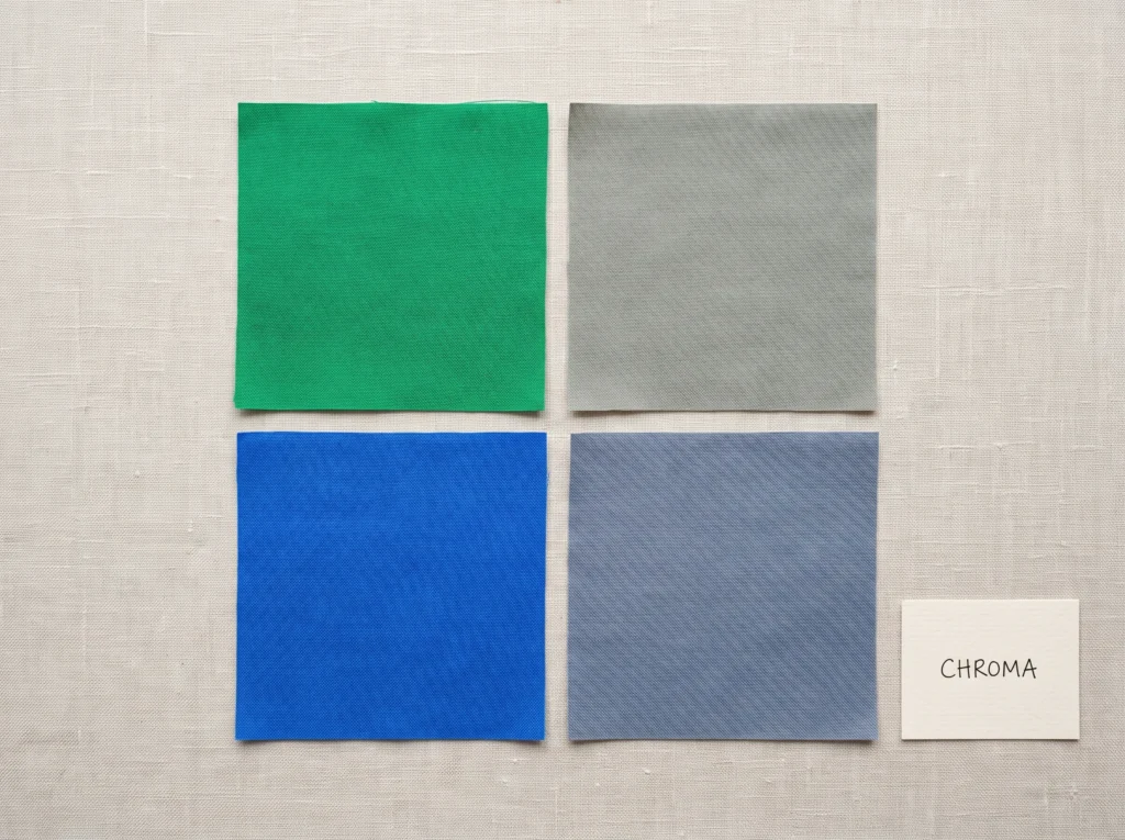
Chroma is the third axis of color, alongside hue and value. It measures how far a color sits from neutral grey at roughly the same lightness. Full chroma is a color at its loudest. Zero chroma is grey itself. Muted sits somewhere in between, closer to the grey end.
Take a pure cobalt blue and mix in grey, a little at a time. The blue doesn't disappear. It just stops competing for attention, until eventually there's barely enough blue left to name.
Think of a pair of jeans worn soft over ten years of washes. The blue hasn't gone anywhere — it's just been worn down until it stopped announcing itself as new.
In practice, "muted" is the word most clients reach for once they've already tried "dull" and decided that wasn't quite fair to the color.
Muted colors are, technically, tones. Different tool, different result — worth knowing before "muted" gets used as a catch-all for anything that isn't neon.
Where Do Muted Colors Sit on the Color Wheel?
Muted colors don't live in one corner of the wheel. They live at a specific distance from its center.
On a color wheel, hue is the position around the edge — is it red, or blue, or green. Chroma is the distance from the center. Every hue has a muted version; muted isn't a place on the rim, it's a ring closer to the middle.
In practice, this diagram is what finally convinces a resistant client that their "boring beige" cardigan and their "romantic dusty rose" scarf are doing the exact same job — one ring in, different hour on the clock face.
Muted colors sit one ring in from the rim, at every hour on the wheel. Cool or warm, any hue can be muted.
Muted vs. Pastel vs. Saturated: What's the Difference?
Three words, three different moves on the same color.
We cover this same mechanic from the other side, gentleness rather than grey, in the Soft Colors guide. Worth reading both; the two words get used almost interchangeably, but they're not solving for quite the same thing.
One more axis worth separating out: muted describes chroma, not value, so a muted color can be light or dark. A pale, greyed lavender and a deep, greyed plum are both equally muted — they just sit at different points on the light-to-dark scale.
Light Summer works the lighter end of that scale. The deeper end belongs to seasons this site doesn't cover — Dark Autumn and Dark Winter both push muted tones toward black in a way Soft Summer never does.
The Muted Color Seasons: Soft Summer vs. Soft Autumn
Soft Summer is a sub-season of the Summer family, in the Sci/ART 16-season framework — and it's the cool half of the muted equation.
Every muted palette needs an undertone, warm or cool, sitting underneath the lowered chroma. Soft Summer takes the cool route: a grey, silvery undertone running through every color in it.
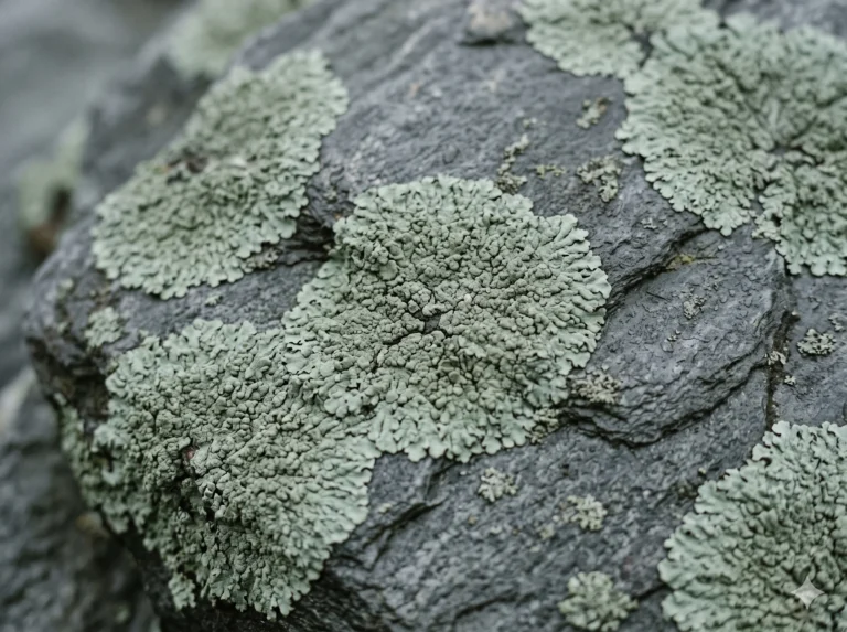
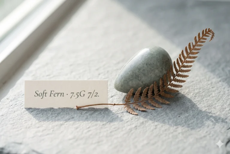
In Munsell terms, this sits in the green hue family, medium value, low chroma — closer to true grey than to any "green" most people would name on sight.
In practice, this is the swatch clients reach for when they want a green that doesn't feel like a green — something that reads as neutral until it's set beside actual grey, and only then shows its hand.
Primary Function: Operates as an anchor neutral for Soft Summer & Soft Autumn palettes. Provides depth without adding stark warmth or high contrast.
Harmonizing Companions: Pair with Charcoal Marl, Rose Taupe, or Light Muted Pewter to highlight its subtle green undertone.
Soft Summer's sister palette carries the same low chroma with the temperature flipped: Soft Autumn. Same grey-worked-in quality, warm and golden underneath instead of cool and silvery.
Inside its own family, the cool side splits further. Light Summer keeps the coolness but lifts the value — a lighter, more diluted kind of muted. Cool Summer, sometimes called True Summer, keeps a similar value but pushes chroma back up — same coolness, less grey worked in. At the far end, Bright Winter and Bright Spring drop the muting altogether: full chroma, zero grey.
The same undertone-and-chroma logic reaches skin, not just fabric. Keep the color closest to the face working with your own natural contrast: lighter Soft Summer coloring reads best in the paler half of the palette, deeper coloring in the richer half. The Soft Colors guide has the full depth-range breakdown, swatch by swatch.

How to Mute Any Color
The technique behind every muted palette is the same three moves, whether you're mixing paint or reading a fabric label.
For Wardrobe & Styling
Nobody's mixing paint when they shop — they're reading the label. Fabric described as dusty, heathered, ash, or stonewashed has usually already had this done to it. That's the shortcut: let the mill do the muting, and just check the undertone matches.
Comprehensive List of Muted Color Names & Hex Codes
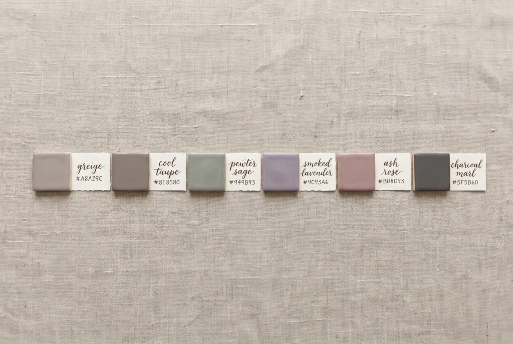
Six named starting points, each built the same way: a cool undertone, grey worked into the chroma.
| Colour Name | HEX | RGB | Undertone |
|---|---|---|---|
|
Greige
|
#A8A29C | 168, 162, 156 | Neutral-Cool |
|
Cool Taupe
|
#8E8580 | 142, 133, 128 | Neutral-Cool |
|
Pewter Sage
|
#949B93 | 148, 155, 147 | Cool-Neutral |
|
Smoked Lavender
|
#9C93A6 | 156, 147, 166 | Cool |
|
Ash Rose
|
#B08D93 | 176, 141, 147 | Cool |
|
Charcoal Marl
|
#5F5B60 | 95, 91, 96 | Cool |
Charcoal Marl anchors any of the other five without fighting them. That's the real test for a muted color combination: nothing in the pairing should out-saturate anything else at a glance.
These six sit alongside the twelve base tones in the Soft Colors palette guide — together they cover the full muted-cool range this site works from.
Frequently Asked Questions
What are muted colors?
Muted colors are hues with reduced chroma, made by mixing grey — or a complementary color — into a pure hue rather than lightening it with white. They sit between fully saturated bright colors and pale pastels. Soft Summer (cool) and Soft Autumn (warm) are the two seasonal palettes built on this quality.
Where do muted colors sit on the color wheel?
Muted colors sit one ring in from the rim of the color wheel, at every hue position around it. Hue is where you are on the wheel; chroma is how far from the center you sit. The outer edge holds full saturation, the middle ring holds muted versions, and the center is grey.
What's the difference between muted and pastel colors?
Pastel colors are made by adding white, which raises value and lightens a hue. Muted colors are made by adding grey, which lowers chroma without necessarily lightening the color. A muted color can be just as deep as a saturated one, only quieter, not paler.
Is black or white considered a muted color?
Not in the technical sense. Muting is something done to a hue, mixing grey into red, blue, or green. Black and white are achromatic: they have no hue to mute in the first place. They're neutrals, not muted colors.
What's the opposite of a muted colors?
The opposite of a muted color is a saturated one, also called bright or clear. It sits at the outer edge of the color wheel, at full chroma, with no grey mixed in. Winter and Spring seasonal palettes are built on this end of the scale.
How do you make a color more muted?
Mix a small amount of grey — or the hue's complementary color — into the pure color, checking after each addition. Most colors read as calm and muted well before they start to look grey or dull. Fabric described as dusty, heathered, or stonewashed has usually already had this done.
Is Soft Summer the only muted season?
No. Soft Summer is the cool-undertoned muted season, but Soft Autumn carries the same low chroma with a warm undertone instead. Between them, muted colors show up at every temperature — the two seasons just split the palette by warm versus cool.
Next Steps
I've watched people spend an hour deciding between two "blues" that were really the same blue at two different chroma levels. Once you can see the ring they're each sitting on, the choice usually makes itself.
Yours in colour, Helen