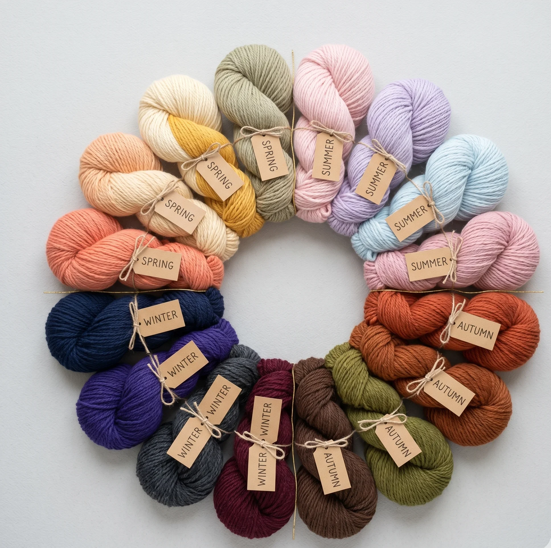
The 16-Season Color Analysis System —Complete Framework Guide
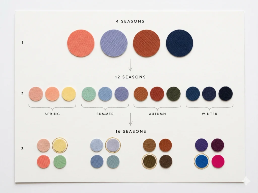
The 16-season color analysis system organises human colouring into 16 distinct palettes — four sub-seasons within each of the four classic season families (Spring, Summer, Autumn, Winter). Each season is defined by three colour dimensions: hue (warm or cool), value (light or dark), and chroma (bright or muted). The system extends the 12-season Sci/ART framework by adding one transitional sub-season per family, capturing colouring profiles that sit at the boundary between season groups.
What Is the 16-Season Color Analysis System?
Seasonal color analysis is the practice of identifying which colours harmonise with your natural features — skin, hair, and eyes — by matching those features to one of a defined set of colour palettes called seasons.
The 16-season system is the most expanded version of this framework in current professional use. It takes the four classic season families and divides each into four sub-seasons, producing 16 distinct palettes in total.
Every palette is defined by a specific combination of three colour properties: temperature (hue), depth (value), and saturation (chroma). No two of the 16 seasons share the same setting on all three dimensions simultaneously.
From My Studio
In my drapting sessions, I describe the system this way: the four classic seasons are like four distinct neighbourhoods on a colour map. The 16-season system is the street-level view inside each neighbourhood — precise enough to send you exactly where you need to go.
Most people who have been told they are “Summer” or “Autumn” have only the neighbourhood name. The 16-season system gives you the street address.
The 16-season system IS an extension OF the 12-season framework, which is itself IN the broader seasonal color analysis tradition. Understanding where this system came from — and what problem it solves — makes every placement decision clearer.
Why 4 Seasons Is Not Enough
The original 4-season model was popularised by Carole Jackson’s 1980s book Color Me Beautiful. It gave millions of people a practical vocabulary for colour — Spring, Summer, Autumn, Winter — and was genuinely transformative for its time.
The fundamental problem is precision. Put a Bright Spring and a Soft Spring in the same “Spring” category, and you send them to the same colour counter with identical advice — even though they need completely different palettes.
A Bright Spring needs high-saturation corals, clear citrus yellows, vivid turquoise. A Soft Spring needs the same warm base but with colours significantly knocked back — dusty peach, muted sage, warm sand. Give a Soft Spring the Bright Spring palette and the colours don’t enhance — they overpower.
Nature Analogy — Understanding Why Precision Matters
Think of a weather forecast. Knowing it is “spring” tells you roughly what to expect. But planning a long coastal walk requires knowing whether the morning will be 7°C and overcast, or 19°C and dry with offshore wind.
The 4-season system gives you the season. The 16-season system gives you the forecast — specific enough to actually plan for.
Clinically, what I observe is this: clients who received a 4-season analysis often find that some of the season’s recommendations work beautifully and others fall completely flat. That inconsistency is not random. It is the 4-season system’s precision limit made visible on real skin.
The expanded systems exist to resolve exactly this. They do not replace the original seasonal framework — they build on it, using the same four families as their foundation.
How the 12-Season System Extended the Original
The 12-season system — the standard taught in the Sci/ART method developed by Kathryn Kalisz — was the first major precision upgrade. It divided each of the four main seasons into three sub-seasons based on the secondary colour characteristic.
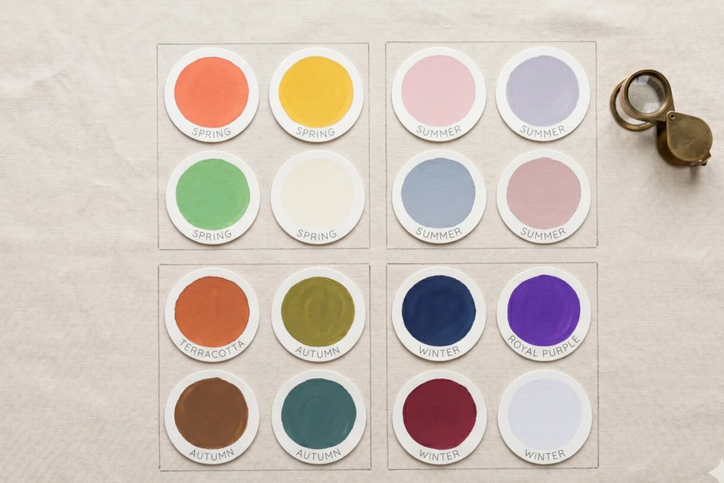
The Spring family became Light Spring, True Spring, and Bright Spring. Summer became Light Summer, True Summer, and Soft Summer. Autumn became Soft Autumn, True Autumn, and Dark Autumn. Winter became Dark Winter, True Winter, and Bright Winter.
The logic behind the split is clean: your primary colour aspect places you in a season family. Your secondary aspect determines which of the three sub-seasons you are within that family.
|
Season Family |
Sub-Season 1 |
Sub-Season 2 (Archetypal) |
Sub-Season 3 |
|---|---|---|---|
|
🌸 Spring |
Light Spring |
True Spring |
Bright Spring |
|
🌿 Summer |
Light Summer |
True Summer |
Bright Spring |
|
🍂 Autumn |
Soft Autumn |
True Autumn |
Bright Spring |
|
❄️ Winter |
Dark Winter |
True Winter |
Bright Winter |
The three sub-seasons within each family push in three directions: lighter, truer (archetypal), and deeper or more intensified along the primary axis. This accounts for the vast majority of human colouring profiles — but not quite all of them.
Take our Soft Summer color analysis quiz to know where you stand !
Practitioner Observation
During live client work, the 12-season system resolves the majority of placement questions clearly and cleanly. Most clients land near the centre of one of the 12 categories with strong confidence on both sides of the drape.
The gaps appear at the boundary lines — where a client’s secondary characteristic consistently points across the family border rather than within it. This is the precise problem the 16-season system exists to solve.
The Step from 12 to 16 — What Changes
The 16-season system adds one additional sub-season to each family. These four additions are transitional seasons — they carry the primary characteristic of their home family, but their secondary characteristic crosses the boundary into an adjacent season family.
In my studio observations, these clients are the ones who have a strong, clearly identifiable primary aspect, but who test well in a colour range that straddles two families. Within the 12-season system, no category quite captures them cleanly.
The four transitional seasons are: Soft Spring (Spring family; secondary muted characteristic leans toward Summer territory), Clear Summer (Summer family; secondary clarity leans toward Winter territory), Clear Autumn (Autumn family; secondary brightness crosses into Spring territory), and Soft Winter (Winter family; secondary muted characteristic leans toward Summer territory).
These four transitional seasons are not “better” than the core 12. They are simply more precisely named for a colouring profile that exists at the gradient between families. The 16-season system is a map with more contour lines — same territory, higher resolution.
The Complete 16-Season Map
Below is the full framework. Each season is listed with its three defining characteristics and a palette sample. All 16 season deep-dives live in dedicated guides — use the internal links to go further with any season.
| Season | Hue | Value | Chroma | Key Characteristics |
|---|---|---|---|---|
| Warm-neutral | Very light | Medium-bright | Warmth diluted by lightness; warm ivory, peach, soft coral, aqua | |
| Warm | Medium-light | Bright | Archetypal warm-bright; coral, golden yellow, fresh aqua, periwinkle | |
| Warm | Medium | Very bright | Maximum chroma in Spring; hot coral, vivid lime, clear turquoise | |
| Warm | Medium-light | Muted-medium | Transitional — warm base, quieter chroma; dusty peach, warm sand, muted sage | |
| Cool-neutral | Very light | Low-medium | Coolness softened by lightness; powder pink, pale lavender, icy blue | |
| Cool | Medium-light | Muted | Archetypal cool-muted; raspberry, periwinkle, dusty rose, slate grey | |
| Cool | Medium | Very muted | Maximum grey in Summer; dusty mauve, muted slate, blue-grey, rose brown | |
| Cool | Light-medium | Medium-bright | Transitional — cool base with unexpected clarity; cool violet, icy fuchsia, powder blue | |
| Warm-neutral | Medium | Very muted | Warm but heavily greyed; warm sand, dusty terracotta, muted olive, taupe | |
| Warm | Medium-dark | Muted | Archetypal warm-muted; burnt orange, olive gold, warm brown, teal | |
| Warm | Dark | Low-medium | Deep Autumn tones; plum burgundy, dark bronze, forest green, espresso | |
| Warm | Medium-dark | Medium-bright | Transitional — warm depth with brightness; pumpkin, golden teal, warm rust | |
| Cool | Medium | Muted-medium | Transitional — cool base, softened intensity; dusty plum, cool grey, muted burgundy | |
| Cool | Dark | Bright | Archetypal cool-bright; navy, cool burgundy, royal blue, pure white | |
| Cool | Very dark | Medium-bright | Maximum depth; deep charcoal, dark plum, midnight navy, near-black | |
| Cool | Medium-dark | Very bright | Maximum chroma in Winter; royal purple, electric blue, hot fuchsia, icy white |
★ Marks the four transitional seasons added in the 16-season extension. Each season links to its complete dedicated guide covering palette, makeup, wardrobe, and hair.Know more about Soft Summers .
The Three Colour Axes: Hue, Value, and Chroma
Every one of the 16 seasons occupies a specific position on three colour dimensions simultaneously. Understanding these axes is not optional background theory — it is how you read any season’s palette intelligently rather than memorising disconnected lists.
Hue
The temperature of your undertone. Are your features reading blue-based (cool) or yellow-based (warm)?
Value
The overall depth of your colouring. How light or dark do your features read in a greyscale photograph?
Chroma
The saturation level of your features. How much grey is naturally mixed into your colouring?
Axis 1 — Hue (Temperature)
Hue describes whether your skin, hair, and eyes carry more yellow (warm) or more blue (cool) in their undertone. It is measured completely independently of how dark or light the overtone appears on the surface.
A person with very dark brown skin can have cool undertones. A person with fair, pale skin can have warm undertones. Surface depth and undertone temperature are separate readings — conflating them is the most common error in self-assessment.
In the 16-season framework, all eight Spring and Autumn seasons are warm-leaning. All eight Summer and Winter seasons are cool-leaning. Hue is the anchor that divides the entire system into its two main camps.
Axis 2 — Value (Depth)
Value describes how light or dark your features read when you remove all colour information — what a greyscale photograph of your face actually shows. The Munsell colour system assigns a numerical value to every colour on a scale from 0 (absolute black) to 10 (absolute white).
In colour analysis, value determines whether you need colours that are predominantly light, medium, or dark in order to mirror your own depth. Wearing colours that sit much lighter or much darker than your natural features creates an imbalance — either washing you out or creating a jarring contrast.
Light seasons (Light Spring, Light Summer) sit at the high-value end. Dark seasons (Dark Autumn, Dark Winter) sit at the low-value end. Most people cluster in the medium band, which is exactly why the secondary characteristic carries so much weight in separating seasons from one another.
Axis 3 — Chroma (Saturation)
Chroma describes how much grey pigment is present in your natural colouring — not how vibrant your features seem subjectively, but the actual grey content measured against a pure, saturated colour reference.Explore our True summer color palette guide .
Nature Analogy — Understanding Chroma
Pick up a piece of sea glass from a beach and hold it next to a fresh piece of clear glass in the same colour. The sea glass has been frosted and softened by the water — still recognisably coloured, but with a grey quality layered through it.
High-chroma colouring is the clear glass: saturated, vivid, defined at the edges. Low-chroma (muted) colouring is the sea glass: softened, greyed, blended. The Soft seasons — Soft Summer, Soft Autumn, Soft Spring, Soft Winter — all have sea-glass chroma as their defining quality.
Clinically, what I observe is that chroma is the axis that causes the most misplacements in self-assessment. People often conflate dark value with low chroma, or interpret bright eye colour as high chroma across the whole colouring profile. Draping separates these two readings reliably — which is why in-person analysis remains the most accurate route.
How to Navigate the 16-Season System
Finding your season is a process of elimination driven by the three axes, not by intuition or preference. The sequence below mirrors the diagnostic logic used in professional Sci/ART draping sessions.
1
Identify Your Primary Colour Aspect
Ask: what is the single most dominant characteristic of my appearance? Is warmth or coolness the first thing that reads in my features? Or is the extreme lightness or darkness of my overall colouring most striking? Or is the clarity or greyness of my colouring the thing that stands out most?
Your primary aspect is whichever dimension sits furthest from the neutral midpoint. It will be either warm or cool (hue), light or dark (value), or bright or muted (chroma).
Hue primary → Spring or Autumn (warm) or Summer or Winter (cool). Value primary → Light or Dark season cluster. Chroma primary → Bright season cluster or Soft season cluster.
2
Identify Your Secondary Colour Aspect
Once the primary axis places you in a broad category, the secondary aspect identifies your sub-season. The secondary aspect cannot be the same dimension as the primary — if hue is primary, the secondary will be either value or chroma.
If your primary is warm (Spring or Autumn family), the secondary will tell you whether you lean light, dark, bright, or muted within that family. The secondary defines which of the four sub-seasons you occupy.
If the secondary crosses a family boundary — for example, warm primary but a secondary that reads as strongly muted — you are likely a transitional season. Soft Spring in this case: warm primary with mutedness that leans toward Summer territory.
3
Confirm with Draping or a Structured At-Home Test
In my drapting sessions, steps one and two narrow the field to two or three candidate seasons. The draping process then confirms placement by showing which family of colours smooths the skin’s appearance, brightens the eyes, and causes any discolouration or shadow to recede.
At home, the most reliable starting tests are: the metal test (gold versus silver held against bare skin in natural daylight), a wrist vein colour check (blue or purple lean = cool; green lean = warm), and a greyscale photograph of your features to assess overall value level.
For the four transitional seasons — Soft Spring, Clear Summer, Clear Autumn, Soft Winter — self-assessment is the least reliable approach. These are precisely the colouring profiles that sit at the crossover points where personal perception is most distorted by assumptions about skin depth or hair colour.
Core Principle of the 16-Season System
You are looking for the season whose palette mirrors your own colouring — not the season whose colours you prefer. The right palette creates harmony because it reflects what is already present in your features. The wrong palette creates visual competition — one element will always draw focus away from the face.
Celebrity Colour Analysis — The Framework in Action
The 16-season framework applies across all Fitzpatrick skin types — from Fitzpatrick I (very fair, always burns) through Fitzpatrick VI (deeply pigmented, never burns). Skin depth is not the sorting variable in this system. Undertone and chroma are what determine seasonal placement.
This distinction is critical. In my drapting sessions with clients of Fitzpatrick IV–VI colouring, one of the most consistent findings is that prior self-analysis has directed them toward Autumn season territory based on skin depth alone — when their actual placement is Winter or Summer based on undertone and chroma.
The most widespread misclassification pattern I observe is the assumption that deep skin tones belong to Autumn or Dark Winter by default. This assumption collapses undertone temperature and value depth into one judgement, which is precisely the error the three-axis system exists to prevent.
Fitzpatrick I – II
Fair to light skin. The full spread of all 16 seasons is possible here. Low melanin means undertone is more visible at the surface, making it easier to read. Light and Bright seasons are common placements. Chroma is the most useful differentiating axis at this depth — whether muted greyness or vivid saturation reads in the features.
Fitzpatrick III – IV
Medium to medium-olive skin. Undertone is sometimes obscured by a carotene-based overtone — warm-looking surface colour that does not necessarily indicate warm undertones. The metal test is particularly reliable at this depth. Autumn, Summer, and True Winter placements are all very possible depending on undertone and secondary characteristic.
Fitzpatrick V – VI
Deep to very deep skin. High melanin makes surface undertone complex to read. The inner wrist, inner upper arm, and gum line offer cleaner undertone readings than facial skin at this depth. Dark Winter, Dark Autumn, True Autumn, and True Summer are all valid placements — determined by undertone and chroma, not by the assumption that dark skin equals warm or dark season.
Chroma as the Key Differentiator for Melanin-Rich Colouring
In my studio observations, chroma is consistently the most reliable differentiating axis for clients with Fitzpatrick V–VI colouring — often more diagnostic than hue alone in separating adjacent seasons.
A Dark Winter at Fitzpatrick VI will look electrified in jewel tones — deep royal purple, electric blue, clear fuchsia. A Dark Autumn at the same skin depth will be overpowered by those same colours, finding their strength instead in earthy bronzes, deep forest greens, and rich burgundy-browns.
The 16-season system requires no separate rules for different ethnic backgrounds. It requires honest, independent reading of the three axes — and the discipline to separate what skin looks like on the surface from what the undertone and chroma actually are when tested against standardised colour references.
The Sci/ART Method — Why In-Person Draping Matters
The Sci/ART system was developed by Kathryn Kalisz and grounds colour analysis in scientific colour theory — specifically Albert Munsell’s three-axis colour model of hue, value, and chroma. It is the primary methodology behind the 12 and 16-season frameworks taught by certified analysts today.
In a Sci/ART session, a trained analyst drapes the client in a series of standardised fabric swatches in specific colour families, applied one at a time against the client’s bare face in neutral north-facing daylight. The analyst observes the skin’s response: whether shadow, unevenness, or dullness appears, or whether the skin clears, evens, and brightens.
No quiz or AI photo tool replicates this. Photographs compress colour data. Artificial lighting shifts undertone readings. Filters and editing tools are designed precisely to override the natural colour signals that analysts rely on. The colour information a camera captures and the colour information a trained eye reads live are fundamentally different data sets.
From My Drapting Sessions
The most consistent experience for clients who arrive having self-assessed online is surprise — not usually because the result is radically different, but because the correct palette is dramatically more obvious in person than any digital tool suggested. The drape removes ambiguity in seconds in a way that no photograph can replicate.
If in-person analysis is not currently accessible, a structured at-home draping practice using solid-coloured fabrics tested in natural daylight is the next most reliable approach. The colour analysis beginners guide walks through this process in full.
Common Misreadings of the System
After more than 2,000 in-person sessions, the misreadings I encounter most consistently fall into a recognisable set of patterns. Each of them is understandable. Each of them is also correctable once the three-axis logic is clear.
- Conflating skin depth with undertone.
- Deep skin is not automatically warm. Fair skin is not automatically cool. Depth (value) and temperature (hue) are separate axes and must be read completely independently. This error accounts for the majority of systematic misplacements I see in clinic.
- Using eye colour as the primary sorting tool.
- Eye colour is one data point among three. A person can have blue eyes with warm undertones (Light Spring is a clear example). Over-relying on eye colour for placement produces inconsistent results across different ethnic colourings.
- Misreading muted colouring as dark colouring.
- The Soft seasons — Soft Summer, Soft Autumn, Soft Spring, Soft Winter — have low chroma, not necessarily low value. A Soft Summer with Fitzpatrick I skin has very fair, light features with a greyed quality that reads as muted, not dark.
- Assuming hair dye changes the season.
- Colouring hair warmer or cooler shifts the visual frame but not the undertone of the skin.Season mimicry through hair dyeis a real and useful styling technique — but it does not change the underlying season. Draping reads bare skin, not dyed hair.
- Treating the 16 seasons as rigid boxes rather than a spectrum.
- Each season is a territory within a continuous colour space. Most people land near the centre of their season. A small number sit near the edge — and those are precisely the profiles the four transitional seasons name.
- Self-assessing using indoor or filtered photos.
- Artificial light and camera processing actively distort undertone and chroma data. North-facing window light on bare, unretouched skin in a raw photo is the minimum usable reference for visual self-assessment.
Frequently Asked Questions
What is the 16-season color analysis system?
The 16-season color analysis system organises human colouring into 16 distinct seasonal palettes — four sub-seasons within each of the four classic season families (Spring, Summer, Autumn, Winter).
Every season is defined by three colour dimensions: hue (warm or cool), value (light or dark), and chroma (bright or muted). It is the most precise personal colour framework in common use, extending the 12-season Sci/ART system by adding four transitional seasons at the boundaries between season families.
What is the difference between 12-season and 16-season color analysis?
The 12-season system uses three sub-seasons per main season family. The 16-season system adds one transitional sub-season per family — a colouring type whose primary aspect belongs to the family but whose secondary characteristic crosses into an adjacent family.
The four additions are Soft Spring (warm primary, muted secondary), Clear Summer (cool primary, bright secondary), Clear Autumn (warm primary, bright secondary), and Soft Winter (cool primary, muted secondary). For most people the 12-season placement is entirely sufficient — the 16-season system provides precision at the boundary cases.
What are the 16 color seasons?
The 16 seasons, grouped by family, are: Spring — Light Spring, True Spring, Bright Spring, Soft Spring. Summer — Light Summer, True Summer, Soft Summer, Clear Summer. Autumn — Soft Autumn, True Autumn, Dark Autumn, Clear Autumn. Winter — Soft Winter, True Winter, Dark Winter, Bright Winter.
Each carries a distinct colour palette defined by specific hue, value, and chroma settings. No two of the 16 seasons share the same combination on all three dimensions simultaneously.
How do I find my color season in the 16-season system?
Start by identifying your primary colour aspect — the single dimension that sits furthest from neutral in your appearance (warm or cool hue, light or dark value, or bright or muted chroma). Then identify your secondary aspect. The combination points to one of the 16 seasons.
In-person draping using the Sci/ART method remains the most accurate route to placement. For at-home assessment, the gold versus silver metal test in natural daylight, a wrist vein colour check, and a greyscale photograph of your features together give a reliable working hypothesis.
Is the 16-season system more accurate than the 4-season system?
Yes, significantly. The 4-season system places a Bright Spring and a Soft Spring in the same “Spring” category despite them needing completely different colour palettes. The 16-season system separates these profiles precisely, preventing the wardrobe mismatch that follows from an imprecise placement.
The greater precision matters most for people whose colouring sits at a season boundary, and for those who found the original 4-season model delivered inconsistent results — some recommendations working well, others falling flat.
Can people with deep or dark skin tones use the 16-season color analysis system?
Yes. The 16-season system applies fully across all Fitzpatrick skin types and all ethnic backgrounds. Skin depth (how light or dark the skin is) is not the primary sorting variable — undertone and chroma are what determine placement.
A person with Fitzpatrick VI colouring may be Dark Winter, Dark Autumn, True Autumn, True Summer, or other seasons entirely depending on their undertone — not simply because their skin is deep. The most common error for clients with melanin-rich colouring is having depth confused with warmth or having the assumption made that depth automatically points to Autumn or Winter territory.
What is the Sci/ART method and how does it relate to the 16-season system?
Sci/ART is an in-person colour analysis methodology developed by Kathryn Kalisz, grounded in scientific colour theory and Albert Munsell’s three-axis colour model. A trained analyst drapes standardised fabric swatches against the client’s bare face in neutral daylight and reads which colour combinations clear the skin and which create shadow or unevenness.
It is the gold-standard methodology behind the 12 and 16-season frameworks. No quiz, AI app, or photo tool replicates the precision of live draping because camera processing and artificial lighting distort the specific colour data the analysis depends on.
Implementation Task Block
Put the 16-Season Framework to Work
- Determine your primary colour aspect. Run the metal test (gold versus silver against bare skin in daylight), check wrist vein colour, and take a greyscale photo of your face. Identify which of the three axes — hue, value, or chroma — sits furthest from the neutral midpoint.
- Narrow to a season family using your primary aspect. Warm primary → Spring or Autumn family. Cool primary → Summer or Winter family. Very light primary → Light Spring or Light Summer cluster. Very dark primary → Dark Autumn or Dark Winter cluster. Very bright primary → Bright Spring or Bright Winter cluster.
- Apply your secondary aspect to reach the sub-season. Use the 16-season table above to match your primary + secondary combination to the specific season. Check whether your secondary leans within the family or across a border — that distinction separates the core 12 from the four transitional seasons.
- Read the dedicated season guide. Each of the 16 seasons has a complete article covering the full colour palette with hex codes, makeup, wardrobe neutrals and accents, hair colour guidance, and comparison to adjacent seasons. Follow the link from the season table above.
- Test with fabric in daylight, not with photos. Gather solid-coloured fabrics in your candidate season family and hold them against bare, clean skin at a north-facing window. The complete beginner’s draping guide walks through this process step by step with specific colour tests for each family.
- Book an in-person session if you sit at a boundary. If self-assessment consistently returns two or three candidate seasons with no clear winner, you likely sit at a transitional point. This is where professional Sci/ART draping resolves what self-assessment cannot. A certified analyst near you will confirm placement in a single session.