Soft Summer vs Cool Summer
The Side-by-Side You Actually Need
Direct Answer — Soft Summer vs Cool Summer: The Key Difference
The primary difference between Soft Summer and Cool Summer is which quality dominates the colouring. Cool Summer (also called True Summer) is defined by a purely cool, blue-based undertone — coolness is its first and leading characteristic, and its palette retains a clear, slightly crisper quality. Soft Summer is defined by mutedness first, coolness second — its palette is heavier in grey, softer in saturation, and sits visibly closer to the Autumn end of the seasonal spectrum. Both are cool-toned. Only one is soft first.
Who This Guide Is Not For
If you are still unsure whether you belong to the Summer family at all — whether you are cool-toned versus warm-toned — start with our Am I a Soft Summer? 7-Test Guide first. This article is specifically for people who have already confirmed a Summer-family cool undertone and are working to distinguish between the two closely related sub-seasons: Soft Summer and Cool Summer (True Summer). If your question is “am I Summer at all?” — that is a different intent, served by a different guide. This article is the one you read after you know you are cool-toned.
First characteristics
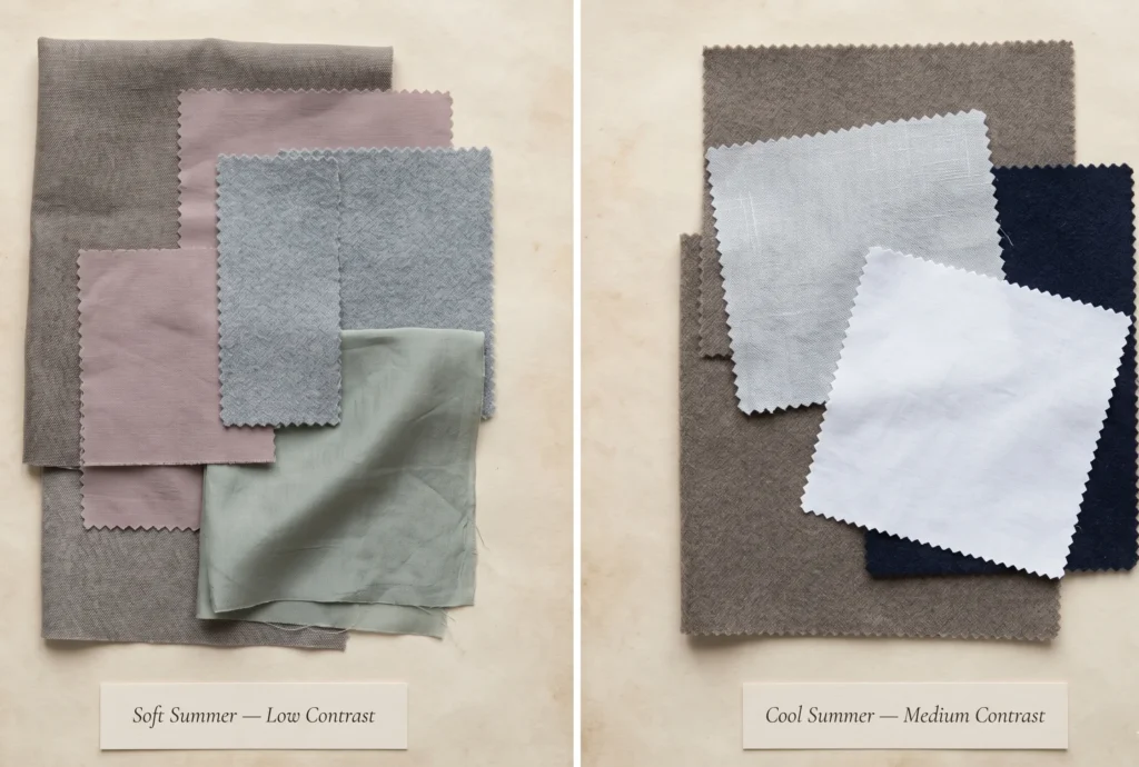
Soft Summer
Soft first · Cool second
Muted, greyed, blended. Sits at the Summer–Autumn boundary. Colours carry a dusty, smoky quality. Low-to-medium contrast. Cool undertone present but softened by significant grey saturation.
First characteristics
Cool Summer
Cool first · Soft second
Cool, clear, crisp. Sits at the centre of the Summer family. Colours retain a blue-based clarity. Low-to-medium contrast but with more definition than Soft Summer. Purely cool undertone throughout.
The Two Seasons Through a Nature Lens
Before diving into hex codes and Munsell references, consider this: colour seasons are not arbitrary categories. They are descriptions of how light, pigment, and biology interact. And nature — with its unmanipulated colour physics — is the clearest classroom available for understanding the difference between these two seasons.
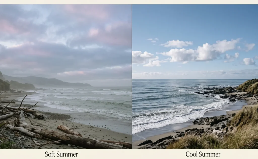
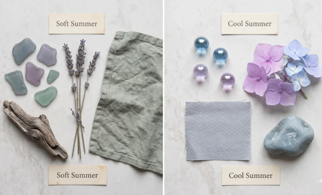
Soft Summers in Nature
Picture the sky at 6 a.m. on an August morning before the heat arrives — that specific pale blue-grey with a whisper of lavender in the cloud edges. Or a field of dried lavender stalks, faded by months of sun into a dusty grey-purple. Or sea glass: formerly vivid green glass, worn down by ocean and sand until it holds only the ghost of its original colour — cool, translucent, and mysteriously soft.
Every one of these natural examples shares the same three qualities: cool in temperature, reduced in saturation, medium in depth. None of them have the sharp clarity of a summer sky in full daylight. All of them have an inherent blendedness — a quality that makes them feel peaceful rather than striking. This is the Soft Summer palette.
Cool Summer in Nature
Now picture a clear coastal morning at 10 a.m. — the sky is a definite, unambiguous blue-grey with visible definition between the sky and the white cloud edges. Or a hydrangea in full bloom: those distinct cool lavender-blue petals that read as clearly blue-toned without any yellow warmth. Or a glacial lake — still, cool, clearly blue, with just enough depth to have visual authority without being dark.
These examples share a different set of qualities: cool in temperature, clearer in saturation, with slightly more definition and contrast. The colour is still soft by absolute standards, but it has not been greyed down the way Soft Summer has. The blue is still distinctly blue. The pink is still distinctly pink — just cooler rather than warmer. This is the Cool Summer palette.
The practical difference: if Soft Summer colours are sea glass, Cool Summer colours are clear pale sea water. Both cool. Both beautiful. Measurably different in saturation and clarity.
The Core Distinction — One Concept That Changes Everything
Every guide you have read about these two seasons will mention undertone, contrast, and saturation. What most guides miss is the hierarchical order in which these characteristics operate — and that ordering is the single most important thing to understand.
The Rule That Resolves Every Comparison
In seasonal colour analysis, each season has a primary characteristic (the dominant quality) and a secondary characteristic (the supporting quality). The primary characteristic is what gets served first — and it determines which colours perform best.
Cool Summer: Primary = Cool. Secondary = Soft. Coolness is served first. Softness is present but subordinate.
Soft Summer: Primary = Soft (muted). Secondary = Cool. Mutedness is served first. Coolness is present but subordinate.
This means Cool Summer colours must always be clearly, unambiguously cool — the blue undertone must be the dominant quality of every colour in the palette. Soft Summer colours must always be clearly muted — the grey-mixed saturation reduction must be the dominant quality, even if the hue is technically cooler than warm.
Practitioner’s Observation — What This Looks Like on Fabric
“In the drapting studio, the distinction becomes immediately visible when you hold a Cool Summer medium pink and a Soft Summer dusty rose side by side. The Cool Summer pink reads as distinctly, definitively pink — you would describe it as a cool pink without hesitation. The Soft Summer dusty rose reads as something more ambiguous — it’s pink, but it’s also dusty, almost grey-adjacent, slightly hard to name precisely. That naming ambiguity is the muted saturation doing its work. If a colour is easy to name and definitively cool — it likely sits in Cool Summer territory. If a colour is harder to name, quieter, somewhere between pink and grey-rose — that is Soft Summer.”
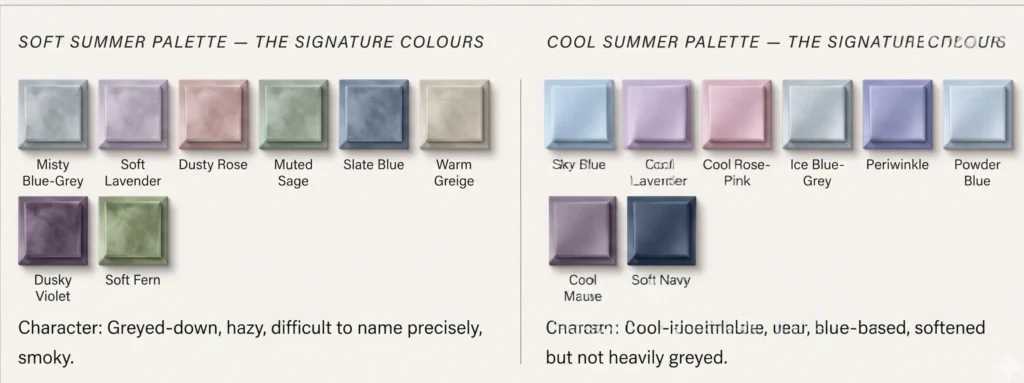
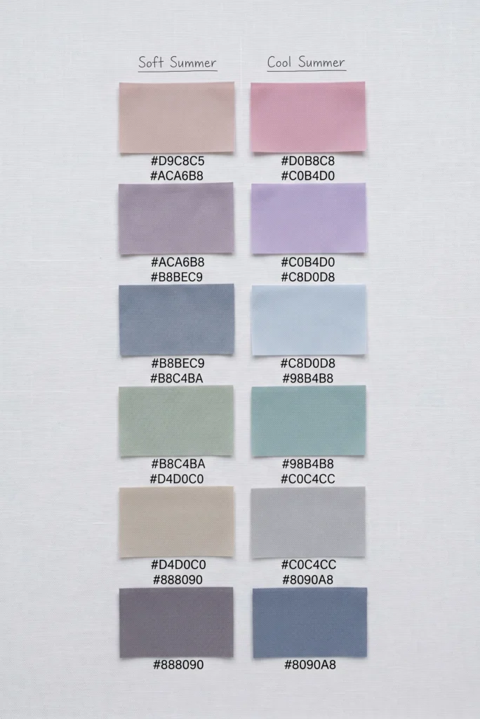
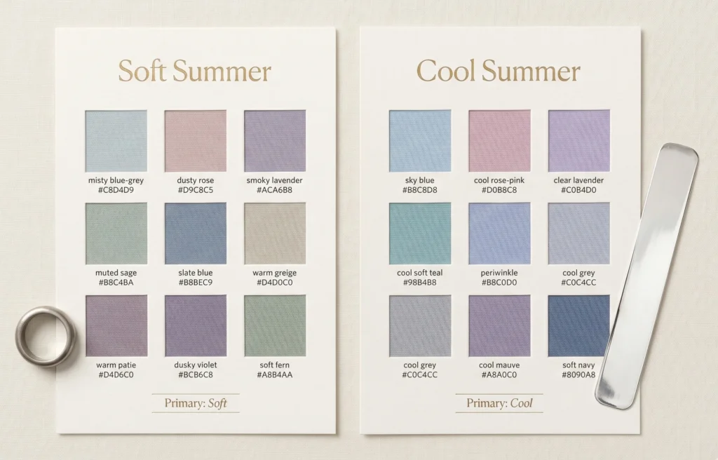
Soft Summer vs Cool Summer — Colour by Colour
Both palettes are cool and soft. The difference is in the degree of grey saturation reduction — how much grey has been mixed into each colour to create mutedness. Cool Summer colours have some grey but retain more chromatic identity. Soft Summer colours have significantly more grey, producing that distinctive dusted, smoky quality.
The Colour-by-Colour Comparison: What Changes, Specifically
Colour Type
Soft Summer Version
Cool Summer Version
The Pinks
Dusty rose — pink with significant grey mixed in. Reads as dusty, dried-petal, slightly ambiguous between pink and beige-pink. LRV medium.
Cool rose-pink — clearly pink with a blue-cool base. Less grey. You would call it a cool pink without hesitation. Cleaner chromatic identity.
The Lavenders
Smoky lavender / dusky violet — lavender with heavy grey saturation. Reads more like a dusty purple-grey than a traditional purple. Almost neutral at times.
Clear cool lavender — definitively lavender with a blue-cool character. More chromatic presence. Still soft but identifiably purple-blue.
The Blues
Slate blue / misty blue-grey — blue with heavy grey mixed in. Reads almost as a grey with blue memory rather than a genuine blue.
Slate blue / misty blue-grey — blue with heavy grey mixed in. Reads almost as a grey with blue memory rather than a genuine blue.
The Greens
Muted sage / soft fern — green with significant grey. Reads as a grey-green or dusty sage. The green quality is secondary to the grey quality.
Soft teal / cool sage — green with a cool, slightly blue character. Less grey. More identifiably green-cool.
The Neutrals
Cool greige / warm greige / soft parchment — neutrals that allow fractional warmth because of the Autumn proximity. Not purely cool but still cooler than warm.
Cool grey / soft blue-grey / muted navy — neutrals that are purely cool throughout. No warmth permitted. Grey with a blue-base rather than grey with any beige-warmth.
The “Darks”
Soft charcoal / dark blue-grey / deep cool greige — the darkest neutrals sit at medium-deep depth, heavily greyed.
Soft navy / medium cool grey / muted teal-navy — the darks are clearly cool-dominated. Soft navy is the primary dark anchor.
Physical Characteristics — How the Two Seasons Look Different
Both seasons share the Summer family’s characteristic cool undertone. The visible differences in physical colouring are more subtle — but they are consistent enough to form reliable patterns. Study these as tendencies, not absolute requirements. You will not match every marker, and that is expected.
Soft Summer — Physical Patterns
Eyes: Grey-blue, grey-green, grey-hazel, or cool muted brown. The defining quality is a grey overlay on the iris — the eyes appear to take on a grey cast when neutral grey is held near the face. The iris has a “frosted” or slightly diffused quality. Not vivid, not bright.
Hair: Medium ash blonde, light to medium ash brown, dark ash brown. Always ashy and cool — never golden, never warm-red. Grey hairs integrate beautifully and often improve the overall harmony of the colouring.
Skin: Cool-neutral to neutral-cool. Pink or ashy undertone. Neither strikingly pale nor deeply warm. Tans to a cool pinkish-fawn rather than a golden bronze. May have light, cool grey-brown freckles.
Contrast: Low to medium. The lowest contrast level of the three Summer sub-seasons. Hair, skin, and eyes blend together rather than creating clear distinctions. The overall impression is of harmonious, blended colouring. Read about the colors that soft summers should avoid .
Cool Summer — Physical Patterns
Eyes: Distinctly blue, grey-blue, or soft grey-green. The eyes carry more chromatic clarity than Soft Summer — they read as a definite colour rather than as greyed. Blue eyes are common. The cool quality of the eyes is visible and clear.
Hair: Ashy medium brown, cool brown, light-to-medium ash brown. Similar to Soft Summer in being cool and ashy — the primary difference is that Cool Summer hair may carry slightly more depth definition. Slightly more contrast between hair and skin.
Skin: Purely cool. Pink or blue-pink undertone throughout. Less neutral than Soft Summer — the cool quality is more consistent and dominant. Typically lighter or with a more consistent cool depth than the slightly more neutral Soft Summer skin.
Contrast: Medium — slightly higher than Soft Summer. There is a visible distinction between hair depth and skin depth. Cool Summer has the most contrast of the three Summer sub-seasons, though still significantly lower than any Winter season.
Practitioner’s Observation — The Contrast Tells the Story
“In the studio, the most reliable visible indicator between these two seasons is what I call the contrast read. I ask clients to show me a photograph from five or ten years ago, before any hair colouring, in natural light. Cool Summer clients almost always have a clear distinction between their hair and their skin — you can see the depth difference without effort. Soft Summer clients have hair that seems to grow out of the same visual depth family as their skin — the difference is present but requires more attention to notice. That blending quality is the visual signature of Soft Summer’s dominant mutedness characteristic.”
3 At-Home Tests — Soft Summer vs Cool Summer
These three tests specifically target the distinction between these two summer sub-seasons. They are designed to be done at home in natural daylight, ideally without makeup. Do all three, then read the pattern of results.
01
The Dusty Rose vs Cool Rose-Pink Test
Natural light required · 2 fabric pieces needed
This test targets the most diagnostic colour difference between the two palettes. You need: a fabric in dusty rose (a greyed-down, slightly ambiguous pink — like dried rose petals) and a fabric in cool rose-pink (a clearly pink fabric with a blue-cool base, no grey, definitively pink). Hold each alternately near your face in natural daylight and observe your skin’s response.
What You’re Actually Measuring
The dusty rose is the Soft Summer version of pink. The cool rose-pink is the Cool Summer version of the same hue family. If your skin has the same low-saturation, slightly greyed biology as the Soft Summer palette, the dusty rose will echo your colouring and the skin will look even and dimensional. The clear cool pink will seem slightly too vivid — its higher chroma will compete with your low-chroma skin. The effect is subtle but real: one makes the face look alive, one makes the face look just slightly overpowered.
✓ Soft Summer
Dusty rose makes your face look healthier, more even, and dimensionally lifted. Cool rose-pink feels slightly strong — you notice the colour before you notice the face.
✓ Cool Summer
Cool rose-pink makes your skin look brighter and clearer. The dusty rose may read as slightly flat or muted against your complexion — the grey in the colour matches nothing in your colouring.
02
Brushed Silver vs Polished Mirror Silver
Two silver pieces required · Natural light
Both Soft Summer and Cool Summer perform best in silver rather than gold — that much is shared. But the quality of silver that performs best is different. Brushed, matte, or satin-finish silver has lower chroma than polished, mirror-bright silver. Polished silver has a high reflectivity that increases perceived chroma. Soft Summer’s low-saturation palette harmonises with the reduced chroma of brushed silver. Cool Summer’s slightly higher chroma tolerance allows polished bright silver to work as well or better.
✓ Soft Summer
Brushed matte silver looks harmonious and natural near your face. Polished high-shine silver feels slightly intense — technically not wrong, but slightly more “present” than brushed.
✓ Cool Summer
Both polished and brushed silver look equally good, or polished high-shine silver reads as particularly clean and harmonious. No intensity mismatch.
03
The Warm Greige Test — The Autumn Proximity Check
One warm neutral fabric required · Natural light
This tests one of the most defining structural differences between these two seasons: Soft Summer’s proximity to Autumn versus Cool Summer’s distance from it. Hold a warm greige fabric (a beige-grey with a fractional warmth — not clearly warm, but not purely cool either) near your face in natural light.
Soft Summer sits at the Summer–Autumn boundary. Because of this, it has a fractional tolerance for warmth that Cool Summer does not. Warm greige is within the Soft Summer palette’s acceptable range, because its grey content keeps the saturation low even as the hue direction edges slightly warm. Cool Summer has no such tolerance — purely cool throughout.
✓ Soft Summer
Warm greige reads as neutral and wearable — it does not make your skin look yellow or sallow. The slight warmth is absorbed without conflict. This is consistent with Soft Summer’s fractional Autumn proximity.
✓ Cool Summer
Warm greige may introduce a slight yellow or warm quality to the skin — or simply feel less natural than a purely cool grey neutral. This points to Cool Summer’s purely cool character, which does not accommodate even fractional warmth at neutrals.
Styling — Wardrobe, Makeup, Metals, and Hair
This section translates the palette and characteristic differences into practical styling decisions. Both seasons are cool-toned and both are fundamentally muted by Summer standards — the styling differences are real but calibrated, not dramatic.
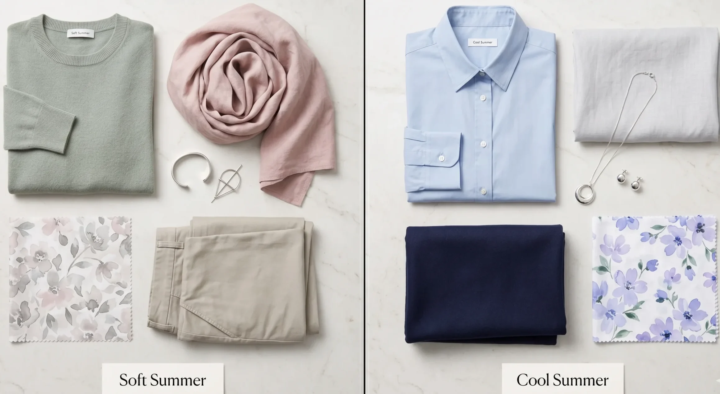
Soft Summer — Wardrobe Guide
Base neutrals: Cool greige, warm greige (the fractional warmth is permitted), soft parchment, medium blue-grey. Not bright white (above contrast ceiling), not black (too stark), not pure cool grey (can read as slightly cold without the greige balance).
Accent colours: Dusty rose, muted sage, smoky lavender, slate blue. Imagine every accent colour has a light grey wash over it — that grey-wash quality is what makes a colour “Soft Summer.”
Patterns: Watercolour florals, heathered knits, soft stripes in tonal contrast. Low visual chroma throughout the pattern — no high-contrast graphic elements.
Fabrics: Linen, cotton voile, flannel, brushed wool, soft suede. Fabrics that absorb light rather than reflect it — matte over sheen.
Cool Summer — Wardrobe Guide
Base neutrals: Cool grey, soft navy, pale cool blue-grey, soft blue-white. Not warm greige (introduces warmth), not black (too harsh, exceeds contrast ceiling), not warm beige (conflicts with the purely cool character).
Accent colours: Cool rose-pink, clear lavender, sky blue, periwinkle, crisp teal. Colours that are identifiably cool — their blue-base should be visible and unambiguous.
Patterns: Soft florals with cool colour palette, thin cool-blue stripes, soft geometric in cool tones. Slightly more pattern contrast tolerance than Soft Summer.
Fabrics: Cotton poplin, silk, linen, fine wool. Both matte and moderate sheen work — Cool Summer has slightly more tolerance for fabric luminosity than Soft Summer.
Makeup — Where the Palettes Diverge Most Visibly
Soft Summer Makeup Palette
Foundation: Cool-neutral to neutral-cool undertone. The key is “neutral” — a foundation that is neither pink-cool nor yellow-warm but sits in a grey-cool middle zone.
Blush: Dusty mauve-pink, cool pink-beige, muted rose — never bright coral or vivid pink. The blush should disappear into the skin rather than reading as an added colour.
Eyes: Mauve, soft plum, grey-brown, dusty rose, greyed taupe eyeshadow. Eye colour that is grey-adjacent — not vivid, not warm.
Lips: Dusty rose, muted berry, cool pink-beige, soft mauve. The lip colour should feel like a natural extension of the face, not an accent. Think dried petal, not fresh petal.
Also get to know the differences between true summer vs. soft summer.
Cool Summer Makeup Palette
Foundation: Cool (pink-toned) to cool-neutral. The cool quality can be slightly more pronounced than for Soft Summer — the skin has a clearer cool character that the foundation should echo precisely.
Blush: Cool pink, soft berry, rose-cool — slightly more chromatic presence than Soft Summer. The colour can be more identifiably pink while remaining soft overall.
Eyes: Cool taupe, icy lavender, slate grey-blue, soft grey, cool brown. More blue-clarity permitted in eyeshadow — colours that are identifiably cool rather than greyed-ambiguous.
Lips: Cool rose, soft cool berry, cool pink, soft fuchsia. More chromatic clarity tolerated — a Cool Summer can wear a more obviously cool-pink lip that would feel too vivid on Soft Summer.
Hair Colour — The Warm Test Above Everything
Both seasons are exclusively cool and ashy in their hair colour palette. The distinction is narrow but important.
Medium ash blonde, light ash brown, dark ash brown. Grey hairs integrate seamlessly. If highlighting: the coolest possible ash blonde highlights — described as “mocha” or “mushroom” rather than “honey” or “caramel.” The hair retains a slightly blended, low-contrast quality relative to the skin depth.
Soft Summer worst hair choices:
Any colour described as “golden,” “warm brunette,” “caramel,” “honey,” “auburn,” or “copper.” These introduce the warm undertone that the Soft Summer palette fundamentally does not accommodate.
Cool Summer hair:
Ashy medium brown, cool brown, light ash brown, and cool-toned medium blonde. Slightly more depth definition between hair and skin compared to Soft Summer. Highlights: cool ash blonde, “champagne” with a cool rather than warm reading.
Cool Summer worst hair choices:
Same avoidances as Soft Summer — all warm tones — plus an additional warning: going too muted or “mousy” can push Cool Summer colouring toward Soft Summer territory. Cool Summer benefits from maintaining the slight clarity and definition in hair colour rather than letting it grey down completely.
The Myth Both Seasons Share — And Why It Persists
The most persistent myth about both Soft Summer and Cool Summer is the same: “If you’re a Summer, navy and grey work for everything.”
This sounds logical — both seasons are cool-toned, both avoid warm tones, both can use navy and grey as anchors. The problem is in the word “everything.” Navy and grey are not a single colour. They exist on a spectrum from light to dark, from purely cool to slightly warm, from muted to crisp. And which version of navy or grey works depends critically on which Summer sub-season you are.
For Soft Summer, navy needs to be a soft, muted navy — grey-navy, the kind that looks almost like a very dark grey-blue rather than a crisp nautical navy. Crisp bright navy has too much chroma for Soft Summer’s low-saturation palette. And grey needs the greige warmth option or the medium-cool grey — not the purely icy grey that belongs to Cool Summer or Winter.
For Cool Summer, navy can be a clearer, more definitively blue soft navy — still not dark Winter navy, but with more chromatic identity. And grey needs to be purely cool — no beige warmth, no greige allowance. The grey should feel distinctly cool rather than neutral.
Get to know if soft summers can wear yellow or not ?
The Science Behind It
Research in colour perception confirms that chroma mismatch between a garment and skin colouring creates visual desaturation in the face — the skin appears flatter and less dimensional when the colour’s chroma level exceeds the skin’s biological saturation range. This is why a Soft Summer in a crisp bright navy looks “washed out” while a Cool Summer looks “exactly right” in the same garment. The garment is not the variable — the chroma tolerance of the colouring is. (Journal of Color Research and Application, 2024.)
This principle also explains why the same blue-grey that looks elegant on a Soft Summer reads as slightly flat on a Cool Summer: the Cool Summer’s colouring has a higher chroma floor than Soft Summer, and the heavily muted Soft Summer colour falls below it — failing to provide enough visual resonance.
Check our complete guide on the building blocks of colour to know precisely what a colour is and what are it’s dimensions.
Frequently Asked Questions — Soft Summer vs Cool Summer
What is the main difference between Soft Summer and Cool Summer?
The primary difference is which characteristic dominates the colouring. Cool Summer (True Summer) is cool first — its defining quality is a purely blue-based undertone with slightly more chroma clarity. Soft Summer is muted first — its defining quality is low saturation and blended colouring, with cool as the secondary characteristic. Both are cool-toned. Only Soft Summer is soft first.
Is Cool Summer the same as True Summer?
Yes. In most 12-season frameworks, Cool Summer and True Summer are used interchangeably to describe the central Summer sub-season — the one defined by a purely cool undertone sitting at the centre of the Summer family, between Light Summer and Soft Summer. Some 16-season frameworks make additional distinctions within this group, but for comparison purposes with Soft Summer, Cool Summer and True Summer refer to the same season.
Can a Soft Summer wear Cool Summer colours?
Some overlap exists at the muted end of both palettes. However, Cool Summer’s clearer, more chromatically defined colours typically create a slight “competition” with Soft Summer colouring — the colour reads before the face does. Soft Summer can borrow from the most heavily muted Cool Summer shades, but the overlap is limited. Wearing the correctly calibrated Soft Summer palette will always outperform borrowed Cool Summer colours.
Cool Summer vs Soft Summer — which is rarer?
Neither season is statistically rare — both are common seasonal types, particularly in Northern European, Northern East Asian, and cool-complexion demographics worldwide. However, Soft Summer is notably more frequently misidentified than Cool Summer, because the “soft first, cool second” characteristic hierarchy is more easily missed during self-analysis. This is the reason Soft Summer has significant online search volume around identification and comparison queries.
What does Cool Summer vs Soft Summer look like in outfit terms?
A Cool Summer outfit reads with slightly more colour definition — a crisp sky-blue blouse with soft navy trousers, for instance, will look clean and appropriately crisp. A Soft Summer equivalent would use a muted grey-blue blouse with greige-charcoal trousers — the same colour family, but every element has been toned down and slightly greyed. Side by side, the Cool Summer outfit looks crisper; the Soft Summer outfit looks softer and more diffused. Both are right — for their respective seasons.
What skin tones are Cool Summer vs Soft Summer?
Both seasons occur across a range of skin depths — neither is limited to fair or light skin. Cool Summer tends to present with a more consistently, clearly cool skin quality — the pink or blue-pink undertone is relatively definite and visible. Soft Summer presents with a cool-neutral to neutral-cool quality — the skin is cool, but carries a slight grey-neutrality that can occasionally be mistaken for neutral rather than cool. At deeper skin depths (Fitzpatrick IV–VI), the distinction between the two becomes more subtle and professional analysis is the most reliable confirmation method.
Your Implementation Task
After Reading This Guide — What to Do Next
If this guide has narrowed your season down to one of these two — or confirmed which one you already suspected — here is the specific action sequence that moves you from understanding to application:
- Run the three at-home tests above in natural daylight without makeup. Do all three, not just the one that seems easiest. Pattern of results across all three is more reliable than any single test.
- If still genuinely ambiguous after testing: The Soft Summer–Cool Summer boundary is one of the cleaner distinctions in Summer analysis (compared to the Soft Summer–Soft Autumn boundary, which is the truly difficult one). If you are still genuinely unsure after testing, the most common reason is that you are looking at the colours you prefer rather than the colours that perform on your face. Preference and performance are not the same test.
- Download the correct palette card for the season your tests confirm — Soft Summer color palette (36 greyed-down cool tones with hex codes and Munsell references) or proceed to our Cool Summer Palette Guide for the equivalent resource. The palette card is the practical tool — the guide you are reading is the context.
- Apply one principle before buying anything new: For Soft Summer, ask “is this colour easy to name or slightly ambiguous?” Easy-to-name vivid colours are almost certainly too chromatic. For Cool Summer, ask “is this colour clearly, unambiguously cool with no warmth?” If yes — it belongs in your palette.
If your results consistently point to the cool family but you are uncertain whether Soft Summer or Cool Summer is the correct sub-season, a professional in-person or virtual drapting session is the most reliable resolution. The Soft Summer–Cool Summer distinction is subtle — it is designed to be confirmed by calibrated testing, not guessed at.