The Building Blocks of Colour
Pick up anything near you — a ceramic mug, a leaf, a piece of fabric, the sky outside your window. What you are seeing is not a name. You are seeing light hitting a surface and returning to your eye at a particular wavelength, at a particular intensity, at a particular brightness.
Every colour that has ever existed — from the red of a fire to the grey of early morning fog to the blue-green of deep ocean — is built from the same three measurable dimensions. Not two. Not four. Three.
Master these three and you can read any colour anywhere. You can say with precision why a colour makes a room feel cold, why a shade of pink makes one person glow and another look unwell, why some colour combinations feel harmonious and others feel like visual noise. The three dimensions are not art theory jargon. They are the grammar of everything you see.
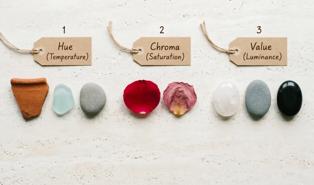
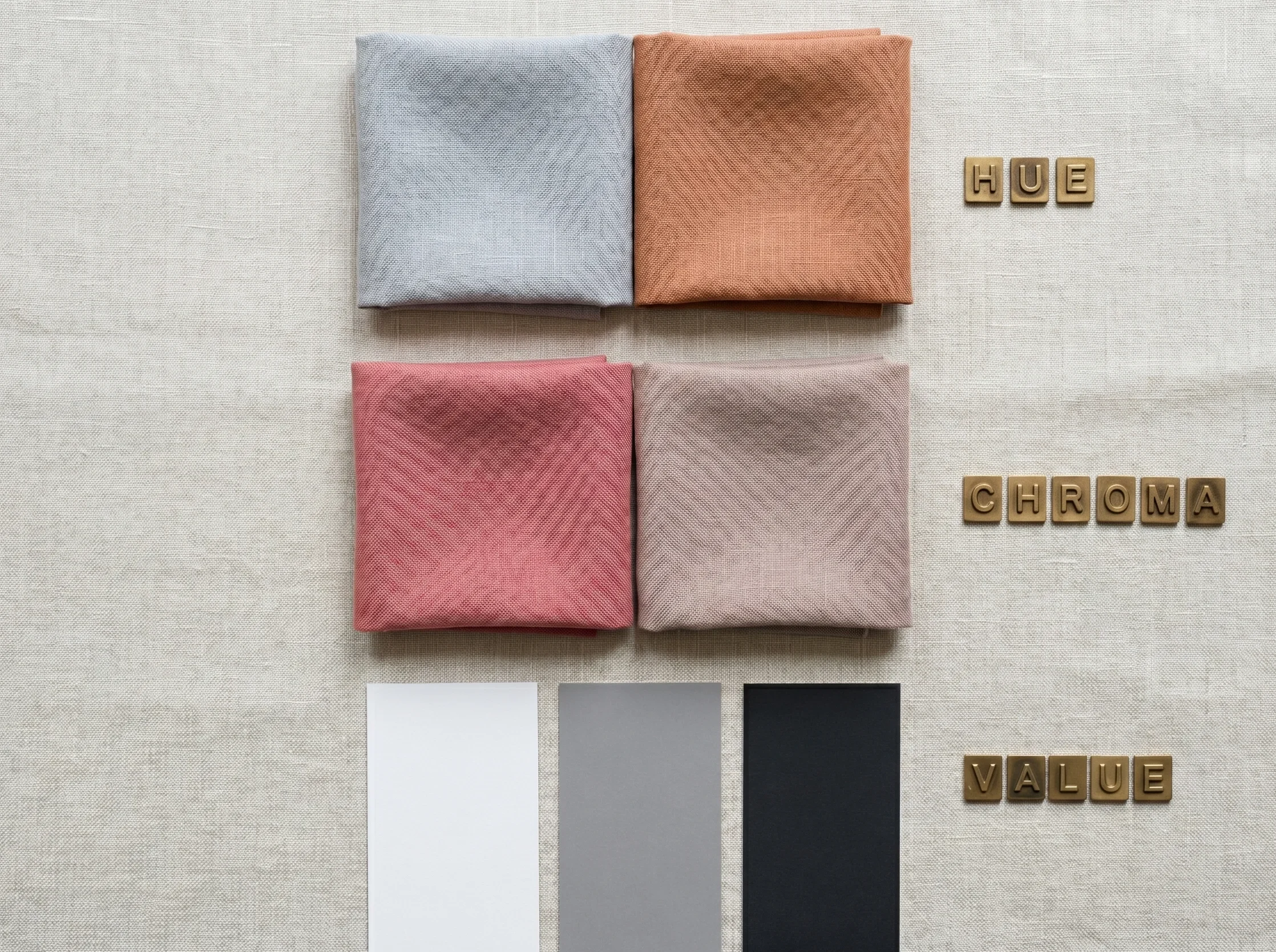
They are called hue, chroma, and value.
Dimension One
Hue
The colour’s temperature and position on the spectrum. Warm, cool, or neutral. The fundamental identity of the colour — what family it belongs to.
Dimension Two
Chroma
The colour’s saturation — how vivid or muted it is. From pure, fully saturated pigment to almost-grey. The intensity dial of any colour.
Dimension Three
Value
The colour’s lightness or darkness. From near-white to near-black. The depth axis — independent of hue or chroma.
The Core Principle — Colour as Coordinates
Every colour you will ever encounter has a precise address in three-dimensional space. Change any one of the three dimensions and you change the colour. Change two and you may not even recognise it as the same colour family. A saturated, mid-value warm red and a muted, light-value warm red are both “red” in hue — but they look nothing alike. That difference lives in chroma and value. Once you can name which dimension changed and by how much, you can decode any colour in seconds.
Dimension One
Hue — The Colour’s Temperature and Identity
01
Hue is the most immediately visible dimension of colour. It is the answer to the question: what colour is that? Red. Blue. Yellow. Green. Purple. These are all hues — their position on the colour spectrum, before anything else is added or removed.
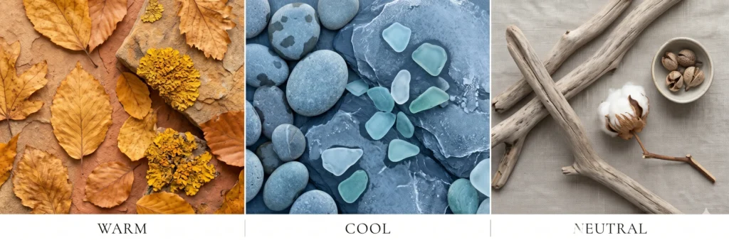
But hue has a crucial second quality that most people do not notice until it is pointed out: every hue has a temperature. Colours sit on a spectrum from warm (yellow-based, golden, earthy, like sunlight on terracotta) to cool (blue-based, like the shadow side of a stone, the inside of a shell, the light before dawn). Some colours sit in the exact neutral middle — neither distinctly warm nor cool, a blend of both.
Warm, Cool, and Neutral Hues
Hold a piece of warm golden-yellow fabric and a piece of cool grey-blue fabric near a white wall. The wall stays the same colour. But the room feels different — one is like late afternoon sunlight, one is like early morning fog. That shift in atmosphere is hue temperature at work. It is not imagined. It is measurable optical physics: warm hues advance visually, cool hues recede. Neutral hues read as quiet and grounded.
Warm hues
contain yellow, orange, or red undertones — think terracotta, golden yellow, warm brown, coral. They feel energising and advancing.
Cool hues
contain blue or pink-cool undertones — think slate blue, cool lavender, grey-green, icy pink. They feel calm and receding.
Neutral hues
contain roughly equal amounts of warm and cool — think greige, taupe, mushroom, warm grey. They do not read as distinctly one or the other.
The Colour Wheel — A Map of All Hues
The colour wheel arranges all hues in their natural spectral order — it is a map of the colour spectrum bent into a circle. Every hue has a position, and the position determines its temperature and its relationships to other colours.
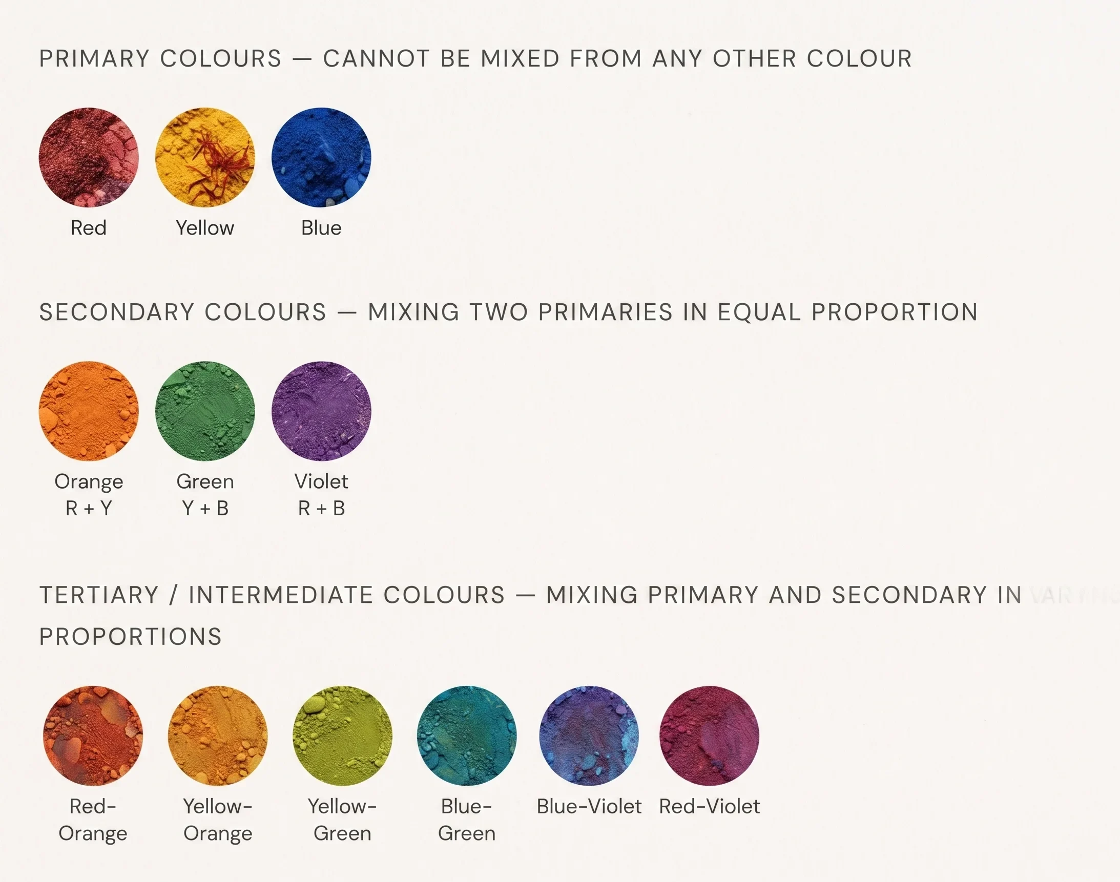
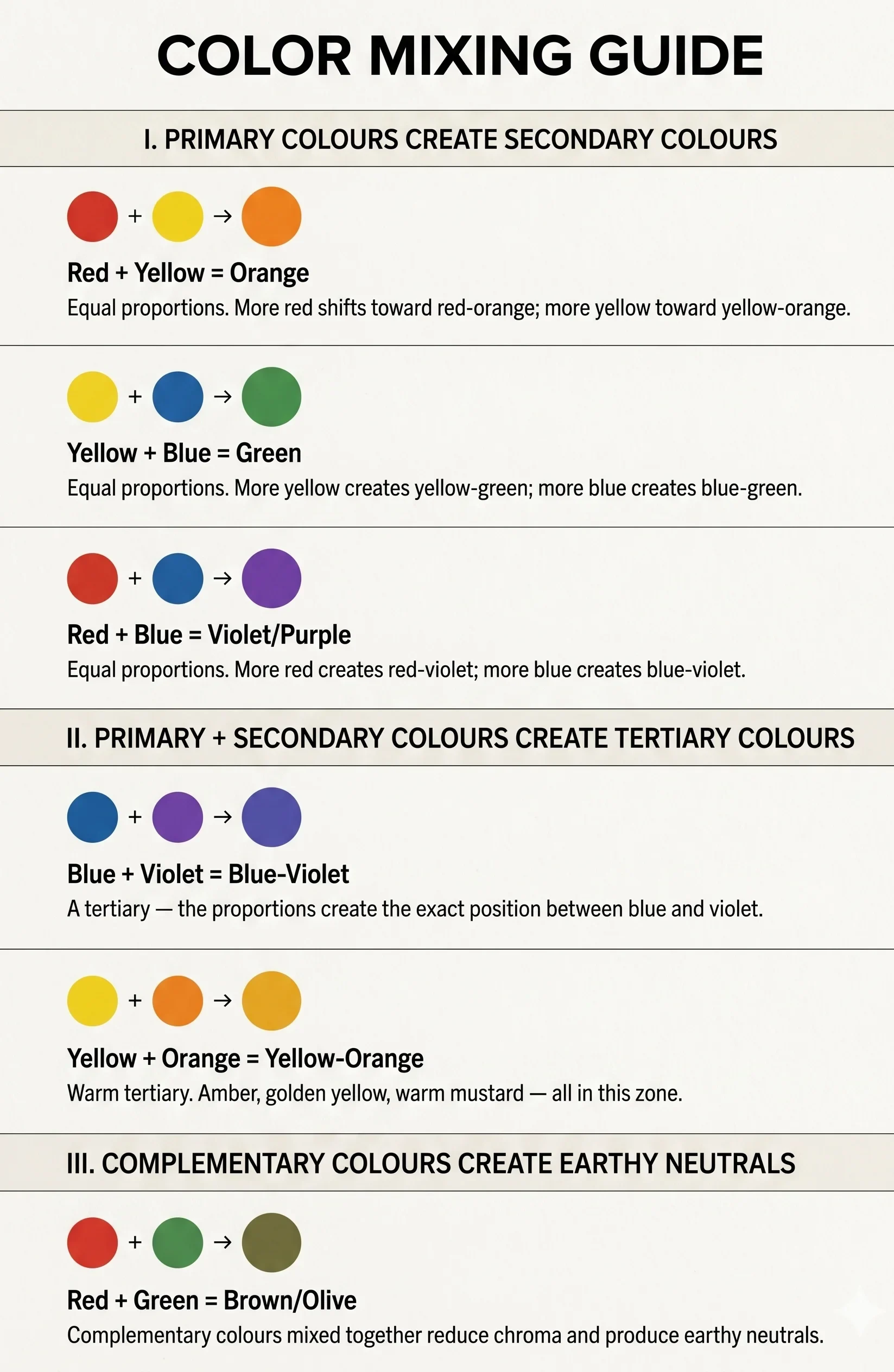
What mixing primary and secondary colors in varying proportions creates
When you mix a primary and a secondary colour in varying proportions, you produce tertiary colours — also called intermediate colours. The exact proportions control the result: equal amounts of red and orange produce a balanced red-orange, while more red than orange shifts the result toward red-orange-red. This is why colour mixing is not a binary operation but a continuous spectrum. Every increment of proportion change produces a different colour.
Dimension Two
Chroma — The Colour’s Saturation and Intensity
02
Chroma is the dimension that most people feel without knowing they are measuring it. It answers: how intense is this colour? How vivid, how saturated, how much pure pigment versus grey or brown is present?
Think of a fire engine and a faded brick wall. Both are red. Both have the same hue direction. But the fire engine is fully saturated — maximum chroma. The faded brick has had its intensity reduced by years of sun and weathering. It is red in the same direction, but with significant grey mixed in, pulling the saturation down the chroma scale.
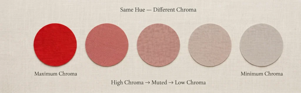
The Chroma Scale — From Vivid to Muted
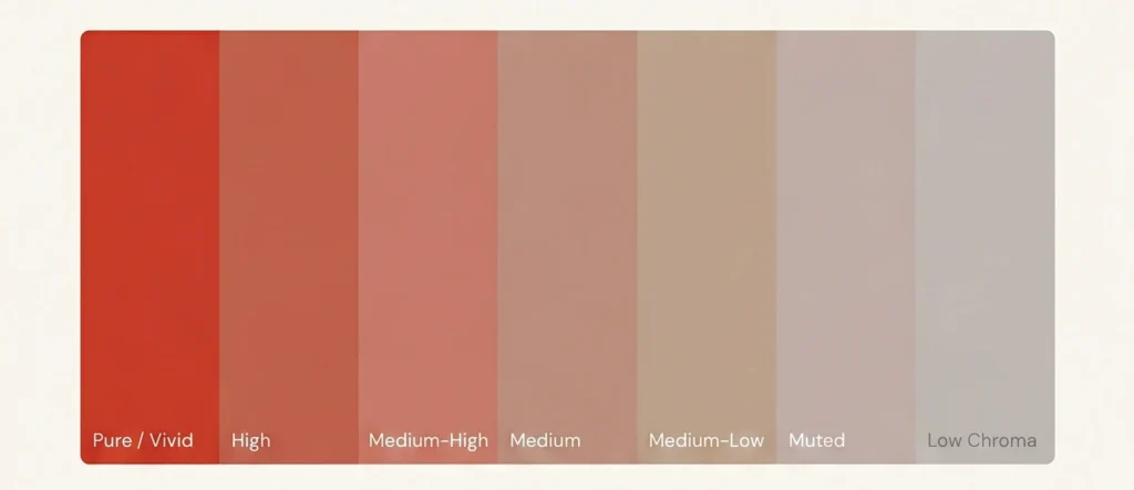
High chroma colours are vivid, clear, and saturated. They have the most pure pigment relative to grey or brown content. Think of a fresh hibiscus, a ripe lemon, a clear blue summer sky. These colours announce themselves. They have energy.
Low chroma colours are muted, dusty, or greyed. They have had significant grey or brown mixed in, reducing their chromatic intensity. Think of dried lavender, weathered sea glass, aged linen. These colours are quieter. They do not announce themselves — they whisper.
This dimension is the one most directly relevant to personal colour analysis. The human face has a natural saturation level — a chroma signature. Wearing colours whose chroma level matches the face creates harmony. Wearing colours that dramatically exceed or fall far below the face’s chroma signature creates a visible mismatch: either the colour overwhelms the face, or the face overwhelms the colour.
Chromatic Colour — A Technical Note
A chromatic colour is any colour with measurable hue content — any colour that is not a pure neutral (black, white, grey). Red, blue, dusty rose, muted sage — these are all chromatic colours because they have a hue direction, even if their saturation is very low. The word “chroma” in colour analysis refers to the saturation level of this chromatic content — how much of the hue identity remains versus how much grey has reduced it.
Dimension Three
Value — The Colour’s Lightness and Depth
03
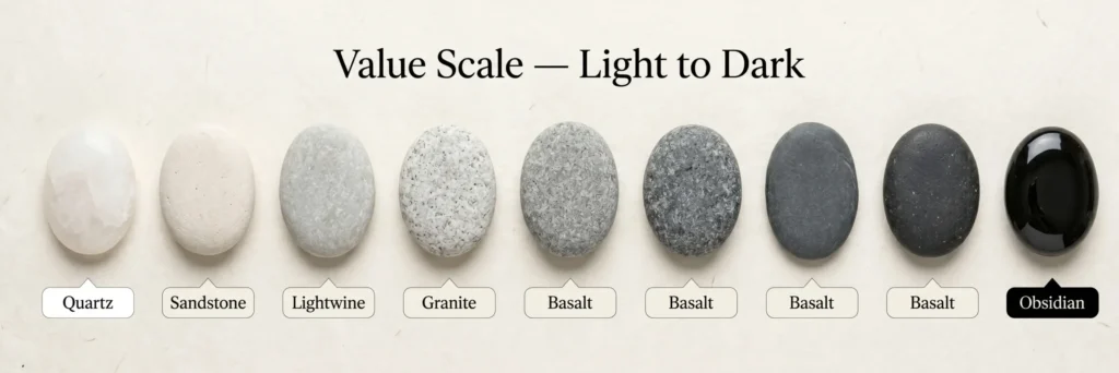
Value is the simplest dimension to grasp and the most frequently misapplied. It answers: how light or dark is this colour? Where does it sit on a scale from white to black?
Imagine photographing a room in black and white. All the hue information disappears. All the saturation information disappears. What remains is pure value — the greyscale rendering of lightness and darkness. This is value, isolated.
Why Value Is the Most Powerful Dimension
Value is the dimension that determines contrast — and contrast is the most visually powerful force in any composition, any outfit, any interior. Contrast is the distance between two values. A pale pink next to a dark navy creates high contrast. A medium grey next to a soft blue-grey creates low contrast. The contrast level determines how the composition reads at distance, at speed, at a glance.
The critical insight that most colour guides miss: value is completely independent of hue and chroma. A vivid red and a muted sage green can have identical value (the same lightness). A pale blue and a pale yellow can have the same value. Remove the hue information and they read as the same grey. This independence is what allows colour combinations to feel harmonious across different hue families — as long as the values are calibrated.
In seasonal colour analysis, the colour value scale determines depth matching — the process of matching the depth of the palette to the natural depth of the person’s colouring. A high-value (light) palette on a deep-value (dark) person creates dramatic contrast that may or may not be appropriate for that season’s contrast tolerance.
The Colour Value Scale in Practice
The Munsell colour system — the most rigorous colour measurement framework in use — defines value on a scale of 0 (pure black) to 10 (pure white). In seasonal colour analysis, palettes are calibrated to specific value ranges: Light Summer sits in the 7–9 Munsell value range; Soft Summer in the 4–7 range; Dark Winter in the 2–5 range. Understanding value is what makes seasonal analysis precise rather than approximate — it is the dimension that distinguishes a Soft Summer from a Light Summer from a Dark Autumn, even when all three share a cool undertone.
The Colour Mixing Guide
How Colours Are Made —The Mixing Principles
Understanding how colours are created through mixing is the practical application of hue theory. Every secondary and tertiary colour exists because of the proportional mixing of primary colours. The mixing ratios determine the result — change the proportion and you change the colour.
The Colour Mixing Chart — Primary to Tertiary
What Two Colours Make Blue — Correcting a Common Misconception
In the traditional RYB (Red-Yellow-Blue) pigment mixing model, blue is a primary colour — it cannot be made by mixing other colours. In the additive (light-based) RGB model used by screens, blue is also a primary. In the CMY print model, blue is created by mixing cyan and magenta. The question “what two colours make blue” is a valid one, but the answer depends entirely on which colour model you are working within. For pigment mixing on canvas or in fashion, blue is your starting point, not a destination.
Colour Harmony Systems
How Colours Work Together — The Harmony Principles
Colour harmony is the science and art of combining colours in a way that feels visually resolved. It is not subjective — it has measurable structural logic. Harmony occurs when colours share a defined relationship on the colour wheel. The main harmony systems are below.
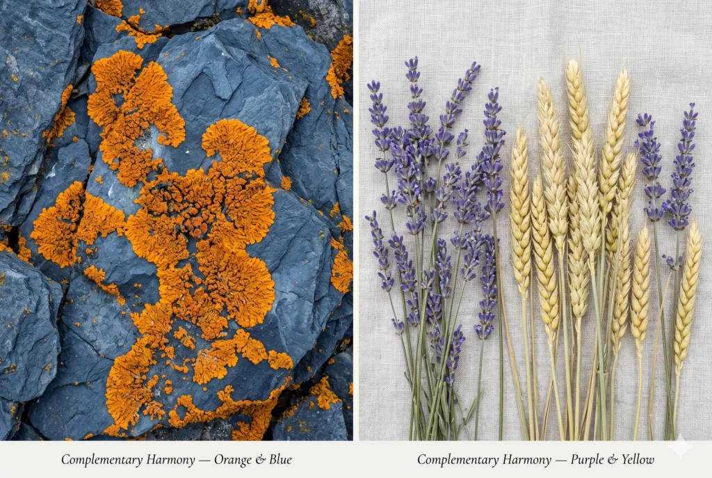
Complementary
Two colours directly opposite each other on the colour wheel. Maximum contrast. Maximum visual energy. Each colour makes the other look more vivid by contrast.
In nature: Orange lichen on blue-grey rock. Red berries against deep green leaves. The most visually striking pairings in the natural world are almost always complementary.
Split Complementary
One base colour paired with the two colours either side of its complement. Lower contrast than full complementary — more harmonious, still visually interesting. The “safe” version of complementary contrast.
In nature: A warm terracotta earth (base) paired with slate blue-grey and pale teal-grey (split complement of warm orange). A sunset in late autumn.
Analogous
Three to five colours sitting next to each other on the colour wheel, sharing a common hue direction. Low contrast, highly harmonious, visually peaceful. The most naturally occurring harmony in nature.
In nature: The shoreline at dusk — soft grey-blue water, muted grey-green sea grass, pale grey-lavender sky. All analogous. All cool. All peaceful.
Tetradic / Double Complementary
Four colours forming two complementary pairs — creating a rectangle or square on the colour wheel. The most complex and most colour-rich harmony. Requires one dominant colour to anchor the composition.
In nature: A spring meadow at peak bloom — red poppies, green grass, blue sky, yellow dandelions. Four colours, all at once, anchored by the dominant green.
|
Harmony Type |
Colour Wheel Position |
Visual Energy |
Best Used When |
|---|---|---|---|
|
Complementary |
Direct opposites |
High contrast, dynamic |
Maximum visual impact needed — focal point, accent |
|
Split Complementary |
Base + 2 either side of its complement |
Medium contrast, versatile |
Complement’s drama needed with more harmony — safer pair |
|
Analogous |
3–5 neighbours |
Low contrast, serene |
Cohesive, peaceful effect — wardrobe tonal dressing |
|
Triadic |
3 colours equally spaced (120° apart) |
Balanced, vibrant |
Three equal colours needed without one dominating |
|
Tetradic |
4 colours (two complementary pairs) |
Complex, rich |
Maximum colour diversity with structural logic |
Colour in Application
From Theory to Practice —Colour in Art, Fashion, and Life
Colour theory is not abstract academic knowledge. It is the framework behind every visually successful decision you have ever admired — a painting that makes you feel something, a room that makes you calm, an outfit that makes a person seem effortlessly put together. The same three dimensions — hue, chroma, and value — govern all of it.
The Colour Wheel for Clothes — How Fashion Uses Colour Theory
The same colour wheel principles that govern painting govern dressing. The difference is the human face as the compositional anchor. In a painting, the eye travels freely. In a person’s appearance, the eye moves toward the face first — and the colours worn either support that movement or compete with it.I hope you will appreciate the understanding we provide on soft summer wardrobe and soft summer makeup guide to demonstrate the application of the 16 season color system theory in fashion industry .
Analogous Dressing
Wearing colours that share a similar hue direction and value depth. The most wearable colour combination for every day — it creates a coherent visual impression that reads as effortless rather than constructed. Works with any palette from Soft Summer to Dark Autumn.
Tonal/Monochromatic
One hue family across varying values and chromas — a single colour worn from light to deep in the same outfit. Highly sophisticated because it depends on texture and material for visual interest rather than colour contrast. The basis of quiet luxury dressing.
Accent Colours
A small proportion of a complementary or contrasting colour introduced into an otherwise harmonious outfit. An accent colour draws the eye. In personal colour analysis, the most effective accent colours are those from the same seasonal palette — their relationship to the base colours is calibrated by the same three dimensions.
What Colours Go With Red — Applied Colour Harmony
Red’s position at the warm end of the hue spectrum means its best relationships on the colour wheel are: its complementary (green), its analogous neighbours (red-orange and red-violet), and its split complementary pair (blue-green and yellow-green). In fashion application, these translate to: deep forest green with red for high-contrast complementary drama; burgundy and coral for analogous warmth; and navy with a hint of teal as the split complementary option that is more harmonious than pure green. The specific value and chroma of each element determine whether the combination reads as intentional or chaotic.
Colour Harmony in Personal Colour Analysis
The three building blocks of colour are exactly the same three dimensions used in seasonal colour analysis — hue (undertone direction), chroma (saturation tolerance), and value (depth range). A person’s season is their specific address on all three scales. The seasonal palette is the set of colours that match that address in all three dimensions simultaneously. This is why colour analysis is the practical application of colour theory made personal — it takes universal colour physics and calibrates it to one specific human biology.
Take our Seasonal Analysis quiz to know which season is yours .
Go Deeper — The Complete Colour Library
Each Color Dimension In Full Detail
The three building blocks introduced above each have an entire dimension of depth. These guides take each one as far as it goes.
Dimension One
Hue — Warm, Cool & Neutral Colour Temperatures
The complete guide to hue temperature, the colour wheel, primary and secondary colours, tertiary colours, and opposite colours.
Dimension Two
Chroma — Saturation, Mutedness & Colour Intensity
How saturation affects every colour decision — from vivid to greyed, from fashion to interior design to personal colour analysis.
Dimension Three
Value — Lightness, Darkness & Contrast in Colour
The complete guide to the value scale, contrast ratios, and how depth difference defines every visual composition.
Harmony Systems
Colour Harmony — Complementary, Analogous & Beyond
Every harmony system on the colour wheel — with nature examples, outfit applications, and the science behind why they work.
Colour Mixing
Colour Mixing — The Complete Chart for Pigment & Fashion
What two colours make every secondary and tertiary — with the mixing chart, proportions guide, and fashion application.
Personal Colour
Seasonal Colour Analysis — How the Three Dimensions Define Your Season
How hue, chroma, and value combine to identify your personal colour season — the bridge from colour theory to colour analysis.
Frequently Asked Questions
Colour Theory — The Answers
What are the three building blocks of colour?
Every colour has three measurable dimensions: Hue (the colour’s position on the spectrum and its temperature — warm, cool, or neutral), Chroma (the colour’s saturation level — how vivid or muted it is), and Value (the colour’s lightness or darkness). Change any one of these and the colour changes. These three dimensions define every colour that exists.
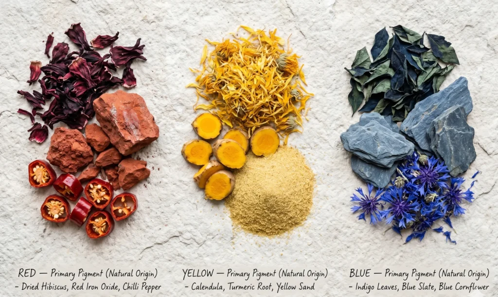
What are the true primary colours?
In traditional pigment mixing (the RYB model), the true primary colours are red, yellow, and blue. These cannot be created by mixing any other colours together — they are the starting points from which all other colours are built. In light (the additive RGB model), the primaries are red, green, and blue. In print (CMY), they are cyan, magenta, and yellow. For colour analysis and fashion, the RYB model is most relevant.
What does mixing primary and secondary colours in varying proportions create?
Mixing a primary and a secondary colour in varying proportions creates tertiary colours (also called intermediate colours): red-orange, yellow-orange, yellow-green, blue-green, blue-violet, and red-violet. The exact proportions determine the result — more primary shifts the tertiary toward the primary parent; more secondary shifts it toward the secondary parent.
What are split complementary colours?
Split complementary colours consist of one base colour paired with the two colours either side of its direct complement on the colour wheel. For example, blue’s complement is orange — so blue’s split complementary pair is yellow-orange and red-orange. This harmony creates visual interest and contrast similar to complementary pairing but with more flexibility and less tension. It is often considered the most versatile of the contrast-based harmony systems.
What is colour harmony?
Colour harmony is the principle of combining colours so that they have a logical, proportional relationship to each other on the colour wheel. Harmony is not the same as “colours that look nice” — it is a measurable structural quality. The main harmony systems are complementary (opposites), analogous (neighbours), split complementary, triadic (three equally spaced), and tetradic (four colours forming two complementary pairs).
What is the opposite colour of red? Of orange? Of pink?
On the traditional colour wheel: Red’s complement is green (the reason red and green appear so vivid together). Orange’s complement is blue (why blue and orange combinations have such visual energy). Pink’s complement is yellow-green — pink sits in the red-violet range, and its direct complement on the wheel is the yellow-green family. The complementary colour is always found directly opposite on the colour wheel — it is the colour with the maximum hue distance from the base colour.
What is a chromatic colour?
A chromatic colour is any colour with measurable hue content — any colour that is not a pure neutral (black, white, or neutral grey). Even a very low-saturation dusty rose is a chromatic colour, because it has a measurable hue direction (pink-cool) even at minimal saturation. The term “chroma” in colour analysis refers to the saturation level of this chromatic content — how much of the hue identity remains versus how much grey has reduced it.
The Bridge — From Colour Theory to Colour Analysis
These three dimensions — hue, chroma, and value — are not just the building blocks of colour as a subject. They are the building blocks of your personal relationship with colour. Your skin, eyes, and hair all have a specific address on these three scales. Your seasonal colour analysis is the process of identifying that address precisely — and then building a wardrobe, makeup palette, and styling approach that works with your biology rather than against it.
Understanding hue means understanding why a warm gold drains some people and lights up others. Understanding chroma means knowing why vivid colours overwhelm certain complexions while muted colours feel flat on others. Understanding value means grasping why high-contrast combinations suit some people perfectly and exhaust others visually.
Colour theory is not separate from personal colour analysis. It is the language personal colour analysis speaks. Once you can read the language, every colour decision — in the wardrobe, in the room, on the canvas — becomes deliberate rather than accidental.Do leave a review on the complete soft summer palette guide we have compiled for you .