True Summer Colors to Avoid The Complete Guide to Cool Summer’s Worst Shades — and What to Wear Instead
True Summer Colors to Avoid: Worst Shades & Best Swaps
QUICK ANSWER True Summer — also called Cool Summer — clashes with anything warm, neon, or too dark. Skip orange, mustard, camel, olive, jet black, and stark white; they carry warmth or contrast this cool, medium-soft palette can’t absorb. The tell: if a color looks like it belongs on an Autumn moodboard or under stadium lights, it isn’t a True Summer color.
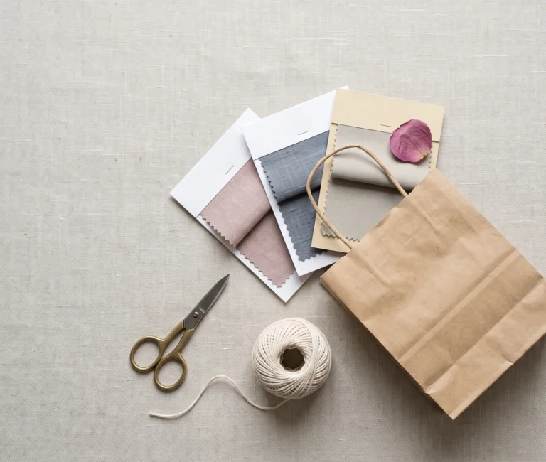
Hero image — reservedEditorial flat-lay of fabric swatches: a muted cool palette (slate, dusty rose, powder blue) set beside the warm “avoid” colors (rust, mustard, camel) for direct contrast. No human subjects. Full prompt + alt text to follow in the image pass.
You’ve been told to avoid warm colors. Fair enough — but which ones, exactly, and why does mustard wreck the whole face while dusty rose doesn’t?
True Summer — also known as Cool Summer — has a specific, checkable list of colors that fight its coloring instead of flattering it.
Not a vague “warm bad, cool good.” Actual colors, the actual reason each one fails, and exactly what to reach for instead.
What Makes a Color “Wrong” for True Summer
True Summer sits inside the Summer family of the Sci/ART sixteen-season system — the same colouring some frameworks call Cool Summer instead.
A colour fights this season for one of three reasons. It’s warm, it’s too saturated, or its contrast sits too far from medium.
| Reason a colour fails | What it looks like |
|---|---|
| Warmth | , , or sitting underneath the colour |
| High chroma | , , or highly saturated versions of any hue |
| Wrong contrast | or — both too extreme for medium contrast |
Get any one of these three wrong and the skin reads the mismatch almost instantly — even when the person wearing it can’t say exactly why.
Same pink–adjacent family, opposite effect. The hue leans a different direction, and the chroma gap alone is wide enough to flip a flattering colour into a draining one.
That’s the actual test — temperature and intensity, checked together. Not just “is this a warm colour.”
The Warm Spectrum: Oranges, Yellows & Warm Browns
Warm hues are the single biggest problem category for True Summer. Nothing else clashes this hard, this consistently.
| Category | Colours to avoid |
|---|---|
| Orange family |
|
| Warm yellows |
|
| Warm reds & browns |
|
Why Orange Specifically
Orange sits at the exact opposite end of the colour wheel from True Summer’s blue-based undertone. It isn’t a small clash — it’s the most direct chromatic opposite this season has.
Next to True Summer skin, orange pulls every warm undertone in the skin forward. That’s exactly the effect this season is built to avoid.
Where True Summer reads like sea kale and winter pine seen through mist, orange reads like a struck match. The two don’t share a temperature, let alone a mood.
REACH FOR THIS INSTEAD
Cool plum, dusty berry, or slate blue — the same visual weight as an orange-family colour, none of the warmth.
Harsh Neutrals: Black, White & Warm Beiges
Neutrals cause just as much trouble as bright colours, usually because they look “safe” on the hanger.
Can True Summer Wear Black?
Technically, yes. Practically, it’s the season’s least flattering neutral.
Jet black creates more contrast than True Summer’s colouring is built to carry. Near the face, it can cast the skin as ashy or tired rather than sharp.
If black is unavoidable — a dress code, a specific piece — keep it away from the face. Soft charcoal or blue-grey does the same job with none of the harshness.
Warm Neutrals to Avoid
-
and pull yellow forward exactly where the skin needs to stay cool.
-
read as a duller, warmer version of white rather than a clean neutral.
What About Stark White?
or for the ‘white’ slot. or for the ‘black’ slot.
Neons and High-Chroma Brights
Bright doesn’t always mean flattering. True Summer’s colouring is built for medium-low chroma, so anything electric overwhelms it rather than lifting it.
The colour ends up wearing the person instead of the other way around — attention goes to the outfit, not the face.
doesn’t read as summer at all. It reads like a highlighter left in direct sun, all chemical brightness with nothing organic about it — and True Summer’s whole world is organic: .
Can True Summer Wear Red?
Not never — but almost never in the way most people picture red.
Primary red and fire-engine red both carry too much warmth and too much saturation for this season.
All warm-based and too saturated for soft contrast.
Carrying the same intensity as Cool Summer’s own and tones.
Warm Greens to Avoid
Green causes fewer arguments than orange or red, but the warm end of it is just as much of a problem.
- and
This Avoid List Across Skin Depths
This mismatch isn’t about how light or deep someone’s skin is. It’s about temperature, and temperature shows up at every depth.
Where This Shows Up in Stores
Knowing the theory helps. Knowing which rack to walk past helps more.
| Where you’ll see it | Avoid | Reach for instead |
|---|---|---|
| Autumn racks |
|
|
| Spring/summer racks |
|
|
| Winter/formal racks |
|
|
Every season’s collection leans into its own warmth or brightness. That’s exactly why True Summer needs a different shopping list at every time of year, not just in summer.
Makeup and Jewellery
Makeup
Bronzer and anything peach-toned creates the same clash on the face that a mustard sweater creates on the body.
Jewellery
Yellow gold behaves like a small dose of orange sitting right at the collarbone or ear.
True Summer vs. Soft Summer
These two seasons share most of the same avoid list. One real difference splits them: warm neutrals.
| True Summer (Cool Summer) | Soft Summer | |
|---|---|---|
| Warm neutrals ( ) | Avoid entirely | Can wear the muted, greyed versions |
|
|
Avoid entirely | Avoid entirely |
|
|
Avoid | Avoid |
|
|
Avoid | Avoid |
If a warm, muted neutral like mushroom or warm greige looks fine on you rather than actively wrong, you may be Soft Summer rather than True Summer — the full breakdown lives on the Soft Summer colors to avoid guide.
What to Wear Instead
Every avoid list needs a landing place, or it’s just a list of no’s.
Avoid
-
-
-
-
-
or
Wear Instead
For the complete list of colors that work — not just what to avoid — the True Summer Color Palette guide has the full breakdown.
Frequently Asked Questions — True Summer Colors to Avoid
Is True Summer the same as Cool Summer?
In most 12- and 16-season systems, yes — True Summer and Cool Summer describe the same coloring: fully cool undertone, medium value, medium-low chroma. Different systems, same palette, same avoid list .
Can True Summer wear black?
Can True Summer wear Technically yes, but it’s the season’s least flattering neutral. Jet black creates more contrast than True Summer’s coloring carries well. Soft charcoal or blue-gray does the same job without the harsh edge near the face.
Can True Summer wear red?
Bright or primary red, no — it’s too warm and too saturated. A muted, cool-based red like dusty rose, cool raspberry, or muted plum works because it keeps the same family while dialing back both temperature and intensity.
Can Cool Summer wear navy blue?
Yes — navy is one of the few dark neutrals that works well. Choose a muted or slightly blue-gray navy over an inky, jet-black navy for the closest match to this season’s softer contrast.
Can Cool Summer wear camel or khaki?
Both carry warmth that clashes with True Summer’s cool base. Cool taupe, soft blue-gray, or slate give the same practical neutral without the yellow undertone underneath.
What colors look best on True Summer?
Cool, muted colors like dusty rose, powder blue, and blue-gray — the opposite of everything on this page. The full best-colors breakdown lives on the True Summer Color Palette guide.
Why does orange look so bad on True Summer specifically?
Orange sits at the direct opposite end of the color wheel from True Summer’s blue-based undertone. It pulls every warm tone in the skin forward — the strongest clash this season has with any single color.
Next Steps
- Not sure if you’re True Summer or actually Soft Summer? Take the free color season quiz.
- Want the complete list of colors that DO work? Read the True Summer Color Palette guide.
- Building a capsule wardrobe? Start with the swap table above before you buy anything new.
“I’ve watched one wardrobe go from ‘nothing feels right’ to ‘everything works together’ by removing exactly four colours — camel, mustard, coral, and jet black. Start there before you touch anything else.”— Helen Alex