Light Summer Colors to Avoid
Light Summer Colors to AvoidThe Complete Guide to What Clashes — and Why
Quick answer
Light Summer’s palette is light, cool, and softly muted — so the colours that fight it are always too dark (true black, deep neutrals), too warm (rust, mustard, olive), or too intense (neon, jewel tones). The fix usually isn’t banning the colour; it’s moving it away from your face or choosing a cooler, softer version of the same hue.
Why these colours clash with Light Summer
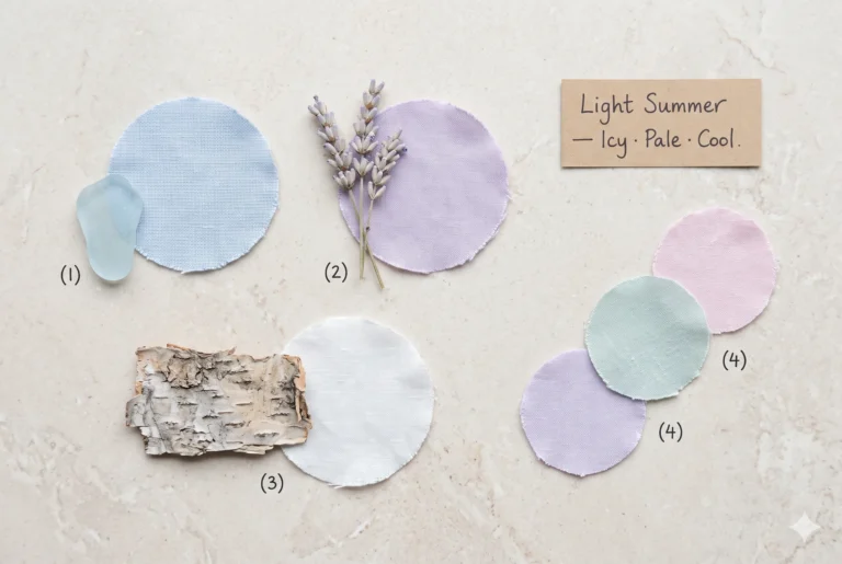
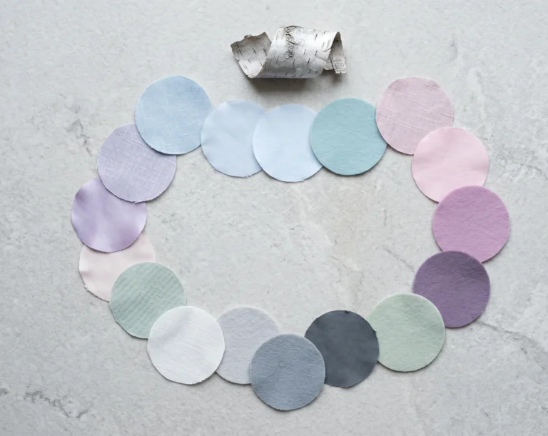
Light Summer sits at the palest, coolest corner of the Summer family: high value, cool undertone, low-to-medium chroma. Light Summer is a sub-season of the Summer family in the Sci/ART 16-season framework, sharing Summer’s cool base but pushed toward Light Spring’s delicacy.
A colour clashes with that combination for one of three reasons, and it’s rarely more than one at once.
- Too dark — a value problem. Anything sitting several Munsell Value steps below Light Summer’s own light colouring reads as a hole near the face instead of a frame around it.
- Too warm — a temperature problem. Orange-leaning hues fight a cool undertone directly; skin compensates by pulling toward yellow or grey.
- Too intense — a chroma problem. Light Summer’s colouring is naturally soft, so a neon or jewel-bright shade doesn’t complement that softness — it competes with it, and usually wins.
Not sure which rule a colour you already own is breaking? The grid below sorts six repeat offenders by exactly that.
The anti-palette: six colours to question
Pitch Black
#0A0A0AReads as a void beside pale skin and hair.
Rust Terracotta
#A0522DPulls redness forward instead of softening it.
Mustard Gold
#BBB80BTurns a light complexion sallow, fast.
Deep Olive
#556B2FDulls eye colour and flattens hair.
Electric Neon Orange
#FF5F1FOverpowers soft colouring instead of framing it.
Oxblood Burgundy
#4A0E1AThe brown undertone is the real problem — not the depth alone.
Notice the pattern? Four of those six problems are the same problem wearing different outfits: warmth. That’s worth remembering before writing off an entire colour family — see the burgundy question below.
Makeup & hair traps
The same three rules govern what’s in your makeup bag.
- Foundation and bronzer. A golden or honey-toned base sits on cool-pink skin like a mask edge. Look for “neutral-cool” or “pink-based” formulas instead.
- Lips and cheeks. Brick red, warm coral, and chocolate-brown lipsticks drain a Light Summer face rather than warming it. A cool-toned rose or soft raspberry adds colour without the fight.
- Eyeliner. Jet-black liquid liner is the makeup version of the black-coat problem — too much value contrast, too fast. Charcoal grey or soft taupe defines without the harshness.
- Hair colour. Brassy golden blonde and copper highlights clash for the same temperature reason rust does on fabric; jet-black dye clashes for the same value reason a black coat does.
Is burgundy really off-limits?
Burgundy shows up on both the avoid list and the flattering list across different colour guides, and that’s not a contradiction once the two burgundies are separated.
A cool, clear burgundy — closer to raspberry or cranberry — sits inside Light Summer’s own chroma and temperature range. A warm, brown-based burgundy, the kind that leans toward oxblood, carries the same problem as rust or mustard: too much yellow underneath the red.
The care label won’t tell you which one is in your hands. Your undertone will.
Studio Read — two burgundies, side by side
Cranberry — #A32638
Cool clear, moderate value. A Light Summer yes.
Oxblood Burgundy — #4A0E1A
Lower value, warmer hue-lean, drifting toward Autumn/Winter crossover territory. A Light Summer no.
How to wear a hard colour anyway
Nobody’s asking anyone to throw out a rust jumper. Move the trouble spot with four adjustments:
- Push it away from the face — trousers, a bag, or shoes carry a hard colour better than a collar does.
- Layer a buffer colour between the shade and the skin — a soft ivory or powder-blue scarf does the job.
- Let it appear as a minor accent in a print, not the dominant shade.
- Add silver hardware, not gold — it pulls the whole look back toward Light Summer’s cool base.
Swap it: avoid → instead
Same role in the outfit, opposite effect on the face:
Does this change on deeper skin?
Light Summer covers a narrow lightness range in hair and eyes, but skin depth still varies within that range — fair-cool through light olive-cool undertones all belong to the category, and the value, temperature, and chroma rules apply the same way regardless of how much melanin is present.
What changes is contrast, not the rulebook. On a fair-cool complexion, true black creates a stark, high-contrast edge right at the jawline. On a deeper-within-range Light Summer complexion, the same black still reads as too dark and too neutral for the palette, but it shows up more as flattening than starkness — the face loses definition rather than gaining harsh shadow.
Either way, the fix is identical: move the colour away from the face, or trade it for a cooler, higher-value version of the same hue.
Frequently asked questions
Is Light Summer’s avoid list different from general Summer advice?
Yes. Cool Summer and Soft Summer share the same caution around orange and gold, but Light Summer’s tolerance for dark values is stricter — a shade that reads as “deep but wearable” on Cool Summer often reads as simply too heavy on Light Summer’s lighter colouring.
Can Light Summer borrow colours from neighbouring seasons?
A little. Light Spring shares Light Summer’s high value, so soft coral and pale peach sometimes cross over — keep them on the cool side of that family rather than the warm side.
What’s the fastest way to check a colour while shopping?
Hold the garment at the jaw in natural light. If the skin looks greyer or more tired than it does with no colour nearby, the garment is fighting the undertone or value — put it back, or plan to wear it away from the face.
Does “avoid” mean never wearing a colour?
No. It means the colour works against a Light Summer complexion up close and in quantity. Away from the face, or as a small accent, most of these colours are wearable in moderation.
Confirm your Light Summer palette before you shop
Colours to avoid are only half the reference — the part that actually changes a wardrobe is knowing the full Light Summer palette cold, so a colour reads as yes or no before the tag’s even flipped over.
“I’ve watched ruling out five colours fix more wardrobes than fifty new purchases ever did — start there before buying anything else this season.” — Helen
Continue your Light Summer research
Light Summer Colour Guide
Best colours, neutrals, and palette strategy for Light Summer.
Light Summer Skin Tone & Undertone
How to confirm your undertone before you shop this list against it.
Soft Summer Palette
How the neighbouring Summer sub-season compares, and where the two overlap.