What is Soft Summer The Definitive Summer Colors Guide
Analyst’s Direct Answer — What Is Soft Summer?
Soft Summer is a cool, muted, and medium-depth colour season within the 16-season colour analysis framework. It sits at the precise intersection of a cool (blue-based) thermal undertone, low-to-medium chroma saturation, and medium value contrast. The soft summer colour palette spans desaturated grey-blues, smoky lavenders, dusty roses, muted sages, and cool greiges. It is the most versatile of the three Summer sub-seasons — and, in clinical practice, the most commonly misidentified.Here we introduce you to soft summers and who belong to it .
Who This Guide Is Not For
If you are looking for a simple “what colours suit me” answer based on the original 4-season or 12-season model, this guide will be more granular than you need. This is a 16-season technical analysis built from over 2,000 clinical drapting sessions. It assumes you are ready to move beyond seasonal labels and understand the precise biological logic behind your colouring.
Why the 12-Season Model Gets Soft Summer Wrong
The original Carole Jackson 4-season framework — and the 12-season system that followed — grouped Soft Summer under a broad “Summer” umbrella alongside Light Summer and True Summer. The logic was efficient: all three seasons share a cool thermal undertone, and grouping them simplified client communication.
The problem is that these three seasons have fundamentally different chroma and value profiles. Prescribing the same palette to a Soft Summer and a True Summer client is the colour equivalent of prescribing the same glasses to three people with different prescriptions. They all need correction. They do not need the same lens.For clarity about hue ,chroma and value visit our building blocks of color guide .
In my studio, the most consistent source of post-consultation frustration comes from clients who were typed as “Summer” under a 12-season analysis and found that many of the recommended colours still looked flat, heavy, or slightly draining. In almost every case on review, these clients are Soft Summer — and the palette they received was calibrated for True Summer’s slightly higher chroma capacity.
Practitioner’s Observation — Studio Notes
“During live drapting sessions, I consistently observe that Soft Summer clients respond dramatically differently to cool neutrals than their True Summer counterparts. A steel grey that lifts and clarifies a True Summer face reads as cold and slightly ageing on a Soft Summer. The Soft Summer needs the same grey blended with a whisper of mauve or sage to bring it into biological alignment. This single calibration point is what the 16-season framework makes possible — and the 12-season model systematically misses.”
The Analyst Glossary — Terms Used in This Guide
Chroma
The saturation level of a colour — how vivid vs. muted it reads on the Munsell scale.
LRV
Light Reflectance Value — the percentage of light a colour reflects. Controls depth matching.
Thermal Undertone
Cool (blue/pink-based) or warm (yellow/gold-based) — the biological root of your colour season.
Value Contrast
The difference in lightness between your hair, skin, and eyes. Determines your palette’s depth range.
Muted Saturation
Colours with grey or brown mixed in — they reduce chroma without losing depth or dimension.
The Soft Summer Colour Season — Precisely Located
Thesoft summers occupy a specific coordinate in three-dimensional colour space. Think of it as a GPS coordinate rather than a vague region on a map. To classify correctly as Soft Summer under the 16-season framework, your natural colouring must meet all three of the following criteria simultaneously:
Thermal Undertone: Cool (blue-dominant).
When a warm golden fabric is held at your face, your skin pulls slightly yellow or sallow. When a cool blue-grey is introduced, the skin looks clearer, more even, and naturally pinker. This is the biological signature of a cool season — and it is non-negotiable for Soft Summer typing.
Chroma: Muted (low-to-medium saturation).
The Soft Summer’s natural colouring has a characteristic softness — a slightly smoky, dusted quality that sits between washed-out and vivid. Highly saturated colours register as loud and “costumy” against this colouring. The palette must match the skin’s inherently low-chroma signature.
Value Contrast: Medium.
The depth difference between your hair, skin, and eyes sits within a medium range — not the sharp contrast of a Dark or Bright Winter, and not the near-invisible delicacy of a Light Summer. This medium contrast defines the palette’s depth ceiling and floor.
Where Soft Summer diverges decisively from its nearest neighbour — Soft Autumn — is on the thermal axis alone. Both seasons share the muted chroma and medium value depth. The single decisive distinction is undertone: Soft Summer reads cool, Soft Autumn reads warm. That one biological difference sends their palettes in entirely opposite directions. For the complete Soft Autumn analysis, see our dedicated Soft Autumn Colour Season Guide.
The Soft Summer Colour Palette — Five Colour Families
The complete soft summer colour palette spans approximately 30 to 36 colours across five distinct families. I use the term “families” rather than individual shades because the practical reality of building a wardrobe from this palette is that chroma level and hue direction matter more than any single hex code. What makes a colour right for Soft Summer is its combination of cool thermal direction, low-to-medium saturation, and medium LRV range.
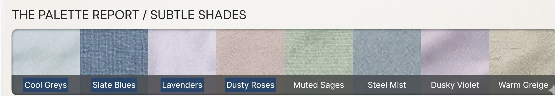
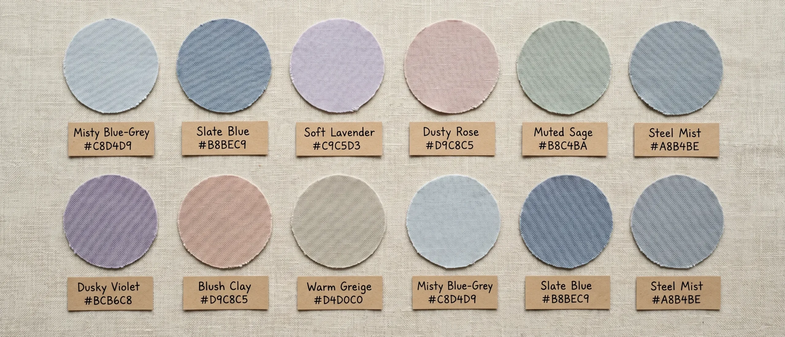
Family 1 — Cool Blue-Greys (The Structural Core)
Misty blue-grey (#C8D4D9) and slate blue (#B8BEC9) form the palette’s primary neutrals. These are not true grey and not true blue — they sit in the precise overlap where cool blue meets desaturated grey. When worn near the face, these tones visually lift under-eye shadow and neutralise surface redness in cool-toned skin. Their LRV sits between 45 and 60, making them medium-light in depth: never so pale as to wash out, never so deep as to overwhelm the colouring.
Family 2 — Soft Lavenders and Muted Violets
Soft lavender (#C9C5D3) and dusky violet (#BCB6C8) carry a slightly pink-purple temperature that is uniquely flattering on cool-toned skin because they echo the pinky-lavender undertones visible in the veins, lips, and eyelid margins of Soft Summer clients. In my studio work, these are consistently the colours that prompt the spontaneous comment: “I don’t know why, but this colour just looks right.” It looks right because it mirrors the skin’s own biological signature — it does not compete with it.
Family 3 — Dusty Roses and Cool Blushes
The rose tones in the soft summer palette are not warm pinks. They are cooler, more powdery — think dried rose petals rather than fresh ones. Blush clay (#D9C8C5) exemplifies this: it reads pink but carries a grey undertone that prevents it from pulling warm. These function as the palette’s most directly face-flattering tones, because they replicate the soft flush of a cool complexion in natural light rather than imposing a colour from outside the biology.
Family 4 — Muted Sages and Cool Blue-Greens
Muted sage (#B8C4BA) and soft fern (#A8B4AA) bring the botanical dimension that is one of the most recognisable aesthetic signatures of Soft Summer style. These are greens with significant grey mixed in — landing closer to the colour of dried sage leaves than lush summer foliage. They photograph with unusual depth and three-dimensionality, and clients frequently describe them as feeling “familiar” — as if the colour belonged to them before they knew why.
Family 5 — Cool Neutrals: Greige, Parchment, and Soft White
The Soft Summer’s neutrals replace black and navy — both of which create contrast ratios that exceed what this colouring can absorb without looking drained. Warm greige (#D4D0C0) and soft parchment (#C4C0B0) serve as the palette’s deep anchors. They are warm enough to avoid reading cold, cool enough to avoid pulling yellow. This family builds the capsule wardrobe — the foundation upon which every other colour family rests and from which every outfit begins.
12-Season vs. 16-Season: What Precision Changes
Dimension
12-Season “Summer” Typing
16-Season Soft Summer Typing
Palette size
~30 generic Summer colours
36 colours calibrated to Soft Summer’s specific chroma range and depth
Neutral range
Light grey, navy included broadly
Navy excluded. Cool greige replaces navy. Soft charcoal as deepest neutral — black flagged as contrast overload.
Pink specification
Generic cool pink
Grey-based dusty rose only — distinct from the higher-chroma pinks that suit True Summer
Green inclusion
Soft teal or sage broadly
Only muted grey-green; warm greens and vivid teals excluded for chroma excess
Undertone allowance
Purely cool across all Summer
Cool-dominant with fractional warm tolerance — allows warm greige as a neutral
Contrast ceiling
Not specified per sub-season
Medium contrast ceiling: high-contrast combinations identified as “overloading” the Soft Summer colouring
Season boundaries
Blurred — all Summers treated similarly
Clear boundary with Soft Autumn (warm axis) and Light Summer (lighter depth)
Soft Summer Across All Skin Depths — Melanin-Calibrated
The majority of Soft Summer content online defaults to a narrow visual: fair-skinned, light-eyed, ash-blonde or light-brown-haired. This is a significant gap that the 16-season framework directly addresses. Soft Summer colouring occurs across every skin depth — from cool porcelain to cool espresso. The season is defined by undertone and chroma, not depth. Skin depth changes how the palette performs, not whether you belong in it.
Cool-Fair to Cool-Light (Fitzpatrick I–III)
In cool-fair Soft Summer clients, the season shows most clearly through a characteristic “transparent” quality to the skin — a cool rosiness that sits close to the surface, often with visible lavender or pink in the under-eye area and lips. The palette’s medium-LRV cool greys and lavendars are the highest performers here. The most common mistake for this group: reaching for pure white (which sits above the contrast ceiling) or warm-beige foundations (which turn visibly yellow against the cool surface of the skin).
Cool-Medium (Fitzpatrick III–IV)
In cool-medium Soft Summer clients — who often describe themselves as “olive but not warm olive” — the season presents through a cool, slightly ashy quality to the skin surface, visible even when deeply tanned. The most reliable diagnostic marker for this group is the neck and chest in winter: a cool, blue-grey cast to the shadow areas. The muted sages and cool greiges perform as the most versatile palette anchors, with the lavendars adding unexpected luminosity in a way that no warm-toned colour can replicate.
Cool-Deep (Fitzpatrick V–VI)
This is the most underrepresented Soft Summer sub-group in colour analysis content. Cool-deep Soft Summer colouring presents with a rich blue-cool undertone to the skin — sometimes with an ashy or plum quality visible in the shadow areas of the face. The muted violet and slate blue families are the most distinctive palette activators for this depth. In studio draping sessions, the most transformative moments for cool-deep clients come when a dusky mauve or cool blue-grey is introduced — the face reads as more three-dimensional, and shadows under the cheekbones lift rather than deepen. Black creates harsh overcontrast for this depth in the Soft Summer season; soft charcoal and deep cool grey are the precision alternatives.By the way do you know what differentiates true summer from soft summer?
Soft Summer for Men — The Quiet Confidence Palette
The Soft Summer palette offers men one of the most accessible routes to “quiet luxury” dressing — a concept that has become the dominant professional aesthetic of 2025 and 2026. The key is understanding that the Soft Summer palette does not announce itself. It never competes for attention. It creates a coherence between the wearer and the clothing that reads as effortless rather than constructed.
Suiting fabric first:
Flannel, doeskin wool, and linen in cool grey or soft charcoal. The matte surface texture of these fabrics reduces perceived visual chroma, naturally harmonising with the palette’s low-saturation character. Avoid high-sheen fabrics — they artificially raise the apparent chroma of any colour, pushing it outside the Soft Summer range.
Shirt choices:
Soft white (not bright white), cool grey-blue, and the mildest lavender-toned whites. In clinical testing, a soft blue-grey poplin shirt against Soft Summer colouring creates an immediate “the face looks healthy and rested” reading that a crisp white shirt — which sits above the contrast ceiling — cannot produce.
Tie and pocket square:
Muted patterns in dusty rose, soft sage, or heathered grey. High-chroma red, saturated gold, or vivid navy draw the eye away from the face and create a subconscious incongruence — a sense that “something is slightly off” that observers cannot precisely articulate but feel clearly.
Eyewear:
Cool grey, soft gunmetal, or light rose-gold frames where the alloy reads pink rather than orange-gold. Warm tortoiseshell typically conflicts with the cool undertone foundation.
The Myth of the Soft Summer Pastel
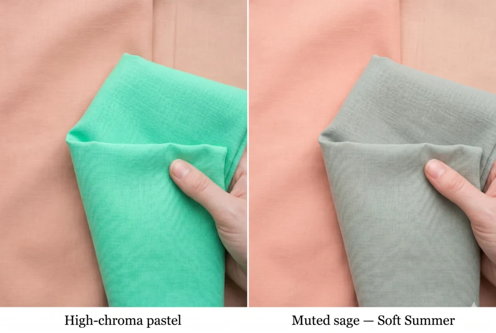
The most common Soft Summer misconception I encounter in consultations: “I’m Soft Summer, so any pastel should work for me.” The logic is intuitive — soft palette, soft colours. It is also incorrect, and the reason is in the chroma physics.
Pastels are not muted. They are light. A pastel is a high-chroma colour with white added to raise its LRV. A muted colour is any-chroma colour with grey or brown added to reduce its saturation. These are entirely different modifications with entirely different results at the face.
A bright pastel — mint green, lemon yellow, hot lilac — carries high chromatic energy even at a light value. When held near a Soft Summer face, the high chroma creates a “competition” with the skin’s low-saturation colouring, making the complexion appear washed out and dimensionless. Research published in the Journal of Color Research and Application (2024) confirms this dynamic: high-saturation light colours consistently produce perceived skin desaturation in cool-muted complexion types.
The Soft Summer’s appropriate pastels are dusted, greyed-down versions: soft dusty rose rather than warm blush, cool grey-lavender rather than lilac, muted sage rather than mint. The difference between the wrong pastel and the right one is subtle on the shelf — and immediately visible on the face in natural light.
Soft Summer and the 2026 Fashion Context
There is a reason that the dominant fashion houses of 2025–2026 — The Row, Toteme, Cos, Lemaire — have converged on a palette that reads, almost precisely, as the Soft Summer colour system. Quiet luxury, European minimalism, and the undone-chic aesthetic that has replaced trend-cycle dressing are all, at their core, Soft Summer colour language: desaturated, cool, medium in depth, restrained in contrast.
The 2026 Pantone trend forecasts include Marina Blue (a medium cool blue-grey), Cloud Dancer (a soft near-white with lavender undertones), and Dusted Mauve — all of which sit squarely within the Soft Summer palette’s optimal range. For Soft Summer clients, this is a rare moment of complete alignment between your permanent biological palette and the mainstream fashion moment.
But the practitioner’s caveat stands: trend alignment without personal analysis is still guesswork. The value of knowing your season is that you are permanently calibrated, regardless of what the trend landscape does in any given year. The Soft Summer palette was yours before Marina Blue was named, and it will be yours long after the next trend cycle has passed.
Also read our popular guide ; soft summer vs. cool summer for more clarity .
Your Implementation Task
What to Do After This Guide
Reading about the Soft Summer colour season is the first step. The second is confirming whether it is actually your season — because understanding a palette and knowing it belongs to you are distinct experiences.
Download your Soft Summer Palette Card — 36 colours with hex codes, Munsell references, and seasonal wear notes. Formatted as a permanent shopping reference.
Take the undertone test: Under natural daylight, examine the veins on the inside of your wrist. Blue-purple or blue-grey veins indicate cool undertone — the Summer family’s biological baseline. Green veins indicate warm.
Try the drape test at home: Hold a warm golden fabric and a cool grey-blue fabric alternately at your face in natural light. If the grey-blue clarifies your skin and the gold introduces any yellow or sallow quality — you are likely in the cool season family.Read the Am I Soft Summer? clinical checklist — our 12-point self-analysis guide covers every physical marker assessed in a professional drapting session, including skin depth, eye pattern, hair value, and contrast ratio.